


既有适合小白学习的零基础资料,也有适合3年以上经验的小伙伴深入学习提升的进阶课程,涵盖了95%以上大数据知识点,真正体系化!
由于文件比较多,这里只是将部分目录截图出来,全套包含大厂面经、学习笔记、源码讲义、实战项目、大纲路线、讲解视频,并且后续会持续更新
需要这份系统化资料的朋友,可以戳这里获取
文章目录
- 系列文章目录
- HTML
-
- 理解 HTML 语义化
- 块状元素和内联元素
- 理解 HTML 语义化
- 布局
-
- 盒模型宽度计算
- margin 纵向重叠问题
- margin 负值问题
- BFC 理解与应用
-
- 形成 BFC 的常见条件
- flex 布局
- 盒模型宽度计算
- CSS - 定位
-
- absolute 和 relative 定位
- 水平居中和垂直居中
-
- 水平居中
- 垂直居中
- 水平居中
- absolute 和 relative 定位
- CSS - 图文样式
-
- line-height(行高) 如何继承
- CSS - 响应式
-
- rem 是什么
- 响应式布局的常用方案
- 网页视口尺寸
- vh 和 vw
- rem 是什么
HTML
理解 HTML 语义化
- 让人更容易读懂(增加代码可读性)
- 让搜索引擎更容易读懂(SEO)
示例:通过操作这两种方式能实现同样的效果,但我们更倾向于第一种写法
- 第一种:
<div> <ul> <li></li> </ul> </div>
- 第二种:
<div> <div> <div></div> </div> </div>
块状元素和内联元素
块状元素:div、h1-h5、table、ul、ol、p 等
diaplay: block/table
内联元素:span、img、input、button 等
display: inline/inline-bolck
block、inline、inline-block 的区别:

图示区别:
.box { width: 100px; height: 100px; background-color: red; display: block; } <div class="box">block</div>

.box { width: 100px; height: 100px; background-color: red; display: inline; } <div class="box">inline</div>

.box { width: 100px; height: 100px; background-color: red; display: inline-block; } <div class="box">inline</div>

布局
盒模型宽度计算
offsetWidth:(内容宽度 + 内边距 + 边框),无外边距
示例:offsetWidth:100 + 10 + 10 + 1 + 1 = 122px
#div { width: 100px; padding: 10px; margin: 10px; border: 1px solid #ccc; } <div id="div"></div>
盒模型
示例:控制 offsetWidth 的值为 100px
#div { width: 100px; padding: 10px; margin: 10px; border: 1px solid #ccc; box-sizing: border-box; } <div id="div">this is div</div>
盒模型2
margin 纵向重叠问题
相邻元素 的 margin-top 和 margin-bottom 会发生重叠
空白内容的 <p></p> 也会重叠
示例:S 的 margin-bottom 为 15 px
p { font-size: 16px; line-height: 1; margin-top: 10px; margin-bottom: 15px; } <p>SSS</p> <p></p> <p></p> <p></p> <p>HHH</p>

margin 负值问题
- margin-top 和 margin-left 负值,元素向上、向左移动
- margin-right 负值,右侧元素左移,自身不受影响
- margin-bottom 负值,下方元素上移,自身不受影响
body { margin: 20px; } .float-left { float: left; } .clearfix:after { content: ''; display: block; clear: both; } .container { border: 1px solid #ccc; padding: 10px; } .container .item { width: 100px; height: 100px; } .container .border-blue { border: 1px solid blue; } .container .border-red { border: 1px solid red; } <p>用于测试 margin top bottom 的负数情况</p> <div class="container"> <div class="item border-blue"> this is item 1 </div> <div class="item border-red"> this is item 2 </div> </div> <p>用于测试 margin left right 的负数情况</p> <div class="container clearfix"> <div class="item border-blue float-left"> this is item 1 </div> <div class="item border-red float-left"> this is item 2 </div> </div>
- 示例:top bottom
margin 负数情况
- 示例:left right
margin 负数情况2
BFC 理解与应用
Block format context,块级格式化上下文
一块独立渲染区域,内部元素的渲染不会影响边界以外的元素
形成 BFC 的常见条件
- float 不是 none
- position 是 absolute 或 fixed
- overflow 不是 visible
- display 是 flex item(直接子元素) 或 inline-block
示例:(不设置 bfc)
.container { background-color: #ccc; } .left { float: left; } <div class="container"> <img src="xxx.png" class="left"> <p>一段文字...</p> </div>

示例:(设置 bfc)
.container { background-color: #ccc; } .left { float: left; } .bfc { overflow: hidden; } <div class="container bfc"> <img src="xxx.png" class="left"> <p class="bfc">一段文字...</p> </div>

flex 布局
常用语法:flex 布局详解—参考链接
- flex-direction:设置主轴的方向
- justify-content:设置主轴上的子元素排列方式
- align-items:设置侧轴上的子元素排列方式(单行)
- flex-wrap:设置子元素是否换行
- align-self:控制子项自己在侧轴上的排列方式
示例:flex 布局画色子(三点)
.box { width: 200px; height: 200px; border: 2px solid #ccc; border-radius: 10px; padding: 20px; display: flex; /\* flex 布局 \*/ justify-content: space-between; /\* 两端对齐 \*/ } .item { display: block; width: 40px; height: 40px; border-radius: 50%; background-color: #666; } .item:nth-child(2) { align-self: center; /\* 第二项居中对齐(垂直轴) \*/ } .item:nth-child(3) { align-self: flex-end; /\* 第三项尾对齐 (垂直轴) \*/ } <div class="box"> <span class="item"></span> <span class="item"></span> <span class="item"></span> </div>

示例:flex 布局画色子(五点)
body>div { display: flex; width: 100px; height: 100px; border-radius: 4px; border: 2px solid red; box-sizing: border-box; } p { width: 15px; height: 15px; background-color: black; border-radius: 50%; margin: 2px; } .div5 { flex-direction: column; justify-content: space-around; } .div5 div { display: flex; justify-content: space-around; } <div class="div5"> <div> <p></p> <p></p> </div> <div> <p></p> </div> <div> <p></p> <p></p> </div> </div>

CSS - 定位
absolute 和 relative 定位
- relative 依据 自身 定位
- absolute 依据 最近一层 的定位元素定位
定位元素:absolute relative fixed body
示例:测试 relative 和 absolute
body { margin: 20px; } .relative { position: relative; width: 400px; height: 200px; border: 1px solid #ccc; top: 20px; left: 50px; } .absolute { position: absolute; width: 200px; height: 100px; border: 1px solid blue; top: 20px; left: 50px; } <p>absolute 和 relative 定位问题</p> <div class="relative"> <div class="absolute"> this is absolute </div> </div>
不加 top 和 left 时:

加上 top 和 left 后:

去除 position: relative 后,absolute 盒子相对于最近一层(body)定位:

水平居中和垂直居中
水平居中
- inline 元素:text-align: center
- block 元素:margin: auto
- absolute 元素:left: 50% + margin-left: 负值
示例:
.container { border: 1px solid #ccc; margin: 10px; padding: 10px; } .item { background-color: #ccc; 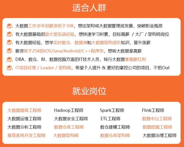 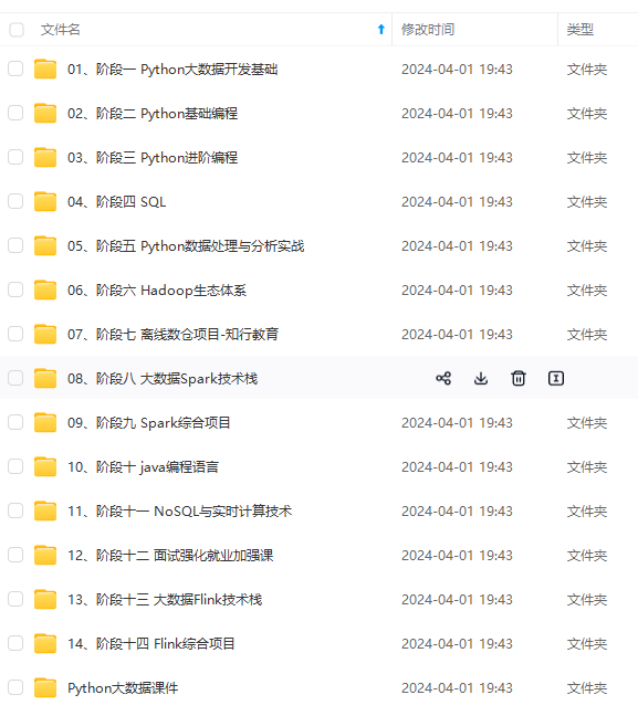 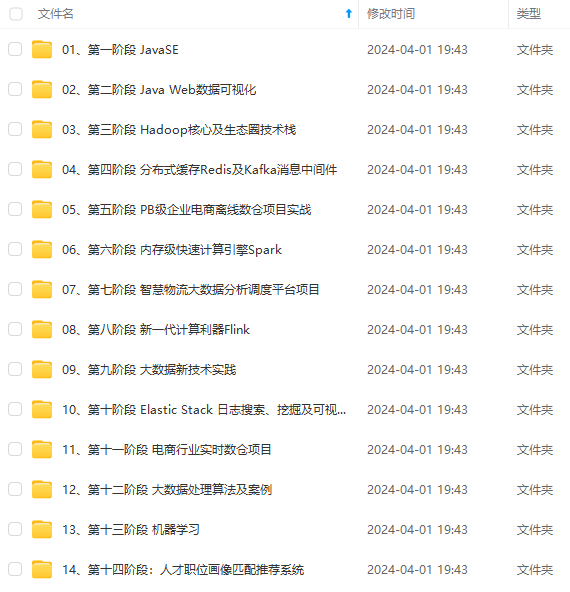 **既有适合小白学习的零基础资料,也有适合3年以上经验的小伙伴深入学习提升的进阶课程,涵盖了95%以上大数据知识点,真正体系化!** **由于文件比较多,这里只是将部分目录截图出来,全套包含大厂面经、学习笔记、源码讲义、实战项目、大纲路线、讲解视频,并且后续会持续更新** **[需要这份系统化资料的朋友,可以戳这里获取](https://bbs.csdn.net/topics/618545628)** ne 元素:text-align: center * block 元素:margin: auto * absolute 元素:left: 50% + margin-left: 负值 示例:
.container { border: 1px solid #ccc; margin: 10px; padding: 10px; } .item { background-color: #ccc;
[外链图片转存中…(img-e9VnpdUK-1715614100009)]
[外链图片转存中…(img-p0vPOd6j-1715614100010)]
[外链图片转存中…(img-du8FBf69-1715614100010)]
既有适合小白学习的零基础资料,也有适合3年以上经验的小伙伴深入学习提升的进阶课程,涵盖了95%以上大数据知识点,真正体系化!
由于文件比较多,这里只是将部分目录截图出来,全套包含大厂面经、学习笔记、源码讲义、实战项目、大纲路线、讲解视频,并且后续会持续更新
需要这份系统化资料的朋友,可以戳这里获取

