
效果
先说一下实现思路,将盒子设置很粗的边框,再将盒子设置成圆形,最后将需要的盒子组合在一起形成的太极图。
第一步
一个大盒子里面放俩个小盒子
 <div>
        <section class="laft"></section>
        <section class="right"></section>
 </div>
给大盒子设置css样式
div{
            width: 200px;
            height: 100px;
            border: 1px solid black;
            border-radius: 50%;
            border-bottom-width: 100px;
            margin: 200px auto;
}
效果

第二步
设置左边一个小盒子为圆形加粗边框,再移动小盒子到合适的位置,这里为了便于区分,设置颜色为红色,后续再做修改
   .laft{
            border: 40px solid black;
            border-radius: 50%;
            background-color: red;
            margin-top: 50px;
}
效果

右边同理制作出一个蓝色的盒子放到合适的位置,同样为了便于区分设置颜色为蓝色
 .right {
            width: 20px;
            height: 20px;
            border: 40px solid white;
            border-radius: 50%;
            margin-left: 100px;
            margin-top: -100px;
}
效果

第三步
再改下小盒子背景色和小盒子边框颜色,太极图就完成了
          div {
            width: 200px;
            height: 100px;
            border: 1px solid black;
            border-radius: 50%;
            margin: 200px auto;
            border-bottom-width: 100px;
      }

         .laft {
            width: 20px;
            height: 20px;
            border: 40px solid black;
            border-radius: 50%;
            margin-top: 50px;
            background-color: white;
      }

        .right {
            width: 20px;
            height: 20px;
            border: 40px solid white;
            border-radius: 50%;
            margin-left: 100px;
            margin-top: -100px;
            background-color: black;
        }
效果

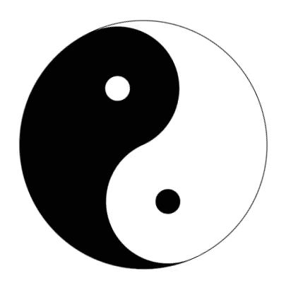
至此太极图已经完成,如果想要让太极图转起来,设置动画即可,全部的css代码如下
 div {
            width: 200px;
            height: 100px;
            border: 1px solid black;
            border-radius: 50%;
            margin: 200px auto;
            border-bottom-width: 100px;
            /* 关键帧名称 */
            animation-name: taiji;
            /* 动画完成一个周期所需时常设为1秒 */
            animation-duration: 1s;
            /* 动画播放周期设为无限次 */
            animation-iteration-count: infinite;
            /* 动画完成一个周期的速度曲线设置为匀速 */
            animation-timing-function: linear;
        }

        .laft {
            width: 20px;
            height: 20px;
            border: 40px solid black;
            border-radius: 50%;
            margin-top: 50px;
            background-color: white;
        }

        .right {
            width: 20px;
            height: 20px;
            border: 40px solid white;
            border-radius: 50%;
            margin-left: 100px;
            margin-top: -100px;
            background-color: black;
        }

        @keyframes taiji {
            from {
                rotate: 0deg;
            }

            to {
                rotate: 360deg;
            }
        }