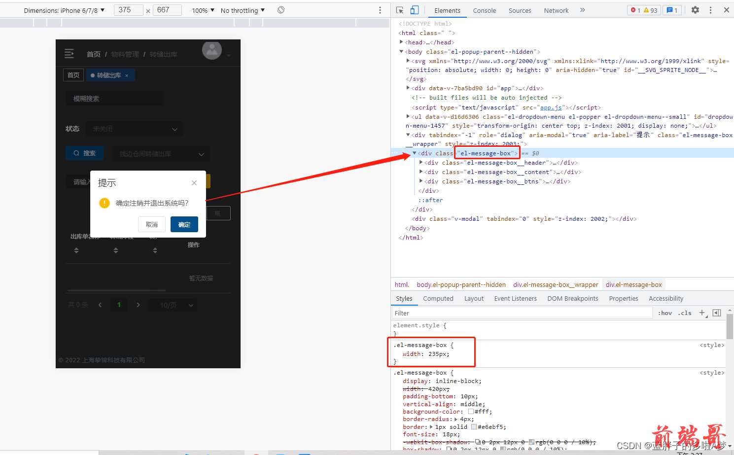
在窄屏模式下(移动端或pda),提示框的宽度太宽,会出现显示不完全的问题。 应当如何修改 ElementUI 的样式呢?
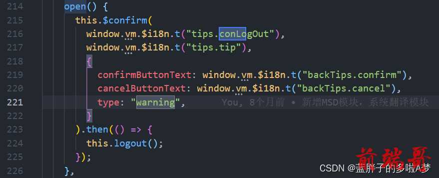
open() { this.$confirm( window.vm.$i18n.t("tips.conLogOut"), window.vm.$i18n.t("tips.tip"), { confirmButtonText: window.vm.$i18n.t("backTips.confirm"), cancelButtonText: window.vm.$i18n.t("backTips.cancel"), type: "warning", } ).then(() => { this.logout(); }); },
<style scoped> .el-message-box { width: 235px; } </style>
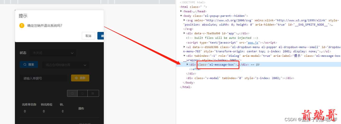
此时在scoped的style中写是无效的,因为ElementUI组件不可以给样式添加scoped,因此必须去掉scoped;但是去掉scoped后不满足单组件的CSS。
解决方案
1、附加在没有scoped的style中
<style scoped> ... </style> <style> ... .el-message-box { width: 235px; } </style>
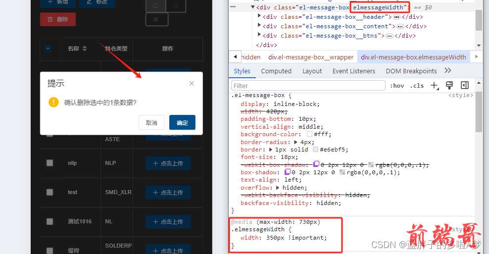
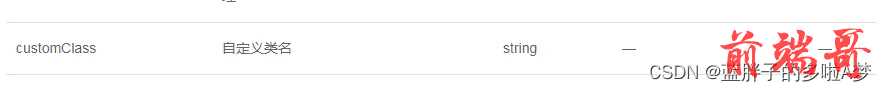
2、给消息提示框加类名(荐)
更加推荐这个messageBox添加一个类名,比较好用并且不会影响到其他页面的弹框样式。
this.$confirm('确认注销吗?', '提示', { customClass: 'elmessageWidth' }).then(() => { this.$message({ message: '已成功注销', type: 'success' }) }).catch(() => { })
<style scoped> ... </style> <style> .elmessageWidth { width: 350px; } </style>
或者直接important
@media (max-width: 730px) { .elmessageWidth{ width: 350px !important; } }