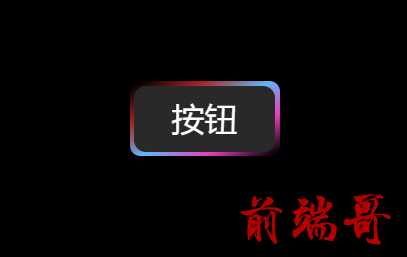
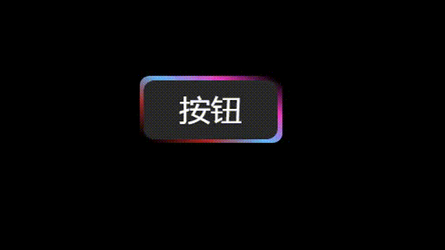
思路很简单,实现方法有很多很多。但是大体思路与实现方法都类似:渐变色 + 动画,主要区别在动画的具体实现
0、HTML 结构
| <!DOCTYPE html> |
| <html lang="en"> |
| <head> |
| <meta charset="UTF-8"> |
| <title>流光按钮</title> |
| </head> |
| <body> |
| <div class="wrapper"> |
| <div class="btn">按钮</div> |
| </div> |
| </body> |
| </html> |
1-1、CSS 实现一
| <style> |
| *{ |
| padding: 0; |
| margin: 0; |
| } |
| @property --rotate{ |
| syntax: "<angle>"; |
| initial-value: 20deg; |
| inherits: false; |
| } |
| body{ |
| background-color: rgba(243, 243, 243); |
| } |
| .wrapper{ |
| position: relative; |
| padding: 50px; |
| background-color: rgb(0, 0, 0); |
| z-index: -4; |
| height: 500px; |
| } |
| .wrapper .btn{ |
| overflow: hidden; |
| position: relative; |
| text-align: center; |
| border-radius: 7px; |
| width: 100px; |
| height: 50px; |
| line-height: 50px; |
| font-size: 22px; |
| color: white; |
| user-select: none; |
| margin: 50px auto; |
| } |
| .btn::before{ |
| position: absolute; |
| border-radius: 7px; |
| content: ""; |
| inset: -20px; |
| background: linear-gradient(var(--rotate), transparent 1%, rgb(255, 0, 191) , #00b7ff, rgba(255, 0, 34, 0.719), transparent 98%); |
| transform-origin: bottom left; |
| z-index: -2; |
| transition: all .4; |
| animation: spin 2.4s linear infinite; |
| transform-origin: 50% 50%; |
| } |
| .btn::after{ |
| content: ""; |
| position: absolute; |
| border-radius: 8px; |
| background-color: rgb(41, 41, 41); |
| inset: 3px; |
| z-index: -1; |
| } |
| |
| @keyframes spin { |
| 0%{ |
| --rotate: 0deg; |
| } |
| 100%{ |
| --rotate: 360deg; |
| } |
| } |
| </style> |
1-2、CSS 实现二
| <style> |
| *{ |
| padding: 0; |
| margin: 0; |
| } |
| body{ |
| background-color: rgba(243, 243, 243); |
| } |
| .wrapper{ |
| position: relative; |
| padding: 50px; |
| background-color: rgb(0, 0, 0); |
| z-index: -4; |
| height: 500px; |
| } |
| |
| .wrapper .btn{ |
| overflow: hidden; |
| position: relative; |
| text-align: center; |
| border-radius: 7px; |
| width: 100px; |
| height: 50px; |
| line-height: 50px; |
| font-size: 22px; |
| color: white; |
| user-select: none; |
| margin: 50px auto; |
| } |
| |
| .btn::before{ |
| position: absolute; |
| border-radius: 7px; |
| content: ""; |
| inset: -20px; |
| background: linear-gradient(0deg, transparent 1%, rgb(255, 0, 191) , #00b7ff, rgba(255, 0, 34, 0.719), transparent 98%); |
| transform-origin: bottom left; |
| z-index: -2; |
| transition: all .4; |
| animation: spin 2.4s linear infinite; |
| transform-origin: 50% 50%; |
| } |
| .btn::after{ |
| content: ""; |
| position: absolute; |
| border-radius: 8px; |
| background-color: rgb(41, 41, 41); |
| inset: 3px; |
| z-index: -1; |
| } |
| @keyframes spin { |
| 0%{ |
| transform: rotate(0deg); |
| } |
| 100%{ |
| transform: rotate(360deg); |
| } |
| } |
| </style> |


