
先自我介绍一下,小编浙江大学毕业,去过华为、字节跳动等大厂,目前阿里P7
深知大多数程序员,想要提升技能,往往是自己摸索成长,但自己不成体系的自学效果低效又漫长,而且极易碰到天花板技术停滞不前!
因此收集整理了一份《2024年最新Web前端全套学习资料》,初衷也很简单,就是希望能够帮助到想自学提升又不知道该从何学起的朋友。


既有适合小白学习的零基础资料,也有适合3年以上经验的小伙伴深入学习提升的进阶课程,涵盖了95%以上前端开发知识点,真正体系化!
由于文件比较多,这里只是将部分目录截图出来,全套包含大厂面经、学习笔记、源码讲义、实战项目、大纲路线、讲解视频,并且后续会持续更新
如果你需要这些资料,可以添加V获取:vip1024c (备注前端)

正文
margin 负数情况2
BFC 理解与应用
Block format context,块级格式化上下文
一块独立渲染区域,内部元素的渲染不会影响边界以外的元素
形成 BFC 的常见条件
- float 不是 none
- position 是 absolute 或 fixed
- overflow 不是 visible
- display 是 flex item(直接子元素) 或 inline-block
示例:(不设置 bfc)
	.container {
	    background-color: #ccc;
	}
	.left {
	    float: left;
	}

	<div class="container">
        <img src="xxx.png" class="left">
        <p>一段文字...</p>
    </div>

示例:(设置 bfc)
	.container {
	    background-color: #ccc;
	}
	.left {
	    float: left;
	}
	.bfc {
	    overflow: hidden;
	}

	<div class="container bfc">
        <img src="xxx.png" class="left">
        <p class="bfc">一段文字...</p>
    </div>

flex 布局
常用语法:flex 布局详解—参考链接
- flex-direction:设置主轴的方向
- justify-content:设置主轴上的子元素排列方式
- align-items:设置侧轴上的子元素排列方式(单行)
- flex-wrap:设置子元素是否换行
- align-self:控制子项自己在侧轴上的排列方式
示例:flex 布局画色子(三点)
    .box {
        width: 200px;
        height: 200px;
        border: 2px solid #ccc;
        border-radius: 10px;
        padding: 20px;

        display: flex; /\* flex 布局 \*/
        justify-content: space-between; /\* 两端对齐 \*/
    }
    .item {
        display: block;
        width: 40px;
        height: 40px;
        border-radius: 50%;
        background-color: #666;
    }
    .item:nth-child(2) {
        align-self: center; /\* 第二项居中对齐(垂直轴) \*/
    }
    .item:nth-child(3) {
        align-self: flex-end; /\* 第三项尾对齐 (垂直轴) \*/
    }

	<div class="box">
        <span class="item"></span>
        <span class="item"></span>
        <span class="item"></span>
    </div>

示例:flex 布局画色子(五点)
	body>div {
        display: flex;
        width: 100px;
        height: 100px;
        border-radius: 4px;
        border: 2px solid red;
        box-sizing: border-box;
    }

    p {
        width: 15px;
        height: 15px;
        background-color: black;
        border-radius: 50%;
        margin: 2px;
    }
    .div5 {
        flex-direction: column;
        justify-content: space-around;
    }
    .div5 div {
        display: flex;
        justify-content: space-around;
    }

	<div class="div5">
        <div>
            <p></p>
            <p></p>
        </div>
        <div>
            <p></p>
        </div>
        <div>
            <p></p>
            <p></p>
        </div>
    </div>

CSS - 定位
absolute 和 relative 定位
- relative 依据 自身 定位
- absolute 依据 最近一层 的定位元素定位
定位元素:absolute relative fixed body
示例:测试 relative 和 absolute
    body {
        margin: 20px;
    }
    .relative {
        position: relative;
        width: 400px;
        height: 200px;
        border: 1px solid #ccc;

        top: 20px;
        left: 50px;
    }
    .absolute {
        position: absolute;
        width: 200px;
        height: 100px;
        border: 1px solid blue;

        top: 20px;
        left: 50px;
    }

	<p>absolute 和 relative 定位问题</p>
    <div class="relative">
        <div class="absolute">
            this is absolute
        </div>
    </div>
不加 top 和 left 时:

加上 top 和 left 后:

去除 position: relative 后,absolute 盒子相对于最近一层(body)定位:

水平居中和垂直居中
水平居中
- inline 元素:text-align: center
- block 元素:margin: auto
- absolute 元素:left: 50% + margin-left: 负值
示例:
    .container {
        border: 1px solid #ccc;
        margin: 10px;
        padding: 10px;
    }
    .item {
        background-color: #ccc;
    }
    .container-1 {
        text-align: center; /\* 居中 \*/
    }
    .container-2 {
        width: 500px;
        margin: auto; /\* 居中 \*/
    }
    .container-3 {
        position: relative;
        height: 100px;
    }
    .container-3 .item {
        position: absolute;
        width: 300px;
        height: 100px;
        /\* 居中 \*/
        left: 50%;
        margin-left: -150px;
    }

	<div class="container container-1">
        <span>一段文字</span>
    </div>

    <div class="container container-2">
        <div class="item">
            this is block item
        </div>
    </div>

    <div class="container container-3">
        <div class="item">
            this is absolute item
        </div>
    </div>
居中前:

居中后:

垂直居中
- inline 元素:line-height 的值等于 height 值
- absolute 元素:top: 50% + margin-top 负值
- absolute 元素:transform(-50%, -50%)
- absolute 元素:top,left,bottom,right = 0 + margin: auto
示例:
    .container {
        border: 1px solid #ccc;
        margin: 10px;
        padding: 10px;
        height: 130px;
    }
    .item {
        background-color: #ccc;
    }
    .container-1 {
        text-align: center;
        /\* 垂直居中 \*/
        line-height: 130px;
        height: 130px;
    }
    .container-2 {
        position: relative;
    }
    .container-2 .item {
        position: absolute;
        width: 300px;
        height: 100px;
        left: 50%;
        margin-left: -150px;
        /\* 垂直居中 \*/
        top: 50%;
        margin-top: -50px;
    }
    .container-3 {
        position: relative;
    }
    .container-3 .item {
        position: absolute;
        width: 300px;
        height: 100px;
        /\* 垂直居中 \*/
        left: 50%;
        top: 50%;
        transform: translate(-50%, -50%);
    }
    .container-4 {
        position: relative
    }
    .container-4 .item {
        position: absolute;
        width: 100px;
        height: 50px;
		/\* 垂直居中 \*/
        top: 0;
        left: 0;
        bottom: 0;
        right: 0;
        margin: auto;
    }

    <div class="container container-1">
        <span>一段文字</span>
    </div>

    <div class="container container-2">
        <div class="item">
            this is item
        </div>
    </div>

    <div class="container container-3">
        <div class="item">
            this is item
        </div>
    </div>

    <div class="container container-4">
        <div class="item">
            this is item
        </div>
    </div>

CSS - 图文样式
line-height(行高) 如何继承
- 写具体数值,如30px,则继承该值
- 写比例,如 2,则继承该比例
- 写百分比,如200%,则继承计算出来的值(重点注意)
示例:p 标签的行高是多少?
示例 1:继承 body 的行高:30px
    body {
        font-size: 20px;
        line-height: 30px;
    }
    p {
        background-color: #ccc;
        font-size: 16px;
    }

	<p>AAA</p>

示例 2:自身的 font-size 乘以继承的 line-height => 16 * 2 = 32px
    body {
        font-size: 20px;
        line-height: 2;
    }
    p {
        background-color: #ccc;
        font-size: 16px;
    }

	<p>AAA</p>

示例 3:继承的 font-size 乘以继承的 line-height => 20 * 2 = 40px
    body {
        font-size: 20px;
        line-height: 200%;
    }
    p {
        background-color: #ccc;
        font-size: 16px;
    }

	<p>AAA</p>

CSS - 响应式
rem 是什么
- px,绝对长度单位,最常用
- em,相对长度单位,相对于父元素,不常用
- rem,相对长度单位,相对于根元素,常用于响应式布局
示例:设置一个 rem 为 100px,都会继承 html 里的 font-size。在这里,0.2 rem 就是 20px
    html {
        font-size: 100px;
    }
    div {
        background-color: #ccc;
        margin-top: 10px;
        font-size: 0.16rem;
    }

	<p style="font-size: 0.1rem">rem 1</p>
    <p style="font-size: 0.2rem">rem 1</p>
    <p style="font-size: 0.3rem">rem 1</p>

    <div style="width: 1rem">
        this is div1
    </div>
    <div style="width: 2rem">
        this is div2
    </div>
    <div style="width: 3rem">
        this is div3
    </div>

响应式布局的常用方案
- media-query,根据不同的屏幕宽度设置根元素 font-size
- rem,基于根元素的相对单位
示例:iPhone5、iPhone6/7/8、iPhone6/7/8Plus 机型
    @media only screen and (max-width: 374px) {
        /\* iphone5 的宽度(320px)比例设置 font-size \*/
        html {
            font-size: 86px;
        }
    }
    @media only screen and (min-width: 375px) and (max-width: 413px) {
        /\* iphone6/7/8 和 iphone x \*/
        html {
            font-size: 100px;
        }
    }
    @media only screen and (min-width: 414px) {
        /\* iphone6/7/8plus 的宽度(414px)比例设置 font-size \*/
        html {
            font-size: 110px;
        }
    }
    body {
        font-size: 0.16rem; /\* 根据机型响应式变化 \*/
    }
    #div1 {
        width: 1rem; /\* 根据机型响应式变化 \*/
        background-color: #ccc;
    }

	<div id="div1">
        this is div
    </div>


网页视口尺寸
- window.screen.height => 屏幕高度(屏幕总高度)
- window.innerHeight => 网页视口高度(除去刘海和下巴的高度)
- document.body.clientHeight => body 高度(内容撑起来的高度)
vh 和 vw
- vh 网页视口高度的 1/100
- vw 网页视口宽度的 1/100
- vmax 取两者的最大值
- vmin 取两者的最小值
### 最后
其实前端开发的知识点就那么多,面试问来问去还是那么点东西。所以面试没有其他的诀窍,只看你对这些知识点准备的充分程度。so,出去面试时先看看自己复习到了哪个阶段就好。
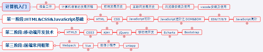
这里再分享一个复习的路线:(以下体系的复习资料是我从各路大佬收集整理好的)
《前端开发四大模块核心知识笔记》
最后,说个题外话,我在一线互联网企业工作十余年里,指导过不少同行后辈。帮助很多人得到了学习和成长。
我意识到有很多经验和知识值得分享给大家,也可以通过我们的能力和经验解答大家在IT学习中的很多困惑,所以在工作繁忙的情况下还是坚持各种整理和分享。
**网上学习资料一大堆,但如果学到的知识不成体系,遇到问题时只是浅尝辄止,不再深入研究,那么很难做到真正的技术提升。**
**需要这份系统化的资料的朋友,可以添加V获取:vip1024c (备注前端)**

**一个人可以走的很快,但一群人才能走的更远!不论你是正从事IT行业的老鸟或是对IT行业感兴趣的新人,都欢迎加入我们的的圈子(技术交流、学习资源、职场吐槽、大厂内推、面试辅导),让我们一起学习成长!**
后
其实前端开发的知识点就那么多,面试问来问去还是那么点东西。所以面试没有其他的诀窍,只看你对这些知识点准备的充分程度。so,出去面试时先看看自己复习到了哪个阶段就好。
这里再分享一个复习的路线:(以下体系的复习资料是我从各路大佬收集整理好的)
《前端开发四大模块核心知识笔记》

最后,说个题外话,我在一线互联网企业工作十余年里,指导过不少同行后辈。帮助很多人得到了学习和成长。
我意识到有很多经验和知识值得分享给大家,也可以通过我们的能力和经验解答大家在IT学习中的很多困惑,所以在工作繁忙的情况下还是坚持各种整理和分享。
**网上学习资料一大堆,但如果学到的知识不成体系,遇到问题时只是浅尝辄止,不再深入研究,那么很难做到真正的技术提升。**
**需要这份系统化的资料的朋友,可以添加V获取:vip1024c (备注前端)**
[外链图片转存中...(img-LjmxFhgO-1713047058764)]
**一个人可以走的很快,但一群人才能走的更远!不论你是正从事IT行业的老鸟或是对IT行业感兴趣的新人,都欢迎加入我们的的圈子(技术交流、学习资源、职场吐槽、大厂内推、面试辅导),让我们一起学习成长!**
