
一、盒子布局

| boder-边框 | 上右下左 |
| padding-外边距 | 内容距离边框的距离上右下左 |
| margin-外边距 | 边框距离页面的距离 |
| none | 定义无边框 |
| hiedden | 与none相同。不过应用于表时除外,对于表,hidden用于解决边框冲突 |
| dotted | 定义点状边框。在大多数浏览器中呈现为实线 |
| dashed | 定义虚线。在大多数浏览器中呈现实线 |
| solid | 定义实线 |
<!DOCTYPE html> <html lang="en"> <head> <meta charset="UTF-8"> <meta http-equiv="X-UA-Compatible" content="IE=edge"> <meta name="viewport" content="width=device-width, initial-scale=1.0"> <title>盒子布局</title> <style> div{ width: 100px; height: 100px; background-color: red; border: 1px solid black; padding: 20px; margin-left: 100px; } </style> </head> <body> <div> 我是重庆彭于晏 </div> </body> </html>
二、元素分类
块级元素------独占一行(自动换行)div p hn hr 可以设置宽度和高度
行内元素(内连)------不会自动换行a span 不可以设置宽度和高度(不起作用)
display可以实现会计元素和行内元素之间互换
属性取值:
none----表示不会被显示,隐藏元素的方式之一
block----将元素变为款及元素,也会自动换行(默认有个换行符)
inline----将元素变为行内元素,元素前后没有换行符
注意:css中隐藏元素的方式:
第一种:display:none;
第二种:width:0;heigth:0;
<!DOCTYPE html> <html lang="en"> <head> <meta charset="UTF-8"> <meta http-equiv="X-UA-Compatible" content="IE=edge"> <meta name="viewport" content="width=device-width, initial-scale=1.0"> <title>元素分类</title> <style> div{ width: 100px; height: 100px; border: 1px solid black; /* display: inline; */ } a{ width: 100px; height: 100px; border: 1px solid black; display: block; } .one{ width: 100px; height: 100px; background-color: red; /* display: none; width: 0; height: 0; */ } </style> </head> <body> <div class="one">这是第一个div</div> <div>这是第二个div</div> <div>这是第三个div</div> <a href="#">这是第一个a标签</a> <a href="#">这是第二个a标签</a> <a href="#">这是第三个a标签</a> <a href="#">这是第四个a标签</a> </body> </html>
三、浮动布局
通过float属性去设置浮动布局
取值:left none(不浮动)right
注意:如果浮动取值是left的话(左浮),会对后面的元素产生一定的影响
<!DOCTYPE html> <html lang="en"> <head> <meta charset="UTF-8"> <meta http-equiv="X-UA-Compatible" content="IE=edge"> <meta name="viewport" content="width=device-width, initial-scale=1.0"> <title>浮动布局</title> <style> .box1{ width: 200px; border: 1px; height: 200px; background-color: blueviolet; float: right; } .box2{ width: 200px; height: 200px; border: 1px; background-color: blue; clear:both; } .box3{ width: 200px; height: 200px; border: 1px; background-color: brown; float:left ; } </style> </head> <body> <div class="box1">这是一个div</div> <div class="box2">这是二个div</div> <div class="box3">这是三个div</div> </body> </html>
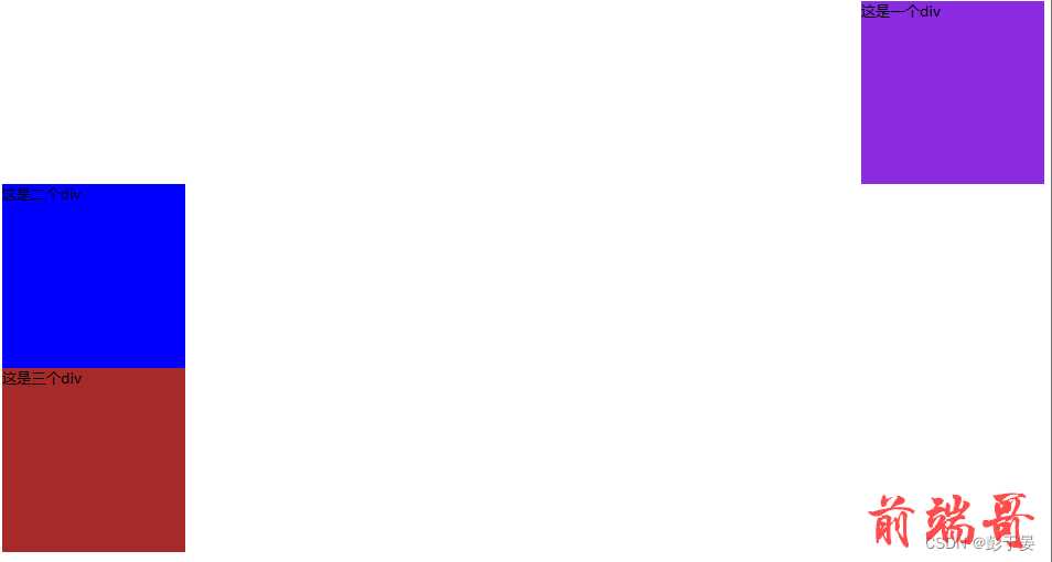
浮动布局如上面所示
如果要消除这总影响(消除浮动)通过clear属性
| none | 默认允许两边都浮动 |
| left | 不允许左边浮动 |
| right | 不允许右边浮动 |
| both | 不允许两侧有浮动 |
四、定位布局
定位就是将指定元素摆放到页面的任意位置,通过定位可以任意摆放元素。
通过position属性来设置元素的定位。
position的取值
| 值 | 描述 |
| static | 与正常流相同,并且为默认值 |
| relative | 盒子的位置可以相对其在正常流中的位置出现偏移,对象不可层叠,可根据left、right、top和bottom等属性的值在正常流中偏移。 |
| fixed | 固定在屏幕的某个位置,位置通过left、right、top和bottom属性指定,并且不随用户滚动窗口而改变位置。 |
示列代码如下面所示
<!DOCTYPE html> <html lang="en"> <head> <meta charset="UTF-8"> <meta http-equiv="X-UA-Compatible" content="IE=edge"> <meta name="viewport" content="width=device-width, initial-scale=1.0"> <title>定位布局</title> <style> .main{ width: 600px; height: 600px; border: 1px solid rgb(255, 47, 161); margin: 200px; position: relative; } .box1{ width: 200px; border: 1px solid black; height: 200px; background-color: blueviolet; position: absolute; top: 100px; left: 200px; } .box2{ width: 200px; height: 200px; border: 1px solid black; background-color: blue; /* position: relative; left: 200px; */ } .box3{ width: 200px; height: 200px; border: 1px solid black; background-color: brown; float:left ; } </style> </head> <body> <div class="main"> <div class="box1">中国彭于晏</div> <div class="box2">重庆彭于晏</div> <div class="box3">永川彭于晏</div> </div> </body> </html>

五、弹性盒子
弹性盒子由弹性容器和弹性子元素组成。弹性容器通过设置display属性的值为flex而定义为的弹性容器。
设置弹性容器是通过 display 属性进行设置, ---------- display:flex 或则 inline-flex 注意:一个弹性容器可以包含多个弹性元素 弹性盒子只是规定了弹性子元素如何在弹性容器内布局,其他时候(弹性容器外,弹性子元素内)都是正常渲染的。并且默认弹性子元素只在弹性盒子的一行展示,默认每个容器只有一行| flex- direction | 指的是弹性容器中子元素的排列方式 |
| flex-wrap | 指的是弹性容器中子元素超出父容器时是否换行 |
| flex-flow | -flex- direction 和 flex-wrap 的简写 |
| align-items | 设置的弹性容器中元素在侧轴 ( 纵轴)的对齐方式 |
| justify-content | 设置的弹性容器中元素在主轴(横轴)的对齐方式 |
| align-content | - 修改了 flex-flow 的行为,类似于 align-items ,它是对齐的弹性线 |

所示代码如下
<!DOCTYPE html> <html lang="en"> <head> <meta charset="UTF-8"> <meta http-equiv="X-UA-Compatible" content="IE=edge"> <meta name="viewport" content="width=device-width, initial-scale=1.0"> <title>弹性盒子</title> <style> .flex-contain{ width: 400px; height: 400px; background-color: orange; display: flex; align-items: center; } .flex-item{ width: 100px; height: 100px; background-color: blueviolet; border: 1px solid black; } </style> </head> <body> <div class="flex-contain"> <div class="flex-item">flex-item1</div> <div class="flex-item">flex-item2</div> <div class="flex-item">flex-item3</div> </div> </body> </html>

