1.物体滚动效果

| <div class="box"> |
| <div class="boxLoading"></div> |
| </div> |
| <style> |
| .boxLoading { |
| width: 50px; |
| height: 50px; |
| margin: auto; |
| position: absolute; |
| left: 0; |
| right: 0; |
| top: 0; |
| bottom: 0; |
| } |
| |
| .boxLoading:before { |
| content: ''; |
| width: 50px; |
| height: 5px; |
| background: #fff; |
| opacity: 0.7; |
| position: absolute; |
| top: 59px; |
| left: 0; |
| border-radius: 50%; |
| animation: shadow .5s linear infinite; |
| } |
| |
| .boxLoading:after { |
| content: ''; |
| width: 50px; |
| height: 50px; |
| background: #075222; |
| animation: animate 0.6s linear infinite; |
| position: absolute; |
| top: 0; |
| left: 0; |
| border-radius: 3px; |
| } |
| |
| @keyframes animate { |
| 17% { |
| border-bottom-right-radius: 3px; |
| } |
| |
| 25% { |
| transform: translateY(9px) rotate(22.5deg); |
| } |
| |
| 50% { |
| transform: translateY(18px) scale(1, .9) rotate(45deg); |
| border-bottom-right-radius: 40px; |
| } |
| |
| 75% { |
| transform: translateY(9px) rotate(67.5deg); |
| } |
| |
| 100% { |
| transform: translateY(0) rotate(90deg); |
| } |
| } |
| |
| @keyframes shadow { |
| |
| 0%, |
| 100% { |
| transform: scale(1, 1); |
| } |
| |
| 50% { |
| transform: scale(1.2, 1); |
| } |
| } |
| </style> |
2.音乐播放效果

| <div class="music"> |
| <span></span> |
| <span></span> |
| <span></span> |
| <span></span> |
| <span></span> |
| <span></span> |
| <span></span> |
| <span></span> |
| <span></span> |
| <span></span> |
| <span></span> |
| <span></span> |
| <span></span> |
| <span></span> |
| <span></span> |
| </div> |
| <style> |
| .music { |
| position: absolute; |
| top: 0px; |
| bottom: 0px; |
| left: 0px; |
| right: 0px; |
| margin: auto; |
| width: 175px; |
| height: 100px; |
| } |
| |
| .music span { |
| display: block; |
| background: #e04960; |
| width: 7px; |
| height: 100%; |
| border-radius: 14px; |
| margin-right: 5px; |
| float: left; |
| } |
| |
| .music span:last-child { |
| margin-right: 0px; |
| } |
| |
| .music span:nth-child(1) { |
| animation: load 2.5s 1.4s infinite linear; |
| } |
| |
| .music span:nth-child(2) { |
| animation: load 2.5s 1.2s infinite linear; |
| } |
| |
| .music span:nth-child(3) { |
| animation: load 2.5s 1s infinite linear; |
| } |
| |
| .music span:nth-child(4) { |
| animation: load 2.5s 0.8s infinite linear; |
| } |
| |
| .music span:nth-child(5) { |
| animation: load 2.5s 0.6s infinite linear; |
| } |
| |
| .music span:nth-child(6) { |
| animation: load 2.5s 0.4s infinite linear; |
| } |
| |
| .music span:nth-child(7) { |
| animation: load 2.5s 0.2s infinite linear; |
| } |
| |
| .music span:nth-child(8) { |
| animation: load 2.5s 0s infinite linear; |
| } |
| |
| .music span:nth-child(9) { |
| animation: load 2.5s 0.2s infinite linear; |
| } |
| |
| .music span:nth-child(10) { |
| animation: load 2.5s 0.4s infinite linear; |
| } |
| |
| .music span:nth-child(11) { |
| animation: load 2.5s 0.6s infinite linear; |
| } |
| |
| .music span:nth-child(12) { |
| animation: load 2.5s 0.8s infinite linear; |
| } |
| |
| .music span:nth-child(13) { |
| animation: load 2.5s 1s infinite linear; |
| } |
| |
| .music span:nth-child(14) { |
| animation: load 2.5s 1.2s infinite linear; |
| } |
| |
| .music span:nth-child(15) { |
| animation: load 2.5s 1.4s infinite linear; |
| } |
| |
| @keyframes load { |
| 0% { |
| background: #409EFF; |
| transform: scaleY(0.08); |
| } |
| |
| 50% { |
| background: #F56C6C; |
| |
| transform: scaleY(1); |
| } |
| |
| 100% { |
| background: #409EFF; |
| transform: scaleY(0.08); |
| } |
| } |
| </style> |
3.交错动画loading效果

| <div class="loading"> |
| <div class="drop"></div> |
| <div class="drop"></div> |
| <div class="drop"></div> |
| <div class="drop"></div> |
| <div class="drop"></div> |
| </div> |
| <style lang="scss" scoped> |
| body { |
| display: flex; |
| height: 100vh; |
| justify-content: center; |
| align-items: center; |
| background: #222; |
| } |
| |
| .loading { |
| position: fixed; |
| left: 500px; |
| right: 0; |
| margin: 0 auto; |
| top: 300px; |
| $colors: #7ef9ff, |
| #89cff0, |
| #4682b4, |
| #0f52ba, |
| #000080; |
| display: flex; |
| |
| .drop { |
| position: relative; |
| width: 2em; |
| height: 2em; |
| margin: 0.8em; |
| border-radius: 50%; |
| |
| &::before { |
| position: absolute; |
| content: ""; |
| width: 100%; |
| height: 100%; |
| background: inherit; |
| border-radius: inherit; |
| animation: wave 2s ease-out infinite; |
| } |
| |
| @for $i from 1 through 5 { |
| &:nth-child(#{$i}) { |
| background: nth($colors, $i); |
| |
| &::before { |
| animation-delay: $i * 0.2s; |
| } |
| } |
| } |
| } |
| } |
| |
| @keyframes wave { |
| |
| 50%, |
| 75% { |
| transform: scale(2.5); |
| } |
| |
| 80%, |
| 100% { |
| opacity: 0; |
| } |
| } |
| </style> |
4.小球移动
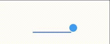
| <div class="move"> |
| <span></span> |
| </div> |
| .move { |
| width: 150px; |
| height: 4px; |
| border-radius: 2px; |
| margin: 0 auto; |
| margin-top: 300px; |
| position: relative; |
| background: #409eff; |
| -webkit-animation: changeBgColor 1.04s ease-in infinite alternate; |
| animation: changeBgColor 1.04s ease-in infinite alternate; |
| } |
| .move span { |
| display: inline-block; |
| width: 30px; |
| height: 30px; |
| border-radius: 50%; |
| background: #409eff; |
| position: absolute; |
| margin-top: -30px; |
| margin-left: -8px; |
| -webkit-animation: changePosition 1.04s ease infinite alternate; |
| animation: changePosition 1.04s ease infinite alternate; |
| } |
| @-webkit-keyframes changeBgColor { |
| 0% { |
| background: lightblue; |
| } |
| 50% { |
| background: red; |
| } |
| 100% { |
| background: #409eff; |
| } |
| } |
| @-webkit-keyframes changePosition { |
| 0% { |
| background: lightblue; |
| } |
| 50% { |
| background: red; |
| } |
| 100% { |
| margin-left: 142px; |
| background: #409eff; |
| } |
| } |
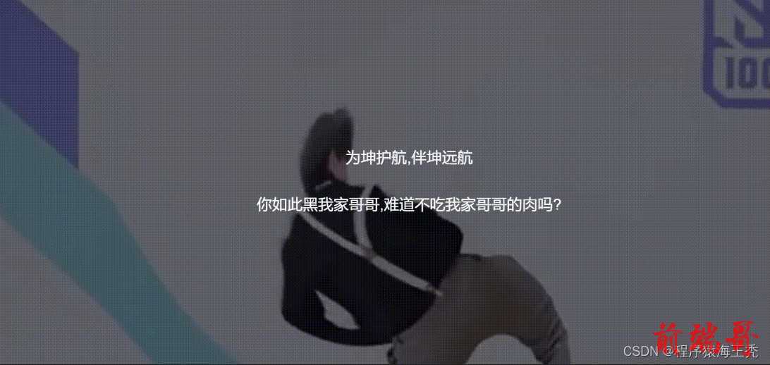
5.电影闭幕效果(这个gif太大了,只能搞个图片将就一下,各位ikun一看就懂)
| <div class="container"> |
| <div class="box"></div> |
| <div class="text"> |
| <p>为坤护航,伴坤远航</p> |
| <br> |
| <p>你如此黑我家哥哥,难道不吃我家哥哥的肉吗?</p> |
| </div> |
| </div> |
| .box { |
| height: 100%; |
| width: 100%; |
| position: absolute; |
| background: url('https://img0.baidu.com/it/u=2771945787,9120044&fm=253&fmt=auto&app=120&f=JPEG?w=800&h=500') no-repeat; |
| background-size: cover; |
| animation: fade-away 3s linear forwards; |
| } |
| .text { |
| position: absolute; |
| line-height: 55px; |
| color: #fff; |
| font-size: 36px; |
| text-align: center; |
| left: 50%; |
| top: 50%; |
| transform: translate(-50%, -50%); |
| opacity: 0; |
| animation: show 2s cubic-bezier(0.74, -0.1, 0.86, 0.83) forwards; |
| } |
| |
| @keyframes fade-away { |
| 30% { |
| filter: brightness(1); |
| } |
| 100% { |
| filter: brightness(0); |
| } |
| } |
| @keyframes show { |
| 20% { |
| opacity: 0; |
| } |
| 100% { |
| opacity: 1; |
| } |
| } |


