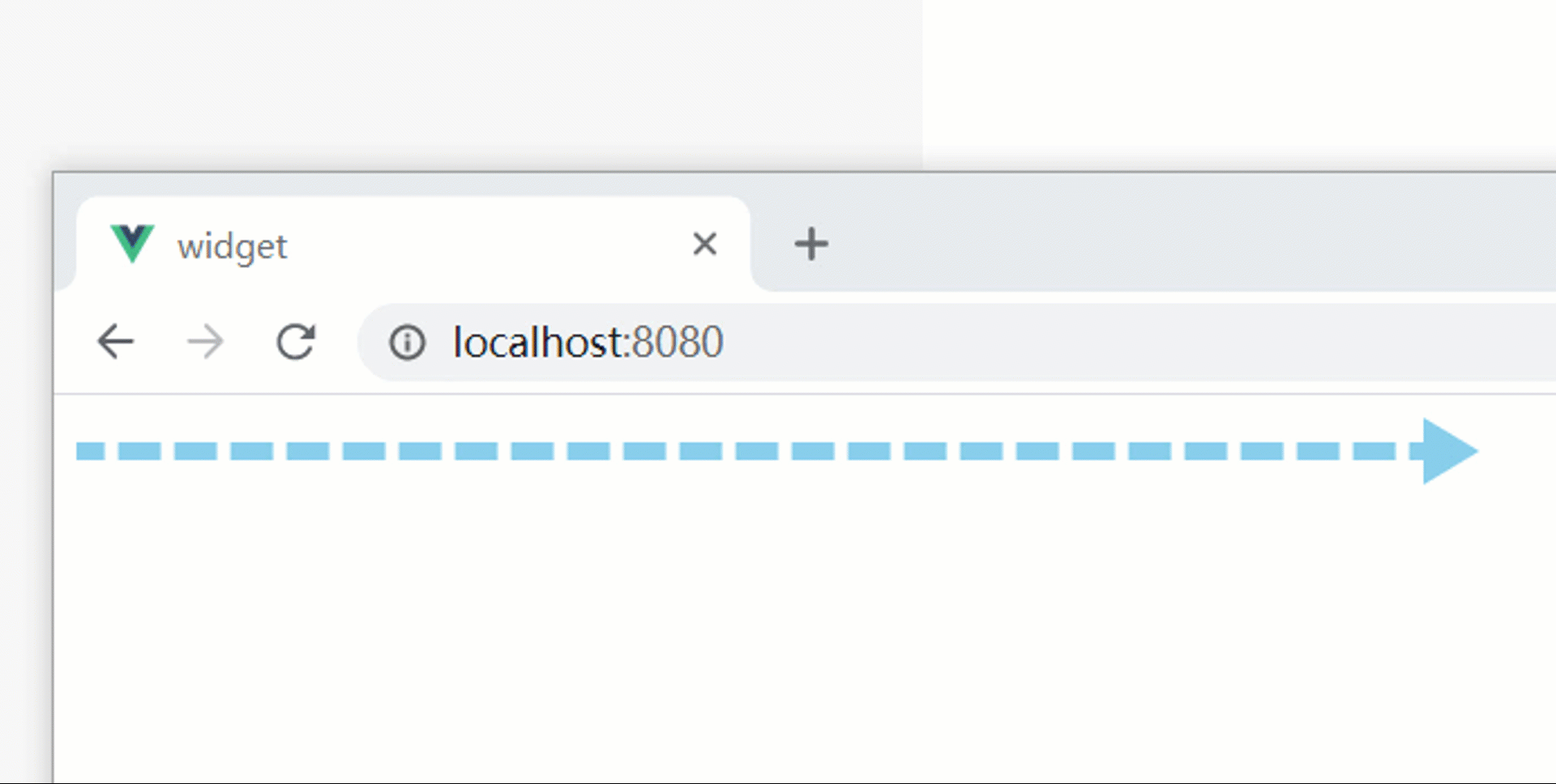
01.简单实例
<!DOCTYPE html> <html lang="en"> <head> <meta charset="UTF-8"> <meta http-equiv="X-UA-Compatible" content="IE=edge"> <meta name="viewport" content="width=device-width, initial-scale=1.0"> <title>流动箭头</title> </head> <style> /* 整个流动箭头的body */ .arrow-body { position: relative; margin: 0; padding: 0; /* 这里修改整个流动箭头的长度 */ width: 500px; /* 这里修改body的高度,注意:会影响三角箭头的形状 */ height: 24px; overflow: hidden; } /* 三角箭头 */ .arrow-body::after { content:""; position:absolute; /* 这里要和下面一起修改 */ right: -12px; top: 0; width: 0; height: 0; /* 这里修改箭头的高度,这里建议是上面的24px的一半,同时要修改right:-12px的值 */ border: 12px solid transparent; /* 这里可以修改箭头的横向长度,以及颜色 */ border-left-width: 20px; border-left-color: skyblue; } /* 流动的线条的body */ .flow-body { position: relative; margin: 0; padding: 0; height: 100%; width: calc(100% - 10px); overflow: hidden; } /* 线条样式 */ .flow-body::before { content:""; position: absolute; width: 200%; /* 这里修改线条的高度,同时top减去的值是高度的一半(为了保持垂直居中) */ height: 6px; top: calc(50% - 3px); /* 这里修改线条的颜色(可以达到渐变) */ background: repeating-linear-gradient(90deg,skyblue 0,skyblue 15px,rgba(0,0,0,0) 15px,rgba(0,0,0,0) 20px); transform: translateX(-100%); animation: flow linear 8s infinite; } /* 流动动画 */ @keyframes flow { from { transform:translateX(-50%); } to { transform:translateX(0); } } </style> <body> <div class="flow-arrow"> <div class="arrow-body"> <div class="flow-body"></div> </div> </div> </body> </html>
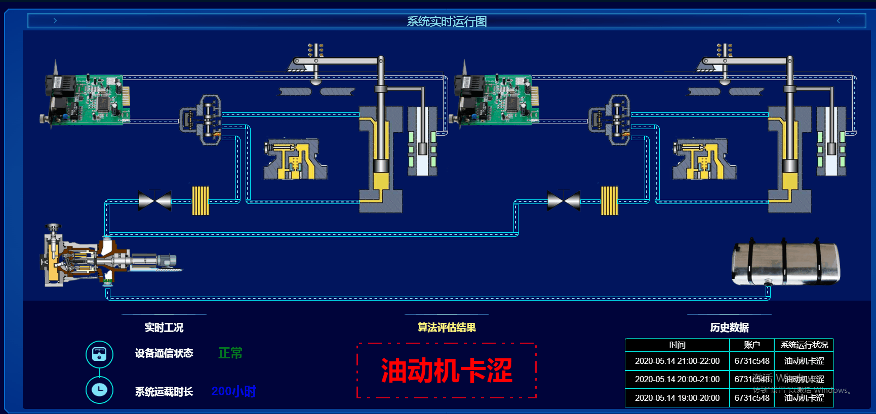
02.DEH项目流动油管
01.需求分析
封装流动管道动画功能:
- 设置动画的起点和终点 宽度和高度暂时定死
- 有横版和竖版两种方式进行选择
- 可以选择流动方向
- 流动的速度可调
- 可以选择头部尾部是否添加弧形
- 弧形可选择左边还是右边
- 油管分为静态白色油管和动态油管
02.css初步实现代码
01.油管横向向右滑动
html
复制
<div class="arrow-body"> <div class="flow-body blcak-border"></div> </div> css
复制
/* 整个流动箭头的body */ .arrow-body { position: absolute; margin: 0; padding: 0; /* 这里修改整个流动箭头的长度和高度 */ width: calc(409vw * 100 / 1920); height: calc(10vh * 100 / 1080); overflow: hidden; } /* 流动的线条的body */ .flow-body { position: relative; margin: 0; padding: 0; height: 100%; width: 100%; overflow: hidden; border: calc(2vh * 100 / 1080) solid #00eaf7; } /* 线条样式 */ .flow-body::before { content: ""; position: absolute; width: 200%; /* 这里修改线条的高度,同时top减去的值是高度的一半(为了保持垂直居中) */ height: 30%; top: 35%; /* 这里修改线条的颜色(可以达到渐变) */ background: repeating-linear-gradient( 90deg, skyblue 0, skyblue calc(5vw * 100 / 1920), #01155d calc(5vw * 100 / 1920), #01155d calc(10vw * 100 / 1920) ); animation: flow linear 8s infinite; } /* 横向流动动画 右*/ @keyframes flow { from { transform: translateX(-50%); } to { transform: translateX(0); } }

02.油管横向向左滑动
直接改变动画函数帧即可,其他不做变动
复制
.arrow-body:nth-child(4) .flow-body::before { animation: flowRight linear 2s 0; } @keyframes flowRight { from { transform: translateX(0%); } to { transform: translateX(-50%); } }

03.纵向油管向下滑动
.arrow-body{ position: absolute; margin: 0; padding: 0; /* 这里修改整个流动箭头的长度和高度 */ left: calc(793vw * 100 / 1920); top: calc(44vh * 100 / 1080); /* 这里修改整个流动箭头的长度和高度 */ width: calc(10vw * 100 / 1920); height: calc(82vh * 100 / 1080); overflow: hidden; } .arrow-body .flow-body { border-radius: 0 20px 0 0; } .arrow-body .flow-body::before { content: ""; /* content: "5"; color: red; */ position: absolute; border-radius: 0 50% 0 0; top: 0; width: 30%; /* 这里修改线条的高度,同时top减去的值是高度的一半(为了保持垂直居中) */ height: 200%; right: 35%; /* 这里修改线条的颜色(可以达到渐变) */ background: repeating-linear-gradient( 180deg, skyblue 0, skyblue calc(5vw * 100 / 1920), #01155d calc(5vw * 100 / 1920), #01155d calc(10vw * 100 / 1920) ); animation: flowDown linear 8s 0; }
04.纵向油管向上滑动
/* 纵向流动动画 上*/ @keyframes flowUp { from { transform: translateY(0%); } to { transform: translateY(-50%); } }
05.油管添加圆角
直接修改放款圆角即可
- 右上圆角 其他类比
复制
.arrow-body:nth-child(5) .flow-body { border-radius: 0 20px 0 0; }
03.scss封装
/* 抽离统一代码 $direection为 1代表横向 0代表纵向*/ @mixin framFlow($direction, $startPosition, $endPosition) { from { transform: if ($direction, translateX($startPosition), translateY($startPosition)); } to { transform: if ($direction, translateX($endPosition), translateY($endPosition)); } } @keyframes flowRight { @include framFlow(1, -50%, 0); } /* 横向流动动画 左*/ @keyframes flowLeft { @include framFlow(1, 0%, -50%); } /* 纵向流动动画 下*/ @keyframes flowDown { @include framFlow(0, -50%, 0%); } /* 纵向流动动画 上*/ @keyframes flowUp { @include framFlow(0, 0%, -50%); }
/* 注:使用此函数时 父元素需不为标准流定位 $shape 决定油管形状 0代表横向 1代表纵向 $direction 决定油管方向 left代表向左 right代表向右 up代表向上 down代表向下 $distence 横向时 决定油管的纵坐标处于距上方多少 纵向时,决定油管距左边多少 $startPosition 决定油管起点 横向时从左到右 终向时从上到下 $endPosition 决定油管终点 $speed 决定动画速度 $radiusPosition 决定是否添加圆角 $style 决定油管风格 实际上就是边框颜色 */ @mixin flow-animation( $shape, $direction, $distence, $startPosition, $endPosition, $speed, $radiusPosition: "none", $style: #00eaf7 ) { position: absolute; /* 根据不同形状判断此时油管位置 */ @if $shape == 0 { left: $startPosition; top: $distence; } @else { left: $distence; top: $startPosition; } margin: 0; padding: 0; /* 这里根据$shape修改矩形大小 0代表横向 1代表纵向*/ @if $shape == 0 { /* 横向时宽为终点-起点 */ width: $endPosition - $startPosition; /* 横向时高固定 */ height: calc(10 * var(--flexHeight)); } @else { /* 纵向时宽固定 */ width: 1rem; /* 纵向时高为 终点-起点 */ height: $endPosition - $startPosition; } overflow: hidden; /* 流动的线条的body */ .flow-body { position: relative; margin: 0; padding: 0; height: 100%; width: 100%; overflow: hidden; border: calc(2 * var(--flexHeight)) solid $style; /* 判断是否添加圆角 */ @if $radiusPosition == "top-left" { border-radius: 20px 0 0 0; } @else if $radiusPosition == "top-right" { border-radius: 0 20px 0 0; } @else if $radiusPosition == "bottom-left" { border-radius: 0 0 0 20px; } @else if $radiusPosition == "bottom-right" { border-radius: 0 0 20px 0; } @else { border-radius: 0; } &::before { content: ""; position: absolute; @if $shape == 0 { width: 200%; /* 这里修改线条的高度,同时top减去的值是高度的一半(为了保持垂直居中) */ height: 30%; top: 35%; left: 0; /* 这里修改线条的颜色(可以达到渐变) */ background: repeating-linear-gradient( 90deg, skyblue 0, skyblue calc(5vw * 100 / 1920), #01155d calc(5vw * 100 / 1920), #01155d calc(10vw * 100 / 1920) ); } @else { top: 0; width: 30%; /* 这里修改线条的高度,同时top减去的值是高度的一半(为了保持垂直居中) */ height: 200%; right: 35%; /* 这里修改线条的颜色(可以达到渐变) */ background: repeating-linear-gradient( 180deg, skyblue 0, skyblue calc(5vw * 100 / 1920), #01155d calc(5vw * 100 / 1920), #01155d calc(10vw * 100 / 1920) ); } @if $direction == "right" { animation: flowRight linear $speed infinite; } @else if $direction == "left" { animation: flowLeft linear $speed infinite; } @else if $direction == "up" { animation: flowUp linear $speed infinite; } @else { animation: flowDown linear $speed infinite; } } } } /* 定义流动动画 */ /* 横向流动动画 右*/ @keyframes flowRight { from { transform: translateX(-50%); } to { transform: translateX(0); } } /* 横向流动动画 左*/ @keyframes flowLeft { from { transform: translateX(0); } to { transform: translateX(-50%); } } /* 纵向流动动画 下*/ @keyframes flowDown { from { transform: translateY(-50%); } to { transform: translateY(0%); } } /* 纵向流动动画 上*/ @keyframes flowUp { from { transform: translateY(0%); } to { transform: translateY(-50%); } } /* 统一的样式 */ .arrow-body { @include flow-animation( 1, "down", 30px, 30px, 200px, 0s, "bottom-right", #cecece ); } .arrow-body:nth-child(1) { @include flow-animation(1, "up", 300px, 30px, 200px, 8s, "top-right"); } .arrow-body:nth-child(2) { @include flow-animation(0, "left", 400px, 30px, 200px, 8s, "top-right"); }
最终的展示效果