
1. 使用技术
- 基于flexible.js + rem 智能大屏适配
- VScode cssrem 插件:快速生成rem单位
- Flex布局
- Less
- div + css布局
- 原生js + jquery
- 基于echarts数据可视化展示
- Echarts柱状图数据设置
- Echarts地图引入
数据可视化主要目的:借助于图像化手段,清晰有效地传达与沟通信息
2.案例适配方案:
- flexible.js 把屏幕分为 24 等份
- cssrem插件的基准值是 80px
先引入flexible.js
(function flexible (window, document) { var docEl = document.documentElement var dpr = window.devicePixelRatio || 1 // adjust body font size function setBodyFontSize () { if (document.body) { document.body.style.fontSize = (12 * dpr) + 'px' } else { document.addEventListener('DOMContentLoaded', setBodyFontSize) } } setBodyFontSize(); // set 1rem = viewWidth / 10 function setRemUnit () { var rem = docEl.clientWidth / 10 docEl.style.fontSize = rem + 'px' } setRemUnit() // reset rem unit on page resize window.addEventListener('resize', setRemUnit) window.addEventListener('pageshow', function (e) { if (e.persisted) { setRemUnit() } }) // detect 0.5px supports if (dpr >= 2) { var fakeBody = document.createElement('body') var testElement = document.createElement('div') testElement.style.border = '.5px solid transparent' fakeBody.appendChild(testElement) docEl.appendChild(fakeBody) if (testElement.offsetHeight === 1) { docEl.classList.add('hairlines') } docEl.removeChild(fakeBody) } }(window, document))
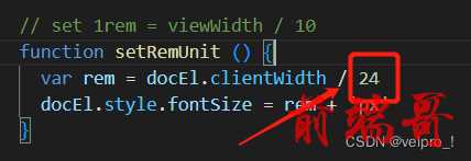
屏幕展示效果为1920px
flexible.js默认将屏幕划分为10等份,1920/10=192px,相当于1rem=192px
这里修改为24等份,1924/24=80,相当于1rem=80px
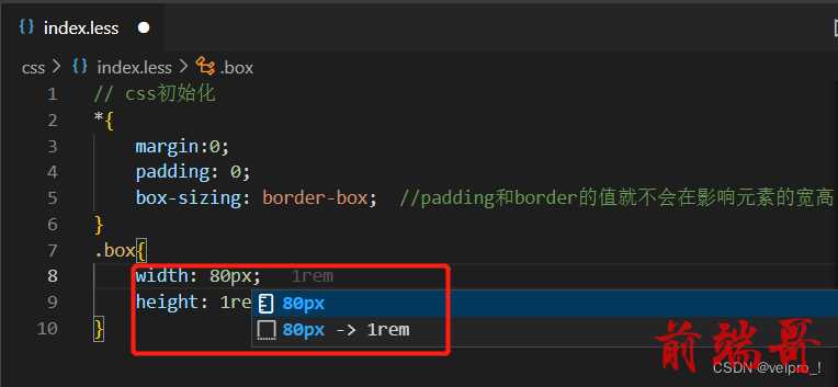
cssrem 插件配置将基准值设置为 80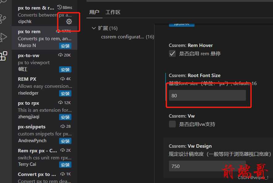
改完之后就会自动转换为 80px=1rem
3. 基础设置
- body 设置背景图,缩放100%,行高1.15
- css初始化
// css初始化 *{ margin:0; padding: 0; box-sizing: border-box; //padding和border的值就不会在影响元素的宽高 } body{ background: url(../images/bg.jpg) //背景图 no-repeat top center; //不会出现平铺或者重复的现象,位于上部的居中位置 line-height: 1.15; //行高 }
4. header布局
- 高度100px
- 背景图,在容器内显示
- 缩放比例为100%
- h1标题部分,白色,38px,居中显示,行高为80px
- 时间模块showTime,定位右侧,right为30px,top为0,行高为75px,文字颜色为rgba(255,255,255,0.7),文字大小20px (子绝父相)
<!-- 头部的盒子 --> <header> <h1>数据可视化-Echarts</h1> <div class="showTime"></div> <script> var t = null t = setTimeout(time, 1000) //开始运行 function time() { clearTimeout(t) //清楚定时器 dt = new Date() var y = dt.getFullYear() var mt = dt.getMonth() + 1 var day = dt.getDate() var h = dt.getHours() var m = dt.getMinutes() var s = dt.getSeconds() document.querySelector(".showTime").innerHTML = "当前时间:" + y + "年" + mt + "月" + day + "日" + "-" + h + "时" + m + "分" + s + "秒" // document.querySelector(".showTime").innerHTML=dt t = setTimeout(time, 1000) //设置定时器,循环运行 } </script> </header>
header{ position: relative; height: 1.25rem; background: url(../images/head_bg.png) no-repeat; background-size: 100% 100%; //缩放 水平100% 垂直100% h1{ font-size: .475rem; color: #fff; text-align: center; //文字居中 line-height: 1rem; //行高 } .showTime{ position: absolute; //绝对位置 (子绝父相) right: .375rem; top: 0; line-height: .9375rem; color: rgba(255,255,255,0.7); font-size: .25rem; } }
5.1. 页面主题模块
- 需要一个上左右的10px内边距
- column列容器,分三列,占比3:5:3
div、section、article,语义上从无到有,逐渐增强; div无任何语义,仅仅用作样式化或者脚本化,对于一段主题性的内容,比较适用section,而假设这段内容是可以脱离上下文,作为完整的结构体独立存在的一段内容,那么就适合用article
<section class="mainbox"> <div class="column">1</div> <div class="column">2</div> <div class="column">3</div> </section>
// 页面主题盒子 .mainbox{ display: flex; min-width: 1024px; max-width: 1920px; // height: 300px; margin: 0 auto; //居中对齐 background-color: pink; padding: .125rem .125rem 0; //上左右10px .column{ flex: 3; //每个盒子占3份 &:nth-child(2){ //给第二个盒子占5份 flex: 5; } } // .column:nth-child(2){ //给第二个盒子占5份 // flex: 5; // } }
5.2. 公共面板模块panel
- 高度为310px
- 1px的边框 1px solid rgba(25,186,139,0.17)
- 有line.jpg背景图
- padding为上0 左右15px 下为40px
- 下外边距是 15px
- 利用panel盒子before和after制作上面两个角 大小为10px 线条为2px solid #02a6b5
- 新加一个盒子before和after 制作下侧两个角 宽度高度为10px
<div class="column"> <div class="panel"> <div class="panel-footer"></div> </div> </div>
.mainbox{ .panel{ position: relative; height: 3.875rem; // background-color: pink; border:1px solid rgba(25, 186, 139, 0.17); padding: 0 .1875rem .5rem ; margin-bottom: .1875rem; background: url(../images/line.png) rgba(255, 255, 255, 0.03); &::before{ position: absolute; top:0; left:0; width: 10px; height: 10px; border-left: 2px solid #e3ebeb; border-top: 2px solid #e3ebeb ; content: ""; } &::after{ position: absolute; top:0; right:0; width: 10px; height: 10px; border-right: 2px solid #e3ebeb; border-top: 2px solid #e3ebeb ; content: ""; } .panel-footer{ position: absolute; bottom: 0; left: 0; width: 100%; &::before{ position: absolute; bottom:0; left:0; width: 10px; height: 10px; border-left: 2px solid #e3ebeb; border-bottom: 2px solid #e3ebeb ; content: ""; } &::after{ position: absolute; bottom:0; right:0; width: 10px; height: 10px; border-right: 2px solid #e3ebeb; border-bottom: 2px solid #e3ebeb ; content: ""; } } } }
5.3. 柱形图bar模型
- 标题模块h2 高度48px 文字颜色为白色 文字大小为20px
- 图标内容模块 chart 高度240px
- 以上可以作为panel公共样式部分
<div class="column"> <div class="panel bar"> <h2>柱形图-就业行业</h2> <div class="chart">图标</div> <div class="panel-footer"></div> </div> <div class="panel line"> <h2>折线图-就业行业</h2> <div class="chart">图标</div> <div class="panel-footer"></div> </div> <div class="panel pie"> <h2>饼形图-就业行业</h2> <div class="chart">图标</div> <div class="panel-footer"></div> </div> </div>
.mainbox{ .panel{ h2{ height: .6rem; color: #fff; line-height: .6rem; text-align: center; font-size: .25rem; font-weight: 5rem; } .chart{ height: 3rem; background-color: pink; } } }
6.1. 中间布局--数字与文字模块
- 上面是no 数字模块,背景颜色rgba(101,132,226,0.1) ,内边距padding15px
- 中间列column有个左右10px,下15px的外边距
- no模块里面上下划分,上面是数字(no-hd),下面是相关文字说明(no-bd)
- no-hd数字模块,有一个边框1px solid rgba(25,186,139,0.17)
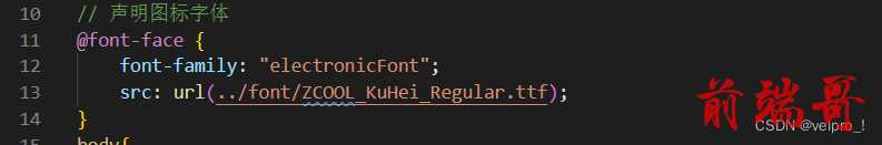
- no-hd数字模块,里面分为两个小li,每个小li高度为80px,文字大小为70px,颜色为#ffeb7b,字体是图标字体 electronicFont,需要下载
- no-hd利用after和before制作两个小角,边框 2px solid #02a6b5,宽度为30px,高度为10px
- 下面是map 地图模块
把li的小圆点去掉

声明图标字体
<!-- 中间 --> <div class="column"> <!-- no模块制作 --> <div class="no"> <div class="no-hd"> <ul> <li>1</li> <li>2</li> </ul> </div> <div class="no-bd"> <ul> <li>需求人数</li> <li>供应人数</li> </ul> </div> </div> </div>
// no数字模块 .no{ background: rgba(101, 132, 226, 0.1); padding: .1875rem; .no-hd{ position: relative; border: 1px solid rgba(25,186,139,0.17); &::before{ position: absolute; top: 0; left: 0; content: ""; width: 30px; height: 10px; border-top: 2px solid #02a6b5; border-left: 2px solid #02a6b5; } &::after{ position: absolute; bottom: 0; right: 0; content: ""; width: 30px; height: 10px; border-bottom: 2px solid #02a6b5; border-right: 2px solid #02a6b5; } ul{ display: flex; li{ position: relative; flex:1; //水平分布 line-height: 1rem; font-size: .875rem; color: #ffeb7b; text-align: center; font-family: "electronicFont"; &:nth-child(1){ //给第一个li设置小竖线 &::after{ content:""; position:absolute; top: 25%; height: 50%; right: 0; width: 1px; background: rgba(255,255,255,0.2); } } } } } //文字模块 .no-bd{ ul{ display: flex; li{ flex:1; text-align: center; color: rgba(255,255,255,0.7); font-size: .225rem; height: .5rem; line-height: .5rem; padding-top: .125rem; } } } }
6.2. 地图模块
- 地圈模块高度为 810px,里面包含4个盒子,chart 放图表模块,球体盒子,旋转1,旋转2
- 球体图片模块map1,大小为 518px, 要加背景图片, 因为要缩放100%,定位到最中央,透明度.3
- 旋转1map2, 大小为 643px, 要加背景图片, 因为要缩放100%, 定位到中央, 透明度.6 ,做旋转动画
- 旋转2map3, 大小为 566, 要加背景图片, 因为要缩放100%, 定位到中央, 旋转动画, 注意是逆时针
<!-- 地图模块 --> <div class="map"> <div class="map1"></div> <div class="map2"></div> <div class="map3"></div> <div class="chart"></div> </div>
.map{ position: relative; height: 10.125rem; .map1{ width: 6.475rem; height: 6.475rem; position: absolute; top: 50%; left: 50%; transform: translate(-50%,-50%); //保持水平居中,垂直居中 background: url(../images/map.png); background-size: 100% 100%; //保证一起缩放 opacity: .3; //透明度 } .map2{ position: absolute; top:50%; left: 50%; transform: translate(-50%,-50%); width: 8.0375rem; height: 8.0375rem; background: url(../images/lbx.png); background-size: 100% 100%; //保证一起缩放 animation: rotate1 15s linear infinite; // 调用旋转 opacity: .6; } @keyframes rotate1 { //定义旋转动画 from{ transform: translate(-50%,-50%) //保留原来位置 rotate(0deg); } to{ transform: translate(-50%,-50%) rotate(360deg); } } .map3{ position: absolute; top:50%; left: 50%; transform: translate(-50%,-50%); width: 7.075rem; height: 7.075rem; background: url(../images/jt.png); background-size: 100% 100%; //保证一起缩放 animation: rotate2 10s linear infinite; // 调用旋转 opacity: .6; } @keyframes rotate2 { //定义旋转动画 from{ transform: translate(-50%,-50%) //保留原来位置 rotate(0deg); } to{ transform: translate(-50%,-50%) rotate(-360deg); //逆时针 } } .chart{ position: absolute; top: 0; left: 0; width: 100%; height: 10.125rem; } }

