文章目录
- 变形效果案例
-
- 过渡效果案例
- 鼠标移动显示内容
- 图片文字滑动效果
- 白光闪过效果
- 手风琴效果
- 动画案例
-
- 动画代码
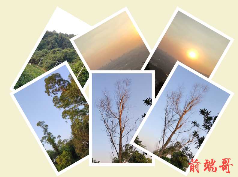
变形效果案例
照片墙
| <!DOCTYPE html> |
| <html> |
| <head> |
| <meta charset="utf-8" /> |
| <title></title> |
| <style type="text/css"> |
| #container { |
| position: relative; |
| width: 800px; |
| height: 600px; |
| margin: 0 auto; |
| background-color: #f4f1d2; |
| } |
| |
| img { |
| position: absolute; |
| padding: 10px; |
| background-color: white; |
| } |
| |
| img:hover { |
| box-shadow: 0 4px 8px rgba(0, 0, 0, 0.2); |
| } |
| |
| #container img:first-child { |
| left: 100px; |
| top: 60px; |
| transform: rotate(30deg); |
| } |
| |
| #container img:nth-child(2) { |
| left: 300px; |
| top: 60px; |
| transform: rotate(-30deg); |
| } |
| |
| #container img:nth-child(3) { |
| left: 500px; |
| top: 60px; |
| transform: rotate(30deg); |
| } |
| |
| #container img:nth-child(4) { |
| left: 100px; |
| top: 240px; |
| transform: rotate(-30deg); |
| } |
| |
| #container img:nth-child(5) { |
| left: 300px; |
| top: 240px; |
| transform: rotate(0); |
| } |
| |
| #container img:last-child { |
| left: 500px; |
| top: 240px; |
| transform: rotate(30deg); |
| } |
| </style> |
| </head> |
| <body> |
| <div id="container"> |
| <img src="img/haizei1.png" alt="" /> |
| <img src="img/haizei2.png" alt="" /> |
| <img src="img/haizei3.png" alt="" /> |
| <img src="img/haizei4.png" alt="" /> |
| <img src="img/haizei5.png" alt="" /> |
| <img src="img/haizei6.png" alt="" /> |
| </div> |
| </body> |
| </html> |
过渡效果案例
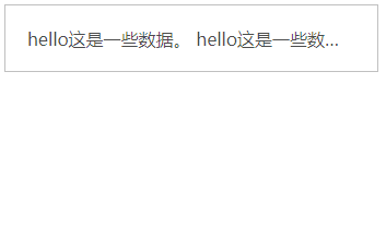
鼠标移动显示内容
| <!DOCTYPE html> |
| <html> |
| <head> |
| <meta charset="utf-8" /> |
| <title></title> |
| <style type="text/css"> |
| #container { |
| width: 300px; |
| height: 20px; |
| padding: 20px; |
| border: 1px solid silver; |
| color: rgba(0, 0, 0, 0.7); |
| cursor: pointer; |
| text-overflow: ellipsis; |
| overflow: hidden; |
| white-space: nowrap; |
| transition: all 0.5s linear 0s; |
| } |
| |
| #container:hover { |
| height: 150px; |
| background-color: azure; |
| white-space: normal; |
| } |
| </style> |
| </head> |
| <body> |
| <div id="container"> |
| hello这是一些数据。 hello这是一些数据。 hello这是一些数据。 hello这是一些数据。 hello这是一些数据。 hello这是一些数据。 hello这是一些数据。 |
| </div> |
| </body> |
| </html> |
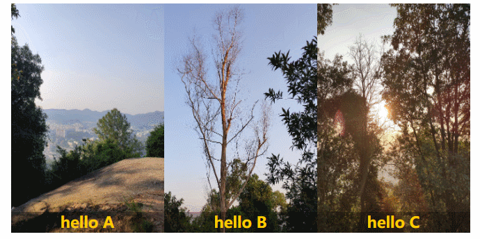
图片文字滑动效果
| <!DOCTYPE html> |
| <html> |
| <head> |
| <meta charset="utf-8" /> |
| <title></title> |
| <style type="text/css"> |
| #info { |
| width: 760px; |
| margin: 0 auto; |
| } |
| |
| .wrap { |
| width: 220px; |
| height: 330px; |
| float: left; |
| position: relative; |
| overflow: hidden; |
| } |
| |
| .wrap img { |
| border: 0; |
| width: 220px; |
| height: 330px; |
| } |
| |
| .wrap p { |
| display: block; |
| width: 220px; |
| height: 330px; |
| position: absolute; |
| left: 0; |
| top: 300px; |
| background-color: rgba(0, 0, 0, 0.3); |
| font-size: 12px; |
| color: white; |
| padding: 0; |
| margin: 0; |
| line-height: 16px; |
| transition: all 0.6s ease-in-out; |
| } |
| |
| .wrap p b { |
| display: block; |
| font-size: 22px; |
| color: #fc0; |
| text-align: center; |
| margin: 0%; |
| padding: 0%; |
| line-height: 30px; |
| } |
| |
| .wrap p span { |
| display: block; |
| padding: 10px; |
| line-height: 20px; |
| } |
| |
| .wrap:hover p { |
| top: 0; |
| } |
| </style> |
| </head> |
| <body> |
| <div id="info"> |
| <div class="wrap"> |
| <img src="img/pic1.jpg" alt=""> |
| <p> |
| <b>hello A</b> |
| <span>这是一堆内容。这是一堆内容。这是一堆内容。这是一堆内容。这是一堆内容。这是一堆内容。</span> |
| </p> |
| </div> |
| <div class="wrap"> |
| <img src="img/pic2.jpg" alt=""> |
| <p> |
| <b>hello B</b> |
| <span>这是一堆内容。这是一堆内容。这是一堆内容。这是一堆内容。这是一堆内容。这是一堆内容。</span> |
| </p> |
| </div> |
| <div class="wrap"> |
| <img src="img/pic3.jpg" alt=""> |
| <p> |
| <b>hello C</b> |
| <span>这是一堆内容。这是一堆内容。这是一堆内容。这是一堆内容。这是一堆内容。这是一堆内容。</span> |
| </p> |
| </div> |
| </div> |
| </body> |
| </html> |
白光闪过效果
| <!DOCTYPE html> |
| <html> |
| <head> |
| <meta charset="utf-8"> |
| <title>白光闪过效果</title> |
| <style type="text/css"> |
| #wrapper { |
| position: relative; |
| width: 240px; |
| height: 180px; |
| cursor: pointer; |
| } |
| |
| #flash { |
| position: absolute; |
| top: 0; |
| left: -120px; |
| width: 100px; |
| height: 100%; |
| background: -webkit-linear-gradient(left, rgba(255, 255, 255, 0)0%, rgba(255, 255, 255, 0.5)50%, rgba(255, 255, 255, 0)100%); |
| transform: skewX(-30deg); |
| } |
| |
| #wrapper:hover #flash { |
| left: 300px; |
| transition: all 0.5s ease-in-out; |
| } |
| </style> |
| </head> |
| <body> |
| <div id="wrapper"> |
| <div id="flash"></div> |
| <img src="../img/person.png"> |
| </div> |
| </body> |
| </html> |

手风琴效果
| <!DOCTYPE html> |
| <html> |
| <head> |
| <meta charset="utf-8"> |
| <title>手风琴效果</title> |
| <style type="text/css"> |
| #box { |
| width: 300px; |
| height: 100px; |
| overflow: hidden; |
| } |
| |
| .item { |
| float: left; |
| width: 20%; |
| height: 100%; |
| transition: all 0.5s; |
| } |
| |
| .item:nth-child(1) { |
| width: 40%; |
| background-color: red; |
| } |
| |
| .item:nth-child(2) { |
| background-color: orange; |
| } |
| |
| .item:nth-child(3) { |
| background-color: yellow; |
| } |
| |
| .item:nth-child(4) { |
| background-color: green; |
| } |
| |
| #box:hover div { |
| width: 20%; |
| } |
| |
| #box div:hover { |
| width: 40%; |
| } |
| </style> |
| </head> |
| <body> |
| <div id="box"> |
| <div class="item"></div> |
| <div class="item"></div> |
| <div class="item"></div> |
| <div class="item"></div> |
| </div> |
| </body> |
| </html> |

动画案例
脉冲动画
| <!DOCTYPE html> |
| <html> |
| <head> |
| <meta charset="utf-8"> |
| <title>脉冲动画</title> |
| <style type="text/css"> |
| @keyframes pulsating { |
| 0% { |
| transform: scale(1); |
| opacity: 0.8; |
| } |
| |
| 20% { |
| transform: scale(1); |
| opacity: 0.6; |
| } |
| |
| 40% { |
| transform: scale(1.2); |
| opacity: 0.4; |
| } |
| |
| 60% { |
| transform: scale(1.4); |
| opacity: 0.2; |
| } |
| |
| 80% { |
| transform: scale(1.6); |
| opacity: 0.1; |
| } |
| |
| 100% { |
| transform: scale(1.8); |
| opacity: 0.0; |
| } |
| } |
| |
| #wrapper { |
| position: relative; |
| display: inline-block; |
| margin: 100px; |
| } |
| |
| #img { |
| width: 50px; |
| height: 50px; |
| } |
| |
| #circle { |
| position: absolute; |
| top: -12px; |
| left: -12px; |
| width: 50px; |
| height: 50px; |
| border: 12px solid #a8e957; |
| border-radius: 50%; |
| opacity: 0; |
| } |
| |
| #wrapper:hover #circle { |
| animation: pulsating 1s ease-out infinite; |
| } |
| </style> |
| </head> |
| <body> |
| <div id="wrapper"> |
| <div id="circle"></div> |
| <img id="img" src="../img/icon.png"> |
| </div> |
| </body> |
| </html> |

loading效果
| <!DOCTYPE html> |
| <html> |
| <head> |
| <meta charset="utf-8"> |
| <title>loading效果</title> |
| <style type="text/css"> |
| @keyframes loading { |
| 0% { |
| transform: scaleY(1); |
| } |
| |
| 50% { |
| transform: scaleY(0.5); |
| } |
| |
| 100% { |
| transform: scaleY(1); |
| } |
| } |
| |
| #box { |
| position: relative; |
| margin: 100px; |
| } |
| |
| #box>i { |
| position: absolute; |
| top: 0; |
| width: 5px; |
| height: 40px; |
| background-color: hotpink; |
| border-radius: 6px; |
| } |
| |
| #box>i:nth-child(1) { |
| left: 0; |
| animation: loading 1s ease-in 0.1s infinite; |
| } |
| |
| #box>i:nth-child(2) { |
| left: 10px; |
| animation: loading 1s ease-in 0.3s infinite; |
| } |
| |
| #box>i:nth-child(3) { |
| left: 20px; |
| animation: loading 1s ease-in 0.6s infinite; |
| } |
| |
| #box>i:nth-child(4) { |
| left: 30px; |
| animation: loading 1s ease-in 0.3s infinite; |
| } |
| </style> |
| </head> |
| <body> |
| <div id="box"> |
| <i></i> |
| <i></i> |
| <i></i> |
| <i></i> |
| </div> |
| </body> |
| </html> |

灯光闪烁
| <!DOCTYPE html> |
| <html> |
| <head> |
| <meta charset="utf-8"> |
| <title>灯光闪烁</title> |
| <style type="text/css"> |
| @keyframes anim { |
| from { |
| opacity: 1; |
| } |
| |
| to { |
| opacity: 0; |
| } |
| } |
| |
| .container { |
| position: relative; |
| width: 100px; |
| margin: 100px; |
| text-align: center; |
| } |
| |
| .dengpao { |
| position: absolute; |
| width: 70%; |
| top: 16px; |
| left: 65px; |
| } |
| |
| .guang { |
| position: absolute; |
| width: 100%; |
| animation: anim 1s ease 0s infinite alternate; |
| } |
| </style> |
| </head> |
| <body> |
| <div class="container"> |
| <img class="dengpao" src="../img/dengpao.png" alt=""> |
| <img class="guang" src="../img/guang.png" alt=""> |
| </div> |
| </body> |
| </html> |

动画代码


