echarts——实现自动轮播展示tooltips
- 场景
- 1.轮播展示`tooltips`的方法
- 2.封装的渲染图表的方法
- 3.鼠标移入移出时,禁止滚动的写法——在2步骤中添加以下代码:
- 4.汇总:上面方法中的重点内容如下:
场景
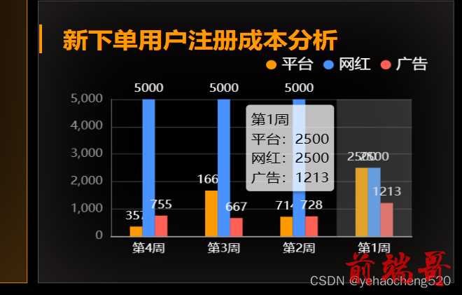
最近在做echarts看板的时候,经常会遇到下面的这种情况,给出的数值比较相近,所以在页面的展示上会出现重叠的情况。但是又无法保证数值能够有很大程度的分开。(如何数值有很大的分离,必须10以下,200以上这种的,就不会有这种问题出现)。
如果遇到这种数值相近的情况,则可以通过轮播展示tooltips的方式来处理:
1.轮播展示tooltips的方法
| |
| this.timer = null; |
| function lunboEcharts(echartsId, dataLen,currentIndex=-1) { |
| this.timer = setInterval(() => { |
| echartsId.dispatchAction({ |
| type: 'downplay', |
| seriesIndex: 0, |
| dataIndex: currentIndex |
| }); |
| currentIndex = (currentIndex + 1) % dataLen; |
| echartsId.dispatchAction({ |
| type: 'highlight', |
| seriesIndex: 0, |
| dataIndex: currentIndex, |
| }); |
| echartsId.dispatchAction({ |
| type: 'showTip', |
| seriesIndex: 0, |
| dataIndex: currentIndex |
| }); |
| }, 3000) |
| } |
2.封装的渲染图表的方法
| |
| function GradientColumn2(id, xaxisData, yaxisData,flash=false) { |
| var id = echarts.init(document.getElementById(id)); |
| let option = { |
| legend: { |
| x2: '20px', |
| y: "0", |
| itemWidth: 10, |
| itemHeight: 10, |
| icon: "circle", |
| textStyle: { |
| color: 'white', |
| fontSize: 15 |
| }, |
| }, |
| tooltip: { |
| trigger: "axis", |
| axisPointer: { |
| type: "shadow", |
| }, |
| backgroundColor: "rgba(255,255,255,0.75)", |
| extraCssText: "box-shadow: 2px 2px 4px 0px rgba(0,0,0,0.3);", |
| textStyle: { |
| fontSize: 14, |
| color: "#000", |
| }, |
| formatter: (params) => { |
| var html = params[0].axisValue+'<br>'; |
| params.forEach((item,index)=>{ |
| html += ''+item.seriesName+':'+item.value+'<br>'; |
| }) |
| return html; |
| }, |
| }, |
| color: ["#4992FF", "#58D9F9", "#7CFFB2", "#f90"], |
| grid: { |
| x: 30, |
| y: 50, |
| x2: 40, |
| y2: 30, |
| containLabel: true, |
| }, |
| xAxis: [ |
| { |
| type: "category", |
| axisLabel: { |
| interval: 0, |
| color: "#fff", |
| fontSize: 12, |
| }, |
| axisLine: { |
| lineStyle: { |
| |
| color: "#ccc", |
| width: 1, |
| }, |
| }, |
| |
| axisTick: { |
| show: false, |
| }, |
| data: xaxisData, |
| }, |
| ], |
| yAxis: [ |
| { |
| name: '', |
| type: "value", |
| nameTextStyle: { |
| color: "#fff", |
| fontWeight: 400, |
| fontSize: 14, |
| }, |
| axisTick: { |
| show: false, |
| }, |
| axisLine: { |
| show: true, |
| lineStyle: { |
| color: "#555", |
| width: 1, |
| }, |
| }, |
| splitLine: { |
| show: true, |
| lineStyle: { |
| color: "#333", |
| width: 1, |
| }, |
| }, |
| axisLabel: { |
| show: true, |
| color: "#999", |
| fontSize: 12 |
| }, |
| }, |
| ], |
| series: yaxisData, |
| }; |
| id.setOption(option); |
| if (flash) lunboEcharts(id, xaxisData.length) |
| |
| } |
3.鼠标移入移出时,禁止滚动的写法——在2步骤中添加以下代码:
| |
| myChart.on('mouseover', (e) => { |
| let currentIndex = e.dataIndex; |
| clearInterval(this.timer); |
| console.log('鼠标移入了', currentIndex, this.timer); |
| myChart.dispatchAction({ |
| type: 'downplay', |
| seriesIndex: 0, |
| dataIndex: currentIndex, |
| }); |
| }); |
| myChart.on('mouseout', (e) => { |
| let currentIndex = e.dataIndex; |
| clearInterval(this.timer); |
| this.lunboEcharts(myChart, dataX.length, currentIndex); |
| console.log('鼠标移出了', currentIndex); |
| }); |
4.汇总:上面方法中的重点内容如下:
下面是自动轮播时,展示的内容结构:

| tooltip: { |
| trigger: "axis", |
| axisPointer: { |
| type: "shadow", |
| }, |
| backgroundColor: "rgba(255,255,255,0.75)", |
| extraCssText: "box-shadow: 2px 2px 4px 0px rgba(0,0,0,0.3);", |
| textStyle: { |
| fontSize: 14, |
| color: "#000", |
| }, |
| formatter: (params) => { |
| var html = params[0].axisValue+'<br>'; |
| params.forEach((item,index)=>{ |
| html += ''+item.seriesName+':'+item.value+'<br>'; |
| }) |
| return html; |
| }, |
| }, |


