最终实现效果图:
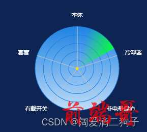
首先画出一个雷达图,然后使用css画出旋转光圈效果定位到雷达图正中心,就实现了该特效。
其中绿色扇形光圈是顺时针转动的。
实现代码如下:
| <div class='right'> |
| |
| <div ref="chart" style="width: 100%; height: 100%" id="chart"></div> |
| |
| <div id="radar"></div> |
| </div> |
| private getRadarChart() { |
| const chartDom: any = this.$refs.chart |
| this.myChart = echarts.init(chartDom) |
| const that = this |
| |
| window.addEventListener('resize', function() { |
| that.myChart.resize() |
| }) |
| var option = { |
| radar: { |
| shape: 'circle', |
| splitNumber: 5, |
| indicator: [ |
| { name: '本体', max: 0 }, |
| { name: '套管', max: 0 }, |
| { name: '有载开关', max: 0 }, |
| { name: '非电量保护', max: 0 }, |
| { name: '冷却器', max: 0 } |
| ], |
| axisLine: { |
| lineStyle: { |
| color: '#c0c0c0' |
| } |
| }, |
| splitArea: { |
| show: true, |
| areaStyle: { |
| |
| |
| |
| |
| color: new echarts.graphic.LinearGradient(0, 1, 0, 0, [ |
| { offset: 0, color: '#c1ddf8' }, |
| { offset: 1, color: '#1e83e4' } |
| ], false) |
| } |
| }, |
| splitLine: { |
| show: true, |
| lineStyle: { |
| width: 1, |
| color: '#1e83e4' |
| } |
| }, |
| name: { |
| textStyle: { |
| color: 'white', |
| fontSize: 10 |
| } |
| } |
| }, |
| series: [{ |
| type: 'radar', |
| symbol: 'circle', |
| symbolSize: 5, |
| symbolColor: 'red', |
| data: [ |
| { |
| value: [this.result.bodyScore, this.result.bushingScore, this.result.oltcscore, this.result.nonElectricQuantityProtectionScore, this.result.coolerScore], |
| itemStyle: { |
| normal: { |
| show: false, |
| color: 'rgba(255,225,0,.3)', |
| lineStyle: { |
| color: 'rgba(255,225,0,.8)' |
| } |
| } |
| }, |
| label: { |
| normal: { |
| show: true, |
| position: 'inside', |
| textStyle: { |
| color: 'white' |
| } |
| } |
| }, |
| areaStyle: { |
| normal: { |
| width: 1, |
| opacity: 0.8 |
| } |
| }, |
| lineStyle: { |
| normal: { |
| width: 0 |
| } |
| } |
| } |
| ] |
| }] |
| } |
| option && this.myChart.setOption(option) |
| } |
css代码:
| .right{ |
| width: 65%; |
| height: 200px; |
| position: relative; |
| } |
| |
| #radar:after { |
| content: ''; |
| display: block; |
| background-image: linear-gradient(44deg, rgba(0, 255, 51, 0) 50%, #00ff33 100%); |
| width: 75px; |
| height: 75px; |
| position: absolute; |
| top: 25px; |
| right: 50%; |
| animation: radar-beam 15s infinite; |
| animation-timing-function: linear; |
| transform-origin: bottom right; |
| border-radius: 100% 0 0 0; |
| } |
| |
| @keyframes radar-beam { |
| 0% { |
| transform: rotate(0deg); |
| } |
| 100% { |
| transform: rotate(360deg); |
| } |
| } |


