
网页概念
网页是网站的一页,网页有很多元素组成,包括视频图片文字视频链接等等,以.htm和.html后缀结尾,俗称html文件
HTML 超文本标记语言,描述网页语言,不是编程语言,是标记语言,有标签组成
超文本指的是不光文本,还有图片视频等等标签
常用浏览器
firefox google safari opera edge
浏览器内核: 读取网页内容, 渲染成网页
Web标准
W3C 组织制定的标准
浏览器不同,页面排版不同,有一套标准约束他,让用户看到的页面一样
Web标准有 : 结构html 表现css 行为js , 三部分是分离的
HTML
Html语法规范
尖括号包含
双标签和单标签
便签关系 : 包含和并列
html基本结构标签
| 标签名 | 定义 | 说明 |
|---|---|---|
| HTML标签 | 根标签 | |
| 文档头部 | head标签必须设置标签title | |
| 文档标题 | 网页标题 | |
| 文档主体 | 元素内容 |
[外链图片转存失败,源站可能有防盗链机制,建议将图片保存下来直接上传(img-TWRqaWka-1689863224128)(https://imgfff-1313020458.cos.ap-shanghai.myqcloud.com/images/image-20230703221041822.png)]
骨架标签代码
<!DOCTYPE html> <html lang="zh-CN"> <head> <meta charset="UTF-8"> <title>Title</title> </head> <body> </body> </html>
文档类型声明标签
<!DOCTYPE html>
文档类型声明,告诉浏览器用HTML5显示网页
<html lang="en">
文档显示语言=英语, 写中文也可以 (浏览器会自动处理)
<html lang="zh-CN">
<meta charset="UTF-8">
编码方式, UTF-8 万国码, 防止乱码
HTML常用标签
标签含义, 能看懂即可, 记得标签是干什么的
标题标签
<h1>我是一级标签</h1> <h2>我是二级标签</h2> <h3>我是三级标签</h3> <h4>我是四级标签</h4>
[外链图片转存失败,源站可能有防盗链机制,建议将图片保存下来直接上传(img-wWyQOFGf-1689863224129)(https://imgfff-1313020458.cos.ap-shanghai.myqcloud.com/images/image-20230703224211647.png)]
分段和分行标签
<!DOCTYPE html> <html lang="zh-CN"> <head> <meta charset="UTF-8"> <title>Title</title> </head> <body> <p> 天空中乌云密布,时不时会冒出一道闪电,伴随着一声声闷雷,一场大雨即将来临。 卧虎城中,沈翔仰头看着天空,喃喃说道:“不能再拖了,我要快点找到好的灵药,否则我难以有翻身的机会。” <br> 沈翔今年十六岁,有着比同龄人要健壮高大的身躯,这身躯和那张带着稚气的俊俏脸蛋有着鲜明对比,但他那双与年龄不相称的深邃眸子,看起来闲得要比同龄人成熟一些。 沈翔此时要去采药,他虽然是沈家族长的孙子,但他却因为没有灵脉,不能成为一个厉害的武者,因此,他从小就非常勤奋的锻炼自己的身体,经常外出去进行各种秘密训练,甚至还和虎兽进行过身上搏斗,他虽然年纪轻轻,但却有过几次生死经历,心境和意志都远胜同龄人。 “这不是沈翔吗?就要下大雨了,你还要去锻炼?”</p> <p>一个老管家走过来说道,看见沈翔如此发奋,他不由得钦佩,但眼神中更多的是惋惜。 沈翔每天都勤学苦练,至今六年,但还是停留在凡武境三重,和他同龄的大多数沈家子弟都进入了凡武境四重,厉害的更是进入了五重。 这一切都是因为他没有灵脉的缘故,所以才不被家族重视,而如今他只是沈家中一个很普通的人。 <br> 虽然没有灵脉,但沈翔却从来不气馁,一直都在努力锻炼自己,至少努力的过程让他感觉自己很充实。 “老马,我是去采药。”沈翔跑到老管家身后,嘻笑着扯住他那光头上的一条鞭子。 “没用的,你没有灵脉,不管怎么努力都是无济于事!” 那老管家摇头叹道。 对于这样的话,沈翔听过无数遍了,但他却依然得坚持,无论如何他都不会放弃。</p> </body> </html>
[外链图片转存失败,源站可能有防盗链机制,建议将图片保存下来直接上传(img-ZPFFmvAE-1689863224130)(https://imgfff-1313020458.cos.ap-shanghai.myqcloud.com/images/image-20230703224746034.png)]
小项目 小说
[外链图片转存失败,源站可能有防盗链机制,建议将图片保存下来直接上传(img-pJsIL6YB-1689863224130)(https://imgfff-1313020458.cos.ap-shanghai.myqcloud.com/images/image-20230703225033932.png)]
文本格式化标签
粗体 斜体 下划线
突出性,比普通文字更重要
| 语义 | 标签 | |
|---|---|---|
| 加粗 | ||
| 倾斜 | ||
| 删除线 | ||
| 下划线 |
<!DOCTYPE html> <html lang="zh-CN"> <head> <meta charset="UTF-8"> <title>Title</title> </head> <body> <h1>全能穿越锦衣卫</h1> <b>天空中乌云密布,</b> <i>时不时会冒出一道闪电,</i> <s>伴随着一声声闷雷,</s> <u>一场大雨即将来临。</u> <!-- 卧虎城中,沈翔仰头看着天空,喃喃说道:“不能再拖了,我要快点找到好的灵药,否则我难以有翻身的机会。”--> </body> </html>
[外链图片转存失败,源站可能有防盗链机制,建议将图片保存下来直接上传(img-tWxqouiF-1689863224131)(https://imgfff-1313020458.cos.ap-shanghai.myqcloud.com/images/image-20230703225653947.png)]
盒子标签
div 大盒子 一行只能放一个
span 小盒子 一行可以有多个
<!DOCTYPE html> <html lang="en"> <head> <meta charset="UTF-8"> <title>Title</title> </head> <body> <div>我是div盒子,我占一行</div>123 <div>我是div盒子,我占一行</div> <span>今日价格</span> <span>昨日价格</span> <span>明日价格</span> </body> </html>
[外链图片转存失败,源站可能有防盗链机制,建议将图片保存下来直接上传(img-ftTbHUBr-1689863224131)(https://imgfff-1313020458.cos.ap-shanghai.myqcloud.com/images/image-20230703230248182.png)]
图像标签
| 属性 | 属性值 | 说明 |
|---|---|---|
| src | 图片路径 | 必须属性 |
| alt | 文本 | 替换文本,图像不能显示的文字 |
| title | 文本 | 提示文本,鼠标放到图像上,显示的文字 |
| height | 像素 | 设置图像高度 |
| border | 像素 | 设置图像边框粗细 |
| width | 像素 | 设置图像宽度 |
<img src="" alt="图片未找到"/>
alt是替换文本, 图像找不到时显示文字
[外链图片转存失败,源站可能有防盗链机制,建议将图片保存下来直接上传(img-j6XGofql-1689863224132)(https://imgfff-1313020458.cos.ap-shanghai.myqcloud.com/images/image-20230704221427857.png)]
title提示文本
<img src="miku.jpeg" alt="图片未找到" title="这是初音"/>
[外链图片转存失败,源站可能有防盗链机制,建议将图片保存下来直接上传(img-MlpRm5Nj-1689863224133)(https://imgfff-1313020458.cos.ap-shanghai.myqcloud.com/images/image-20230704221640379.png)]
<body> <h3>图像标签使用:</h3> <img src="miku.jpeg" alt="图片未找到" title="这是初音" height="367" border="10"/> </body>
可以看到图像变小了, 边框变大了
width宽度和height高度只需要修改一个即可, 浏览器等比例缩放, 避免失真
boder一般在css中指定
[外链图片转存失败,源站可能有防盗链机制,建议将图片保存下来直接上传(img-3snYF0ZR-1689863224134)(https://imgfff-1313020458.cos.ap-shanghai.myqcloud.com/images/image-20230704221949319.png)]
图像标签使用注意点
其他属性写在 src 的后面, src 后面的属性不分次序
属性使用键值对形式存储
文件夹
目录文件夹:项目文件夹
根目录:打开项目文件夹的第一层
路径
相对路径: 引用文件所在位置坐参考基础,建立目录路径
绝对路径:从盘符开始的路径
超链接标签
| 属性 | 作用 |
|---|---|
| href | 跳转的链接地址 |
| target | 显示的方式 默认_self本页面 , _blank新标签页 |
<a href="https://www.bilibili.com" target="_blank">点击进入bilibili</a>
内部链接
<body> <a href="demo2.html" target="_blank">点击进入demo2</a> <a href="#" target="_blank">空标签</a> <a href="test.zip" target="_blank">下载</a> </body>
锚点链接
跳转到href=“#{{id}}”, 类似bilibili的小火箭
<body> <a href="#two">跳转到末尾</a> <img src="miku.jpeg"/> <img src="miku.jpeg"/> <img src="miku.jpeg"/> <img src="miku.jpeg"/> <img src="miku.jpeg"/> <img src="miku.jpeg"/> <img src="miku.jpeg"/> <img src="miku.jpeg"/> <h3 id="two">跳转目的地</h3> </body>
特殊字符
常见的
空格  
大于 <
小于 >
其他的不常用的可以随时用随时搜
表格标签
作用: 显示数据 布局页面 增强可读性
语法 table表格 tr行 td单元格 这三个是嵌套关系
<table> <tr> <td>单元格内的文字</td> </tr> </table>
定义一个表格
| boss | 难度 |
|---|---|
| 恶兆 | 2 |
| 接肢葛瑞特 | 3 |
| 狮子混种 | 5 |
<table> <tr> <td>boss</td> <td>难度</td> </tr> <tr> <td>恶兆</td> <td>2</td> </tr> <tr> <td>接肢葛瑞特</td> <td>3</td> </tr> <tr> <td>狮子混种</td> <td>5</td> </tr> </table>
[外链图片转存失败,源站可能有防盗链机制,建议将图片保存下来直接上传(img-mrbiRKuv-1689863224134)(https://imgfff-1313020458.cos.ap-shanghai.myqcloud.com/images/image-20230705225436061.png)]
表头单元格标签
有加粗效果<table> <tr> <th>boss</th> <th>难度</th> </tr> <tr> <td>恶兆</td> <td>2</td> </tr> <tr> <td>接肢葛瑞特</td> <td>3</td> </tr> <tr> <td>狮子混种</td> <td>5</td> </tr> </table>
[外链图片转存失败,源站可能有防盗链机制,建议将图片保存下来直接上传(img-HiqNtsYf-1689863224135)(https://imgfff-1313020458.cos.ap-shanghai.myqcloud.com/images/image-20230705225748847.png)]
表格属性
边框 粗细
后面 CSS 使用
| 属性 | 属性值 | 描述 |
|---|---|---|
| align | left center right | 表格对齐 |
| border | 1 或 “” | 表格边框 |
| cellpadding | 像素值 | 单元格与内容之间的空白, 默认1 |
| cellspacing | 像素值 | 单元格之间的空白, 默认2 |
| width | 像素值或百分比 | 表格宽度 |
<table align="center" border="1" cellpadding="0" cellspacing="0" width="500">
[外链图片转存失败,源站可能有防盗链机制,建议将图片保存下来直接上传(img-CW2nWWP2-1689863224136)(https://imgfff-1313020458.cos.ap-shanghai.myqcloud.com/images/image-20230705230350124.png)]
+++
小说排行榜案例
<table align="center" border="1" cellpadding="0" cellspacing="0" width="500"> <tr> <th>排名</th> <th>关键词</th> <th>趋势</th> <th>今日搜索</th> <th>最近七日</th> <th>相关链接</th> </tr> <tr> <td>1</td> <td>鬼吹灯</td> <td><img src="down.jpg"></td> <td>345</td> <td>123</td> <td> <a href="https://tieba.baidu.com/f?ie=utf-8&kw=鬼吹灯&fr=search">贴吧</a> <a href="https://image.baidu.com/search/index?tn=baiduimage&ipn=r&ct=201326592&cl=2&lm=-1&st=-1&fm=index&fr=&hs=0&xthttps=111110&sf=1&fmq=&pv=&ic=0&nc=1&z=&se=1&showtab=0&fb=0&width=&height=&face=0&istype=2&ie=utf-8&word=鬼吹灯&oq=鬼吹灯&rsp=-1">图片</a> <a href="https://baike.baidu.com/item/鬼吹灯之精绝古城/19171105?fromModule=lemma_search-box&fromtitle=鬼吹灯&fromid=16401918">百科</a> </td> </tr> <tr> <td>2</td> <td>盗墓笔记</td> <td><img src="down.jpg"></td> <td>124</td> <td>675432</td> <td> <a href="https://tieba.baidu.com/f?ie=utf-8&kw=盗墓笔记&fr=search">贴吧</a> <a href="https://image.baidu.com/search/index?tn=baiduimage&ipn=r&ct=201326592&cl=2&lm=-1&st=-1&fm=result&fr=&sf=1&fmq=1688652664891_R&pv=&ic=0&nc=1&z=&hd=&latest=©right=&se=1&showtab=0&fb=0&width=&height=&face=0&istype=2&dyTabStr=&ie=utf-8&sid=&word=盗墓笔记">图片</a> <a href="https://baike.baidu.com/item/盗墓笔记/21859?fromModule=lemma_search-box">百科</a> </td> </tr> <tr> <td>3</td> <td>西游记</td> <td><img src="up.jpg"></td> <td>212</td> <td>7654</td> <td> <a href="https://tieba.baidu.com/f?ie=utf-8&kw=西游记&fr=search">贴吧</a> <a href="https://image.baidu.com/search/index?tn=baiduimage&ipn=r&ct=201326592&cl=2&lm=-1&st=-1&fm=result&fr=&sf=1&fmq=1688652714025_R&pv=&ic=0&nc=1&z=&hd=&latest=©right=&se=1&showtab=0&fb=0&width=&height=&face=0&istype=2&dyTabStr=&ie=utf-8&sid=&word=西游记">图片</a> <a href="https://baike.baidu.com/item/西游记/5723?fromModule=lemma_search-box">百科</a> </td> </tr> <tr> <td>4</td> <td>东游记</td> <td><img src="up.jpg"></td> <td>23</td> <td>75645</td> <td> <a href="https://tieba.baidu.com/f?ie=utf-8&kw=东游记&fr=search">贴吧</a> <a href=" https://image.baidu.com/search/index?tn=baiduimage&ipn=r&ct=201326592&cl=2&lm=-1&st=-1&fm=result&fr=&sf=1&fmq=1688652752839_R&pv=&ic=0&nc=1&z=&hd=&latest=©right=&se=1&showtab=0&fb=0&width=&height=&face=0&istype=2&dyTabStr=&ie=utf-8&sid=&word=东游记">图片</a> <a href="https://baike.baidu.com/item/东游记/10461211?fromModule=lemma_search-box">百科</a> </td> </tr> <tr> <td>5</td> <td>甄嬛传</td> <td><img src="down.jpg"></td> <td>121</td> <td>7676</td> <td> <a href="https://tieba.baidu.com/f?ie=utf-8&kw=甄嬛传&fr=search">贴吧</a> <a href="https://image.baidu.com/search/index?tn=baiduimage&ipn=r&ct=201326592&cl=2&lm=-1&st=-1&fm=result&fr=&sf=1&fmq=1688652802072_R&pv=&ic=0&nc=1&z=&hd=&latest=©right=&se=1&showtab=0&fb=0&width=&height=&face=0&istype=2&dyTabStr=&ie=utf-8&sid=&word=甄嬛传">图片</a> <a href="https://baike.baidu.com/item/甄嬛传/4701562">百科</a> </td> </tr> <tr> <td>6</td> <td>水浒传</td> <td><img src="up.jpg"></td> <td>576575</td> <td>1231421</td> <td> <a href="https://tieba.baidu.com/f?ie=utf-8&kw=水浒传&fr=search">贴吧</a> <a href="https://image.baidu.com/search/index?tn=baiduimage&ipn=r&ct=201326592&cl=2&lm=-1&st=-1&fm=result&fr=&sf=1&fmq=1688652835678_R&pv=&ic=0&nc=1&z=&hd=&latest=©right=&se=1&showtab=0&fb=0&width=&height=&face=0&istype=2&dyTabStr=&ie=utf-8&sid=&word=水浒传">图片</a> <a href="https://image.baidu.com/search/index?tn=baiduimage&ipn=r&ct=201326592&cl=2&lm=-1&st=-1&fm=result&fr=&sf=1&fmq=1688652835678_R&pv=&ic=0&nc=1&z=&hd=&latest=©right=&se=1&showtab=0&fb=0&width=&height=&face=0&istype=2&dyTabStr=&ie=utf-8&sid=&word=水浒传">百科</a> </td> </tr> <tr> <td>7</td> <td>三国演义</td> <td><img src="up.jpg"></td> <td>234</td> <td>7686</td> <td> <a href="https://tieba.baidu.com/f?ie=utf-8&kw=三国演义&fr=search">贴吧</a> <a href="https://image.baidu.com/search/index?tn=baiduimage&ipn=r&ct=201326592&cl=2&lm=-1&st=-1&fm=result&fr=&sf=1&fmq=1688652871111_R&pv=&ic=0&nc=1&z=&hd=&latest=©right=&se=1&showtab=0&fb=0&width=&height=&face=0&istype=2&dyTabStr=&ie=utf-8&sid=&word=三国演义">图片</a> <a href="https://baike.baidu.com/item/三国演义/5782?fromModule=lemma_search-box">百科</a> </td> </tr> </table>
[外链图片转存失败,源站可能有防盗链机制,建议将图片保存下来直接上传(img-wF1SzcEY-1689863224136)(https://imgfff-1313020458.cos.ap-shanghai.myqcloud.com/images/image-20230706221703373.png)]
+++
表格结构标签
把表格分成表格头部和表格主体两个部分, 给表格划分区域
最外边的是
合并单元格
跨行合并 rowspan=“合并单元格的个数”
跨列合并 colspan=“合并单元格的个数”
目标单元格 写合并代码
跨行: 最上侧单元格为目标单元格,写合并代码
跨列: 最左侧单元格为目标单元格,写合并代码
三部曲:
- 确定跨行合并还是跨列合并
- 找到目标单元格, 写上合并方式 = 数量
- 删除多余代码
<table align="center" border="1" cellpadding="0" cellspacing="0" width="500"> <tr> <td colspan="4">跨行合并</td> </tr> <tr> <td>1</td> <td>2</td> <td rowspan="3">跨列合并</td> <td>4</td> </tr> <tr> <td>1</td> <td>2</td> <td>4</td> </tr> </table>
[外链图片转存失败,源站可能有防盗链机制,建议将图片保存下来直接上传(img-V1LfAQp6-1689863224137)(https://imgfff-1313020458.cos.ap-shanghai.myqcloud.com/images/image-20230706225323581.png)]
表格总结
-
表格相关标签
table tr td th
-
表格相关属性
align border cellpadding cellspacing width height
-
表格合并
rowspan colspan
列表标签
列表用来布局, 整齐有序整洁自由方便
无序列表, 有序列表, 自定义列表
重点无序列表
<h4>您喜欢的食物?</h4> <ul> <li>榴莲</li> <li>臭豆腐</li> <li>鲱鱼罐头</li> </ul>
[外链图片转存失败,源站可能有防盗链机制,建议将图片保存下来直接上传(img-PxpksHVY-1689863224137)(https://imgfff-1313020458.cos.ap-shanghai.myqcloud.com/images/image-20230706230233312.png)]
有序列表
<h4>最帅的boss?</h4> <ol> <li>黑剑</li> <li>女武神</li> <li>拉塔恩</li> </ol>
[外链图片转存失败,源站可能有防盗链机制,建议将图片保存下来直接上传(img-K2ULjHoj-1689863224137)(https://imgfff-1313020458.cos.ap-shanghai.myqcloud.com/images/image-20230707164237578.png)]
+++
自定义列表
<dl> <dt>线下门店</dt> <dd>小米之家</dd> <dd>服务网点</dd> <dd>授权体验店</dd> </dl>
[外链图片转存失败,源站可能有防盗链机制,建议将图片保存下来直接上传(img-ccQBkJel-1689863224138)(https://imgfff-1313020458.cos.ap-shanghai.myqcloud.com/images/image-20230707165032362.png)]
列表总结
| 标签名 | 定义 | 说明 |
|---|---|---|
|
| 无序标签 | 里面含有li 没有顺序 使用多 li里面可以包含任何标签 |
|
| 有序标签 | 里面含有li 有顺序 使用少 li里面可以包含任何标签 |
|
| 自定义列表 | 里面包含dt 和 dd dt和dd可以包含任何标签 |
表单标签
使用目的: 收集用户信息
表单组成: 表单域 表单控件 提示信息
[外链图片转存失败,源站可能有防盗链机制,建议将图片保存下来直接上传(img-XY3IgCPb-1689863224138)(https://imgfff-1313020458.cos.ap-shanghai.myqcloud.com/images/image-20230707165527813.png)]
表单域
把表单元素信息提供给服务器<form action="url" method="提交方式" name="表单域名称"> 表单元素 </form>
表单元素分类
input select textarea
input 文本框密码框
<form> 用户名: <input type="text"> <br> 密码: <input type="password"> </form>
[外链图片转存失败,源站可能有防盗链机制,建议将图片保存下来直接上传(img-5o1rZwZA-1689863224139)(https://imgfff-1313020458.cos.ap-shanghai.myqcloud.com/images/image-20230707171457133.png)]
input 单选框 复选框
<form> 用户名:<input type="text"> <br> 密码:<input type="password"> <br> 性别: 男<input type="radio"> 女<input type="radio"><br> 爱好: 体育<input type="checkbox"> 游戏 <input type="checkbox">新闻<input type="checkbox"> </form>
[外链图片转存失败,源站可能有防盗链机制,建议将图片保存下来直接上传(img-CHTNRItG-1689863224139)(https://imgfff-1313020458.cos.ap-shanghai.myqcloud.com/images/image-20230707171947652.png)]
input 的 name和value属性
解决单选框可以多选的问题, 加name属性
注意单选框和复选框必须name一样
<form> 用户名:<input type="text" name="username" value="请输入用户名"> <br> 密码:<input type="password" name="pwd"> <br> 性别: 男<input type="radio" name="sex" value="男"> 女<input type="radio" name="sex" value="女"><br> 爱好: 体育<input type="checkbox" name="hobby" value="体育"> 游戏 <input type="checkbox" name="hobby" value="游戏"> 新闻<input type="checkbox" name="hobby" value="新闻"> </form>
input 的 checked和maxlength属性
checked 默认选中的 用于单选框和复选框
maxlength 表单元素输入最多个数
<form> 用户名:<input type="text" name="username" value="请输入用户名" maxlength="6"> <br> 密码:<input type="password" name="pwd"> <br> 性别: 男<input type="radio" name="sex" value="男"> 女<input type="radio" name="sex" value="女" checked="checked"><br> 爱好: 体育<input type="checkbox" name="hobby" value="体育"> 游戏 <input type="checkbox" name="hobby" value="游戏"> 新闻<input type="checkbox" name="hobby" value="新闻" checked="checked"> </form>
input 的 submit和reset属性
<form action="xxx.php" method="get"> 用户名:<input type="text" name="username" value="请输入用户名" maxlength="6"> <br> 密码:<input type="password" name="pwd"> <br> 性别: 男<input type="radio" name="sex" value="男"> 女<input type="radio" name="sex" value="女" checked="checked"><br> 爱好: 体育<input type="checkbox" name="hobby" value="体育"> 游戏 <input type="checkbox" name="hobby" value="游戏"> 新闻<input type="checkbox" name="hobby" value="新闻" checked="checked"><br> <input type="submit" value="注册"> <input type="reset" value="重新填写"> </form>
[外链图片转存失败,源站可能有防盗链机制,建议将图片保存下来直接上传(img-qgpTQCNQ-1689863224140)(https://imgfff-1313020458.cos.ap-shanghai.myqcloud.com/images/image-20230707181159669.png)]
input 的 button和file属性
<form action="xxx.php" method="get"> 用户名:<input type="text" name="username" value="请输入用户名" maxlength="6"> <br> 密码:<input type="password" name="pwd"> <br> 性别: 男<input type="radio" name="sex" value="男"> 女<input type="radio" name="sex" value="女" checked="checked"><br> 爱好: 体育<input type="checkbox" name="hobby" value="体育"> 游戏 <input type="checkbox" name="hobby" value="游戏"> 新闻<input type="checkbox" name="hobby" value="新闻" checked="checked"><br> <input type="submit" value="注册"><br> <input type="reset" value="重新填写"><br> <input type="button" value="获取验证码"><br> <input type="file" value="上传头像"><br> </form>
[外链图片转存失败,源站可能有防盗链机制,建议将图片保存下来直接上传(img-lZXLuKaN-1689863224140)(https://imgfff-1313020458.cos.ap-shanghai.myqcloud.com/images/image-20230707181452445.png)]
label 标签
点击label标签内所有区域, 都可以定义input属性, 增加用户体验
<form action="xxx.php" method="get"> <label> 用户名: <input type="text" name="username" value="请输入用户名" maxlength="6"> </label> <br> <label> 密码: <input type="password" name="pwd"> </label> <br> <label> 性别: 男 <input type="radio" name="sex" value="男"> </label> <label> 女 <input type="radio" name="sex" value="女" checked> </label><br> <label> 爱好: 体育 <input type="checkbox" name="hobby" value="体育"> </label> <label> 游戏 <input type="checkbox" name="hobby" value="游戏"> </label> <label> 新闻 <input type="checkbox" name="hobby" value="新闻" checked="checked"> </label><br> <input type="submit" value="注册"><br> <input type="reset" value="重新填写"><br> <input type="button" value="获取验证码"><br> <input type="file" value="上传头像"><br> </form>
select 下拉表单元素
<form> <label> <select> <option>山东</option> <option selected>上海</option> <option>北京</option> </select> </label> </form>
textarea文本域元素
<form> <label> 今日反馈 <textarea cols="50" rows="5">不吃香菜</textarea> </label> </form>
一行50个字, 默认5行
[外链图片转存失败,源站可能有防盗链机制,建议将图片保存下来直接上传(img-UVclispk-1689863224140)(C:\Users\Administrator\AppData\Roaming\Typora\typora-user-images\image-20230707182734605.png)]
综合案例
<!DOCTYPE html> <html lang="zh-CN"> <head> <meta charset="UTF-8"> <title>Title</title> </head> <body> <h3>青春不常在,抓紧谈恋爱</h3> <table width="600"> <tr> <td>性别</td> <td> <input type="radio">男 <input type="radio">女 </td> </tr> <tr> <td> 生日 </td> <td> <select> <option>--请选择年--</option> <option>2001</option> <option>2002</option> </select> <select> <option>--请选择月--</option> <option>5</option> <option>6</option> </select> <select> <option>--请选择日--</option> <option>2</option> <option>2</option> </select> </td> </tr> <tr> <td>所在地区</td> <td><input type="text" value="北京思密达"></td> </tr> <tr> <td>婚姻状况</td> <td><input type="radio">未婚 <input type="radio">已婚 <input type="radio">离婚</td> </tr> <tr> <td>学历</td> <td><input type="text" value="幼儿园"></td> </tr> <tr> <td>喜欢的类型</td> <td><input type="checkbox">妩媚的 <input type="checkbox">可爱的 <input type="checkbox">老腊肉 <input type="checkbox">都喜欢</td> </tr> <tr> <td>自我介绍</td> <td><textarea>自我介绍</textarea></td> </tr> <tr> <td></td> <td><button>免费注册</button></td> </tr> <tr> <td></td> <td><input type="checkbox">我同意注册条款和会员加入标准</td> </tr> <tr> <td></td> <td><a href="https://www.baidu.com" target="_blank">我是会员,立即登录</a></td> </tr> <tr> <td></td> <td><h2>我承诺</h2></td> </tr> <tr> <td></td> <td> <ol> <li>年满18岁、单身</li> <li>抱着严肃的态度</li> <li>真诚导找另一半</li> </ol> </td> </tr> </table> </body> </html>
[外链图片转存失败,源站可能有防盗链机制,建议将图片保存下来直接上传(img-SV7XJd1g-1689863224141)(https://imgfff-1313020458.cos.ap-shanghai.myqcloud.com/images/image-20230707204735786.png)]
查阅文档
百度
W3C
MDN
CSS
简介
网页的美容师 美化HTML 布局页面 也是一种标记语言
设置文本内容, 图片外形,版面布局和外观显示样式
语法规范
style 标签
属性和属性值之间以键值对
分号结束
<head> <meta charset="UTF-8"> <title>Title</title> <style> p { color: red; font-size: 30px; /*文字大小30像素*/ } </style> </head> <body> <p>有点意思</p> </body>
CSS 代码风格
样式格式
- 紧凑格式
h1{color:red;font-size:30px;}
- 展开格式
h1{ color:red; font-size:30px; }
样式大小写
小写
空格规范
属性值前面,冒号后面有一个空格
选择器和大括号之间敲一个空格
基础选择器
- 找到标签
- 设置标签样式
标签选择器
html标签名作为选择器
div {}
类选择器
<head> <meta charset="UTF-8"> <title>Title</title> <style> .xl{ color: #543630; } </style> </head> <body> <div>小林</div> <div class="xl">小林</div> <div>小林</div> <div>小林</div> </body>
[外链图片转存失败,源站可能有防盗链机制,建议将图片保存下来直接上传(img-FNHjvPNi-1689863224141)(https://imgfff-1313020458.cos.ap-shanghai.myqcloud.com/images/image-20230707220123385.png)]
多属性类选择器
减少重复性, 简化代码
<style> .one { color: #006b00; } .two { font-size: 50px; } </style> <body> <div class="one two">123</div> 多个类名之间用空格隔开 </body>
id 选择器
id 类标签只能调用一次
<style> #one { color: #006b00; } #two { font-size: 50px; } </style> <body> <div id="one two">123</div> </body>
通配符选择器
选取页面所有元素
<style> * { color: red; } </style> <body> <div>123</div> <div>123</div> <div>123</div> <div>123</div> <div>123</div> </body>
[外链图片转存失败,源站可能有防盗链机制,建议将图片保存下来直接上传(img-WDXX0Zv7-1689863224141)(https://imgfff-1313020458.cos.ap-shanghai.myqcloud.com/images/image-20230707222956231.png)]
所有标签都改成红色
基础选择器总结
| 基础选择器 | 作用 | 特点 | 使用情况 | 用法 |
|---|---|---|---|---|
| 标签选择器 | 选出所有相同的标签 | 不能差异化选择 | 较多 | p {color: red;} |
| 类选择器 | 选出1个或多个标签 | 根据需求选择 | 非常多 | .nav {color:} |
| id选择器 | 一次只能选择一个标签 | id属性只能在每个html中出现一次 | 一般和js搭配 | #nav {color: red;} |
| 通配符选择器 | 选择所有标签 | 选择的太多,不成功 | 特殊情况使用 | * {color: red;} |
指定字体
div { font-family: 'Arial', Times, serif; } // 三个字体按顺序没有则用后面的
常见字体:
[外链图片转存失败,源站可能有防盗链机制,建议将图片保存下来直接上传(img-U4CGGQTO-1689863224142)(https://imgfff-1313020458.cos.ap-shanghai.myqcloud.com/images/image-20230707230433933.png)]
字体大小
学会查手册
div { font-family: "Microsoft YaHei"; font-size: 50px; }
标题标签需要单独更改大小
h2 { font-size: 50px; }
字体粗细
font-weight 设置字体粗细
.bold { color: pink; font-weight: 700; /*400-normal 700-bold*/ }
<h2>pink的秘密</h2> <p>那一抹众人中最漂亮的颜色,</p> <p>优雅,淡然又那么心中清澈</p> <p>前端总是伴随着困难和犯错</p> <p>静心,坦然攻克一个又一个</p> <p class="bold">拼死也要克服它,</p> <p>这是pink的秘密也是老师最终的嘱托.</p>
[外链图片转存失败,源站可能有防盗链机制,建议将图片保存下来直接上传(img-FVaZh5xq-1689863224142)(https://imgfff-1313020458.cos.ap-shanghai.myqcloud.com/images/image-20230708110529444.png)]
文字样式
.bold { color: pink; font-weight: 700; font-style: italic; }
italic [i'tælik] a. 斜体的 n. 斜体字, 斜体 [计] 斜体
[外链图片转存失败,源站可能有防盗链机制,建议将图片保存下来直接上传(img-OMvky9b6-1689863224142)(https://imgfff-1313020458.cos.ap-shanghai.myqcloud.com/images/image-20230708110727011.png)]
复合属性
.bold { font-weight: 700; font-style: italic; font-size: 16px; font-family: 'Microsoft JhengHei UI'; }
把四行合并成一行, 注意顺序: font-style font-weight font-size font-family
.bold { font: italic 700 16px 'Microsoft JhengHei UI'; }
字体属性总结
| 属性 | 表示 | 注意点 |
|---|---|---|
| font-size | 字号 | 使用单位px像素, 一定写单位 |
| font-family | 字体 | 安装公司要求的字体 |
| font-weight | 字体粗细 | normal(400) 不加粗 bold(700) 加粗 |
| font-style | 字体样式 | italic 倾斜 normal不清晰 |
| font | 字体连写 | 字体连写注意顺序, 字号和字体必须同时出现 |
文本属性
文本是指文本外观, 如颜色,对齐, 下划线, 首行缩进, 行间距 …
颜色
| 表示 | 属性值 |
|---|---|
| 颜色单词 | red green |
| 十六定制 | #FF0000 |
| RGB代码 | rgb(255, 0, 0) |
对齐文本
text-align 属性用于设置元素水平居中
| 属性值 | 解释 |
|---|---|
| left | 左对齐 |
| right | 右对齐 |
| center | 居中对齐 |
p { text-align: center; }
[外链图片转存失败,源站可能有防盗链机制,建议将图片保存下来直接上传(img-WJnQym7K-1689863224143)(https://imgfff-1313020458.cos.ap-shanghai.myqcloud.com/images/image-20230708112023616.png)]
装饰文本
记住如何添加和删除下划线
text-decoration属性添加到文本修饰, 给文本加下划线 删除线 上划线
| 属性值 | 描述 |
|---|---|
| none | 默认 |
| underline | 下划线(常用) |
| overline | 上划线 |
| line-through | 删除线 |
常用的是把超链接的下划线去掉
[外链图片转存失败,源站可能有防盗链机制,建议将图片保存下来直接上传(img-CpSLa35P-1689863224143)(https://imgfff-1313020458.cos.ap-shanghai.myqcloud.com/images/image-20230708112442126.png)]
<style> a { text-decoration: none; } </style> </head> <body> <a href="https://www.bilibili.com">点击进入bilibili</a>
[外链图片转存失败,源站可能有防盗链机制,建议将图片保存下来直接上传(img-k6bNo4SM-1689863224144)(https://imgfff-1313020458.cos.ap-shanghai.myqcloud.com/images/image-20230708112430137.png)]
+++
首行缩进
text-indent 属性用来指定文本的第一行的缩进, 通常是段落的首行缩进
<style> p { text-indent: 20px; /*2em 两个字距离*/ } </style> </head> <body> <p>打开北京、上海与广州的地铁地图,你会看见三张纵横交错的线路网络,这代表了中国最成熟的三套城市轨道交通系统。</p> <p>可即使这样,在北上广生活的人依然少不了对地铁的抱怨,其中谈及最多的问题便是拥挤一对很多人而言,每次挤地</p> <p>铁的过程,都像是一场硬仗。更何况,还都是败仗居多。</p> <p>那么,当越来越多的二线甚至三线城市迎接来了自己的地铁,中国哪里的地铁是最拥挤的呢?</p> </body>
[外链图片转存失败,源站可能有防盗链机制,建议将图片保存下来直接上传(img-xPAG2UmI-1689863224144)(https://imgfff-1313020458.cos.ap-shanghai.myqcloud.com/images/image-20230708150232845.png)]
行间距
p { text-indent: 2em; line-height: 50px; }
[外链图片转存失败,源站可能有防盗链机制,建议将图片保存下来直接上传(img-y1uFTeBr-1689863224145)(https://imgfff-1313020458.cos.ap-shanghai.myqcloud.com/images/image-20230708152136654.png)]
[外链图片转存失败,源站可能有防盗链机制,建议将图片保存下来直接上传(img-lLBjCW4P-1689863224145)(https://imgfff-1313020458.cos.ap-shanghai.myqcloud.com/images/image-20230708152320868.png)]
文本属性总结
| 属性 | 表示 | 注意点 |
|---|---|---|
| color | 颜色 | |
| text-align | 对齐 | |
| text-indent | 缩进 | 常用 text-indent: 2em; |
| text-decoration | 修饰 | 添加下划线 underline 取消下划线 none |
| text-height | 行高 | 控制行与行之间距离 |
引入css
行内样式表
<p style = ""></p>
内部样式表
<style></style>
外部样式表 单独写一个css文件
<link rel="stylesheet" href="xxx.css">
引入方式总结
| 样式表 | 优点 | 缺点 | 使用情况 | 控制范围 |
|---|---|---|---|---|
| 行内样式表 | 书写方便 | 结构样式混写 | 少 | 一个标签 |
| 内部样式表 | 部分结构和样式分离 | 没有彻底分离 | 多 | 一个页面 |
| 外部样式表 | 完全分离结构和样式 | 需要引入 | 最多 | 多个页面 |
综合案例
<!DOCTYPE html> <html lang="en"> <head> <meta charset="UTF-8"> <title>Title</title> </head> <body> <h1 style="text-align: center;">北方高温明日达鼎盛京津冀多地地表温度将超60℃</h1> <div style="text-align: center"> <span style="color: gray">2019-07-03 16:31:47 来源:</span> <a href="http://www.weather.com.cn/" style="text-decoration: none;">中国天气网</a>    <input type="text" placeholder="请输入查询条件"> <button>搜索</button> </div> <hr> <p style="text-indent: 2em;">中国天气网讯今天(3日),华北、黄准多地出现高温天气,截至下午2点,北凉、天津、郑州等地气温突破35℃。预报显示,今后三天(3-5日),这一带的高温天气将继续发酵,高温 范围以及强度将在4日达到鼎盛,预计北凉、天津、石家庄、济南等地明天的最高气温有望突破38℃,其中北京和石家庄的最高气温还有望创今年以来的新高。</p> <p style="font-weight: 700;">气温41.4℃!地温66.5!北京强势迎七月首个高温日</p> <p style="text-indent: 2em;">今天,华北、黄淮一带的高温持续发酵,截至今天下午2点,陕西北部、山西西南部、河北南部、北凉、天津、山东西部、河南北部最高气温已普遍超过35℃。大城市中,北京、天津、 郑州均迎来高温日。</p> <div style="text-align: center;"><img src="pic.jpeg"></div> <p style="text-indent: 2em;">在阳光暴晒下,地表温度也逐渐走高。今天下午2点,华北黄淮大部地区的地表温度都在50℃以上,部分地区地表温度甚至超过60℃。其中,河北衡水地表温度高达68.3℃,天津站和北 京站附近的地表温度分别高达66.6℃和66.5℃。</p> <p style="font-weight: 700;">明日热度再升级!京津翼携手冲击38℃+/p> <p style="text-indent: 2em;">中国天气网气象分析师王伟跃介绍,明天(4日),华北、黄准地区35℃以上的高温天气还将继续升级,并进入鼎盛阶段,高温强度和范围都将发展到最强。明天,北凉南部、天津大 部、河北中部和南部、山东中部和西部、山西南部局地、河南北部、东北部分地区的最高气温都将达到或超过35℃。</p> <p style="text-indent: 2em;">不过,专家提醒,济南被雨水天气完美绕开,因此未来一周,当地的高温还会天天上岗。在此提醒当地居民注意防暑降温,防范持续高温带来的各种不利影响。(文/张慧数据支持/王伟 跃胡啸审核刘文静张方丽)</p> <p style="color: gray;font-size: 2px;">本文来源:中国天气网麦任编损:刘京_NO5631</p> </body> </html>
[外链图片转存失败,源站可能有防盗链机制,建议将图片保存下来直接上传(img-tIxdQLfv-1689863224146)(https://imgfff-1313020458.cos.ap-shanghai.myqcloud.com/images/image-20230708163034583.png)]
chrome 调试工具使用
左边是html, 右边是css
用这个工具来排查错误
Emmet 语法
提供html/css 编写速度
生成5个div div*5 + tab
父子包含关系
ul>li*5 + tab
<ul> <li></li> <li></li> <li></li> <li></li> <li></li> </ul>
p#one.gray + tab
<p id="one" class="gray"></p>
.demo$*5
<div class="demo1"></div> <div class="demo2"></div> <div class="demo3"></div> <div class="demo4"></div> <div class="demo5"></div>
.demo{hello}
<div class="demo">hello</div>
.demo{$}*5
<div class="demo">1</div> <div class="demo">2</div> <div class="demo">3</div> <div class="demo">4</div> <div class="demo">5</div>
快速生成css语法
本质还是快捷键
w + tab width: ;
td + tab text-decoration: none;
…
css选择器有 基础选择器和复合选择器
后代选择器 子选择器 并集选择器 伪类选择器
后代选择器
包含选择器,选择父元素里面的所有子元素
<style> ol li { color: pink; } ul li { color: red; } </style> <ol> <li>我是ol的孩子</li> <li>我是ol的孩子</li> <li>我是ol的孩子</li> </ol> <ul> <li>我是ul的孩子</li> <li>我是ul的孩子</li> <li>我是ul的孩子</li> </ul>
[外链图片转存失败,源站可能有防盗链机制,建议将图片保存下来直接上传(img-ZXzZ7zsk-1689863224146)(https://imgfff-1313020458.cos.ap-shanghai.myqcloud.com/images/image-20230708172729207.png)]
可以用类选择器 id选择器 …
.gra .fa .son { color: blue; }
子选择器
如果中间隔着标签, 则子选择器选不到对应的儿子
智能选择某元素的子元素 , 选亲儿子元素
<style> .nav>p { color: red; } </style> <body> <div class="nav"> <p>123</p> <div> <p>456</p> </div> </div>
[外链图片转存失败,源站可能有防盗链机制,建议将图片保存下来直接上传(img-yrUuKBL4-1689863224146)(https://imgfff-1313020458.cos.ap-shanghai.myqcloud.com/images/image-20230708173459399.png)]
并集选择器
用于集体声明, 选择多组标签, 同时为他们定义相同的样式, 减少重复代码
<style> #one, .woman { color: red; text-align: center; } #two, .boss, .bigMan { color: gray; text-decoration: underline; } </style> <div id="one">熊大</div> <div id="two">熊二</div> <p class="boss">女武神</p> <p class="bigMan">巨人</p> <p class="woman">玛丽</p>
[外链图片转存失败,源站可能有防盗链机制,建议将图片保存下来直接上传(img-zskq7a1Q-1689863224147)(https://imgfff-1313020458.cos.ap-shanghai.myqcloud.com/images/image-20230708174101989.png)]
伪类选择器
向选择器添加特殊效果, 用冒号表示
链接伪类选择器
顺序 lvha link visited hover active
a:link 选择所有未被访问的链接 a:visited 选择已被访问过的链接 你已经点击过的链接 , 回过头来发现变色了 a:hover 选择鼠标悬停时的链接 a:active 选择活动链接
a:hover 用的最多
a:hover { color: red; }
+++
focus 伪类选择器
选取获得焦点的表单元素
input:focus { color: red; } <input type="text"> <input type="text"> <input type="text">
[外链图片转存失败,源站可能有防盗链机制,建议将图片保存下来直接上传(img-Ezw97Lej-1689863224147)(https://imgfff-1313020458.cos.ap-shanghai.myqcloud.com/images/image-20230708180355458.png)]
复合选择器总结
| 选择器 | 作用 | 特征 | 使用情况 | 隔开符号及用法 |
|---|---|---|---|---|
| 后代选择器 | 用来选择后代元素 | 可以是子孙后代 | 较多 | .nav a |
| 子代选择器 | 选择最近的元素 | 只能亲儿子 | 较少 | .nav>p |
| 并集选择器 | 选择某些相同样式元素 | 用于集体声明 | 较多 | .nav, .header |
| 链接伪类选择器 | 选择不同状态链接 | 根链接有关 | 较多 | a:hover |
| :focus选择器 | 选择获得光标的表单 | 根表单有关 | 较少 | input:focus |
css 元素显示模式
帮助我们更好的布局页面
html元素分为块元素和行内元素
块元素特点:
- 自己独占一行
- 高度宽度边距都可以控制
- 宽度默认和父亲元素一样宽
- 是一个容器盒子, 里面可以放行内或者块级元素
文字标签内部不能放块级元素 <p>里面不能放<div>
行内元素
最典型
特征:
-
一行可以写多个行内元素
-
不能赋予高度和宽度
-
默认宽度是本身的宽度
-
行内元素只能容纳文本或其他行内元素
-
链接内部不能放链接
行内块元素
同时有行和块元素的特点
一行多个 默认宽度是本身宽度 (行内特性)
高度宽度边距都可以控制 (块级特性)
例如
元素显示模式总结
| 元素模式 | 元素排列 | 设置样式 | 默认宽度 | 包含 |
|---|---|---|---|---|
| 块级元素 | 一行只能放一个块级元素 | 可以设置宽度高度 | 容器100% | 容器可以包含的任何标签 |
| 行内元素 | 一行可以放多个行内元素 | 不可以设置 | 本身内容的宽度 | 其他行内块元素 |
| 分类块元素 | 一行放多个行内块元素 | 可以 | 本身内容的宽度 |
元素显示模式转换
元素需要其他元素的触发范围
a { width: 150px; height: 50px; background-color: red; display: block; /*转换成块级元素*/ } <a href="#">金星</a>
[外链图片转存失败,源站可能有防盗链机制,建议将图片保存下来直接上传(img-WEciBqMS-1689863224148)(https://imgfff-1313020458.cos.ap-shanghai.myqcloud.com/images/image-20230708200523609.png)]
div { display: inline; display: inline-block; }
简洁小米侧边栏
<!DOCTYPE html> <html lang="en"> <head> <meta charset="UTF-8"> <title>Title</title> <style> a:hover { background-color: #ff7000; } a { background-color: #515556; color: white; text-decoration: none; display: block; width: 230px; height: 40px; text-indent: 2em; font-size: 14px; } </style> </head> <body> <a href="#">手机 电话卡</a> <a href="#">电视 盒子</a> <a href="#">笔记本 平板</a> <a href="#">出行 穿戴</a> <a href="#">智能 路由器</a> <a href="#">健康 儿童</a> <a href="#">耳机 音响</a> </body> </html>
[外链图片转存失败,源站可能有防盗链机制,建议将图片保存下来直接上传(img-hEiYDJzw-1689863224148)(https://imgfff-1313020458.cos.ap-shanghai.myqcloud.com/images/image-20230708203347541.png)]
单行文字垂直居中
让文字行高等于标签高度
line-height: 40px; height: 40px;
[外链图片转存失败,源站可能有防盗链机制,建议将图片保存下来直接上传(img-fZdFaqEM-1689863224149)(https://imgfff-1313020458.cos.ap-shanghai.myqcloud.com/images/image-20230708203553910.png)]
[外链图片转存失败,源站可能有防盗链机制,建议将图片保存下来直接上传(img-z96V28Gx-1689863224149)(https://imgfff-1313020458.cos.ap-shanghai.myqcloud.com/images/image-20230708204422120.png)]
背景颜色
给页面元素添加背景样式
background-color
默认为透明 transparent
背景图片
便于控制位置, 比插入图片
background-image: url("dz.jpg");
背景平铺
| 参数值 | 作用 |
|---|---|
| backround-repeat : repeat; | 平铺 |
| no-repeat; | 不平铺 |
| repeat-x; | 沿着x轴平铺 |
| repeat-y; | 沿着y轴平铺 |
[外链图片转存失败,源站可能有防盗链机制,建议将图片保存下来直接上传(img-vRg3IJ9f-1689863224150)(https://imgfff-1313020458.cos.ap-shanghai.myqcloud.com/images/image-20230708212336968.png)]
背景图片位置
background-position 属性可以改变图片在背景位置
background-position: x y; 可以是方位名词或精确坐标
background-position: left top; 图片在左上角
[外链图片转存失败,源站可能有防盗链机制,建议将图片保存下来直接上传(img-mkDJmiWt-1689863224150)(https://imgfff-1313020458.cos.ap-shanghai.myqcloud.com/images/image-20230708213336440.png)]
只写一个方位名词, 另一个默认center
背景案例 一
小的装饰性的图片
h3 { width: 300px; height: 100px; background-color: pink; background-image: url("https://game.gtimg.cn/images/js/title/title_sprite.png"); background-repeat: no-repeat; background-position: center left; line-height: 100px; text-indent: 7em; } <h3>成长守护平台</h3>
[外链图片转存失败,源站可能有防盗链机制,建议将图片保存下来直接上传(img-1vdpPMDd-1689863224150)(https://imgfff-1313020458.cos.ap-shanghai.myqcloud.com/images/image-20230708214828801.png)]
背景案例二
大的背景图片
body{ background-image: url("dz.jpg"); background-position: center top; background-repeat: no-repeat; }
背景位置 精确
第一个参数是x 第二个参数是y
如果只写了一个, 那一定是x , 另一个y默认垂直居中
background-position: 20px 50px;
背景位置 混合
一个精确 , 一个方位
第一个值是x坐标, 第二个值是y坐标, 写一个也是这样的
background-position: 20px center;
背景附着
背景图像随着页面滚动
background-attachment: scroll | fixed
| 参数 | 作用 |
|---|---|
| scroll | 背景图像随着对象内容滚动 |
| fixed | 背景图像固定 |
背景复合写法
background: pink url("dz.jpg") left top no-repeat fixed;
背景颜色半透明
background: rgba(0, 0, 0, 0.3);
背景总结
| 属性 | 作用 | 值 |
|---|---|---|
| background-color | 背景颜色 | 预定义的颜色值 十六进制 RGB代码 |
| background-image | 背景图片 | url(图片路径) |
| background-repeat | 是否平铺 | repeat/no-repeat/repeat-x/repeat-y |
| background-position | 背景位置 | length position 分别是x y 坐标 |
| 背景简写 | 书写简单 | |
| 背景半透明 | 背景颜色半透明 | background: rgba(0,0,0,0.3) |
综合案例
五彩导航
<!DOCTYPE html> <html lang="en"> <head> <meta charset="UTF-8"> <title>Title</title> <style> .one { background-image: url("bg1.png"); } .two { background-image: url("bg3.jpg"); } .three { background-image: url("bg4.png"); } .four { background-image: url("bg5.png"); } .one, .two, .three, .four { width: 120px; height: 60px; background-repeat: no-repeat; display: inline-block; line-height: 50px; text-indent: 2em; color: white; } .one:hover { background-image: url("bg2.png"); } .two:hover { background-image: url("bg4.png"); } .three:hover { background-image: url("bg1.png"); } .four:hover { background-image: url("bg2.png"); } a { text-decoration: none; } </style> </head> <body> <div> <a href="#" class="one">五彩缤纷</a> <a href="#" class="two">五彩缤纷</a> <a href="#" class="three">五彩缤纷</a> <a href="#" class="four">五彩缤纷</a> </div> </body> </html>
[外链图片转存失败,源站可能有防盗链机制,建议将图片保存下来直接上传(img-DmriUDRD-1689863224151)(https://imgfff-1313020458.cos.ap-shanghai.myqcloud.com/images/image-20230708224741205.png)]
CSS 三大特性
层叠性
样式冲突: 就近原则
样式不冲突 不会层叠
继承性
div { color: pink; } <div> <p> ლ(′◉❥◉`ლ) </p> </div>
[外链图片转存失败,源站可能有防盗链机制,建议将图片保存下来直接上传(img-mNrk0LHy-1689863224151)(https://imgfff-1313020458.cos.ap-shanghai.myqcloud.com/images/image-20230708225815661.png)]
优先级
行高的继承
body { font: 12px/1.5 'Microsoft JhengHei UI'; } div { color: pink; font-size: 14px; /* 当前行高的1.5倍 14*1.5 */ }
优先级
给同一个元素指定多个选择器
选择器相同,执行层叠性
选择器不同,按照权重执行
权重从大到小 1. !import 2. style="" 3. ID选择器 4. 类选择器 5. 元素选择器 6. 继承或* 继承 + !import 不起作用
#test { color: blue; } .one { color: green!important; } div { color: gray; } body { color: pink; } <div id="test" class="one">权重不同,颜色不同</div>
按理说id比类大, 因为!important的关系, 还是green
[外链图片转存失败,源站可能有防盗链机制,建议将图片保存下来直接上传(img-aTHaNwlB-1689863224152)(https://imgfff-1313020458.cos.ap-shanghai.myqcloud.com/images/image-20230709101640930.png)]
优先级注意点
权重表
| 选择器 | 权重 |
|---|---|
| 继承或* | 0,0,0,0 |
| 元素选择器 | 0,0,0,1 |
| 类选择器 | 0,0,1,0 |
| ID选择器 | 0,1,0,0 |
| 行内样式 style=“” | 1,0,0,0 |
| !important | 无穷大 |
权重有四组数字组成,不会进位
类选择器永远大于元素选择器, id选择器永远大于类选择器
如果元素没有直接选中, 不管父元素的权重多高, 子元素的权重都是0 [继承 + !import 不起作用]
权重叠加
需要计算权重
复合选择器会有权重叠加问题
ul li { color: blue; } li { color: gray; } <ul> <li>你好</li> <li>你好</li> <li>你好</li> <li>你好</li> </ul>
[外链图片转存失败,源站可能有防盗链机制,建议将图片保存下来直接上传(img-94l2QJnH-1689863224152)(https://imgfff-1313020458.cos.ap-shanghai.myqcloud.com/images/image-20230709105113570.png)]
盒子模型
网页布局核心: 盒子模型 浮动 定位
网页布局过程:
- 准备标签(盒子)
- 设计标签样式, 摆放位置
- 往标签装内容
盒子组成部分
边框 内边距 外边距 实际内容
[外链图片转存失败,源站可能有防盗链机制,建议将图片保存下来直接上传(img-zyNSPkcR-1689863224153)(https://imgfff-1313020458.cos.ap-shanghai.myqcloud.com/images/image-20230709110844700.png)]
边框 border
| 属性 | 作用 |
|---|---|
| border-width | 定义边框粗细 |
| border-style | 边框样式 |
| border-color | 边框颜色 |
宽度
border-width: 5px;
实线边框
border-style: solid;
[外链图片转存失败,源站可能有防盗链机制,建议将图片保存下来直接上传(img-UdSgGkkG-1689863224153)(https://imgfff-1313020458.cos.ap-shanghai.myqcloud.com/images/image-20230709111821512.png)]
虚线边框
border-style: dashed;
[外链图片转存失败,源站可能有防盗链机制,建议将图片保存下来直接上传(img-wVZq2V8D-1689863224154)(https://imgfff-1313020458.cos.ap-shanghai.myqcloud.com/images/image-20230709111821512.png)]
点线边框
border-style: dotted;
[外链图片转存失败,源站可能有防盗链机制,建议将图片保存下来直接上传(img-nVLxo3q7-1689863224154)(https://imgfff-1313020458.cos.ap-shanghai.myqcloud.com/images/image-20230709111944284.png)]
边框颜色
border-color: pink;
[外链图片转存失败,源站可能有防盗链机制,建议将图片保存下来直接上传(img-GH35DUtr-1689863224155)(https://imgfff-1313020458.cos.ap-shanghai.myqcloud.com/images/image-20230709112122946.png)]
边框复合写法
div { width: 30px; height: 40px; border: 2px pink solid; }
[外链图片转存失败,源站可能有防盗链机制,建议将图片保存下来直接上传(img-4AeuGUAS-1689863224155)(https://imgfff-1313020458.cos.ap-shanghai.myqcloud.com/images/image-20230709112443651.png)]
边框分开写法
div { width: 30px; height: 40px; border-top: green solid 1px; border-right: red solid 1px; border-left: yellow solid 1px; border-bottom: pink solid 1px; }
[外链图片转存失败,源站可能有防盗链机制,建议将图片保存下来直接上传(img-ev1uhPc0-1689863224156)(https://imgfff-1313020458.cos.ap-shanghai.myqcloud.com/images/image-20230709112651942.png)]
边框层叠性 下面覆盖上面
border: blue solid 1px; border-top: red solid 1px;
表格细线边框
边框会影响盒子实际大小, 会撑大盒子
table { width: 500px; height: 249px; } th { height: 35px; } table, td, th{ border: pink 1px solid; border-collapse: collapse; /*相邻单元格的边框合并, 不影响边界粗细*/ text-align: center; }
[外链图片转存失败,源站可能有防盗链机制,建议将图片保存下来直接上传(img-41GoXzHV-1689863224156)(https://imgfff-1313020458.cos.ap-shanghai.myqcloud.com/images/image-20230709114330613.png)]
内边距 padding
| 属性 | 作用 |
|---|---|
| padding-left | 左内边距 |
| padding-right | 右内边距 |
| padding-top | 上内边距 |
| padding-bottom | 下内边距 |
<div style="width: 300px;height: 200px;background-color: pink;padding-left: 15px;padding-top: 15px;"> 你好 </div>
[外链图片转存失败,源站可能有防盗链机制,建议将图片保存下来直接上传(img-TgxchuVU-1689863224157)(https://imgfff-1313020458.cos.ap-shanghai.myqcloud.com/images/image-20230709115155177.png)]
padding 复合写法
padding 也会撑大盒子
<div style="width: 300px;height: 200px;background-color: pink;padding-left: 15px;padding: 30px;"> 你好 </div>
| 值的个数 | 意思 |
|---|---|
| padding: 10px | 上下左右10px |
| padding: 5px 10px | 上下5px左右10px |
| padding: 5px 6px 10px | 上5左右6下10 |
| padding: 10px 5px 7px 10px | 上10右5下7左10 |
新浪导航案例
<!DOCTYPE html> <html lang="en"> <head> <meta charset="UTF-8"> <title>Title</title> <style> a { display: inline-block; text-decoration: none; padding: 0 20px; font-size: 12px; color: #4c4c4c; height: 41px; } a:hover { background-color: #eee; } div { height: 41px; border-top: 3px solid #ff7000; border-bottom: 3px solid antiquewhite; line-height: 41px; } </style> </head> <body> <div> <a href="#" >设为主页</a> <a href="#" >手机新浪网</a> <a href="#" >移动客户端</a> <a href="#" >博客 </a> <a href="#" >微博</a> <a href="#" >关注我</a> </div>
[外链图片转存失败,源站可能有防盗链机制,建议将图片保存下来直接上传(img-rHNgPrvh-1689863224157)(https://imgfff-1313020458.cos.ap-shanghai.myqcloud.com/images/image-20230709141947776.png)]
小米侧边栏修改
text-indent: 2em; 这样写很傻
<!DOCTYPE html> <html lang="en"> <head> <meta charset="UTF-8"> <title>Title</title> <style> a:hover { background-color: #ff7000; } a { background-color: #515556; color: white; text-decoration: none; display: block; width: 200px; height: 40px; padding-left: 30px; font-size: 14px; line-height: 40px; } </style> </head> <body> <a href="#">手机 电话卡</a> <a href="#">电视 盒子</a> <a href="#">笔记本 平板</a> <a href="#">出行 穿戴</a> <a href="#">智能 路由器</a> <a href="#">健康 儿童</a> <a href="#">耳机 音响</a> </body> </html>
padding 不会撑开盒子
有padding不指定高和宽的子盒子, 则不会撑开父亲盒子
外边距 margin
margin 属性用于设置外边距, 控制盒子和盒子之间的距离
| 属性 | 作用 |
|---|---|
| margin-left | 左外边距 |
| margin-right | 右外边距 |
| margin-top | 上外边距 |
| margin-bottom | 下外边距 |
使用和padding 相同
margin-bottom: 2px;
[外链图片转存失败,源站可能有防盗链机制,建议将图片保存下来直接上传(img-ZCUU6XN8-1689863224158)(https://imgfff-1313020458.cos.ap-shanghai.myqcloud.com/images/image-20230709150523593.png)]
外边距应用
使块级盒子水平居中显示
- 盒子必须有宽度width
- 左右外边距设为auto
- 块级盒子
<style> div { background-color: antiquewhite; width: 50px; height: 50px; margin: 0 auto; margin-bottom: 2px; } </style> <div id="one"></div> <div></div>
[外链图片转存失败,源站可能有防盗链机制,建议将图片保存下来直接上传(img-IBnCdLFk-1689863224158)(https://imgfff-1313020458.cos.ap-shanghai.myqcloud.com/images/image-20230709150851894.png)]
行内和行内块 水平居中
给他们的父元素 text-align: center;
嵌套块元素塌陷问题
嵌套块元素, 如果给子元素一个外边距, 父元素会有塌陷较大的外边距值
<style> .father { width: 400px; height: 400px; background-color: purple; margin-top: 50px; } .son { width: 200px; height: 200px; background-color: pink; margin-top: 100px; } </style> <div class="father"> <div class="son"></div> </div>
[外链图片转存失败,源站可能有防盗链机制,建议将图片保存下来直接上传(img-Kyj4QJXN-1689863224159)(https://imgfff-1313020458.cos.ap-shanghai.myqcloud.com/images/image-20230709160107445.png)]
解决方案:
- 给父亲加一个边框 border: 1px solid transparent ;
- 给父亲加一个内边距 padding: 1px;
- 给父亲加 overflow:hidden
- 盒子有浮动 固定 绝对定位
清除内外边距
不同的元素自带内外边距
[外链图片转存失败,源站可能有防盗链机制,建议将图片保存下来直接上传(img-Cz1Il9Hb-1689863224159)(https://imgfff-1313020458.cos.ap-shanghai.myqcloud.com/images/image-20230709163502327.png)]
* { margin: 0; padding: 0; }
[外链图片转存失败,源站可能有防盗链机制,建议将图片保存下来直接上传(img-pYd1qAol-1689863224160)(https://imgfff-1313020458.cos.ap-shanghai.myqcloud.com/images/image-20230709163721880.png)]
行内元素尽量只设置左右边距
photoshop 操作
ctrl & R 调出标尺
ctrl & +|- 放大|缩小
空格点击拖动, 便于测量
ctrl + D 取消选区 或者 在空图层点击一下
综合案例
- 产品模块
<!DOCTYPE html> <html lang="en"> <head> <meta charset="UTF-8"> <meta name="viewport" content="width=device-width, initial-scale=1.0"> <meta http-equiv="X-UA-Compatible" content="ie=edge"> <title>综合案例-产品模块</title> <style> * { margin: 0; padding: 0; } body { background-color: #f5f5f5; } a { color: #333; text-decoration: none; } .box { width: 298px; height: 415px; background-color:#fff; /* 让块级的盒子水平居中对齐 */ margin: 100px auto; } .box img { /* 图片的宽度和父亲一样宽 */ width: 100%; } .review { height: 70px; font-size: 14px; /* 因为这个段落没有 width属性 所有 padding不会撑开盒子的宽度 */ padding: 0 28px; margin-top: 30px; } .appraise { font-size: 12px; color: #b0b0b0; margin-top: 20px; padding: 0 28px; } .info { font-size: 14px; margin-top: 15px; padding: 0 28px; } .info h4 { display: inline-block; font-weight: 400; } .info span { color: #ff6700; } .info em { font-style: normal; color: #ebe4e0; margin: 0 6px 0 15px; } </style> </head> <body> <div class="box"> <img src="img.jpg" alt=""> <p class="review">快递牛,整体不错蓝牙可以说秒连。红米给力</p> <div class="appraise">来自于 117384232 的评价</div> <div class="info"> <h4> <a href="#">Redmi AirDots真无线蓝...</a></h4> <em>|</em> <span> 99.9元</span> </div> </div> </body> </html>
[外链图片转存失败,源站可能有防盗链机制,建议将图片保存下来直接上传(img-32NbNslR-1689863224160)(https://imgfff-1313020458.cos.ap-shanghai.myqcloud.com/images/image-20230709183914066.png)]
+++
一些问题总结
- 不能所有盒子都用div, 标题用h, 段落用p
- 尽量多起类名, 是一个好的习惯, 便于后期维护
- margin和padding 各有优缺点, 根据实际情况使用
- 多用辅助工具, ps 截图工具
快报模板
<!DOCTYPE html> <html lang="en"> <head> <meta charset="UTF-8"> <title>Title</title> <style> body { color: gray; } * { margin: 0; padding: 0; } .a { width: 300px; height: 400px; margin: 100px auto; border: 1px solid transparent ; } .b { padding-left: 30px; padding-top: 20px; height: 50px; font-size: 25px; border: 1px solid lightgray; } .c { height: 200px; padding-top: 20px; padding-left: 20px; border: 1px solid lightgray; } p { height: 30px; } </style> </head> <body> <div class="a"> <div class="b">品优购快报</div> <div class="c"> <p>【特惠】爆款耳机5折秒</p> <p>【特惠】母亲节,健康好礼任至5折!</p> <p>【特惠】爆款耳机5折秒!</p> <p>【特惠】9.9元洗100张照片!</p> <p>【特惠】长虹智能空调立省1000</p> </div> </div> </body> </html>
[外链图片转存失败,源站可能有防盗链机制,建议将图片保存下来直接上传(img-qp2U54x8-1689863224160)(https://imgfff-1313020458.cos.ap-shanghai.myqcloud.com/images/image-20230709205721025.png)]
+++
圆角边框
CSS3添加了圆角属性
<div style="background-color: pink; border-radius:5px;width:50px;height:50px;"> </div>
[外链图片转存失败,源站可能有防盗链机制,建议将图片保存下来直接上传(img-rIQCwTC0-1689863224161)(https://imgfff-1313020458.cos.ap-shanghai.myqcloud.com/images/image-20230709210330019.png)]
可以写百分比
<div style="background-color: pink;border-radius: 100%;width: 50px;height: 50px;"> </div>
[外链图片转存失败,源站可能有防盗链机制,建议将图片保存下来直接上传(img-ArQboUhS-1689863224161)(https://imgfff-1313020458.cos.ap-shanghai.myqcloud.com/images/image-20230709210558287.png)]
盒子阴影
box-shadow: 10px 10px 10px 10px rgba(0,0,0,50%) inset(内阴影)
影子左 右移 模糊程度 大小 color(透明色)
<div style="margin: 100px auto; background-color: pink; border-radius: 10%;width: 200px;height: 200px; box-shadow: 10px 10px 10px 10px rgba(0,0,0,.3)"> </div>
[外链图片转存失败,源站可能有防盗链机制,建议将图片保存下来直接上传(img-JvrwTT6y-1689863224162)(https://imgfff-1313020458.cos.ap-shanghai.myqcloud.com/images/image-20230709211522268.png)]
box-shadow: 10px 10px 10px 10px rgba(0,0,0,.3) inset;
[外链图片转存失败,源站可能有防盗链机制,建议将图片保存下来直接上传(img-vDeWX9Ph-1689863224162)(https://imgfff-1313020458.cos.ap-shanghai.myqcloud.com/images/image-20230709211611190.png)]
常用: 鼠标经过有阴影
div:hover { box-shadow: 10px 10px 10px 10px rgba(0,0,0,.3) }
文字阴影
text-shadow: 5px 5px 5px rgba(0,0,0,.3);
[外链图片转存失败,源站可能有防盗链机制,建议将图片保存下来直接上传(img-AQGfdnrU-1689863224162)(https://imgfff-1313020458.cos.ap-shanghai.myqcloud.com/images/image-20230709212130468.png)]
CSS 浮动
下拉网页, 顶部栏始终呈现浮动效果
[外链图片转存失败,源站可能有防盗链机制,建议将图片保存下来直接上传(img-erN71Zky-1689863224163)(https://imgfff-1313020458.cos.ap-shanghai.myqcloud.com/images/image-20230709222722777.png)]
传统网页布局三种方式
第一种 标准流,标签按照规定好默认方式排列
-
块级元素独占一行, 从上到下排序
-
行内元素按照顺序从左到右排列, 碰到父元素自动换行
第二种 浮动
第三种 定位
为什么需要浮动
多个块级元素纵向排列找标准流, 多个块级元素横向排列找浮动
让多个div在一行显示, 用行内块会有缝隙 或者 让两个div左右两个角排列 标准流按部就班无能为力
网页布局第一准则: 多个块级元素纵向排列找标准流, 多个块级元素横向排列用浮动排列
浮动入门
float 属性用于创建浮动框, 将其移动到一遍, 直到边缘被吸附
| 属性值 | 描述 |
|---|---|
| none | 元素不浮动 |
| left | 元素向左浮动 |
| right | 元素向右浮动 |
设置浮动元素重要特性:
- 脱离标准普通流移动到制定位置 , 称为脱标
- 浮动盒子不再保留原来的位置
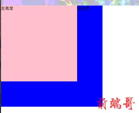
<style> * { margin: 0; padding: 0; } div { background-color: pink; } </style> </head> <body> <div style="width: 300px;height: 300px;float: left">左青龙</div> <div style="width: 300px;height: 300px;float: right">右白虎</div>
[外链图片转存失败,源站可能有防盗链机制,建议将图片保存下来直接上传(img-H0Os7Ana-1689863224163)(https://imgfff-1313020458.cos.ap-shanghai.myqcloud.com/images/image-20230709221739201.png)]
浮动的盒子会压住未浮动的盒子, 变成三维空间
<div style="background-color: pink;width: 300px;height: 300px;float: left">左青龙</div> <div style="background-color: blue;width: 400px;height: 400px;">右白虎</div>
浮动特性
多个盒子都设置浮动, 按照属性值一行内显示并
顶端对齐排列如果一行装不开浮动的盒子, 会另起一行显示
[外链图片转存失败,源站可能有防盗链机制,建议将图片保存下来直接上传(img-0NsseJtC-1689863224164)(https://imgfff-1313020458.cos.ap-shanghai.myqcloud.com/images/image-20230709222911653.png)]
+++
任何元素都可以浮动, 添加浮动后, 都会有行内块元素的特性
浮动布局练习1
浮动元素和标准流父级搭配使用
用标准流的父元素排列上下位置, 内部子元素左右排列, 符合网络布局第一准则
<style> .box { width: 700px; height: 400px; background-color: pink; } .left { width: 300px; height: 400px; float: left; background-color: cadetblue; } .right { width: 400px; height: 400px; float: right; background-color: greenyellow; } </style> <div class="box"> <div class="left">左侧盒子</div> <div class="right">右侧盒子</div> </div>
浮动布局练习二
实现小米布局
[外链图片转存失败,源站可能有防盗链机制,建议将图片保存下来直接上传(img-HkMdTmfK-1689863224164)(https://imgfff-1313020458.cos.ap-shanghai.myqcloud.com/images/image-20230710145244669.png)]
<!DOCTYPE html> <html lang="en"> <head> <meta charset="UTF-8"> <title>Title</title> <style> ul { margin: 0; padding: 0; background-color: pink; width: 660px; height: 200px; } li { list-style: none; background-color: cadetblue; width: 150px; height: 200px; margin-right: 20px; float: left; } .last { margin-right: 0; } </style> </head> <body> <ul> <li></li> <li></li> <li></li> <li class="last"></li> </ul> </body> </html>
[外链图片转存失败,源站可能有防盗链机制,建议将图片保存下来直接上传(img-PH8fU4jr-1689863224165)(https://imgfff-1313020458.cos.ap-shanghai.myqcloud.com/images/image-20230710145322846.png)]
<!DOCTYPE html> <html lang="en"> <head> <meta charset="UTF-8"> <title>Title</title> </head> <style> ul { margin: 0; padding: 0; } ul li { background-color: pink; margin-left: 10px; height: 290px; width: 200px; float: left; } </style> <body> <div style="width: 300px;height: 600px;float: left;background-color: purple"> 左青龙</div> <ul style="float: left;background-color: greenyellow;width: 840px;height: 600px;margin-top: 0;list-style: none; "> <li style="margin-bottom: 10px;">1</li> <li style="margin-bottom: 10px;">2</li> <li style="margin-bottom: 10px;">3</li> <li style="margin-bottom: 10px;">4</li> <li>5</li> <li>6</li> <li>7</li> <li>8</li> </ul> </body> </html>
[外链图片转存失败,源站可能有防盗链机制,建议将图片保存下来直接上传(img-d8qsTsPz-1689863224165)(https://imgfff-1313020458.cos.ap-shanghai.myqcloud.com/images/image-20230710150857610.png)]
+++
常见的网络布局
[外链图片转存失败,源站可能有防盗链机制,建议将图片保存下来直接上传(img-ACsT4Ho9-1689863224165)(https://imgfff-1313020458.cos.ap-shanghai.myqcloud.com/images/image-20230710153930733.png)]
[外链图片转存失败,源站可能有防盗链机制,建议将图片保存下来直接上传(img-ZdQ9fpOC-1689863224166)(https://imgfff-1313020458.cos.ap-shanghai.myqcloud.com/images/image-20230710153943969.png)]
[外链图片转存失败,源站可能有防盗链机制,建议将图片保存下来直接上传(img-FyDgEr7D-1689863224166)(https://imgfff-1313020458.cos.ap-shanghai.myqcloud.com/images/image-20230710153959008.png)]
第三种实现一下
<!DOCTYPE html> <html lang="en"> <head> <meta charset="UTF-8"> <title>Title</title> <style> * { margin: 0; padding: 0; } ul { list-style: none; } ul li { width: 150px; height: 200px; background-color: lightgray; margin: 0 10px 0 auto; float: left; } .ul { width: 630px; height: 200px; margin: 0 auto; } </style> </head> <body> <div class="top" style="height: 80px;background-color: lightgray;">top</div> <div class="banner" style="background-color: lightgray;width: 630px;height: 200px; margin: 20px auto;">banner</div> <div class="ul"> <ul> <li>1</li> <li>2</li> <li>3</li> <li style="margin-right: 0">4</li> </ul> </div> <div class="footer"></div> <div class="top" style="height: 200px;width: 1300px;background-color: lightgray;margin: 20px auto;">top</div> </body> </html>
[外链图片转存失败,源站可能有防盗链机制,建议将图片保存下来直接上传(img-rzTXWVuK-1689863224167)(https://imgfff-1313020458.cos.ap-shanghai.myqcloud.com/images/image-20230710154038216.png)]
浮动布局注意点
- 浮动和标准的父盒子搭配
先用标准流父元素排列上下位置, 之后内部子元素采取浮动排列左右位置
- 一个元素浮动了, 理论上其余兄弟元素也要浮动
浮动的盒子只会影响盒子后面的标准流, 不会影响前面的标准流
[外链图片转存失败,源站可能有防盗链机制,建议将图片保存下来直接上传(img-CuQKNpCy-1689863224167)(https://imgfff-1313020458.cos.ap-shanghai.myqcloud.com/images/image-20230710155055266.png)]
浮动盒子前面的1标准盒子不会被浮动
浮动盒子后面的3标准盒子会被浮动
清除浮动原因
[外链图片转存失败,源站可能有防盗链机制,建议将图片保存下来直接上传(img-kacFXkWi-1689863224167)(https://imgfff-1313020458.cos.ap-shanghai.myqcloud.com/images/image-20230710160325802.png)]
我们可以不设定父盒子的高度, 然而又会出现问题
[外链图片转存失败,源站可能有防盗链机制,建议将图片保存下来直接上传(img-5glg6GNn-1689863224168)(https://imgfff-1313020458.cos.ap-shanghai.myqcloud.com/images/image-20230710160615657.png)]
清除浮动
- 添加额外标签
在浮动标签和标准标签中间用标签隔开
<div style="clear:both;"></div>
- 父亲添加overflow
<div style="overflow:auto;"></div>
- 伪元素
需要的话直接复制粘贴即可
.clearfix:after { content:""; display:block; height:0; clear:both; visibility:hidden; } .clearfix { /*IE6、7专有*/ *zoom: 1; }
- 双伪元素
.clearfix:before, .clearfix:after { content:""; display:table; } .clearfix:after{ clear:both; } .clearfix { *zoom:1; }
清除浮动总结
为什么清除浮动?
- 父级没高度
- 子盒子浮动了
- 影响下面布局了, 应该清除浮动了
| 清除浮动方式 | 优点 | 缺点 |
|---|---|---|
| 额外标签法 | 通俗易懂,书写方便 | 添加许多无意义的标签,结构化较差。 |
| 父级 overflow:hidden | 书写简单 | 溢出隐藏 |
| 父级 after 伪元素 | 结构语义化正确 | 由于1E6-7不支持:after,兼容性问题 |
| 父级双伪元素 | 结构语义化正确 | 由于IE6-7不支持:after,兼容性问题 |
切图
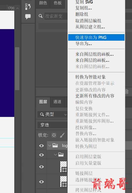
操作 .psd 文件
- 右键, 快速导出PNG
- 多选切图
[外链图片转存失败,源站可能有防盗链机制,建议将图片保存下来直接上传(img-bSvPcXKG-1689863224168)(https://imgfff-1313020458.cos.ap-shanghai.myqcloud.com/images/image-20230710165203997.png)]
此处文字和图片分离, 我们需要把文字和图片合并在一起
shift 多选, ctrl + E 合并
- 切片工具切割
导出为web旧版格式
[外链图片转存失败,源站可能有防盗链机制,建议将图片保存下来直接上传(img-FJpx0Oy5-1689863224169)(https://imgfff-1313020458.cos.ap-shanghai.myqcloud.com/images/image-20230710165730242.png)]
如果要透明的我们需要在图层把背景眼睛闭上
像素大厨
这个工具的作用是便于测量
[外链图片转存失败,源站可能有防盗链机制,建议将图片保存下来直接上传(img-4WiS0vVL-1689863224169)(https://imgfff-1313020458.cos.ap-shanghai.myqcloud.com/images/image-20230710171834572.png)]
学成在线案例准备
* { padding: 0; margin: 0; }
CSS 书写顺序
[外链图片转存失败,源站可能有防盗链机制,建议将图片保存下来直接上传(img-M3bo2HP4-1689863224170)(https://imgfff-1313020458.cos.ap-shanghai.myqcloud.com/images/image-20230710173224962.png)]
[外链图片转存失败,源站可能有防盗链机制,建议将图片保存下来直接上传(img-fBfpO8OH-1689863224170)(https://imgfff-1313020458.cos.ap-shanghai.myqcloud.com/images/image-20230710173231586.png)]
页面布局整体思路
- 确定页面的版式, 可视区, 直接用PS测量
- 分析页面的行模块, 每个行的列模块
- 一个行模块里面的列模块会浮动布局, 确定每个列的
大小, 之后确定列的位置 - HTML 先结构, 后样式的原则, 结构远比样式重要
- 先理清布局结构, 再写代码
+++
定位导读
把盒子定位到一个位置
浮动: 让多个块级盒子一行没有缝隙排列显示, 用于横向排列盒子
定位: 让盒子自由在盒子内移动位置或固定屏幕中某个位置, 可以压住盒子
定位 = 定位模式 + 边偏移
定位模式:
通过css的position属性设置:
| 值 | 语义 |
|---|---|
| static | 静态定位 |
| relative | 相对定位 |
| absolute | 绝对定位 |
| fixed | 固定定位 |
边偏移:
是定位盒子移动到最终位置
| 边偏移属性 | 示例 | 描述 |
|---|---|---|
| top | top:80px | 顶端偏移量, 定义元素相对于其父元素上边线的距离 |
| bottom | bottom:80px | 底部偏移量, 定义元素相对于其父元素下边线的距离 |
| left | left:80px | 左侧偏移量, 定义元素相对于其父元素下边线的距离 |
| right | right:80px | 右侧偏移量, 定义元素相对于其父元素下边线的距离 |
相对定位
静态定位 static 了解
默认定位方式, 无定位
静态定位没有边偏移, 基本不用
+++
相对定位 relative 重要
元素移动位置, 相对于它原来的位置来说的
选择器 { position:relative }
特点
- 相对于自己原来的位置移动
- 原来在标准流的位置继续占用, 后面的盒子仍然以标准流的方式对待他
相对定位没有脱标, 典型应用是给绝对定位当爹
.box1 { width: 100px; height: 100px; background-color: blue; position: relative; top: 50px; left: 50px; } .box2 { width: 100px; height: 100px; background-color: pink; }
[外链图片转存失败,源站可能有防盗链机制,建议将图片保存下来直接上传(img-q9zuVSAE-1689863224171)(https://imgfff-1313020458.cos.ap-shanghai.myqcloud.com/images/image-20230710224258243.png)]
绝对定位
绝对定位是元素移动位置时相对于祖先元素来说的, 到处找爹, 三姓家奴
选择器 { position: absolute; }
- 如果没有父元素或父元素没有定位, 则以浏览器为准定位
<style> .father { width: 300px; height: 300px; background-color: lightskyblue; } .son { width: 100px; height: 100px; background-color: pink; position: absolute; top: 400px; left: 0; } </style> </head> <body> <div class="father"> <div class="son"> </div> </div> </body>
尽管 son 和 father 是父子关系, 但是son 比较叛逆, 会跑出父亲盒子
[外链图片转存失败,源站可能有防盗链机制,建议将图片保存下来直接上传(img-pkLHf0NQ-1689863224171)(https://imgfff-1313020458.cos.ap-shanghai.myqcloud.com/images/image-20230710225755554.png)]
- 如果父元素有定位, 则父元素就是参照位置
父亲有能力, 可以管住儿子
.father { position: relative; width: 300px; height: 300px; background-color: lightskyblue; } .son { width: 100px; height: 100px; background-color: pink; position: absolute; top: 30px; left: 0; }
[外链图片转存失败,源站可能有防盗链机制,建议将图片保存下来直接上传(img-Lk6tFoCX-1689863224172)(https://imgfff-1313020458.cos.ap-shanghai.myqcloud.com/images/image-20230710230120472.png)]
儿子不会跑出去了, 被父元素给约束了
这里的父元素只要是父辈都适用, 比如它爷爷有定位, 则在他爷爷里面定位
以最近一级的有定位祖先元素为参考点移动位置
.gra { width: 800px; height: 800px; background-color: pink; position: relative; } .father { width: 300px; height: 300px; background-color: lightskyblue; } .son { width: 100px; height: 100px; background-color: green; position: absolute; top: 30px; right: 0; }
[外链图片转存失败,源站可能有防盗链机制,建议将图片保存下来直接上传(img-hWo56G6w-1689863224172)(https://imgfff-1313020458.cos.ap-shanghai.myqcloud.com/images/image-20230710230626416.png)]
这里它去了爷爷的右边界
+++
- 绝对定位脱标后不会占有原来的位置
子绝父相
因为父级需要占位, 因此是相对定位, 子盒子不需要占位, 则是绝对定位
子级用绝对定位的话, 父级要用相对定位
- 子级绝对定位不会占位, 可以放到父盒子的任何一个地方, 不会影响其他兄弟盒子
- 父盒子需要加定位限制子盒子在父盒子内显示
- 父盒子布局时, 需要占位, 因此父亲只能相对定位
相对定位经常用来作为绝对定位的父级
.gra { width: 800px; height: 800px; background-color: pink; position: relative; } .father { width: 300px; height: 300px; background-color: lightskyblue; position: relative; } .son { width: 100px; height: 100px; background-color: green; position: absolute; top: 30px; right: 0; }
[外链图片转存失败,源站可能有防盗链机制,建议将图片保存下来直接上传(img-9DSpDsQP-1689863224173)(https://imgfff-1313020458.cos.ap-shanghai.myqcloud.com/images/image-20230711085100480.png)]
+++
固定定位
<style> .dj { position: fixed; top: 100px; right: 40px; } </style> </head> <body> <div class="dj"> <img src="pvp.png" alt=""> </div>
不管页面怎么滚动, 小妲己始终在页面右侧中间位置
固定定位到版心的右侧
小算法:
- 让固定定位的盒子 left: 50% 走到浏览器可视区(版心)的一半
- 让固定定位的盒子margin-left:版心宽度的一半距离, 多走版心宽度的一半, 可以让固定定位的盒子贴着版心右侧对齐
<style> .w { width: 800px; height: 1400px; background-color: pink; margin: 0 auto; } .m { width: 100px; height: 100px; background-color: blue; position: fixed; left: 50%; margin-left: 400px; } </style> </head> <body> <div class="m"></div> <div class="w"></div> </body>
[外链图片转存失败,源站可能有防盗链机制,建议将图片保存下来直接上传(img-IrGjuNsl-1689863224173)(https://imgfff-1313020458.cos.ap-shanghai.myqcloud.com/images/image-20230711093546810.png)]
粘性定位
-
以浏览器可视窗口为参照点移动元素
-
粘性定位占有原先的位置
<style> .one { width: 200px; height: 200px; background-color: lightskyblue; margin: auto; position: sticky; top: 0; } </style>
[外链图片转存失败,源站可能有防盗链机制,建议将图片保存下来直接上传(img-2NAaW7wV-1689863224174)(C:\Users\Administrator\AppData\Roaming\Typora\typora-user-images\image-20230711094426124.png)]
滑动滚轮, 蓝色盒子在紧贴top: 0;的位置粘住了
定位模式总结
| 定位模式 | 是否脱标(不占位) | 移动位置 | 是否常用 |
|---|---|---|---|
| static 静态定位 | 否 | 不能使用边偏移 | 很少 |
| relative 相对定位 | 否 | 相对于自身位置移动 | 常用 |
| absolute 绝对定位 | 是 | 带有定位的父级 | 常用 |
| fixed 固定定位 | 是 | 浏览器可视区 | 常用 |
| sticky 粘性定位 | 否 | 浏览器可视区 | 当前阶段少 |
定位叠放顺序
使用定位布局, 会出现盒子重叠情况, 使用z-index控制盒子前后次序(z轴)
<style> .a { width: 200px; height: 200px; background-color: lightskyblue; position: absolute; top: 0; left: 0; z-index: 3; } .b { width: 300px; height: 300px; background-color: pink; position: absolute; top: 10px; left: 10px; z-index: 2; } .c { width: 400px; height: 400px; background-color: navajowhite; position: absolute; top: 0; left: 0; z-index: 1; } </style> </head> <body> <div class="a">123</div> <div class="b">456</div> <div class="c">789</div> </body>
[外链图片转存失败,源站可能有防盗链机制,建议将图片保存下来直接上传(img-NnBl7YK6-1689863224174)(https://imgfff-1313020458.cos.ap-shanghai.myqcloud.com/images/image-20230712142328597.png)]
+++
拓展: 绝对定位盒子居中
.box { position: absolute; width: 200px; height: 200px; background-color: pink; margin: 0 auto; }
发现 margin:0 auto; 居中失效了, 我们要更改 left & margin-left 属性
.box { position: absolute; left: 50%; width: 200px; height: 200px; margin-left: -100px; background-color: pink; /*margin: 0 auto;*/ }
[外链图片转存失败,源站可能有防盗链机制,建议将图片保存下来直接上传(img-EunZ5tS2-1689863224174)(https://imgfff-1313020458.cos.ap-shanghai.myqcloud.com/images/image-20230712143907348.png)]
+++
.box { position: absolute; left: 50%; margin-left: -100px; top: 50%; margin-top: -100px; width: 200px; height: 200px; background-color: pink; /*margin: 0 auto;*/ }
[外链图片转存失败,源站可能有防盗链机制,建议将图片保存下来直接上传(img-7QCKEuqy-1689863224175)(https://imgfff-1313020458.cos.ap-shanghai.myqcloud.com/images/image-20230712144257662.png)]
+++
拓展: 定位和浮动
绝对&固定定位和浮动类似
- 行内元素添加绝对或者固定定位, 可以直接设置高度和宽度
.one { background-color: pink; width: 200px; height: 300px; /*display: block;*/ position: absolute; /*和上面转换块级元素代码等价*/ }
- 块级元素添加绝对或者固定定位, 不给宽度或高度, 默认大小是内容大小
<style> .one { background-color: pink; position: absolute; } </style> <div class="one">123</div>
[外链图片转存失败,源站可能有防盗链机制,建议将图片保存下来直接上传(img-0SM5LYgR-1689863224175)(https://imgfff-1313020458.cos.ap-shanghai.myqcloud.com/images/image-20230712151444431.png)]
如果不加定位, 则宽度是body宽度
<style> .one { background-color: pink; } </style> <div class="one">123</div>
[外链图片转存失败,源站可能有防盗链机制,建议将图片保存下来直接上传(img-EFYYlAjq-1689863224176)(https://imgfff-1313020458.cos.ap-shanghai.myqcloud.com/images/image-20230712151506093.png)]
+++
- 脱标的盒子不会出发外边距塌陷
浮动元素, 绝对定位(固定定位) 元素的都不会触发外边距合并的问题
- 浮动会压住盒子, 不会压住盒子里的文字, 而绝对定位都会
.box { float: left; width: 200px; height: 200px; background-color: pink; }
[外链图片转存失败,源站可能有防盗链机制,建议将图片保存下来直接上传(img-bY9MXsCp-1689863224176)(https://imgfff-1313020458.cos.ap-shanghai.myqcloud.com/images/image-20230712154510316.png)]
.box { position: absolute; width: 200px; height: 200px; background-color: pink; }
[外链图片转存失败,源站可能有防盗链机制,建议将图片保存下来直接上传(img-KNDPsXeT-1689863224176)(https://imgfff-1313020458.cos.ap-shanghai.myqcloud.com/images/image-20230712154608821.png)]
淘宝大图片盒子制作
注意: left 的权重大于right , top > bottom
<!DOCTYPE html> <html lang="en" xmlns="http://www.w3.org/1999/html"> <head> <meta charset="UTF-8"> <title>Title</title> <style> * { margin: 0; padding: 0; } .tb { position: relative; background-color: pink; width: 520px; height: 280px; margin: 100px auto; } .tb img { /*更改图片大小是以防万一*/ width: 520px; height: 280px; } .imgA { background-color: rgba(0,0,0,.3); position: absolute; left: 0; width: 20px; height: 30px; line-height: 30px; text-decoration-line: none; top: 50%; margin-top: -15px; text-align: center; color: #fff; border-top-right-radius: 15px; border-bottom-right-radius: 15px; } .imgB { background-color: rgba(0,0,0,.3); position: absolute; right: 0; width: 20px; height: 30px; line-height: 30px; top: 50%; margin-top: -15px; text-align: center; text-decoration-line: none; border-top-left-radius: 15px; border-bottom-left-radius: 15px; color: #fff; } .imgUl { position: absolute; bottom: 10px; left: 50%; margin-left: -35px; width: 70px; height: 13px; background-color: rgba(255, 255, 255, .3); border-radius: 20px; } ul li { border-radius: 100%; background-color: white; width: 8px; height: 8px; list-style: none; float: left; margin: 3px; } </style> </head> <body> <div class="tb"> <img src="tb.jpg" alt="#"/> <a href="#" class="imgA"> < </a> <a href="#" class="imgB"> > </a> <ul class="imgUl"> <li class="one"></li> <li></li> <li></li> <li style="background-color: red"></li> <li></li> </ul> </div> </body> </html>
[外链图片转存失败,源站可能有防盗链机制,建议将图片保存下来直接上传(img-gGi3bIxK-1689863224177)(https://imgfff-1313020458.cos.ap-shanghai.myqcloud.com/images/image-20230712170944340.png)]
+++
网络布局总结
html标签是一个盒子 , css浮动, 定位可以让每个盒子排列成网页,
一个完整的网页是标准流, 浮动, 定位一起完成的, 每个都有自己的专门用法
- 标准流
让盒子上下排列或左右排列, 垂直的块级盒子显示用标准流布局
- 浮动
让多个块级元素一行显示或左右对齐盒子, 多个块级盒子水平显示用浮动布局
- 定位
最大特点是有层叠的概念, 可以让多个盒子前后叠压来显示, 如果元素自由在某个盒子内移动就用布局定义
display 属性
display 属性用于设置一个元素应如何显示
- 默认样式
<head> <style> div { width: 200px; height: 200px; background-color: pink; } </style> </head> <body> <div style="background: blue"> 佩奇 </div> <div> 乔治 </div> </body>
[外链图片转存失败,源站可能有防盗链机制,建议将图片保存下来直接上传(img-abLsaXiV-1689863224177)(https://imgfff-1313020458.cos.ap-shanghai.myqcloud.com/images/image-20230712174304735.png)]
- display:none 隐藏对象
<div style="background: blue;display: none"> 佩奇 </div>
我们发现佩奇丢了
[外链图片转存失败,源站可能有防盗链机制,建议将图片保存下来直接上传(img-XfWeh4So-1689863224178)(https://imgfff-1313020458.cos.ap-shanghai.myqcloud.com/images/image-20230712174406179.png)]
- display:block 除了转换为块级元素之外, 同时还有显示元素的意思
<div style="background: blue;display: block"> 佩奇 </div>
[外链图片转存失败,源站可能有防盗链机制,建议将图片保存下来直接上传(img-ThCaVLSk-1689863224178)(https://imgfff-1313020458.cos.ap-shanghai.myqcloud.com/images/image-20230712174519274.png)]
佩奇又回来了
display 隐藏元素后, 不再占有原来的位置, 搭配JS可以做很多网页特效
visibility 可见性
visibility 属性用于指定一个元素可见还是隐藏, _ 隐藏视野罢了
- visibility: hidden 元素隐藏
<div style="background: blue;visibility: hidden">佩奇</div>
[外链图片转存失败,源站可能有防盗链机制,建议将图片保存下来直接上传(img-b5SsUhxG-1689863224179)(https://imgfff-1313020458.cos.ap-shanghai.myqcloud.com/images/image-20230712175349547.png)]
- visibility: visible 元素可视
<div style="background: blue;visibility: visible">佩奇</div>
恢复正常 [外链图片转存失败,源站可能有防盗链机制,建议将图片保存下来直接上传(img-Yyv89FEX-1689863224179)(https://imgfff-1313020458.cos.ap-shanghai.myqcloud.com/images/image-20230712174519274.png)]
+++
overflow 溢出
指定内容溢出元素的框, 会发生什么
overflow:hidden 隐藏
<style> .one { width: 150px; height: 200px; border: 3px solid pink; margin: 100px auto; overflow: hidden; } </style> </head> <body> <div class="one"> 粉红猪小妹佩奇是一只非常可爱的小粉红猪,她与弟弟乔治、爸爸、妈妈快乐地住在一起。粉红猪小妹最喜欢做的事情是玩游戏, 打扮的漂漂亮亮,度假,以及住在小泥坑里快乐地跳上跳下!除了这些 </div>
[外链图片转存失败,源站可能有防盗链机制,建议将图片保存下来直接上传(img-dZX3ZAar-1689863224179)(https://imgfff-1313020458.cos.ap-shanghai.myqcloud.com/images/image-20230712204259307.png)]
overflow: visible 显示
[外链图片转存失败,源站可能有防盗链机制,建议将图片保存下来直接上传(img-Zvv3vJaG-1689863224180)(https://imgfff-1313020458.cos.ap-shanghai.myqcloud.com/images/image-20230712204351818.png)]
overflow: scroll; 显示滚动条
[外链图片转存失败,源站可能有防盗链机制,建议将图片保存下来直接上传(img-RMH7uYCC-1689863224180)(https://imgfff-1313020458.cos.ap-shanghai.myqcloud.com/images/image-20230712204426841.png)]
overflow: auto; 在需要时添加滚动条 , 超出则加条, 不超不加条
[外链图片转存失败,源站可能有防盗链机制,建议将图片保存下来直接上传(img-jfvkrlgg-1689863224181)(https://imgfff-1313020458.cos.ap-shanghai.myqcloud.com/images/image-20230712204505843.png)]
| 属性 | 描述 |
|---|---|
| visible | 不剪切内容也不添加滚动条 |
| hidden(常用) | 不显示超过对象的内容, 超出的部分隐藏 |
| scroll | 不管超出内容否, 总是显示滚动条 |
| auto | 超出自动显示滚动条, 不超出不显示滚动条 |
隐藏总结
如果隐藏元素想要原来位置, 用visibility:hidden
如果隐藏元素不想要原来位置, 用display:none (更常用, 配js更丝滑)
需要管理溢出显示隐藏则使用 overflow:hidden
土豆网案例
<!DOCTYPE html> <html lang="en"> <head> <meta charset="UTF-8"> <title>Title</title> <style> .one { width: 444px; height: 320px; background-color: pink; margin: 100px auto; position: relative; } .two { width: 100%; height: 100%; background: rgba(0,0,0,.3) url("arr.png") no-repeat center; position: absolute; left: 0; top: 0; display: none; } /*鼠标经过图片时, 就会有遮罩*/ .one:hover .two{ display: block; } </style> </head> <body> <div class="one"> <img style="width: 100%;height: 100%" src="tudou.jpg" alt=""> <div class="two"></div> </div> </body> </html>
[外链图片转存失败,源站可能有防盗链机制,建议将图片保存下来直接上传(img-WUQievJy-1689863224181)(https://imgfff-1313020458.cos.ap-shanghai.myqcloud.com/images/image-20230712211332859.png)]
CSS 高级技巧
精灵图
目的: 减少服务器接收和发送请求的次数, 提高页面的加载速度
原理: 将网页一些小背景图整合到一张大图, 这样服务器只需要一次请求即可
[外链图片转存失败,源站可能有防盗链机制,建议将图片保存下来直接上传(img-53E3e09p-1689863224181)(https://imgfff-1313020458.cos.ap-shanghai.myqcloud.com/images/image-20230713153939946.png)]
<style> .one { width: 60px; height: 60px; margin: 200px auto; background: url("sprites.png") -180px 0; } .two { width: 26px; height: 24px; margin: 100px auto; background: url("sprites.png") -154px -107px; } </style> </head> <body> <div class="one"></div> <div class="two"></div> </body>
[外链图片转存失败,源站可能有防盗链机制,建议将图片保存下来直接上传(img-DW89jHla-1689863224182)(https://imgfff-1313020458.cos.ap-shanghai.myqcloud.com/images/image-20230713161051300.png)]
精灵图拼自己的名字
<head> <meta charset="UTF-8"> <title>Title</title> <style> .one { width: 95px; height: 114px; background: url("abcd.jpg") 0 -138px; float: left; } .two { width: 111px; height: 114px; background: url("abcd.jpg") -95px -138px; float: left; } .three { width: 103px; height: 114px; background: url("abcd.jpg") -389px -138px; float: left; } </style> </head> <body> <div class="one"></div> <div class="two"></div> <div class="three"></div> </body> </html>
[外链图片转存失败,源站可能有防盗链机制,建议将图片保存下来直接上传(img-x0yAtvVX-1689863224182)(https://imgfff-1313020458.cos.ap-shanghai.myqcloud.com/images/image-20230713163618860.png)]
字体图标知识
字体图标使用场景: 网页通用常用的小图标
图片文件比较大, 本身放大缩小失真, 图片制作完毕更换会很麻烦
字体图标本质属于字体, 只是以图标形式展示
字体图标和精灵图:
- 结构和样式比较简单的小图标, 用字体图标
- 结构和样式比较复杂的小图标, 用精灵图
字体图标使用
- 字体图标下载
- 字体图标引入
- 字体图标追加
<svg style="width: 50px; height: 50px" height="1024" node-id="1" sillyvg="true" template-height="1024" template-width="1024" version="1.1" viewBox="0 0 1024 1024" width="1024" xmlns="http://www.w3.org/2000/svg" xmlns:xlink="http://www.w3.org/1999/xlink"><defs node-id="42"><clipPath id="mask-2" node-id="13"><path d="M 559.28 0.24 L 591.59 0.24 C 600.96 0.24 609.90 2.02 618.10 5.27 C 663.64 12.36 697.48 26.60 719.61 47.98 C 756.96 87.79 794.30 133.24 831.65 184.31 C 851.65 213.99 874.52 228.84 900.26 228.84 C 938.87 228.84 951.24 255.37 951.24 278.93 C 952.64 291.82 952.64 313.17 951.24 342.99 L 951.24 417.72 L 662.04 410.13 C 659.71 414.64 655.01 417.72 649.59 417.72 L 14.00 417.72 C 6.27 417.72 0.00 411.45 0.00 403.72 L 0.00 14.24 C 0.00 6.50 6.27 0.24 14.00 0.24 L 523.35 0.24 C 535.84 -0.08 547.82 -0.08 559.28 0.24 Z" fill="#000000" fill-rule="evenodd" node-id="47" stroke="none" target-height="417.8" target-width="952.64" target-x="0" target-y="-0.08"></path></clipPath><clipPath id="mask-4" node-id="22"><path d="M 2.00 0.00 L 216.69 0.00 C 217.79 0.00 218.69 0.90 218.69 2.00 L 218.69 123.25 C 218.69 124.35 217.79 125.25 216.69 125.25 L 2.00 125.25 C 0.90 125.25 0.00 124.35 0.00 123.25 L 0.00 2.00 C 0.00 0.90 0.90 0.00 2.00 0.00 Z" fill="#000000" fill-rule="evenodd" node-id="54" stroke="none" target-height="125.25" target-width="218.69" target-x="0" target-y="0"></path></clipPath><clipPath id="mask-6" node-id="28"><path d="M 2.00 0.00 L 137.89 0.00 C 138.46 -0.00 139.00 0.24 139.38 0.67 L 247.53 121.92 C 248.26 122.74 248.19 124.01 247.36 124.74 C 247.00 125.07 246.52 125.25 246.03 125.25 L 2.00 125.25 C 0.90 125.25 0.00 124.35 0.00 123.25 L 0.00 2.00 C -0.00 0.90 0.90 0.00 2.00 0.00 Z" fill="#000000" fill-rule="evenodd" node-id="61" stroke="none" target-height="125.25" target-width="248.26" target-x="0" target-y="0"></path></clipPath><clipPath id="mask-2_3" node-id="13"><path d="M 593.15 338.24 L 625.46 338.24 L 630.14 338.39 L 634.70 338.82 L 639.15 339.54 L 645.70 341.12 L 651.97 343.27 L 665.38 345.63 L 677.79 348.36 L 689.26 351.43 L 699.85 354.81 L 709.61 358.48 L 718.59 362.43 L 726.85 366.65 L 734.42 371.12 L 741.36 375.83 L 747.70 380.78 L 753.48 385.98 L 768.96 402.80 L 784.60 420.46 L 800.43 439.00 L 816.43 458.42 L 832.61 478.76 L 848.97 500.05 L 865.51 522.31 L 871.15 530.18 L 876.78 537.11 L 882.40 543.16 L 888.01 548.40 L 893.62 552.90 L 899.24 556.70 L 904.88 559.84 L 910.56 562.38 L 916.31 564.33 L 922.13 565.72 L 928.06 566.56 L 934.13 566.84 L 939.99 567.06 L 945.26 567.65 L 950.00 568.57 L 954.26 569.79 L 958.50 571.42 L 962.31 573.28 L 965.71 575.37 L 968.75 577.69 L 972.48 581.22 L 975.64 585.02 L 978.28 589.12 L 980.47 593.49 L 982.21 598.00 L 983.51 602.68 L 984.41 607.45 L 984.94 612.20 L 985.11 616.93 L 985.81 626.27 L 986.14 639.43 L 985.97 657.33 L 985.11 680.99 L 985.11 755.72 L 695.91 748.13 L 694.54 750.27 L 692.86 752.09 L 690.84 753.61 L 688.59 754.75 L 686.15 755.45 L 683.46 755.72 L 47.87 755.72 L 45.31 755.48 L 42.97 754.84 L 40.80 753.80 L 38.84 752.41 L 37.17 750.75 L 35.78 748.78 L 34.74 746.61 L 34.11 744.27 L 33.87 741.72 L 33.87 352.24 L 34.11 349.68 L 34.74 347.34 L 35.78 345.17 L 37.17 343.20 L 38.84 341.54 L 40.80 340.15 L 42.97 339.11 L 45.31 338.47 L 47.87 338.24 L 557.22 338.24 L 575.77 338.00 L 593.15 338.24 Z" fill="#000000" fill-rule="evenodd" node-id="47" stroke="none" target-height="417.71997" target-width="952.27" target-x="33.87" target-y="338"></path></clipPath><clipPath id="mask-2_4" node-id="13"><path d="M 593.15 338.24 L 625.46 338.24 L 630.14 338.39 L 634.70 338.82 L 639.15 339.54 L 645.70 341.12 L 651.97 343.27 L 665.38 345.63 L 677.79 348.36 L 689.26 351.43 L 699.85 354.81 L 709.61 358.48 L 718.59 362.43 L 726.85 366.65 L 734.42 371.12 L 741.36 375.83 L 747.70 380.78 L 753.48 385.98 L 768.96 402.80 L 784.60 420.46 L 800.43 439.00 L 816.43 458.42 L 832.61 478.76 L 848.97 500.05 L 865.51 522.31 L 871.15 530.18 L 876.78 537.11 L 882.40 543.16 L 888.01 548.40 L 893.62 552.90 L 899.24 556.70 L 904.88 559.84 L 910.56 562.38 L 916.31 564.33 L 922.13 565.72 L 928.06 566.56 L 934.13 566.84 L 939.99 567.06 L 945.26 567.65 L 950.00 568.57 L 954.26 569.79 L 958.50 571.42 L 962.31 573.28 L 965.71 575.37 L 968.75 577.69 L 972.48 581.22 L 975.64 585.02 L 978.28 589.12 L 980.47 593.49 L 982.21 598.00 L 983.51 602.68 L 984.41 607.45 L 984.94 612.20 L 985.11 616.93 L 985.81 626.27 L 986.14 639.43 L 985.97 657.33 L 985.11 680.99 L 985.11 755.72 L 695.91 748.13 L 694.54 750.27 L 692.86 752.09 L 690.84 753.61 L 688.59 754.75 L 686.15 755.45 L 683.46 755.72 L 47.87 755.72 L 45.31 755.48 L 42.97 754.84 L 40.80 753.80 L 38.84 752.41 L 37.17 750.75 L 35.78 748.78 L 34.74 746.61 L 34.11 744.27 L 33.87 741.72 L 33.87 352.24 L 34.11 349.68 L 34.74 347.34 L 35.78 345.17 L 37.17 343.20 L 38.84 341.54 L 40.80 340.15 L 42.97 339.11 L 45.31 338.47 L 47.87 338.24 L 557.22 338.24 L 575.77 338.00 L 593.15 338.24 Z" fill="#000000" fill-rule="evenodd" node-id="47" stroke="none" target-height="417.71997" target-width="952.27" target-x="33.87" target-y="338"></path></clipPath><clipPath id="mask-4_3" node-id="22"><path d="M 272.45 385.93 L 487.14 385.93 L 487.92 386.09 L 488.55 386.52 L 488.98 387.15 L 489.14 387.93 L 489.14 509.18 L 488.98 509.97 L 488.55 510.60 L 487.92 511.02 L 487.14 511.18 L 272.45 511.18 L 271.67 511.02 L 271.04 510.60 L 270.61 509.97 L 270.45 509.18 L 270.45 387.93 L 270.61 387.15 L 271.04 386.52 L 271.67 386.09 L 272.45 385.93 Z" fill="#000000" fill-rule="evenodd" node-id="54" stroke="none" target-height="125.25" target-width="218.69" target-x="270.45" target-y="385.93"></path></clipPath><clipPath id="mask-4_4" node-id="22"><path d="M 272.45 385.93 L 487.14 385.93 L 487.92 386.09 L 488.55 386.52 L 488.98 387.15 L 489.14 387.93 L 489.14 509.18 L 488.98 509.97 L 488.55 510.60 L 487.92 511.02 L 487.14 511.18 L 272.45 511.18 L 271.67 511.02 L 271.04 510.60 L 270.61 509.97 L 270.45 509.18 L 270.45 387.93 L 270.61 387.15 L 271.04 386.52 L 271.67 386.09 L 272.45 385.93 Z" fill="#000000" fill-rule="evenodd" node-id="54" stroke="none" target-height="125.25" target-width="218.69" target-x="270.45" target-y="385.93"></path></clipPath><clipPath id="mask-6_3" node-id="28"><path d="M 530.90 385.93 L 666.79 385.93 L 667.60 386.11 L 668.28 386.60 L 776.42 507.85 L 776.83 508.54 L 776.93 509.30 L 776.74 510.03 L 776.26 510.68 L 775.64 511.05 L 774.93 511.18 L 530.90 511.18 L 530.11 511.02 L 529.48 510.60 L 529.06 509.97 L 528.90 509.18 L 528.90 387.93 L 529.06 387.15 L 529.48 386.52 L 530.11 386.09 L 530.90 385.93 Z" fill="#000000" fill-rule="evenodd" node-id="61" stroke="none" target-height="125.25" target-width="248.02997" target-x="528.9" target-y="385.93"></path></clipPath><clipPath id="mask-6_4" node-id="28"><path d="M 530.90 385.93 L 666.79 385.93 L 667.60 386.11 L 668.28 386.60 L 776.42 507.85 L 776.83 508.54 L 776.93 509.30 L 776.74 510.03 L 776.26 510.68 L 775.64 511.05 L 774.93 511.18 L 530.90 511.18 L 530.11 511.02 L 529.48 510.60 L 529.06 509.97 L 528.90 509.18 L 528.90 387.93 L 529.06 387.15 L 529.48 386.52 L 530.11 386.09 L 530.90 385.93 Z" fill="#000000" fill-rule="evenodd" node-id="61" stroke="none" target-height="125.25" target-width="248.02997" target-x="528.9" target-y="385.93"></path></clipPath></defs><g node-id="120"><path d="M 20.62 875.03 L 1044.00 875.03 L 1045.00 904.53 C 984.69 917.99 903.35 924.73 800.98 924.73 C 798.88 953.91 760.86 955.02 696.39 953.36 C 661.82 955.95 655.32 959.72 644.92 970.42 C 634.51 981.11 586.84 1006.46 511.81 970.42 C 488.94 960.48 473.06 953.62 439.55 986.34 C 406.04 1019.06 376.17 988.05 369.09 979.23 C 362.00 970.42 364.18 952.53 305.58 946.84 C 272.85 943.75 261.19 934.22 270.61 918.25 C 67.67 909.05 -21.13 894.64 4.22 875.02 C 9.56 874.99 15.02 874.99 20.62 875.03 Z" fill="#8ecec5" fill-opacity="0.4" fill-rule="nonzero" group-id="1" id="路径-16" node-id="9" stroke="none" target-height="144.07" target-width="1066.13" target-x="-21.13" target-y="874.99"></path></g><g node-id="121"><path d="M 6.44 620.95 C -2.08 583.64 -57.58 340.66 99.33 307.25 C 256.24 273.84 348.94 312.75 417.89 244.72 C 486.83 176.70 504.03 187.86 560.66 192.36 C 617.29 196.86 682.92 147.76 704.97 133.01 C 727.03 118.26 926.15 23.36 977.06 307.25 C 985.10 429.99 991.79 563.15 935.46 613.58 C 879.13 664.02 936.49 709.31 977.06 714.35 C 1017.63 719.38 958.09 805.56 864.39 843.19 C 802.09 871.55 399.10 952.86 157.77 869.28 C 41.24 818.64 14.97 658.26 6.44 620.95 Z" fill="#8ecec5" fill-opacity="0.08" fill-rule="nonzero" group-id="2" id="路径-58" node-id="10" stroke="none" target-height="929.5" target-width="1075.21" target-x="-57.58" target-y="23.36"></path></g><g node-id="122"><g node-id="123"><g node-id="127"><path d="M 593.15 338.24 L 625.46 338.24 L 630.14 338.39 L 634.70 338.82 L 639.15 339.54 L 645.70 341.12 L 651.97 343.27 L 665.38 345.63 L 677.79 348.36 L 689.26 351.43 L 699.85 354.81 L 709.61 358.48 L 718.59 362.43 L 726.85 366.65 L 734.42 371.12 L 741.36 375.83 L 747.70 380.78 L 753.48 385.98 L 768.96 402.80 L 784.60 420.46 L 800.43 439.00 L 816.43 458.42 L 832.61 478.76 L 848.97 500.05 L 865.51 522.31 L 871.15 530.18 L 876.78 537.11 L 882.40 543.16 L 888.01 548.40 L 893.62 552.90 L 899.24 556.70 L 904.88 559.84 L 910.56 562.38 L 916.31 564.33 L 922.13 565.72 L 928.06 566.56 L 934.13 566.84 L 939.99 567.06 L 945.26 567.65 L 950.00 568.57 L 954.26 569.79 L 958.50 571.42 L 962.31 573.28 L 965.71 575.37 L 968.75 577.69 L 972.48 581.22 L 975.64 585.02 L 978.28 589.12 L 980.47 593.49 L 982.21 598.00 L 983.51 602.68 L 984.41 607.45 L 984.94 612.20 L 985.11 616.93 L 985.81 626.27 L 986.14 639.43 L 985.97 657.33 L 985.11 680.99 L 985.11 755.72 L 695.91 748.13 L 694.54 750.27 L 692.86 752.09 L 690.84 753.61 L 688.59 754.75 L 686.15 755.45 L 683.46 755.72 L 47.87 755.72 L 45.31 755.48 L 42.97 754.84 L 40.80 753.80 L 38.84 752.41 L 37.17 750.75 L 35.78 748.78 L 34.74 746.61 L 34.11 744.27 L 33.87 741.72 L 33.87 352.24 L 34.11 349.68 L 34.74 347.34 L 35.78 345.17 L 37.17 343.20 L 38.84 341.54 L 40.80 340.15 L 42.97 339.11 L 45.31 338.47 L 47.87 338.24 L 557.22 338.24 L 575.77 338.00 L 593.15 338.24 Z" fill="#ffffff" fill-rule="evenodd" group-id="3,4,8" node-id="79" stroke="none" target-height="417.71997" target-width="952.27" target-x="33.87" target-y="338"></path></g><g node-id="128"><g clip-path="url(#mask-2_3)" group-id="3,4,9" node-id="82"><path d="M 33.87 531.06 L 39.01 540.06 L 44.79 548.97 L 51.22 557.81 L 58.34 566.59 L 66.17 575.31 L 74.76 583.99 L 84.14 592.61 L 94.35 601.20 L 105.44 609.73 L 117.45 618.22 L 130.43 626.67 L 144.44 635.05 L 159.52 643.38 L 175.73 651.65 L 193.14 659.83 L 211.79 667.94 L 231.76 675.95 L 253.10 683.86 L 275.88 691.64 L 300.17 699.30 L 326.03 706.81 L 353.54 714.16 L 382.77 721.33 L 413.79 728.32 L 446.68 735.09 L 481.51 741.63 L 518.37 747.92 L 557.33 753.95 L 598.48 759.69 L 548.09 759.49 L 391.43 759.40 L 33.87 759.69 L 33.87 531.06 Z" fill="#d6dbdb" fill-rule="evenodd" group-id="3,4,9" id="路径-91" node-id="16" stroke="none" target-height="228.63" target-width="564.61" target-x="33.87" target-y="531.06"></path></g></g><g clip-path="url(#mask-2_4)" group-id="3,4,10" node-id="86"><path d="M 35.87 576.79 L 984.15 576.79 L 984.94 576.95 L 985.57 577.38 L 986.00 578.01 L 986.15 578.79 L 986.15 622.50 L 986.00 623.29 L 985.57 623.92 L 984.94 624.34 L 984.15 624.50 L 35.87 624.50 L 35.08 624.34 L 34.45 623.92 L 34.03 623.29 L 33.87 622.50 L 33.87 578.79 L 34.03 578.01 L 34.45 577.38 L 35.08 576.95 L 35.87 576.79 Z" fill="#e85f5b" fill-rule="evenodd" group-id="3,4,10" node-id="88" stroke="none" target-height="47.710022" target-width="952.28" target-x="33.87" target-y="576.79"></path></g></g><path d="M 23.00 759.69 L 20.99 759.51 L 19.15 759.00 L 17.45 758.19 L 15.90 757.10 L 14.60 755.79 L 13.50 754.24 L 12.69 752.54 L 12.19 750.70 L 12.00 748.69 L 12.00 668.24 L 302.26 668.24 L 302.26 725.89 L 721.74 725.89 L 721.74 668.24 L 1012.00 668.24 L 1012.00 748.69 L 1011.81 750.70 L 1011.31 752.54 L 1010.50 754.24 L 1009.40 755.79 L 1008.10 757.10 L 1006.55 758.19 L 1004.85 759.00 L 1003.01 759.51 L 1001.00 759.69 L 23.00 759.69 Z" fill="#184657" fill-rule="nonzero" group-id="3" id="形状结合" node-id="18" stroke="none" target-height="91.45001" target-width="1000" target-x="12" target-y="668.24"></path><path d="M 169.06 385.93 L 174.18 386.15 L 179.12 386.75 L 183.90 387.73 L 188.54 389.08 L 193.08 390.80 L 197.40 392.82 L 201.52 395.17 L 205.46 397.83 L 209.18 400.78 L 212.64 403.99 L 215.84 407.44 L 218.80 411.17 L 221.46 415.10 L 223.80 419.22 L 225.83 423.55 L 227.55 428.08 L 228.90 432.72 L 229.87 437.51 L 230.47 442.45 L 230.69 447.56 L 230.47 452.68 L 229.87 457.62 L 228.90 462.41 L 227.55 467.04 L 225.83 471.58 L 223.80 475.91 L 221.46 480.03 L 218.80 483.96 L 215.84 487.69 L 212.64 491.14 L 209.18 494.35 L 205.46 497.30 L 201.52 499.96 L 197.40 502.31 L 193.08 504.33 L 188.54 506.05 L 183.90 507.40 L 179.12 508.38 L 174.18 508.98 L 169.06 509.20 L 163.94 508.98 L 159.00 508.38 L 154.22 507.40 L 149.58 506.05 L 145.04 504.33 L 140.71 502.31 L 136.59 499.96 L 132.66 497.30 L 128.94 494.35 L 125.48 491.14 L 122.28 487.69 L 119.32 483.96 L 116.66 480.03 L 114.32 475.91 L 112.29 471.58 L 110.57 467.04 L 109.22 462.41 L 108.24 457.62 L 107.64 452.68 L 107.43 447.56 L 107.64 442.45 L 108.24 437.51 L 109.22 432.72 L 110.57 428.08 L 112.29 423.55 L 114.32 419.22 L 116.66 415.10 L 119.32 411.17 L 122.28 407.44 L 125.48 403.99 L 128.94 400.78 L 132.66 397.83 L 136.59 395.17 L 140.71 392.82 L 145.04 390.80 L 149.58 389.08 L 154.22 387.73 L 159.00 386.75 L 163.94 386.15 L 169.06 385.93 Z M 181.75 409.79 L 156.37 409.79 L 155.58 409.95 L 154.95 410.38 L 154.53 411.01 L 154.37 411.79 L 154.37 411.79 L 154.37 432.87 L 133.28 432.88 L 132.50 433.03 L 131.87 433.46 L 131.44 434.09 L 131.28 434.88 L 131.28 434.88 L 131.28 460.25 L 131.44 461.04 L 131.87 461.67 L 132.50 462.09 L 133.28 462.25 L 133.28 462.25 L 154.37 462.25 L 154.37 483.34 L 154.53 484.12 L 154.95 484.75 L 155.58 485.18 L 156.37 485.34 L 156.37 485.34 L 181.75 485.34 L 182.53 485.18 L 183.16 484.75 L 183.59 484.12 L 183.75 483.34 L 183.75 483.34 L 183.75 462.25 L 204.83 462.25 L 205.62 462.09 L 206.25 461.67 L 206.67 461.04 L 206.83 460.25 L 206.83 460.25 L 206.83 434.88 L 206.67 434.09 L 206.25 433.46 L 205.62 433.03 L 204.83 432.88 L 204.83 432.88 L 183.75 432.87 L 183.75 411.79 L 183.59 411.01 L 183.16 410.38 L 182.53 409.95 L 181.75 409.79 L 181.75 409.79 Z" fill="#e85f5b" fill-rule="evenodd" group-id="3,5" id="形状结合" node-id="20" stroke="none" target-height="123.27002" target-width="123.26" target-x="107.43" target-y="385.93"></path><path d="M 272.45 385.93 L 487.14 385.93 L 487.92 386.09 L 488.55 386.52 L 488.98 387.15 L 489.14 387.93 L 489.14 509.18 L 488.98 509.97 L 488.55 510.60 L 487.92 511.02 L 487.14 511.18 L 272.45 511.18 L 271.67 511.02 L 271.04 510.60 L 270.61 509.97 L 270.45 509.18 L 270.45 387.93 L 270.61 387.15 L 271.04 386.52 L 271.67 386.09 L 272.45 385.93 Z" fill="#8ecec5" fill-rule="nonzero" group-id="3,5,11,13" node-id="97" stroke="none" target-height="125.25" target-width="218.69" target-x="270.45" target-y="385.93"></path><g clip-path="url(#mask-4_3)" group-id="3,5,11,14" node-id="100"><path d="M 407.87 385.93 L 308.22 511.18 L 348.10 511.18 L 447.39 385.93 Z" fill="#c5f2eb" fill-opacity="0.4" fill-rule="nonzero" group-id="3,5,11,14" id="路径-86" node-id="25" stroke="none" target-height="125.25" target-width="139.17001" target-x="308.22" target-y="385.93"></path></g><g clip-path="url(#mask-4_4)" group-id="3,5,11,15" node-id="104"><path d="M 456.06 385.93 L 359.91 511.18 L 378.01 511.18 L 473.23 385.93 Z" fill="#c5f2eb" fill-opacity="0.4" fill-rule="nonzero" group-id="3,5,11,15" id="路径-89" node-id="26" stroke="none" target-height="125.25" target-width="113.32001" target-x="359.91" target-y="385.93"></path></g><path d="M 530.90 385.93 L 666.79 385.93 L 667.60 386.11 L 668.28 386.60 L 776.42 507.85 L 776.83 508.54 L 776.93 509.30 L 776.74 510.03 L 776.26 510.68 L 775.64 511.05 L 774.93 511.18 L 530.90 511.18 L 530.11 511.02 L 529.48 510.60 L 529.06 509.97 L 528.90 509.18 L 528.90 387.93 L 529.06 387.15 L 529.48 386.52 L 530.11 386.09 L 530.90 385.93 Z" fill="#8ecec5" fill-rule="nonzero" group-id="3,5,12,16" node-id="111" stroke="none" target-height="125.25" target-width="248.02997" target-x="528.9" target-y="385.93"></path><g clip-path="url(#mask-6_3)" group-id="3,5,12,17" node-id="114"><path d="M 670.29 385.93 L 570.65 511.18 L 610.52 511.18 L 709.81 385.93 Z" fill="#c5f2eb" fill-opacity="0.4" fill-rule="nonzero" group-id="3,5,12,17" id="路径-86" node-id="31" stroke="none" target-height="125.25" target-width="139.15997" target-x="570.65" target-y="385.93"></path></g><g clip-path="url(#mask-6_4)" group-id="3,5,12,18" node-id="118"><path d="M 718.48 385.93 L 622.34 511.18 L 640.44 511.18 L 735.66 385.93 Z" fill="#c5f2eb" fill-opacity="0.4" fill-rule="nonzero" group-id="3,5,12,18" id="路径-89" node-id="32" stroke="none" target-height="125.25" target-width="113.31995" target-x="622.34" target-y="385.93"></path></g><path d="M 213.79 634.44 L 222.84 634.74 L 231.66 635.57 L 240.26 636.93 L 248.66 638.82 L 256.96 641.23 L 264.98 644.10 L 272.75 647.43 L 280.27 651.21 L 287.56 655.46 L 294.52 660.08 L 301.17 665.11 L 307.51 670.53 L 313.52 676.32 L 319.15 682.43 L 324.40 688.88 L 329.28 695.66 L 333.74 702.73 L 337.75 710.05 L 341.33 717.64 L 344.47 725.53 L 347.10 733.57 L 349.23 741.82 L 350.85 750.29 L 351.96 759.02 L 75.62 759.02 L 76.73 750.29 L 78.35 741.82 L 80.48 733.57 L 83.11 725.53 L 86.25 717.64 L 89.83 710.05 L 93.84 702.73 L 98.30 695.66 L 103.18 688.88 L 108.43 682.43 L 114.06 676.32 L 120.07 670.53 L 126.41 665.11 L 133.06 660.08 L 140.02 655.46 L 147.31 651.21 L 154.83 647.43 L 162.59 644.10 L 170.62 641.23 L 178.92 638.82 L 187.32 636.93 L 195.92 635.57 L 204.74 634.74 L 213.79 634.44 Z" fill="#2c5c6e" fill-rule="evenodd" group-id="3,6" id="形状结合" node-id="34" stroke="none" target-height="124.58002" target-width="276.34" target-x="75.62" target-y="634.44"></path><path d="M 316.18 771.62 L 315.94 778.51 L 315.28 785.21 L 314.23 791.73 L 312.77 798.09 L 310.90 804.30 L 308.02 811.91 L 304.62 819.16 L 300.69 826.08 L 296.23 832.68 L 291.27 838.92 L 285.90 844.72 L 280.10 850.09 L 273.85 855.05 L 267.25 859.52 L 260.34 863.44 L 253.09 866.85 L 245.47 869.73 L 239.26 871.59 L 232.91 873.05 L 226.39 874.11 L 219.69 874.76 L 212.80 875.00 L 205.90 874.76 L 199.20 874.11 L 192.68 873.05 L 186.33 871.59 L 180.12 869.73 L 172.50 866.85 L 165.25 863.44 L 158.34 859.52 L 151.74 855.05 L 145.50 850.09 L 139.69 844.72 L 134.32 838.92 L 129.36 832.68 L 124.90 826.08 L 120.97 819.16 L 117.57 811.91 L 114.69 804.30 L 112.82 798.09 L 111.36 791.73 L 110.31 785.21 L 109.65 778.51 L 109.42 771.62 L 109.65 764.73 L 110.31 758.03 L 111.36 751.51 L 112.82 745.15 L 114.69 738.94 L 117.57 731.33 L 120.97 724.08 L 124.90 717.16 L 129.36 710.57 L 134.32 704.32 L 139.69 698.52 L 145.50 693.15 L 151.74 688.19 L 158.34 683.73 L 165.25 679.80 L 172.50 676.39 L 180.12 673.51 L 186.33 671.65 L 192.68 670.19 L 199.20 669.13 L 205.90 668.48 L 212.80 668.24 L 219.69 668.48 L 226.39 669.13 L 232.91 670.19 L 239.26 671.65 L 245.47 673.51 L 253.09 676.39 L 260.34 679.80 L 267.25 683.73 L 273.85 688.19 L 280.10 693.15 L 285.90 698.52 L 291.27 704.32 L 296.23 710.57 L 300.69 717.16 L 304.62 724.08 L 308.02 731.33 L 310.90 738.94 L 312.77 745.15 L 314.23 751.51 L 315.28 758.03 L 315.94 764.73 L 316.18 771.62 Z" fill="#0d232b" fill-rule="evenodd" group-id="3,6" id="椭圆形" node-id="35" stroke="none" target-height="206.76001" target-width="206.76" target-x="109.42" target-y="668.24"></path><path d="M 266.47 771.62 L 266.18 777.19 L 265.37 782.51 L 264.06 787.61 L 262.25 792.51 L 259.97 797.24 L 257.30 801.65 L 254.23 805.75 L 250.75 809.58 L 246.93 813.05 L 242.82 816.12 L 238.42 818.79 L 233.69 821.08 L 228.79 822.89 L 223.69 824.19 L 218.37 825.00 L 212.80 825.30 L 207.22 825.00 L 201.90 824.19 L 196.80 822.89 L 191.90 821.08 L 187.17 818.79 L 182.77 816.12 L 178.66 813.05 L 174.84 809.58 L 171.36 805.75 L 168.29 801.65 L 165.62 797.24 L 163.34 792.51 L 161.53 787.61 L 160.22 782.51 L 159.42 777.19 L 159.12 771.62 L 159.42 766.05 L 160.22 760.73 L 161.53 755.63 L 163.34 750.73 L 165.62 746.00 L 168.29 741.59 L 171.36 737.49 L 174.84 733.66 L 178.66 730.19 L 182.77 727.12 L 187.17 724.45 L 191.90 722.16 L 196.80 720.36 L 201.90 719.05 L 207.22 718.24 L 212.80 717.94 L 218.37 718.24 L 223.69 719.05 L 228.79 720.36 L 233.69 722.16 L 238.42 724.45 L 242.82 727.12 L 246.93 730.19 L 250.75 733.66 L 254.23 737.49 L 257.30 741.59 L 259.97 746.00 L 262.25 750.73 L 264.06 755.63 L 265.37 760.73 L 266.18 766.05 L 266.47 771.62 Z" fill="#ffffff" fill-rule="evenodd" group-id="3,6" id="椭圆形" node-id="36" stroke="none" target-height="107.359985" target-width="107.350006" target-x="159.12" target-y="717.94"></path><path d="M 810.21 634.22 L 819.26 634.52 L 828.08 635.35 L 836.68 636.71 L 845.08 638.60 L 853.38 641.01 L 861.41 643.88 L 869.17 647.21 L 876.69 650.99 L 883.98 655.23 L 890.94 659.86 L 897.59 664.88 L 903.93 670.31 L 909.94 676.10 L 915.57 682.21 L 920.82 688.66 L 925.70 695.44 L 930.16 702.51 L 934.17 709.83 L 937.75 717.42 L 940.89 725.31 L 943.52 733.35 L 945.65 741.60 L 947.27 750.07 L 948.38 758.79 L 672.04 758.79 L 673.15 750.07 L 674.77 741.60 L 676.90 733.35 L 679.53 725.31 L 682.67 717.42 L 686.25 709.83 L 690.26 702.51 L 694.72 695.44 L 699.60 688.66 L 704.85 682.21 L 710.48 676.10 L 716.49 670.31 L 722.83 664.88 L 729.48 659.86 L 736.44 655.23 L 743.73 650.99 L 751.25 647.21 L 759.02 643.88 L 767.04 641.01 L 775.34 638.60 L 783.74 636.71 L 792.34 635.35 L 801.16 634.52 L 810.21 634.22 Z" fill="#2c5c6e" fill-rule="evenodd" group-id="3,7" id="形状结合" node-id="38" stroke="none" target-height="124.57001" target-width="276.34003" target-x="672.04" target-y="634.22"></path><path d="M 912.60 771.40 L 912.36 778.29 L 911.71 784.99 L 910.65 791.51 L 909.19 797.87 L 907.33 804.08 L 904.44 811.69 L 901.04 818.94 L 897.11 825.86 L 892.65 832.45 L 887.69 838.70 L 882.32 844.50 L 876.52 849.87 L 870.27 854.83 L 863.67 859.29 L 856.76 863.22 L 849.51 866.63 L 841.89 869.51 L 835.68 871.37 L 829.33 872.83 L 822.81 873.89 L 816.11 874.54 L 809.22 874.78 L 802.32 874.54 L 795.63 873.89 L 789.11 872.83 L 782.75 871.37 L 776.54 869.51 L 768.93 866.63 L 761.67 863.22 L 754.76 859.30 L 748.16 854.83 L 741.92 849.87 L 736.12 844.50 L 730.74 838.70 L 725.78 832.45 L 721.32 825.86 L 717.39 818.94 L 713.99 811.69 L 711.11 804.08 L 709.25 797.87 L 707.79 791.51 L 706.73 784.99 L 706.08 778.29 L 705.84 771.40 L 706.08 764.51 L 706.73 757.81 L 707.79 751.29 L 709.25 744.93 L 711.11 738.72 L 713.99 731.11 L 717.39 723.86 L 721.32 716.94 L 725.78 710.34 L 730.74 704.10 L 736.12 698.30 L 741.92 692.93 L 748.16 687.97 L 754.76 683.50 L 761.67 679.58 L 768.93 676.17 L 776.54 673.29 L 782.75 671.43 L 789.11 669.97 L 795.63 668.91 L 802.32 668.26 L 809.22 668.02 L 816.11 668.26 L 822.81 668.91 L 829.33 669.97 L 835.68 671.43 L 841.89 673.29 L 849.51 676.17 L 856.76 679.58 L 863.67 683.50 L 870.27 687.97 L 876.52 692.93 L 882.32 698.30 L 887.69 704.10 L 892.65 710.34 L 897.11 716.94 L 901.04 723.86 L 904.44 731.11 L 907.33 738.72 L 909.19 744.93 L 910.65 751.29 L 911.71 757.81 L 912.36 764.51 L 912.60 771.40 Z" fill="#0d232b" fill-rule="evenodd" group-id="3,7" id="椭圆形" node-id="39" stroke="none" target-height="206.76001" target-width="206.75995" target-x="705.84" target-y="668.02"></path><path d="M 862.89 771.40 L 862.60 776.97 L 861.79 782.29 L 860.48 787.39 L 858.68 792.29 L 856.39 797.02 L 853.72 801.43 L 850.65 805.53 L 847.17 809.36 L 843.35 812.83 L 839.24 815.90 L 834.84 818.57 L 830.11 820.86 L 825.21 822.66 L 820.11 823.97 L 814.79 824.78 L 809.22 825.08 L 803.64 824.78 L 798.32 823.97 L 793.23 822.66 L 788.32 820.86 L 783.60 818.57 L 779.19 815.90 L 775.08 812.83 L 771.26 809.36 L 767.78 805.53 L 764.72 801.43 L 762.04 797.02 L 759.76 792.29 L 757.95 787.39 L 756.64 782.29 L 755.84 776.97 L 755.54 771.40 L 755.84 765.83 L 756.64 760.51 L 757.95 755.41 L 759.76 750.51 L 762.04 745.78 L 764.72 741.37 L 767.78 737.27 L 771.26 733.44 L 775.08 729.97 L 779.19 726.90 L 783.60 724.23 L 788.32 721.94 L 793.23 720.13 L 798.32 718.83 L 803.64 718.02 L 809.22 717.72 L 814.79 718.02 L 820.11 718.83 L 825.21 720.13 L 830.11 721.94 L 834.84 724.23 L 839.24 726.90 L 843.35 729.97 L 847.17 733.44 L 850.65 737.27 L 853.72 741.37 L 856.39 745.78 L 858.68 750.51 L 860.48 755.41 L 861.79 760.51 L 862.60 765.83 L 862.89 771.40 Z" fill="#ffffff" fill-rule="evenodd" group-id="3,7" id="椭圆形" node-id="40" stroke="none" target-height="107.36005" target-width="107.35004" target-x="755.54" target-y="717.72"></path></g></svg>
直接用即可~~~
[外链图片转存失败,源站可能有防盗链机制,建议将图片保存下来直接上传(img-jfh0LFeE-1689863224183)(https://imgfff-1313020458.cos.ap-shanghai.myqcloud.com/images/image-20230713225044935.png)]
+++
CSS 三角做法
<!DOCTYPE html> <html lang="en"> <head> <meta charset="UTF-8"> <title>Title</title> <style> .box1 { width: 0; height: 0; border-top: 10px solid pink; border-right: 10px solid red; border-bottom: 10px solid blue; border-left: 10px solid green; } .box2 { width: 0; height: 0; border: 10px solid transparent; border-top-color: pink; margin: 100px auto; } </style> </head> <body> <div class="box1"></div> <div class="box2"></div> </body> </html>
[外链图片转存失败,源站可能有防盗链机制,建议将图片保存下来直接上传(img-wC9Srdqf-1689863224183)(https://imgfff-1313020458.cos.ap-shanghai.myqcloud.com/images/image-20230713230813444.png)]
模拟京东三角
<!DOCTYPE html> <html lang="en"> <head> <meta charset="UTF-8"> <title>Title</title> <style> .one { width: 100px; height: 200px; position: relative; background: lightpink; margin: 200px auto; border-radius: 5%; } .one span { width: 0; height: 0; border: 8px solid transparent; border-bottom-color: blue; position: absolute; left: 80px; top: -16px; } </style> </head> <body> <div class="one"> <span></span> </div> </body> </html>
[外链图片转存失败,源站可能有防盗链机制,建议将图片保存下来直接上传(img-hBQA2Ix7-1689863224184)(https://imgfff-1313020458.cos.ap-shanghai.myqcloud.com/images/image-20230714084229648.png)]
+++
更改鼠标样式
| 属性值 | 描述 |
|---|---|
| default | 小白默认 |
| pointer | 小手 |
| move | 移动 |
| text | 文本 |
| not-allowed | 禁止 |
<li style="cursor: default">1234564789</li> <li style="cursor:not-allowed">1234564789</li>
取消表单轮廓和防止文本域拖拽
<!DOCTYPE html> <html lang="en"> <head> <meta charset="UTF-8"> <title>Title</title> <style> input textarea { outline: none; /*去除外边框*/ } textarea { resize: none; /*不能拖拽改大小*/ } </style> </head> <body> <input type="text"/> <textarea>123465</textarea> <!--不要放到一行--> </body> </html>
行内块元素垂直居中
[外链图片转存失败,源站可能有防盗链机制,建议将图片保存下来直接上传(img-jLcq87pw-1689863224184)(https://imgfff-1313020458.cos.ap-shanghai.myqcloud.com/images/image-20230714154741411.png)]
| 值 | 描述 |
|---|---|
| baseline | 默认, 元素在父元素基线上 |
| top | 顶端对齐 |
| middle | 居中对齐 |
| bottom | 与最低元素顶端对齐 |
没加css默认效果
<img src="ldh.jpg">恭喜发财
[外链图片转存失败,源站可能有防盗链机制,建议将图片保存下来直接上传(img-ru9ssB1s-1689863224184)(https://imgfff-1313020458.cos.ap-shanghai.myqcloud.com/images/image-20230714155217674.png)]
img { vertical-align: middle; }
[外链图片转存失败,源站可能有防盗链机制,建议将图片保存下来直接上传(img-iKsngeGm-1689863224185)(https://imgfff-1313020458.cos.ap-shanghai.myqcloud.com/images/image-20230714155247789.png)]
+++
文本域和图片一样
<head> <meta charset="UTF-8"> <title>行内块元素垂直对齐</title> <style> textarea { vertical-align: middle; } </style> </head> <body> <textarea style="width: 300px;height: 400px"></textarea>123 </body>
[外链图片转存失败,源站可能有防盗链机制,建议将图片保存下来直接上传(img-Xr5QxbPn-1689863224185)(https://imgfff-1313020458.cos.ap-shanghai.myqcloud.com/images/image-20230714155840142.png)]
溢出文字显示省略号
单行文字
<div class="one"> 山有木兮木有枝,心悦君兮君不知。____佚名《越人歌》 人生若只如初见,何事秋风悲画扇。 </div> .one { width: 150px; height: 300px; background-color: pink; margin: 100px auto; /*下面三个条件*/ white-space: nowrap; /*单行显示*/ overflow: hidden; /*溢出隐藏*/ text-overflow: ellipsis; /*显示省略号*/ }
多行文字建议后台做, 需要调节高度, 不然会漏出来下方内容, 像下面这样还要减少高度
[外链图片转存失败,源站可能有防盗链机制,建议将图片保存下来直接上传(img-H392aJ29-1689863224186)(https://imgfff-1313020458.cos.ap-shanghai.myqcloud.com/images/image-20230714162554842.png)]
<style> .one { width: 150px; height: 50px; background-color: pink; margin: 100px auto; overflow: hidden; text-overflow: ellipsis; /*弹性伸缩盒子模型显示*/ display: -webkit-box; /*限制在一个块元素显示的文本的行数*/ -webkit-line-clamp: 2; /*设置或检索伸缩盒对象的子元素的排列方式*/ -webkit-box-orient: vertical; } </style>
margin 负值运用
[外链图片转存失败,源站可能有防盗链机制,建议将图片保存下来直接上传(img-w7st2GKv-1689863224186)(https://imgfff-1313020458.cos.ap-shanghai.myqcloud.com/images/image-20230714163238443.png)]
[外链图片转存失败,源站可能有防盗链机制,建议将图片保存下来直接上传(img-Vofy0ENP-1689863224186)(https://imgfff-1313020458.cos.ap-shanghai.myqcloud.com/images/image-20230714163619673.png)]
ul li { width: 200px; height: 300px; background-color: pink; list-style: none; float: left; border: 1px solid; margin-left: -1px; } <ul> <li>1</li> <li>2</li> <li>3</li> <li>4</li> <li>5</li> </ul>
改造: 鼠标经过,边框变色
ul li:hover { border: 1px solid gray; margin-left: -1px; }
文字环绕盒子
<style> * { margin: 0; padding: 0; } .one { width: 300px; height: 70px; margin: auto; background-color: pink; padding: 5px; } .two img { width: 100%; } .two { float: left; width: 120px; height: 60px; margin-right: 5px; } </style> <div class="one"> <div class="two"> <img alt="" src="img.png"> </div> <p>【集锦】热身赛-巴西0-1秘鲁内马尔替补 两人血染塞场</p> </div>
[外链图片转存失败,源站可能有防盗链机制,建议将图片保存下来直接上传(img-g6d797VY-1689863224187)(https://imgfff-1313020458.cos.ap-shanghai.myqcloud.com/images/image-20230714165403683.png)]
行内块元素的巧妙运用
底部页面栏
<!DOCTYPE html> <html lang="en"> <head> <meta charset="UTF-8"> <title>Title</title> <style> .one { text-align: center; } .one a ,.one input { color: #333; display: inline-block; width: 36px; height: 36px; background-color: #f7f7f7; border: 1px solid #ccc; text-align: center; line-height: 36px; text-decoration: none; } .one input { outline: none; } </style> </head> <body> <div class="one"> <a style="width: 80px" href="#"> << 上一页 </a> <a href="#" style="background: white;border: none">2</a> <a href="#">3</a> <a href="#">4</a> <a href="#">5</a> <a href="#" style="background: white;border: none">...</a> <a style="width: 80px" href="#"> 下一页 >> </a> 到第<input type="text"/>页 <a href="#" style="width: 60px">确定</a> </div> </body> </html>
[外链图片转存失败,源站可能有防盗链机制,建议将图片保存下来直接上传(img-Zx42LqFp-1689863224187)(https://imgfff-1313020458.cos.ap-shanghai.myqcloud.com/images/image-20230714172139887.png)]
CSS 初始化
京东css初始化
/* 把我们所有标签的内外边距清零 */ * { margin: 0; padding: 0 } /* em 和 i 斜体的文字不倾斜 */ em, i { font-style: normal } /* 去掉li 的小圆点 */ li { list-style: none } img { /* border 0 照顾低版本浏览器 如果 图片外面包含了链接会有边框的问题 */ border: 0; /* 取消图片底侧有空白缝隙的问题 */ vertical-align: middle } button { /* 当我们鼠标经过button 按钮的时候,鼠标变成小手 */ cursor: pointer } a { color: #666; text-decoration: none } a:hover { color: #c81623 } button, input { /* "\5B8B\4F53" 就是宋体的意思 这样浏览器兼容性比较好 */ font-family: Microsoft YaHei, Heiti SC, tahoma, arial, Hiragino Sans GB, "\5B8B\4F53", sans-serif } body { /* CSS3 抗锯齿形 让文字显示的更加清晰 */ -webkit-font-smoothing: antialiased; background-color: #fff; font: 12px/1.5 Microsoft YaHei, Heiti SC, tahoma, arial, Hiragino Sans GB, "\5B8B\4F53", sans-serif; color: #666 } .hide, .none { display: none } /* 清除浮动 */ .clearfix:after { visibility: hidden; clear: both; display: block; content: "."; height: 0 } .clearfix { *zoom: 1 }
HTML 新特性
视频标签
| 属性 | 值 | 描述 |
|---|---|---|
| autoplay | autoplay | 视频就绪自动播放 |
| controls | controls | 向用户显示播放控件 |
| width | pixels(像素) | 设置播放器宽度 |
| height | pixels(像素) | 设置播放器高度 |
| loop | loop | 播放完是否继续播放该视频,循环播放 |
| preload | auto (预先加载视频】none (不应加载视频】 | 规定是否预加载视频(如果有了autoplay就忽略 |
| src | url | 视频ur地址 |
| poster | Imgurl | 加载等待的画面图片 |
| muted | muted | 静音播放 |
video {
width: 100%;
}
音频
### 新增input表单input 更多标签类型
<form action=""> <ul> <li>邮箱:<input type="email"></li> <li>网址:<input type="url"></li> <li>日期:<input type="date"></li> <li>日期:<input type="time"></li> <li>数量:<input type="number"></li> <li>手机号码:<input type="tel"></li> <li>搜索:<input type="search"></li> <li>颜色:<input type="color"></li> <li><input type="submit" value="提交"></li> </ul> </form>
[外链图片转存失败,源站可能有防盗链机制,建议将图片保存下来直接上传(img-cBVhi8gL-1689863224188)(https://imgfff-1313020458.cos.ap-shanghai.myqcloud.com/images/image-20230714220447196.png)]
+++
HTML新增表单属性
| 属性 | 值 | 说明 |
|---|---|---|
| required | required | 表单拥有属性表示内容不为空, 必填 |
| placeholder | 提示文本 | 表单的提示信息, 存在默认值将不显示 |
| autofocus | autofocus | 自动聚焦属性, 页面加载完自动聚焦 |
| autocomplete | off / on | 用户键入, 浏览器基于之前键入的值, 显示字段中填写 默认打开 |
| multiple | multiple | 可以多选文件提交 |
<li><input type="submit" value="提交"></li>
CSS3新特性
新建属性选择器
<li>邮箱:<input type="email" value="123" required></li>
选择上面代码, 下面两个都可
input[value] { } input[type=email] { }
+++
<div class="icon1"></div> <div class="icon2"></div> <div class="icon3"></div> <div class="icon4"></div>
一次选这四个标签
div[class^=icon] { //icon开头 } div[class$=icon] { //icon结尾 }
新增结构伪类选择器
<ul> <li>我是1</li> <li>我是2</li> <li>我是3</li> <li>我是4</li> <li>我是5</li> </ul>
ul li:first-child { /*我是1*/ } ul li:last-child { /*我是5*/ } ul li:nth-child(3) { /*我是3*/ }
注意上面的 nth-child(n) 可以选择偶数even和奇数odd, n可以是公式数字关键字
[外链图片转存失败,源站可能有防盗链机制,建议将图片保存下来直接上传(img-yxIOYA4I-1689863224188)(https://imgfff-1313020458.cos.ap-shanghai.myqcloud.com/images/image-20230714224009125.png)]
+++
<section> <p>光头</p> <div>大哥</div> <div>二哥</div> </section>
这样的盒子用nth-child无能为力, 用 nth-of-type , 因为标签类型不同
section div:nth-of-type(1) { background-color: blue; } /*大哥变蓝*/
nth-child 和 nth-of-type 区别
- 结构伪类选择器用于选择父级里面第几个孩子
- nth-child对父元素里面的所有孩子排序选择, 找到第n个, 然后看看是否和标签匹配
- nth-of-type 对父元素里面制定子元素进行排序选择, 先匹配E , 然后根据E 找第n个孩子
- 无序列表用 nth-child
伪元素选择器
利用css创建新标签元素, 不需要html标签, 简化Html结构
| 选择符 | 简介 |
|---|---|
| ::before | 在元素内部前面插入内容 |
| ::after | 在元素内部后面插入内容 |
[外链图片转存失败,源站可能有防盗链机制,建议将图片保存下来直接上传(img-ZrJ8x9tf-1689863224189)(https://imgfff-1313020458.cos.ap-shanghai.myqcloud.com/images/image-20230714230305009.png)]
<!DOCTYPE html> <html lang="en"> <head> <meta charset="UTF-8"> <title>Title</title> <style> .one { width: 400px; height: 300px; background-color: pink; } div::before { content: '我'; } div::after { content: '小猪'; } </style> </head> <body> <div class="one"> 是 </div> </body> </html>
[外链图片转存失败,源站可能有防盗链机制,建议将图片保存下来直接上传(img-B2ZITj9o-1689863224189)(https://imgfff-1313020458.cos.ap-shanghai.myqcloud.com/images/image-20230714230525291.png)]
伪标签土豆网
.tudou::before { content: ''; display: none; position: absolute; top: 0; left: 0; width: 100%; height: 100%; background: rgba(0,0,0,.4) url(images/arr.png) no-peat center; } .tudou::hover .mask{ display: block; }
盒子模型
给一个盒子加margin和border, 盒子会变大
box-sizing: content-box 默认盒子大小 = 宽度+高度+边框
box-sizing: border-box
这样padding不会撑开盒子
写两个div比较一下
.one { width: 200px; height: 300px; background-color: pink; margin: auto; margin-bottom: 20px; padding: 15px; border: 20px solid red; box-sizing: border-box; } .two { width: 200px; height: 300px; background-color: pink; margin: auto; padding: 15px; border: 20px solid red; }
[外链图片转存失败,源站可能有防盗链机制,建议将图片保存下来直接上传(img-DBJv9Nr2-1689863224190)(https://imgfff-1313020458.cos.ap-shanghai.myqcloud.com/images/image-20230717092458230.png)]
通用模板要加一句
* { margin: 0; padding: 0; box-sizing: border-box; }
+++
CSS3 过渡
谁做过渡给谁加 transition
div { width: 300px; height: 100px; background-color: pink; transition: width .5s; } div:hover { width: 600px; }
[外链图片转存失败,源站可能有防盗链机制,建议将图片保存下来直接上传(img-dzgBPdzQ-1689863224190)(https://imgfff-1313020458.cos.ap-shanghai.myqcloud.com/images/123.gif)]
给所有属性都做动画
直接改成 all即可
div { width: 300px; height: 100px; background-color: pink; transition: all .5s; } div:hover { width: 600px; height: 500px; background-color: deepskyblue; }
[外链图片转存失败,源站可能有防盗链机制,建议将图片保存下来直接上传(img-eY7eFVLB-1689863224191)(https://imgfff-1313020458.cos.ap-shanghai.myqcloud.com/images/动画.gif)]
+++
进度条练习
.one { width: 300px; height: 10px; border: solid black 1px; border-radius: 7px; padding: 1px; } .two { width: 50%; height: 100%; background-color: red; border-radius: 7px; transition: all .7s; } .two:hover { width: 100%; } <div class="one"> <div class="two"> </div> </div>
[外链图片转存失败,源站可能有防盗链机制,建议将图片保存下来直接上传(img-AmLVdZKZ-1689863224191)(https://imgfff-1313020458.cos.ap-shanghai.myqcloud.com/images/456.gif)]
品优购项目
TDK 三大标签 SEO 优化
SEO [搜索引擎优化] 一种利用搜索引擎规则提高网站有关搜索引擎自然排名方式
SEO 目的是对网站深度优化, 帮助网站获取免费流量, 在搜索引擎提升网站的知名度
TDK title description keywords
网站名(产品名)-网站的介绍 </title> <!-- 网站说明 --> <meta name="description" content="品优购商城-专业的综合网上购物商城,销售家电、数码通讯、电脑、家居百货、服装服饰、母婴、图书、食品等数万个品牌优质商品.便捷、诚信的服务,为您提供愉悦的网上购物体验!" /> <!-- 关键字 --> <meta name="keywords" content="网上购物,网上商城,手机,笔记本,电脑,MP3,CD,VCD,DV,相机,数码,配件,手表,存储卡,京东" />
2D 转换
位移 translate 旋转 rotate 缩放 scale
transform: translate(30px, 30px);
二维坐标系
[外链图片转存失败,源站可能有防盗链机制,建议将图片保存下来直接上传(img-z1JjJpVl-1689863224191)(https://imgfff-1313020458.cos.ap-shanghai.myqcloud.com/images/image-20230718170456369.png)]
盒子移动不会影响其他盒子
.a { width: 500px; height: 500px; background-color: pink; transform: translate(30px, 30px); } .b { width: 500px; height: 500px; background-color: red; } <div class="a"></div> <div class="b"></div>
[外链图片转存失败,源站可能有防盗链机制,建议将图片保存下来直接上传(img-dajJ8PdE-1689863224192)(https://imgfff-1313020458.cos.ap-shanghai.myqcloud.com/images/image-20230718172239839.png)]
+++
2D & 定位 实现垂直居中
2D 对 行内元素无效
子绝父相 + transform
div { position: relative; width: 500px; height: 500px; background-color: pink; } p { width: 200px; height: 200px; background-color: red; left: 50%; top: 50%; position: absolute; transform: translate(-50%, -50%); } <div> <p></p> </div>
旋转
transform:rotate(45deg)
鼠标经过图片, 转一圈, 延时
div { background: url("123.jpg"); width: 413px; height: 376px; transition: .7s; } div:hover { transform: rotate(360deg); }
[外链图片转存失败,源站可能有防盗链机制,建议将图片保存下来直接上传(img-d9J3Gwq3-1689863224192)(https://imgfff-1313020458.cos.ap-shanghai.myqcloud.com/images/888999.gif)]
三角形案例
不用图标自己实现三角效果
div { position: relative; width: 300px; height: 50px; border: 1px black solid; } div::after { content: ""; position: absolute; top: 3px; right: 16px; width: 30px; height: 30px; border-top: 1px black solid; border-right: 1px black solid; transform: rotate(133deg); }
[外链图片转存失败,源站可能有防盗链机制,建议将图片保存下来直接上传(img-Q0S7jUBr-1689863224193)(https://imgfff-1313020458.cos.ap-shanghai.myqcloud.com/images/image-20230718194650851.png)]
设置转换中心点
transform-origin: left bottom; 左下角做转轴
div { background: url("123.jpg"); width: 413px; height: 376px; transition: all .7s; margin: 200px 200px; } div:hover { transform: rotate(360deg); transform-origin: left bottom; }
[外链图片转存失败,源站可能有防盗链机制,建议将图片保存下来直接上传(img-MckunD5R-1689863224193)(https://imgfff-1313020458.cos.ap-shanghai.myqcloud.com/images/87875.gif)]
+++
案例 鼠标悬浮显示内容
<!DOCTYPE html> <html lang="en"> <head> <meta charset="UTF-8"> <title>Title</title> <style> div { width: 413px; height: 376px; background-color: pink; transition: all .7s; margin: 10px; float: left; overflow: hidden; } div:hover::before { transform: rotate(360deg); } div::before { content: ""; width: 100%; height: 100%; display: block; transition: all .7s; background: url("123.jpg"); transform: rotate(180deg); transform-origin: bottom left; } </style> </head> <body> <div> 转圈圈 </div> <div> 转圈圈 </div> <div> 转圈圈 </div> </body> </html>
[外链图片转存失败,源站可能有防盗链机制,建议将图片保存下来直接上传(img-75n0FuXa-1689863224194)(https://imgfff-1313020458.cos.ap-shanghai.myqcloud.com/images/88585.gif)]
+++
缩放
transform: scale(.5);
不影响其他盒子, 并且可以设置缩放中心点
div { width: 413px; height: 376px; background: url("123.jpg") no-repeat; transition: all .7s; margin: 300px auto; } div:hover { transform: scale(.5); /*缩小一半*/ }
[外链图片转存失败,源站可能有防盗链机制,建议将图片保存下来直接上传(img-VadhKBjr-1689863224194)(https://imgfff-1313020458.cos.ap-shanghai.myqcloud.com/images/56595.gif)]
+++
缩放图片案例
<!DOCTYPE html> <html lang="en"> <head> <meta charset="UTF-8"> <title>Title</title> <style> div { width: 413px; height: 376px; margin: 300px auto; overflow: hidden; } div a img { transition: all .9s; } div a img:hover { transform: scale(1.2); /*放大1.2倍*/ } </style> </head> <body> <div> <a href="#"> <img src="123.jpg" alt="#"> </a> </div> </body> </html>
[外链图片转存失败,源站可能有防盗链机制,建议将图片保存下来直接上传(img-0dSdRcCo-1689863224194)(https://imgfff-1313020458.cos.ap-shanghai.myqcloud.com/images/9652641.gif)]
复合写法
tranform: translate(50px, 50px) rotate(180deg)
注意顺序, 先位移后旋转
动画
先定义, 再调用
0% { transform: translateX(0); }
100% { transform: translateX(1000px) }
0 和 100 可以换成 from to
animation-name: move; /调用动画/
animation-duration: 5s; /持续时间/
<head> <meta charset="UTF-8"> <title>Title</title> <style> div { width: 413px; height: 376px; animation-name: move; /*调用动画*/ animation-duration: 5s; /*持续时间*/ } @keyframes move { /*开始状态*/ 0% { transform: translateX(0); } /*结束状态*/ 100% { transform: translateX(1000px); } } </style> </head> <body> <div> <a href="#"> <img src="123.jpg" alt="#"> </a> </div>
[外链图片转存失败,源站可能有防盗链机制,建议将图片保存下来直接上传(img-s5bzDaWX-1689863224195)(https://imgfff-1313020458.cos.ap-shanghai.myqcloud.com/images/54624151411.gif)]
设置多个状态
百分比是对总时间的划分
@keyframes move { 0% { transform: translateX(0); } 25% { transform: translateX(1000px); } 50% { transform: translateX(1000px) translateY(1000px); } 75% { transform: translateY(1000px); } 100% { transform: translateX(0); } } <a href="#"> <img src="123.jpg" alt="#"> </a>
[外链图片转存失败,源站可能有防盗链机制,建议将图片保存下来直接上传(img-0Mv0ogL8-1689863224196)(https://imgfff-1313020458.cos.ap-shanghai.myqcloud.com/images/123785.gif)]
+++
动画常用属性
[外链图片转存失败,源站可能有防盗链机制,建议将图片保存下来直接上传(img-5MLU6OxS-1689863224196)(https://imgfff-1313020458.cos.ap-shanghai.myqcloud.com/images/image-20230718221521188.png)]
animation-iteration-count: infinite; /无限循环/
黑塔就会一直动
补充一个打字机效果
animation: w 4s steps(5) forwords
动画简写
上面的代码简写成一行 => animation: move 5s infinite;
[外链图片转存失败,源站可能有防盗链机制,建议将图片保存下来直接上传(img-BIjAoHnd-1689863224196)(https://imgfff-1313020458.cos.ap-shanghai.myqcloud.com/images/image-20230718222047657.png)]
+++
3D 转换
transform: translate3d(100px, 100px, 100px);
3D 坐标系
[外链图片转存失败,源站可能有防盗链机制,建议将图片保存下来直接上传(img-avdcrWN3-1689863224197)(https://imgfff-1313020458.cos.ap-shanghai.myqcloud.com/images/image-20230719083704505.png)]
透视 perspective
透视写在被观察元素父盒子上, 透视越小, 看到的图像越大
div { width: 500px; height: 500px; background-color: pink; transform: translate3d(400px, 100px, 100px); } body { perspective: 500px; }
透视固定的情况下, 改变 z 轴, 呈现正比缩放
[外链图片转存失败,源站可能有防盗链机制,建议将图片保存下来直接上传(img-GjtfIOGn-1689863224197)(https://imgfff-1313020458.cos.ap-shanghai.myqcloud.com/images/454541.gif)]
+++
3D 旋转
div { width: 413px; height: 376px; background: url("123.jpg"); transition: all .9s; } div:hover { transform: rotateY(180deg); }
[外链图片转存失败,源站可能有防盗链机制,建议将图片保存下来直接上传(img-Q9gaHtua-1689863224197)(https://imgfff-1313020458.cos.ap-shanghai.myqcloud.com/images/525234.gif)]
加透视 [增加立体感] 旋转
body { perspective: 500px; }
[外链图片转存失败,源站可能有防盗链机制,建议将图片保存下来直接上传(img-bis6lnrQ-1689863224198)(https://imgfff-1313020458.cos.ap-shanghai.myqcloud.com/images/525236.gif)]
3D 呈现
transform-style: preserve-3d;
<!doctype html> <html lang="en"> <head> <meta charset="UTF-8"> <meta name="viewport" content="width=device-width, user-scalable=no, initial-scale=1.0, maximum-scale=1.0, minimum-scale=1.0"> <meta http-equiv="X-UA-Compatible" content="ie=edge"> <title>Document</title> <style> .box { position: relative; width: 400px; height: 400px; margin: 100px auto; transform-style: preserve-3d; transition: all 1s; } .box div { position: absolute; left: 0; top: 0; width: 100%; height: 100%; background-color: green; margin: 100px auto; } .box div:last-child { background-color: blue;transform: rotateX(60deg); } .box:hover { transform: rotateY(60deg); } body { perspective: 500px; } </style> </head> <body> <div class="box"> <div></div> <div></div> </div> </body> </html>
[外链图片转存失败,源站可能有防盗链机制,建议将图片保存下来直接上传(img-v6TBpx6S-1689863224198)(https://imgfff-1313020458.cos.ap-shanghai.myqcloud.com/images/8574d.gif)]
+++
移动端视口
<meta name="viewport" content="width=device-width, user-scalable=no, initial-scale=1.0, maximum-scale=1.0, minimum-scale=1.0"> <!--上面代码的意思是 适配移动端-->
- 视口宽度和设备保持致
- 视口的默认缩微比例1.0
- 不允许用户自行缩放
- 最大允许的缩放比例1.0
- 最小允许的缩放比例1.0
物理像素 & 物理像素比
| 属性 | 电脑 | 手机 |
|---|---|---|
| 物理像素 | 1px = 1 物理像素 | 不一定 |
| 物理像素比 | 1 | px/物理像素=物理像素比 |
二倍图
我们准备的图片到手机端会变模糊, 这里需要准备比原来页面图片大小2倍的图,然后在页面中css 把这个图片缩小一半
背景缩放
div { width: 300px; height: 400px; background: url("123.jpg") no-repeat; background-color: pink; margin: 100px auto; }
[外链图片转存失败,源站可能有防盗链机制,建议将图片保存下来直接上传(img-wx0JfEwb-1689863224199)(https://imgfff-1313020458.cos.ap-shanghai.myqcloud.com/images/image-20230719112941874.png)]
+++
加一个 cover: 把背景图像扩展到足够大, 使背景图像完全覆盖背景区域
div { width: 300px; height: 400px; background: url("123.jpg") no-repeat; background-color: pink; background-size: cover; margin: 100px auto; }
[外链图片转存失败,源站可能有防盗链机制,建议将图片保存下来直接上传(img-CZZZdd5k-1689863224199)(https://imgfff-1313020458.cos.ap-shanghai.myqcloud.com/images/image-20230719113026740.png)]
+++
加一个 contain: 把背景图像扩展到最大尺寸, 使宽度和高度适应内容区域
div { width: 300px; height: 400px; background: url("123.jpg") no-repeat; background-color: pink; background-size: contain; margin: 100px auto; }
[外链图片转存失败,源站可能有防盗链机制,建议将图片保存下来直接上传(img-nyGT1iQM-1689863224199)(https://imgfff-1313020458.cos.ap-shanghai.myqcloud.com/images/image-20230719113110476.png)]
+++
CSS 初始化
normalize.css/
+++
CSS3 盒子模型
box-sizeing: border-box; 内边距和边框不会撑大盒子
- 移动端可以全部CSS3盒子模型
- PC端如果完全需要兼容,我们就用传统模式,如果不考虑兼容性,我们就选择CSS3盒子模型
特殊样式
[外链图片转存失败,源站可能有防盗链机制,建议将图片保存下来直接上传(img-dBoJ8hs5-1689863224200)(https://imgfff-1313020458.cos.ap-shanghai.myqcloud.com/images/image-20230719115212287.png)]
移动端布局
单独制作移动端页面
流式布局
百分比布局, 非固定像素布局
通过盒子的宽度设置百分比根据屏幕宽度进行伸缩, 不受固定像素的限制, 内容向两侧填充
section { margin: 0; padding: 0; width: 100%; } section div { float: left; width: 50%; height: 400px; } section div:nth-child(1) { background-color: pink; } section div:nth-child(2) { background-color: purple; } <section> <div></div> <div></div> </section>
[外链图片转存失败,源站可能有防盗链机制,建议将图片保存下来直接上传(img-Xhz1LwaD-1689863224200)(https://imgfff-1313020458.cos.ap-shanghai.myqcloud.com/images/85rggb.gif)]
加一个宽度限制
section { margin: 0; padding: 0; width: 100%; max-width: 980px; min-width: 240px; }
[外链图片转存失败,源站可能有防盗链机制,建议将图片保存下来直接上传(img-ijaeSh6P-1689863224201)(https://imgfff-1313020458.cos.ap-shanghai.myqcloud.com/images/fgerswgvrb.gif)]
+++
京东移动端 - 流式布局
fuguangjian0/pink-JD: 黑马pink 京东移动端流式布局项目(百分比布局) (github.com)
flex布局
原理 => 通过给父盒子添加flex属性, 控制子盒子位置和排列方式
PC端用传统布局
移动端使用flex弹性布局
设置主轴方向
[外链图片转存失败,源站可能有防盗链机制,建议将图片保存下来直接上传(img-CMXRRgsk-1689863224201)(https://imgfff-1313020458.cos.ap-shanghai.myqcloud.com/images/image-20230719201826928.png)]
+++
主轴和侧轴
[外链图片转存失败,源站可能有防盗链机制,建议将图片保存下来直接上传(img-ZMOH6Xpu-1689863224201)(https://imgfff-1313020458.cos.ap-shanghai.myqcloud.com/images/image-20230719201955631.png)]
+++
flex-direction设置主轴方向
[外链图片转存失败,源站可能有防盗链机制,建议将图片保存下来直接上传(img-84IWX0Ea-1689863224202)(https://imgfff-1313020458.cos.ap-shanghai.myqcloud.com/images/image-20230719202352178.png)]
元素根据主轴来排列
div { /*给父亲添加flex元素*/ display: flex; width: 800px; height: 300px; background-color: pink; } div span { width: 150px; height: 100px; background-color: purple; } <div><span>1</span><span>2</span><span>3</span></div>
[外链图片转存失败,源站可能有防盗链机制,建议将图片保存下来直接上传(img-W1CytDVZ-1689863224202)(https://imgfff-1313020458.cos.ap-shanghai.myqcloud.com/images/image-20230719202732791.png)]
+++
div { /*给父亲添加flex元素*/ display: flex; width: 800px; height: 300px; background-color: pink; flex-direction: column;/*设置y为主轴, x变侧轴*/ }
[外链图片转存失败,源站可能有防盗链机制,建议将图片保存下来直接上传(img-MGAbGr30-1689863224203)(https://imgfff-1313020458.cos.ap-shanghai.myqcloud.com/images/image-20230719203126370.png)]
主轴子元素排列方式
justify-content 定义对齐方式, 需要确定主轴
[外链图片转存失败,源站可能有防盗链机制,建议将图片保存下来直接上传(img-Mc7Zero2-1689863224203)(https://imgfff-1313020458.cos.ap-shanghai.myqcloud.com/images/image-20230719203415542.png)]
+++
演示一个重要的
justify-content: space-between;
[外链图片转存失败,源站可能有防盗链机制,建议将图片保存下来直接上传(img-tAdPLdb9-1689863224204)(https://imgfff-1313020458.cos.ap-shanghai.myqcloud.com/images/image-20230719203740641.png)]
+++
子元素换行
flex-wrap 默认不换行, 弹性伸缩到一行
[外链图片转存失败,源站可能有防盗链机制,建议将图片保存下来直接上传(img-u7raZRNh-1689863224204)(https://imgfff-1313020458.cos.ap-shanghai.myqcloud.com/images/image-20230719204215272.png)]
+++
侧轴子元素排列方式 单行
align-items 设置侧轴子元素对齐方式
用于单行元素
[外链图片转存失败,源站可能有防盗链机制,建议将图片保存下来直接上传(img-DyteRnhX-1689863224205)(https://imgfff-1313020458.cos.ap-shanghai.myqcloud.com/images/image-20230719204449158.png)]
+++
div { /*给父亲添加flex元素*/ display: flex; width: 800px; height: 300px; background-color: pink; justify-content: center; align-items: center; }
[外链图片转存失败,源站可能有防盗链机制,建议将图片保存下来直接上传(img-BasuMhF7-1689863224205)(https://imgfff-1313020458.cos.ap-shanghai.myqcloud.com/images/image-20230719204558303.png)]
侧轴子元素排列方式 多行
align-content
注意必须换行: flex-wrap : wrap
[外链图片转存失败,源站可能有防盗链机制,建议将图片保存下来直接上传(img-pYMpAKz6-1689863224206)(https://imgfff-1313020458.cos.ap-shanghai.myqcloud.com/images/image-20230719205319359.png)]
+++
解决圣杯布局
左右固定, 中间自适应
在flex里面一行搞定
div { display: flex; width: 60%; height: 150px; margin: 0 auto; } .a { width: 100px; height: 100%; background-color: green; } .b { flex: 1; background-color: pink; } .c { width: 100px; height: 100%; background-color: red; } <div> <span class="a"></span> <span class="b"></span> <span class="c"></span> </div>
[外链图片转存失败,源站可能有防盗链机制,建议将图片保存下来直接上传(img-e9i4tAUx-1689863224206)(https://imgfff-1313020458.cos.ap-shanghai.myqcloud.com/images/898.gif)]
+++
携程旅游 - flex布局
fuguangjian0/xiecheng-flex: 黑马pink携程旅游flex布局 (github.com)
+++
rem 适配布局
rem的优点是通过修改html里面的文字大小来改变页面元素大小
em 相对于父元素 的字体大小来说的
html { font-size: 14px; } div { font-size: 12px; } p { width: 10em; height: 10em; background-color: pink; }
[外链图片转存失败,源站可能有防盗链机制,建议将图片保存下来直接上传(img-6govpZLl-1689863224207)(https://imgfff-1313020458.cos.ap-shanghai.myqcloud.com/images/image-20230720095309869.png)]
html { font-size: 14px; } div { font-size: 12px; } p { width: 10rem; height: 10rem; background-color: pink; }
[外链图片转存失败,源站可能有防盗链机制,建议将图片保存下来直接上传(img-k5Rs393B-1689863224207)(https://imgfff-1313020458.cos.ap-shanghai.myqcloud.com/images/image-20230720095352266.png)]
+++
媒体查询
针对不同屏幕尺寸设置不同样式
/*在宽度500px以下, 蓝色, 800px以下, 粉色*/ @media screen and (max-width: 800px){ body { background-color: pink; } } @media screen and (max-width: 500px){ body { background-color: blue; } }
[外链图片转存失败,源站可能有防盗链机制,建议将图片保存下来直接上传(img-hqMtbxNn-1689863224208)(https://imgfff-1313020458.cos.ap-shanghai.myqcloud.com/images/52rf.gif)]
+++
根据屏幕不同宽度变色
@media screen and (max-width: 300px){ body { background: url("th.jpg") 0 0 no-repeat; background-size: cover; } } @media screen and (min-width: 301px) and (max-width: 500px){ body { background: url("th2.jpg") 0 0 no-repeat; background-size: cover; } } @media screen and (min-width: 501px){ body { background: url("th.jpg") 0 0 no-repeat; background-size: cover; } }
[外链图片转存失败,源站可能有防盗链机制,建议将图片保存下来直接上传(img-ezEvcexB-1689863224209)(https://imgfff-1313020458.cos.ap-shanghai.myqcloud.com/images/84454few.gif)]
+++
不同宽度,行高和字号大小改变
@media screen and (min-width: 320px){ html { font-size: 50px; } } @media screen and (min-width: 540px){ html { font-size: 100px; } } div { height: 1rem; font-size: 0.5rem; background-color: green; text-align: center; line-height: 1rem; } <div> 购物车 </div>
+++
媒体查询引入css
引入资源就是 针对不同的屏幕尺寸, 调用不同的css文件
<link rel="stylesheet"href="style320.css"media="screen and d (min-width:320px)"> <link rel="stylesheet"href="style640.css"media="screen and (min-width:640px)">
Less 基础
css有很多弊端, 不适合非前端开发工程师快速上手
Less 是CSS预处理语言
Less 变量
@表达式, 键值对替换
@font14: 14px; @color: red; body { background-color: @color; } div { font-size: @font14; }
Less 编译
自动转换css文件, 名字一样, 后缀改变
Less 嵌套
子元素样式直接写进父元素里面就好了
p { background-color: @color; a { background-color: #fff; } }
转换后 =>
p a { background-color: #fff; }
用到冒号的元素前面加 &
a { background-color: #fff; &:hover { color: #006b00; } }
转换后 =>
p a:hover { color: #006b00; }
Less 运算
[外链图片转存失败,源站可能有防盗链机制,建议将图片保存下来直接上传(img-ypIrUGlb-1689863224209)(https://imgfff-1313020458.cos.ap-shanghai.myqcloud.com/images/image-20230720142619303.png)]
+++
@font14: 14px + 888;
转换css =>
div { font-size: 902px; }
苏宁易购 rem
fuguangjian0/suningyigou-rem: 苏宁易购移动端学习 less+媒体查询+rem (github.com)
+++
响应式布局
随着页面伸缩盒子宽度改变
.container { height: 150px; background-color: pink; margin: 0 auto; } @media screen and (max-width: 767px) { .container { width: 100%; } } @media screen and (min-width: 768px) { .container { width: 750px; } } @media screen and (min-width: 992px) { .container { width: 970px; } }
[外链图片转存失败,源站可能有防盗链机制,建议将图片保存下来直接上传(img-YFwqIJPt-1689863224210)(https://imgfff-1313020458.cos.ap-shanghai.myqcloud.com/images/丢耳闻.gif)]
+++
响应式案例
宽度改变, 盒子长度改变
.container { height: 750px; margin: 0 auto; } ul { list-style: none; } .container ul li { float: left; width: 93.75px; height: 30px; background-color: green; } @media screen and (max-width: 767px) { .container { width: 100%; } .container ul li { width: 33%; } } <div class="container"> <ul> <li>导航栏</li> <li>导航栏</li> <li>导航栏</li> <li>导航栏</li> <li>导航栏</li> <li>导航栏</li> <li>导航栏</li> <li>导航栏</li> </ul> </div>
[外链图片转存失败,源站可能有防盗链机制,建议将图片保存下来直接上传(img-W7DC58dT-1689863224210)(https://imgfff-1313020458.cos.ap-shanghai.myqcloud.com/images/凡尔赛翁主北荣蹦.gif)]
+++
Bootstrap 4 框架使用
框架是一套架构, 完整的网页功能解决方案, 控制权在框架本身, 有预制样式库, 组件和插件, 使用者按照框架规定的规范开发
文件夹结构
[外链图片转存失败,源站可能有防盗链机制,建议将图片保存下来直接上传(img-bTPFHTbB-1689863224210)(https://imgfff-1313020458.cos.ap-shanghai.myqcloud.com/images/image-20230720210314420.png)]
+++
栅格系统
把屏幕划分成12等份
[外链图片转存失败,源站可能有防盗链机制,建议将图片保存下来直接上传(img-sUB4uEuX-1689863224211)(https://imgfff-1313020458.cos.ap-shanghai.myqcloud.com/images/image-20230720213244862.png)]
首先引入css文件
<link rel="stylesheet" href="https://cdn.jsdelivr.net/npm/bootstrap@4.6.2/dist/css/bootstrap.min.css" integrity="sha384-xOolHFLEh07PJGoPkLv1IbcEPTNtaed2xpHsD9ESMhqIYd0nLMwNLD69Npy4HI+N" crossorigin="anonymous">
把页面分成横向的4份, 类似flex布局
<div class="container"> <div class="row"> <div class="col-lg-3">1</div> <div class="col-lg-3">2</div> <div class="col-lg-3">3</div> <div class="col-lg-3">4</div> </div> </div>
[外链图片转存失败,源站可能有防盗链机制,建议将图片保存下来直接上传(img-NETSaSS5-1689863224211)(https://imgfff-1313020458.cos.ap-shanghai.myqcloud.com/images/image-20230720213215646.png)]
+++
如果份数总和小于 12 , 则占不满页面
<style> [class^="col"] { border: solid 1px gray; } </style> <div class="container"> <div class="row"> <div class="col-lg-3">1</div> <div class="col-lg-3">2</div> <div class="col-lg-3">3</div> <div class="col-lg-3">4</div> </div> <div class="row"> <div class="col-lg-2">1</div> <div class="col-lg-5">2</div> <div class="col-lg-2">3</div> <div class="col-lg-3">4</div> </div> <div class="row"> <div class="col-lg-1">1</div> <div class="col-lg-5">2</div> <div class="col-lg-2">3</div> <div class="col-lg-3">4</div> </div> </div>
[外链图片转存失败,源站可能有防盗链机制,建议将图片保存下来直接上传(img-VZHrZNpc-1689863224212)(https://imgfff-1313020458.cos.ap-shanghai.myqcloud.com/images/image-20230720213733164.png)]
+++
列嵌套
刚才里面的盒子再进行划分, 注意先加一个 .row 盒子取消外盒子 padding, 正常分即可
<style> .row>div { height: 50px; } </style> </head> <body> <div class="container"> <div class="row"> <div class="col-lg-3"> <div class="row"> <div class="col-lg-6" style="background-color: blue;">5</div> <div class="col-lg-6" style="background-color: red;">6</div> </div> </div> <div class="col-lg-3">2</div> <div class="col-lg-3">3</div> <div class="col-lg-3">4</div> </div> </div> </body> </html>
[外链图片转存失败,源站可能有防盗链机制,建议将图片保存下来直接上传(img-2XkXabtt-1689863224212)(https://imgfff-1313020458.cos.ap-shanghai.myqcloud.com/images/image-20230720215433731.png)]
+++
列偏移
让两个盒子靠左右两边, 用列偏移来做
<div class="container"> <div class="row"> <div class="col-md-4">1</div> <div class="col-md-4 offset-4">2</div> </div> </div>
[外链图片转存失败,源站可能有防盗链机制,建议将图片保存下来直接上传(img-Eczy2kvo-1689863224213)(https://imgfff-1313020458.cos.ap-shanghai.myqcloud.com/images/image-20230720220355060.png)]
+++
响应式工具
不同屏幕不同效果
[外链图片转存失败,源站可能有防盗链机制,建议将图片保存下来直接上传(img-F8NnWRun-1689863224213)(https://imgfff-1313020458.cos.ap-shanghai.myqcloud.com/images/image-20230720221704219.png)]
+++
vw / vh
相对单位
相对视口的尺寸设置网页元素尺寸
1vw = 1/100视口宽度
1vh = 1/100视口高度
width: 10vw; height: 10vh;
-size: cover;
}
}
@media screen and (min-width: 501px){
body {
background: url(“th.jpg”) 0 0 no-repeat;
background-size: cover;
}
}
[外链图片转存中...(img-ezEvcexB-1689863224209)] +++ ### 不同宽度,行高和字号大小改变 ```css @media screen and (min-width: 320px){ html { font-size: 50px; } } @media screen and (min-width: 540px){ html { font-size: 100px; } } div { height: 1rem; font-size: 0.5rem; background-color: green; text-align: center; line-height: 1rem; } <div> 购物车 </div>
+++
媒体查询引入css
引入资源就是 针对不同的屏幕尺寸, 调用不同的css文件
<link rel="stylesheet"href="style320.css"media="screen and d (min-width:320px)"> <link rel="stylesheet"href="style640.css"media="screen and (min-width:640px)">
Less 基础
css有很多弊端, 不适合非前端开发工程师快速上手
Less 是CSS预处理语言
Less 变量
@表达式, 键值对替换
@font14: 14px; @color: red; body { background-color: @color; } div { font-size: @font14; }
Less 编译
自动转换css文件, 名字一样, 后缀改变
Less 嵌套
子元素样式直接写进父元素里面就好了
p { background-color: @color; a { background-color: #fff; } }
转换后 =>
p a { background-color: #fff; }
用到冒号的元素前面加 &
a { background-color: #fff; &:hover { color: #006b00; } }
转换后 =>
p a:hover { color: #006b00; }
Less 运算
[外链图片转存中…(img-ypIrUGlb-1689863224209)]
+++
@font14: 14px + 888;
转换css =>
div { font-size: 902px; }
苏宁易购 rem
fuguangjian0/suningyigou-rem: 苏宁易购移动端学习 less+媒体查询+rem (github.com)
+++
响应式布局
随着页面伸缩盒子宽度改变
.container { height: 150px; background-color: pink; margin: 0 auto; } @media screen and (max-width: 767px) { .container { width: 100%; } } @media screen and (min-width: 768px) { .container { width: 750px; } } @media screen and (min-width: 992px) { .container { width: 970px; } }
[外链图片转存中…(img-YFwqIJPt-1689863224210)]
+++
响应式案例
宽度改变, 盒子长度改变
.container { height: 750px; margin: 0 auto; } ul { list-style: none; } .container ul li { float: left; width: 93.75px; height: 30px; background-color: green; } @media screen and (max-width: 767px) { .container { width: 100%; } .container ul li { width: 33%; } } <div class="container"> <ul> <li>导航栏</li> <li>导航栏</li> <li>导航栏</li> <li>导航栏</li> <li>导航栏</li> <li>导航栏</li> <li>导航栏</li> <li>导航栏</li> </ul> </div>
[外链图片转存中…(img-W7DC58dT-1689863224210)]
+++
Bootstrap 4 框架使用
框架是一套架构, 完整的网页功能解决方案, 控制权在框架本身, 有预制样式库, 组件和插件, 使用者按照框架规定的规范开发
文件夹结构
[外链图片转存中…(img-bTPFHTbB-1689863224210)]
+++
栅格系统
把屏幕划分成12等份
[外链图片转存中…(img-sUB4uEuX-1689863224211)]
首先引入css文件
<link rel="stylesheet" href="https://cdn.jsdelivr.net/npm/bootstrap@4.6.2/dist/css/bootstrap.min.css" integrity="sha384-xOolHFLEh07PJGoPkLv1IbcEPTNtaed2xpHsD9ESMhqIYd0nLMwNLD69Npy4HI+N" crossorigin="anonymous">
把页面分成横向的4份, 类似flex布局
<div class="container"> <div class="row"> <div class="col-lg-3">1</div> <div class="col-lg-3">2</div> <div class="col-lg-3">3</div> <div class="col-lg-3">4</div> </div> </div>
[外链图片转存中…(img-NETSaSS5-1689863224211)]
+++
如果份数总和小于 12 , 则占不满页面
<style> [class^="col"] { border: solid 1px gray; } </style> <div class="container"> <div class="row"> <div class="col-lg-3">1</div> <div class="col-lg-3">2</div> <div class="col-lg-3">3</div> <div class="col-lg-3">4</div> </div> <div class="row"> <div class="col-lg-2">1</div> <div class="col-lg-5">2</div> <div class="col-lg-2">3</div> <div class="col-lg-3">4</div> </div> <div class="row"> <div class="col-lg-1">1</div> <div class="col-lg-5">2</div> <div class="col-lg-2">3</div> <div class="col-lg-3">4</div> </div> </div>
[外链图片转存中…(img-VZHrZNpc-1689863224212)]
+++
列嵌套
刚才里面的盒子再进行划分, 注意先加一个 .row 盒子取消外盒子 padding, 正常分即可
<style> .row>div { height: 50px; } </style> </head> <body> <div class="container"> <div class="row"> <div class="col-lg-3"> <div class="row"> <div class="col-lg-6" style="background-color: blue;">5</div> <div class="col-lg-6" style="background-color: red;">6</div> </div> </div> <div class="col-lg-3">2</div> <div class="col-lg-3">3</div> <div class="col-lg-3">4</div> </div> </div> </body> </html>
[外链图片转存中…(img-2XkXabtt-1689863224212)]
+++
列偏移
让两个盒子靠左右两边, 用列偏移来做
<div class="container"> <div class="row"> <div class="col-md-4">1</div> <div class="col-md-4 offset-4">2</div> </div> </div>
[外链图片转存中…(img-Eczy2kvo-1689863224213)]
+++
响应式工具
不同屏幕不同效果
[外链图片转存中…(img-F8NnWRun-1689863224213)]
+++
vw / vh
相对单位
相对视口的尺寸设置网页元素尺寸
1vw = 1/100视口宽度
1vh = 1/100视口高度
width: 10vw; height: 10vh;

