
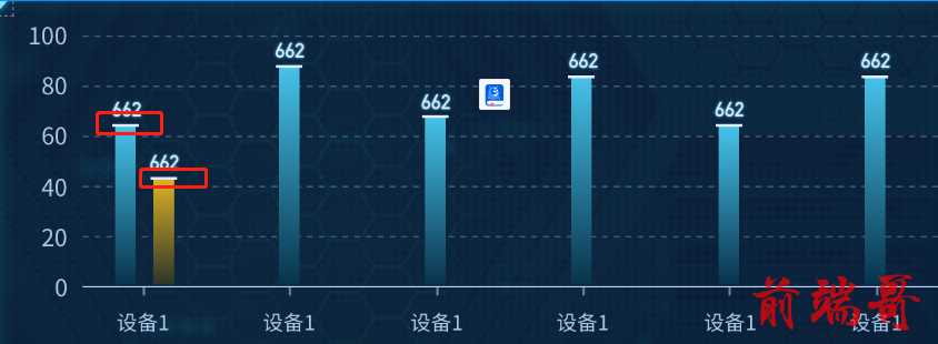
在echarts中实现下图效果,首先就想到echarts可以配置label富文本,属性rich
采用echarts中富文本标签,直接上代码
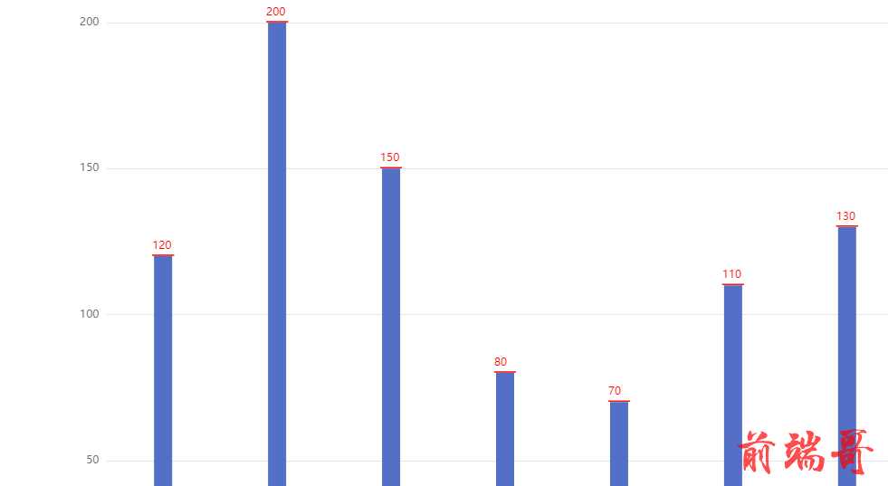
option = {
  xAxis: {
    type: 'category',
    data: ['Mon', 'Tue', 'Wed', 'Thu', 'Fri', 'Sat', 'Sun']
  },
  yAxis: {
    type: 'value'
  },
  series: [
    {
      data: [120, 200, 150, 80, 70, 110, 130],
      type: 'bar',
      barWidth: 20,
      label:{
        distance: 1,
        show:true,
        position: 'top',
        formatter: function(params){
          return '{a|'+params.value+'}'+'\n'+'{b|}'
        },
        rich:{
          a:{
            color: 'red',
            width: 20,
            padding:[0,0,4,0]
          },
          b:{
            color: 'red',
            width:24,
            height: 0,
            borderWidth:1,
            borderColor:'red'
          }
        }
      }
    }
  ]
};
因为rich中不支持设置border的上下左右分开设置,所以取巧加了空的内容仅设置border。
还有一种方式是做一个下划线的图片,通过rich中backgroundColor去设置背景图片,只不过灵活性没有这种好一些
