
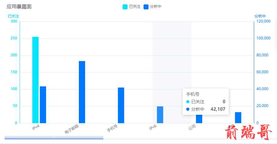
在同意坐标系中画两张纵坐标不同的柱形图,需求如下图:
根据需求设置两种不同颜色,纵坐标值不同且在统一坐标系下的柱形图代码如下:
-
html 代码:
<div ref="myChart" v-loading="loading1" class="model-l" />
-
js主要代码片段:主要是在yAxis设置成数组对象形式在其每个对象里填写我们所需要的样式,在series中设置柱形图的名称,位置,数据。
yAxis: [ { type: 'value', name: '已关注', position: 'left', nameTextStyle: { padding: [0, 0, 0, -40] // 四个数字分别为上右下左与原位置距离 }, nameGap: 10, // y轴name与横纵坐标轴线的间距 nameLocation: 'end', // y轴name处于y轴的什么位置 silent: false, clickable: true, alignTicks: true, axisLine: { show: true, lineStyle: { color: '#00E4FF' } }, axisLabel: { formatter: '{value}' } }, { type: 'value', name: '分析中', nameTextStyle: { padding: [0, -40, 0, 0] // 四个数字分别为上右下左与原位置距离 }, nameGap: 10, // y轴name与横纵坐标轴线的间距 nameLocation: 'end', // y轴name处于y轴的什么位置 position: 'right', alignTicks: true, axisLine: { show: true, lineStyle: { color: '#0079FE' } }, axisLabel: { formatter: '{value}' } } ], series: [ { name: '已关注', type: 'bar', data: this.data13, barWidth: '20', itemStyle: { normal: { color: '#00E4FF' } } }, { name: '分析中', type: 'bar', yAxisIndex: 1, data: this.data12, barWidth: '20', itemStyle: { normal: { color: '#0079FE' } } } ] }
-
在X轴底部产生滚动条,代码如下:
dataZoom: [ { type: 'slider', realtime: true, start: 0, end: 90, // 数据窗口范围的结束百分比。范围是:0 ~ 100。 height: 5, // 组件高度 left: 5, // 左边的距离 right: 5, // 右边的距离 bottom: 10, // 下边的距离 show: 0, // 是否展示 fillerColor: 'rgba(17, 100, 210, 0.42)', // 滚动条颜色 borderColor: 'rgba(17, 100, 210, 0.12)', handleSize: 0, // 两边手柄尺寸 showDetail: false, // 拖拽时是否展示滚动条两侧的文字 zoomLock: true, // 是否只平移不缩放 moveOnMouseMove: false, // 鼠标移动能触发数据窗口平移 // zoomOnMouseWheel: false, //鼠标移动能触发数据窗口缩放 // 下面是自己发现的一个问题,当点击滚动条横向拖拽拉长滚动条时,会出现文字重叠,导致效果很不好,以此用下面四个属性进行设置,当拖拽时,始终保持显示六个柱状图,可结合自己情况进行设置。添加这个属性前后的对比见**图二** startValue: 0, // 从头开始。 endValue: 5, // 最多六个 minValueSpan: 5, // 放大到最少几个 maxValueSpan: 5 // 缩小到最多几个 }, { type: 'inside', // 支持内部鼠标滚动平移 start: 0, end: 90, zoomOnMouseWheel: false, // 关闭滚轮缩放 moveOnMouseWheel: true, // 开启滚轮平移 moveOnMouseMove: true // 鼠标移动能触发数据窗口平移 } ],
-
使产生的柱形图能做到自适应,代码如下:
window.addEventListener('resize', () => { myChart.resize() })
-
其完整代码如下:
initChart() { const myChart = echarts.init(this.$refs.myChart) const option = { tooltip: { trigger: 'axis', axisPointer: { type: 'shadow' } }, title: [ { text: '接口暴露面', left: '1%', top: '0', textStyle: { fontSize: 16, fontWeight: 'normal', color: '#454458' } } ], grid: { left: '3%', right: '4%', bottom: '3%', containLabel: true }, legend: { orient: 'horizontal', right: 'center', y: '0', itemWidth: 16, // 设置图例图形的宽 itemHeight: 16, // 设置图例图形的高 textStyle: { color: '#666' // 图例文字颜色 }, // itemGap设置各个item之间的间隔,单位px,默认为10,横向布局时为水平间隔,纵向布局时为纵向间隔 itemGap: 10, data: ['已关注', '分析中'] }, xAxis: [ { type: 'category', boundaryGap: ['0%', '10%'], data: ["IPv4", "电子邮箱", "手机号", "IPv6", "公司", "护照", "地址", "余额", "经纬度", "弱密码", "身份证号码", "区域", "微信号", "脱敏地址","MAC地址"], axisLine: { show: false // 不显示坐标轴轴线 }, axisLabel: { interval: 0, rotate: 30 // 倾斜的程度 }, axisTick: { show: false, // 不显示坐标轴刻度 alignWithLabel: true } } ], yAxis: [ { type: 'value', name: '已关注', position: 'left', nameTextStyle: { padding: [0, 0, 0, -40] // 四个数字分别为上右下左与原位置距离 }, nameGap: 10, // y轴name与横纵坐标轴线的间距 nameLocation: 'end', // y轴name处于y轴的什么位置 silent: false, clickable: true, alignTicks: true, axisLine: { show: true, lineStyle: { color: '#00E4FF' } }, axisLabel: { formatter: '{value}' } }, { type: 'value', name: '分析中', nameTextStyle: { padding: [0, -40, 0, 0] // 四个数字分别为上右下左与原位置距离 }, nameGap: 10, // y轴name与横纵坐标轴线的间距 nameLocation: 'end', // y轴name处于y轴的什么位置 position: 'right', alignTicks: true, axisLine: { show: true, lineStyle: { color: '#0079FE' } }, axisLabel: { formatter: '{value}' } } ], dataZoom: [ { type: 'slider', realtime: true, start: 0, end: 90, // 数据窗口范围的结束百分比。范围是:0 ~ 100。 height: 5, // 组件高度 left: 5, // 左边的距离 right: 5, // 右边的距离 bottom: 10, // 下边的距离 show: 0, // 是否展示 fillerColor: 'rgba(17, 100, 210, 0.42)', // 滚动条颜色 borderColor: 'rgba(17, 100, 210, 0.12)', handleSize: 0, // 两边手柄尺寸 showDetail: false, // 拖拽时是否展示滚动条两侧的文字 zoomLock: true, // 是否只平移不缩放 moveOnMouseMove: false, // 鼠标移动能触发数据窗口平移 // zoomOnMouseWheel: false, //鼠标移动能触发数据窗口缩放 // 下面是自己发现的一个问题,当点击滚动条横向拖拽拉长滚动条时,会出现文字重叠,导致效果很不好,以此用下面四个属性进行设置,当拖拽时,始终保持显示六个柱状图,可结合自己情况进行设置。添加这个属性前后的对比见**图二** startValue: 0, // 从头开始。 endValue: 5, // 最多六个 minValueSpan: 5, // 放大到最少几个 maxValueSpan: 5 // 缩小到最多几个 }, { type: 'inside', // 支持内部鼠标滚动平移 start: 0, end: 90, zoomOnMouseWheel: false, // 关闭滚轮缩放 moveOnMouseWheel: true, // 开启滚轮平移 moveOnMouseMove: true // 鼠标移动能触发数据窗口平移 } ], series: [ { name: '已关注', type: 'bar', data: ["43435", "73408", "42107", "19832", "16829", "13005", "3465", "2507", "2168", "1679", "1244", "986","863", "721", "986"], barWidth: '20', itemStyle: { normal: { color: '#00E4FF' } } }, { name: '分析中', type: 'bar', yAxisIndex: 1, data: ["255", "0", "0", "0", "0", "0", "0", "0", "0", "0", "0", "0", "0", "0", "0"], barWidth: '20', itemStyle: { normal: { color: '#0079FE' } } } ] } myChart.setOption(option) window.addEventListener('resize', () => { myChart.resize() }) },

