CSS层叠样式表
三大特性
层叠性:相同的样式会覆盖
继承性:属性可向下继承
优先级:范围越小权重越高
选择器
基础选择器
标签选择器
类选择器
| .people‐first { |
| color:green; |
| } |
id选择器
| #laowang { |
| color:yello; |
| } |
通配符选择器
| * { |
| margin: 0 ; |
| padding: 0 ; |
| } |
高级选择器
后代选择器
| ul li { |
| list‐style;none; |
| } |
子选择器
| h3>a { |
| line‐height:36px; |
| } |
并集选择器
| div, |
| p { |
| font‐size:14px; |
| } |
伪类选择器
| a::hover { |
| background‐color:springgreen; |
| } |
| a::link |
| a::visited |
| a::hover |
| a::active |
| input::focus |
相邻兄弟选择器
| h1 + p { |
| margin-top:50px |
| } |
font属性
| font‐style:italic; |
| font‐weight: 400 ; |
| font‐size:16px; |
| font‐family:"Microsoft Yahei"; |
| font:italic 400 16px "Microsoft Yahei"; |
字体图标的下载与使用
text属性
| color:pink; |
| text‐align:center; |
| text‐decoration:none; |
| text‐indent:2em; |
| line‐height:26px; |
块元素
例如h p div ul li
- 独占一行
- 宽 高 内外边距 可控
- 宽度默认继承
- 主要作为容器
行内元素
例如 a strong b em
- 一行可以是多个
- 宽高无法设定
- 默认宽度为自身宽度
- 很内元素只能容纳文本或其他行内元素
注:连接标签里不能放链接
注:链接里可放块级元素,但最好把a转换成块级元素安全
行内块元素
例如 img input td
- 可以一行多个(有缝隙)
- 可以设置宽高
- 宽度为默认
- 元素显示模式转换
| display:block; |
| display:inline; |
| display:inline‐block; |
background背景
| background‐color:transparent; |
| background‐img:url(./xx); |
| background‐repeat:repeat | no‐repeat | repeat‐x | repeat‐y; |
| background‐position:center center; |
| background‐attachment:scroll | fixed; |
| background:pink url(./) no‐repeat fixed center top; |
| background‐size:500px 200px;//cover等比完全覆盖,contain等比宽高覆盖 |
精灵图的具体操作与使用
盒子模型
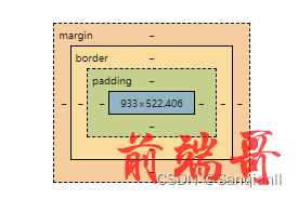
border or margin
| border‐width:5px; |
| border‐style:solid; // dashed(虚线) dotted(点线) |
| border‐color:black; |
| |
| border:5px solid black; |
| margin:0 auto;//可使盒子水平居中 |
| margin‐left:‐1px;//用于消除紧挨着的边框 |
| border-collapse |
| |
| border-collapse: collapse; |
| |
| border collapse 属性设置表格的边框是否被合并为一个单一的边框,还是象在标准的 |
HTML 中那样分开显示。
圆角边框
| border‐radius:10px; |
| border‐radius:1px 2px 3px 4px;//右上角开始 |
| border‐top‐left‐radius:...; |
盒子阴影
| box‐shadow: 10px 10px 5px ‐5px rgba(0,0,0,.3); |
水平阴影 垂直阴影 [模糊 尺寸 颜色 外部或内部]
文字阴影
| text‐shadow:10px 10px 5px rgba(0,0,0,.3); |
float浮动
浮动特性:
清除浮动
1 . 额外标签法
| <div> |
| <div>盒子</div> |
| <div class="clearfix"></div> |
| </div> |
| .clearfix { |
| clear: both; |
| } |
2 . 父级添加overflow
| <div class="clearfix"> |
| <div>盒子</div> |
| </div> |
| .clearfix { |
| overflow:hidden; |
| } |
3 . :after伪元素
| <div class="clearfix"> |
| <div>盒子</div> |
| </div> |
| .clearfix::after { |
| content: ""; |
| display: block; |
| height: 0 ; |
| clear: both; |
| visibility: hidden; |
| } |
| |
| .clearfix { |
| *zoom: 1 ; |
| } |
4 . 双伪元素清楚浮动
| <div class="clearfix"> |
| <div>盒子</div> |
| </div> |
| .clearfix:before, |
| .clearfix::after { |
| content: ""; |
| display: table; |
| } |
| |
| .clearfix::after { |
| clear: both; |
| } |
| |
| .clearfix { |
| *zoom: 1 ; |
| } |
定位
静态定位(了解)
相对定位
绝对定位
固定定位
粘性定位(了解)
边偏移
top
bottom
left
right
优先级
元素显示与隐藏
显示模式
| display:block | inline | none ; |
| 块级 行内 无 |
可视能力
| visibility:inherit | visible | hidden; |
| 继承 可视 隐藏 |
溢出部分
| overflow:visible | hidden | scroll | auto; |
| 不剪切,不加滚动条 隐藏 滚动条 自动 |
用户界面样式
鼠标样式


表单样式
文本域样式
| textarea { |
| resize:none; |
| } |
对齐方式
| vertical‐align:baseline | top | bottom | middle; |
| 基线对齐 顶线 底线 中线 |
图片采用基线对齐后,底部有白色缝隙
文字省略
单行文本溢出显示省略号必须满足三个条件
| white-space:nowrap; |
| overflow:hidden; |
| text-overflow:ellipsis; |
CSS3新增特性
选择器
属性选择器
选择具有value的input
选择value="text"的input
选择icon开头的div
选择data结尾的div
选择含有iii的div
结构伪类选择器
| :first‐child{} |
| :last‐child{} |
| :nth‐child(n){}//n可为数字 1 , 2 , 3 关键字even 偶数,odd奇数 |
| :first‐of‐type |
| :last‐of‐type |
| :nth‐of‐type(on) |
伪元素选择器
| div::before{ |
| content=""; |
| } |
| div::after{ |
| content=""; |
| } |
C3盒子模型
| box‐sizing:conten‐box;//传统盒子模型 |
| box‐sizing:border‐box;//边框不占用大小,而是挤压内容 |
滤镜
| filter:blur(5px);//进行布尔模糊 |
其他
过渡
| transition:all 1s;//所选属性 花费时间 运动曲线 何时开始 |
转换
| transform:translate(100px,‐50px);//纯移动,保留源 |
| transform:rotate(45deg);//顺时针旋转45° |
| transform:scale(2,2);//长和宽变为原来的 2 倍 |
| |
| transform:translate() rotate() scale();//简写 |
3D转换
| transform‐style:flat | preserve;//开启3D空间(默认不开启) |
| prespective:500px;//开启透视 设置透视高度 |
| |
| transform:translate3d(x,y,x);//3d移动 |
动画
| animation‐name:动画名称; |
| animation‐duration:3s;//动画时间 |
| animation‐timing‐function:ease;//运动曲线 |
| animation‐delay:5s;//五秒之后开始 |
| animation‐iteration‐count:ifinite;//重复次数 无限 |
| animation‐direction:alternate;//逆向 |
| animation‐fill‐mode:forwards;//保持 |
| |
| animation:动画名称 动画时间 [速度曲线 何时开始 播放次数 是否反向 结束状态]; |
标准viewport视口设置
| <meta name="viewport" |
| content="width=device‐width, |
| initial‐scale=1.0, |
| user‐scalable=no, |
| maximum‐scale=1.0, |
| minimum‐scale=1.0"> |
流式布局(百分)
宽度为百分比
flex布局
设置主轴方向
| flex‐direction: row; |
| row‐reverse//右到左 |
| column//上到下 |
| column‐reverse//下到上 |
设置主轴的子元素排列方式
| justify‐content:flex‐start;// 左对齐(默认) |
| flex‐end 右对齐 |
| center 居中 |
| space‐around 平均分配 |
| space‐between 先两侧贴边然后平均分 |
设置子元素是否换行
| flex‐wrap:nowrap;//不换行(默认) |
| wrap;//换行 |
设置侧轴上的子元素排列方式(单行)
| align‐items:flex‐start;// 左对齐 |
| flex‐end 右对齐 |
| center 居中 |
| stretch 拉伸(默认值) |
设置侧轴上的子元素排列方式(多行)
| align‐content:flex‐start;// 左对齐 |
| flex‐end 右对齐 |
| center 居中 |
| space‐around 平均分配 |
| space‐between 先两侧贴边然后平均分 |
| stretch 拉伸(默认值) |
flex子属性
| flex:50%; |
| align‐self:flex‐start;子项在侧轴的排列方式(了解) |
rem适配布局
em 父级字体大小
rem HTML字体大小
媒体查询
| @media screen and (min‐width:500px){ //如果屏幕大于等于500px |
| html{ |
| font‐size:14px; |
| } |
| } |
less
| @color1: skyblue; |
| @font14: 14px; |
| body{ |
| background‐color:@color1; |
| font‐size:@font14; |
| a{ |
| text‐decration:none; |
| &:hover{ |
| background‐color:@color1; |
| font‐size:14px+16; |
| } |
| } |
| } |
| @import"common"//多个less合并在一起共同生成一份css文件 |
响应式布局
Bootstrap框架


