
一直觉得自己写的不是技术,而是情怀,一个个的教程是自己这一路走来的痕迹。靠专业技能的成功是最具可复制性的,希望我的这条路能让你们少走弯路,希望我能帮你们抹去知识的蒙尘,希望我能帮你们理清知识的脉络,希望未来技术之巅上有你们也有我。
前言
学习前端必须都要学会CSS的使用,里面提供的属性非常多,最好还是一个一个用一下,下面的内容都是我把我知道的每一个属性进行使用,截图效果和代码,直接复制就能运行看到效果,然后有一些通常是结合一起使用的也会具例子,然后再通过需求一起结合使用,更快的融汇贯通
CSS样式
.view-box{ //解析1.inline-block 行级块元素 //解析2.将子项设置为 inline-block 确保水平排列 display: inline-block; flex-direction: row; /*布局方向: 确保内容水平排列 */ width: fit-content;//内容多大,宽度就多大 width: 50%;//屏幕宽度的50% width: 200upx 50%; height: 200upx; max-height: 200upx;//最大的高度不能超出200 60vh(605) background-color: aquamarine;//view的背景颜色 color: bisque;//view里面的文字颜色 font-size: 40upx;//容器里面的文字大小 line-height: 200upx;//行间距 行高 font-weight: bold;//字体粗细 text-align: center;//字体对齐方式 border-radius:100%;//设置圆角。20upx border-radius:10rpx;//设置圆角20rpx //visible就是超出的内容仍然正常被显示出来。 //hidden就是超出的内容被隐藏。 //auto是默认值,根据内容剪切或者加滚动条。 //scroll就是总加滚动条 overflow: hidden;//控制内容溢出元素框时显示的方式 border: 1upx solid #CCCCCC;//边框大小和颜色 border-bottom: 10upx solid #FEDE33;//设置底部的边框厚度和颜色 solid是线条的类型,代表实线的意思 padding: 30upx;//内边距左右上下30 //如果上下0upx 左右10upx padding: 0 10px; //如果设置上1px. 下2px 左3px 右4px(逆时针) padding: 1px 4px 2px 3px; //或者最麻烦的办法 padding-top: 0; padding-bottom: 0; padding-left: 10px; padding-right: 10px; margin: 100upx; //外边距 的下发也是一样的 margin-top: 10rpx; margin-bottom: 10rpx; margin-left: 10rpx; margin-right: 10rpx; //磨砂效果 backdrop-filter: blur(20rpx); // view 阴影 box-shadow: 0 10rpx 30rpx rgba(0,0,0,0.8); // text 阴影 text-shadow: 0 4rpx rgba(0,0,0,0.3); //零散 box-sizing: border-box;//不包含padding距离 下面专门有说该用法 filter: blur(10px);//用于给元素应用高斯模糊效果的属性 white-space: nowrap;//nowrap(超出一行不换行) pre-wrap(保持文本中的换行符) flex-shrink: 0;/* 确保子项不会收缩 */ //安全区域设置 height:env(safe-area-inset-bottom);//盒子高度是安全区域的高度 padding-bottom:env(safe-area-inset-bottom);//底部外边距 安全区域 padding-bottom:calc(env(safe-area-inset-bottom) + 50rpx); //超出一行,内容省略 ... overflow: hidden;//控制内容溢出元素框时显示的方式 white-space: nowrap; //不能换行 text-overflow: ellipsis; //显示省略号... overflow-x: auto; /* 启用横向滚动 */ //缩放0.8。 以左边上边作为参考 transform: scale(0.8); transform-origin: left top; } //待总结 position: relative; position: absolute; bottom: 44rpx; left: 50%; letter-spacing: 6rpx; z-index: 1; .mask-view { position: fixed; top: 0; left: 0; width: 100%; height: 100%; background-color: rgba(0, 0, 0, 0.5); /* 黑色半透明背景 */ display: flex; justify-content: center; align-items: center; z-index: 99999; /* 确保模态框在最上层 */ }
Demol列表调试用到
例子一
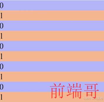
<template> <view> <view v-for="(item,index) in 10"> <!-- 通过%运算符求余数,实现隔行换色的效果 --> <view :class="'list-' + index%2">{{index%2}}</view> </view> </view> </template> <script> export default { data() { return { } } } </script> <style> .list-0{ background-color: #aaaaff; } .list-1{ background-color: #ffaa7f; } </style>
例子二
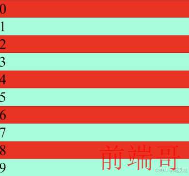
<template> <view> <view v-for="(item, index) in 10" :key="index" class="list-item"> {{ index }} </view> </view> </template> <script> export default { data() { return {} } } </script> <style> .list-item { background-color: red; } .list-item:nth-child(2n) { background-color: aquamarine; } </style>
封装颜色
定义scss颜色变量deep()修改子组件css样式
注意:新定义的颜色,是预编译的,一定要重新启动项目才能生效
创建一个颜色封装的文件+导入使用

base-style.css
$brand-theme-color:#28B389; //品牌主体红色 $border-color:#e0e0e0; //边框颜色 $border-color-light:#efefef; //边框亮色 $text-font-color-1:#000; //文字主色 $text-font-color-2:#676767; //副标题颜色 $text-font-color-3:#a7a7a7; //浅色 $text-font-color-4:#e4e4e4; //更浅
导入
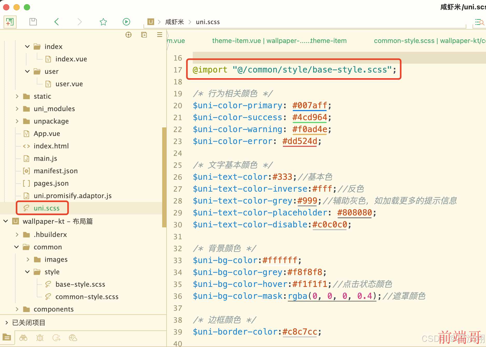
@import "@/common/style/base-style.scss";
必须要重新启动项目才生效
使用
CSS的使用,修改颜色

修改图标的颜色

:deep(){ }是: 穿透的意思
!important. 加大权重
:deep(){ .uni-icons{ color:$brand-theme-color !important; } }
CSS属性
display 显示方式
display: block;
特点:
占据整行,自动换行
每一个块会自己独占一行,也就是每一个块元素会占据整行
会不会自动换行,有待确认,我认为会,GBT说不会
block是一个块元素,块元素需要占据整个屏幕的宽度,也就是当有一个块需要占据整个屏幕的宽度就需要用到block,并在其前后添加换行符

<template> <view class="content"> <view class="inline-item">A</view> <view class="inline-item">B</view> <view class="inline-item">C</view> <view class="inline-item">D</view> <view class="inline-item">E</view> <view class="inline-item">F</view> <view class="inline-item">G</view> <view class="inline-item">A</view> <view class="inline-item">B</view> <view class="inline-item">C</view> <view class="inline-item">D</view> <view class="inline-item">E</view> <view class="inline-item">F</view> <view class="inline-item">G</view> </view> </template> <script> export default { data() { return { title: 'Hello' } }, onLoad() { }, methods: { } } </script> <style> .content { width: 150px; /* 设置一个较窄的容器宽度 */ height: 100px; background-color: lightgray; } .inline-item { display: block; /* 行内元素 */ padding: 10px; background-color: lightblue; margin: 5px; width: 25px; height: 25px; } </style>
display: inline;
特点:
最多占据父类宽度,不换行
inline 行内元素, 不会换行,子元素超出父类容器不会换行
inline: 元素会显示为行内元素,只占据其内容所需的宽度,不会换行

<template> <view class="content"> <view class="inline-item">A</view> <view class="inline-item">B</view> <view class="inline-item">C</view> <view class="inline-item">D</view> <view class="inline-item">E</view> <view class="inline-item">F</view> <view class="inline-item">G</view> </view> </template> <script> </script> <style> .content { width: 150px; /* 设置一个较窄的容器宽度 */ height: 100px; background-color: lightgray; } .inline-item { display: inline; /* 行内元素 */ padding: 10px; background-color: lightblue; margin: 5px; } </style>
display: inline-block;
特点:
排列在一行内,自动换行,可以设置宽高,可以设置padding, margin
GBT解析
结合了 inline 和 block 的特性。它的行为特点如下:
行内显示: 元素会像 inline 元素一样排列在同一行内,不会强制换行。如果一行的空间不足以容纳所有的 inline-block 元素,它们会自动换行到下一行。
块级特性: 元素可以设置宽度和高度,并且可以在元素周围添加边距(margin)和填充(padding),类似于 block 元素。这样,你可以控制元素的尺寸和布局,同时保持行内排列的特性。

<template> <view class="container"> <view class="inline-block-item">项1</view> <view class="inline-block-item">项2</view> <view class="inline-block-item">项3</view> <view class="inline-block-item">项4</view> <view class="inline-block-item">项5</view> <view class="inline-block-item">项6</view> <view class="inline-block-item">项7</view> <view class="inline-block-item">项8</view> <view class="inline-block-item">项9</view> <view class="inline-block-item">项10</view> </view> </template> <script> </script> <style> .container { width: 300px; /* 设置容器宽度 */ background-color: lightgray; } .inline-block-item { display: inline-block; /* 行内块级元素 */ width: 100px; height: 50px; background-color: lightcoral; margin: 5px; text-align: center; line-height: 50px; /* 垂直居中内容 */ } </style>
display: flex;

<template> <view class="content"> <view class="flex-item">弹性项1</view> <view class="flex-item">弹性项2</view> <view class="flex-item">弹性项3</view> </view> </template> <script> export default { data() { return { title: 'hello' } }, onLoad() { }, methods: { } } </script> <style> .content { display: flex; /* 修改为 flex */ flex-direction: row; /* 横向排列项 */ justify-content: space-between; /* 分散对齐 */ } .flex-item { width: 100px; height: 50px; background-color: lightgoldenrodyellow; } </style>
flex-direction: row; 布局方向
一般结合display: flex;使用,子元素的主轴方向
GBT解析:
在 Uni-app 的开发中,flex-direction 属性用于定义主轴的方向,从而控制子元素的排列方向。它有四个值:row(默认值,水平排列)、row-reverse(水平反向排列)、column(垂直排列)、column-reverse(垂直反向排列)。
justify-content (主轴方向)
常用: center(中心对齐) space-between(贴边均匀分布) space-around(均匀分布)
justify-content属性定义了项目在主轴上的对齐方式。
.box { justify-content: flex-start | flex-end | center | space-between | space-around; }

它可能取5个值,具体对齐方式与轴的方向有关。下面假设主轴为从左到右。
flex-start(默认值):左对齐
flex-end:右对齐
center: 居中
space-between:两端对齐,项目之间的间隔都相等。
space-around:每个项目两侧的间隔相等。所以,项目之间的间隔比项目与边框的间隔大一倍。
align-items (交叉轴-单行)
常用: center(中心对齐)
align-items属性定义项目在交叉轴上如何对齐。
.box { align-items: flex-start | flex-end | center | baseline | stretch; }

它可能取5个值。具体的对齐方式与交叉轴的方向有关,下面假设交叉轴从上到下。
flex-start:交叉轴的起点对齐。
flex-end:交叉轴的终点对齐。
center:交叉轴的中点对齐。
baseline: 项目的第一行文字的基线对齐。
stretch(默认值):如果项目未设置高度或设为auto,将占满整个容器的高度。
align-content (交叉轴-多行)
侧轴有多行的,uni-app开发比较少用,都是单行的约束控件比较多
align-content属性定义了多根轴线的对齐方式。如果项目只有一根轴线,该属性不起作用。
.box { align-content: flex-start | flex-end | center | space-between | space-around | stretch; }

flex-start:与交叉轴的起点对齐。
flex-end:与交叉轴的终点对齐。
center:与交叉轴的中点对齐。
space-between:与交叉轴两端对齐,轴线之间的间隔平均分布。
space-around:每根轴线两侧的间隔都相等。所以,轴线之间的间隔比轴线与边框的间隔大一倍。
stretch(默认值):轴线占满整个交叉轴。
column 竖轴

<template> <view class="container"> <view class="item">Item 1</view> <view class="item">Item 2</view> <view class="item">Item 3</view> </view> </template> <script> </script> <style> .container { display: flex; flex-direction: column; /* 改为 row 或 row-reverse、column-reverse 进行不同排列效果的测试 */ background-color: lightgray; padding: 10px; } .item { background-color: lightblue; margin: 5px; padding: 10px; text-align: center; } </style>
row 横轴

<template> <view class="container"> <view class="item">Item 1</view> <view class="item">Item 2</view> <view class="item">Item 3</view> </view> </template> <script> </script> <style> .container { display: flex; flex-direction: row; /* 子元素将水平排列 */ background-color: lightgray; padding: 10px; } .item { background-color: lightblue; margin: 5px; padding: 10px; text-align: center; } </style>
flex-wrap 是否允许换行
nowrap:默认值,所有 flex 项目都在同一行上,不换行。
wrap:允许项目换行。如果需要,项目会换行到多行。
wrap-reverse:允许项目换行,但换行的方向与 wrap 相反
nowrap 不允许换行

<template> <view class="content"> <view class="item">1</view> <view class="item">2</view> <view class="item">3</view> <view class="item">4</view> <view class="item">5</view> <view class="item">6</view> </view> </template> <script> </script> <style> .content { display: flex; flex-wrap: wrap; /* 允许换行 */ background-color: lightgray; } .item { width: 100px; height: 100px; background-color: lightblue; margin: 5px; display: flex; justify-content: center; align-items: center; } </style>
wrap 允许换行

<template> <view class="content"> <view class="item">1</view> <view class="item">2</view> <view class="item">3</view> <view class="item">4</view> <view class="item">5</view> <view class="item">6</view> </view> </template> <script> </script> <style> .content { display: flex; flex-wrap: nowrap; /* 允许换行 */ background-color: lightgray; } .item { width: 100px; height: 100px; background-color: lightblue; margin: 5px; display: flex; justify-content: center; align-items: center; } </style>
wrap-reverse 允许换行 - 反方向

<template> <view class="content"> <view class="item">1</view> <view class="item">2</view> <view class="item">3</view> <view class="item">4</view> <view class="item">5</view> <view class="item">6</view> </view> </template> <script> </script> <style> .content { display: flex; flex-wrap: wrap-reverse; /* 允许换行 */ background-color: lightgray; } .item { width: 100px; height: 100px; background-color: lightblue; margin: 5px; display: flex; justify-content: center; align-items: center; } </style>
flex-flow 布局方向和是否换行缩写
flex-flow: row nowrap; 横向 不允许换行

<template> <view class="content"> <view class="item">1</view> <view class="item">2</view> <view class="item">3</view> <view class="item">4</view> <view class="item">5</view> <view class="item">6</view> </view> </template> <script> </script> <style> .content { display: flex; flex-flow: row nowrap; background-color: lightgray; } .item { width: 100px; height: 100px; background-color: coral; margin: 5px; } </style>
flex-flow: row wrap; 横向 允许换行

<template> <view class="content"> <view class="item">1</view> <view class="item">2</view> <view class="item">3</view> <view class="item">4</view> <view class="item">5</view> <view class="item">6</view> </view> </template> <script> </script> <style> .content { display: flex; flex-flow: row wrap; background-color: lightgray; } .item { width: 100px; height: 100px; background-color: coral; margin: 5px; } </style>
flex-flow: column nowrap; 竖向 不允许换行
其实没什么用,因为可以滑动

<template> <view class="content"> <view class="item">1</view> <view class="item">2</view> <view class="item">3</view> <view class="item">4</view> <view class="item">5</view> <view class="item">6</view> </view> </template> <script> </script> <style> .content { display: flex; flex-flow: column nowrap; background-color: lightgray; } .item { width: 100px; height: 100px; background-color: coral; margin: 5px; } </style>
flex-flow: column wrap; 竖向 允许换行
其实没什么用,因为可以滑动
<template> <view class="content"> <view class="item">1</view> <view class="item">2</view> <view class="item">3</view> <view class="item">4</view> <view class="item">5</view> <view class="item">6</view> <view class="item">8</view> <view class="item">9</view> <view class="item">10</view> <view class="item">11</view> <view class="item">12</view> <view class="item">13</view> </view> </template> <script> </script> <style> .content { display: flex; flex-flow: column wrap; background-color: lightgray; } .item { width: 100px; height: 100px; background-color: coral; margin: 5px; } </style>
flex-shrink 控制子容器的缩小比例
当自容器的宽度大于父容器宽度的时候是否允许缩小
flex-shrink: 1:表示项目可以缩小,默认值为 1。
flex-shrink: 0:表示项目不缩小。
flex-shrink: 2:表示项目缩小的比例是其他项目的两倍。

<template> <view class="container"> <view class="item item1">Item 1</view> <view class="item item2">Item 2</view> <view class="item item3">Item 3</view> </view> </template> <script> </script> <style> .container { display: flex; background-color: lightgray; width: 250px; /* 容器宽度设置为较小的固定值 */ height: 200px; overflow: hidden; /* 确保容器内容溢出部分不可见 */ } .item { background-color: lightblue; margin: 5px; color: white; text-align: center; line-height: 200px; /* Center text vertically */ width: 150px; /* 子元素宽度设置为大于容器宽度的总和 */ } .item1 { flex-shrink: 1; /* 默认值,项目会缩小 */ } .item2 { flex-shrink: 0; /* 项目不会缩小 */ } .item3 { flex-shrink: 2; /* 项目缩小的比例是 item1 的两倍 */ } </style>
width
width: 300rpx;
width: 50%;

<template> <view class="container"> <view class="content"> <!-- 内容 --> </view> </view> </template> <script> </script> <style> .container { background-color: lightblue; /* 为了更好地展示效果 */ } .content { width: 50%; /* 宽度为父容器宽度的50% */ height: 30rpx; background-color: lightgray; padding-top: 100rpx; } </style>
width: auto;
使元素的宽度自适应内容。也就是说,元素的宽度会根据其内容的实际宽度进行调整,而不是固定一个值或按父容器的百分比设置。

<template> <view class="container"> <view class="content"> 1111111111111111111111111111111111111111111111 </view> </view> </template> <script> </script> <style> .container { background-color: rebeccapurple; /* 为了更好地展示效果 */ padding: 100rpx 0rpx; width: 500rpx; } .content { width: auto; /* 宽度自适应内容 */ background-color: lightgray; } </style>
width: fit-content;
也是一种有效的设置宽度的方式。这种设置方式会使元素的宽度适应其内容的宽度,但不会超过其父容器的宽度

<template> <view class="container"> <view class="content"> <!-- 内容 --> 这是一段示例内容,用于展示 fit-content 的效果。 </view> </view> </template> <script> </script> <style> .container { background-color: lightblue; /* 为了更好地展示效果 */ padding: 20px; } .content { width: fit-content; /* 宽度自适应内容 */ background-color: lightgray; } </style>
min-height
max-height: 200upx;
max-height
max-height: 200upx;
 s
s
<template> <view class="content"> <view class="box">一直觉得自己写的不是技术,而是情怀,一个个的教程是自己这一路走来的痕迹。靠专业技能的成功是最具可复制性的,希望我的这条路能让你们少走弯路,希望我能帮你们抹去知识的蒙尘,希望我能帮你们理清知识的脉络,希望未来技术之巅上有你们也有我。</view> </view> </template> <script> </script> <style> .content { background-color: lightgray; padding: 20upx; } .box { background-color: white; max-height: 200upx; /* 设置最大高度 */ overflow: auto; /* 如果内容超过最大高度,显示滚动条 */ padding: 10upx; } </style>
box-sizing: border-box;
ChatGBT解析
不加 box-sizing: border-box; 会增加总大小
width 和 height 属性只应用于元素的内容。任何添加的 padding 和 border 都会增加元素的总大小。
例如,如果设置了 width: 100px;,然后又添加了 padding: 10px; 和 border: 5px;,元素的实际宽度将是 100px (内容宽度) + 20px (左右填充) + 10px (左右边框),总共 130px。
加上 box-sizing: border-box; 不会增加总大小
width 和 height 包括元素的内容、内边距 (padding) 和边框 (border)。
例如,如果设置了 width: 100px;,并添加了 padding: 10px; 和 border: 5px;,元素的内容宽度会自动调整,使元素的总宽度仍然为 100px,其中包含内容、内边距和边框。
需求
做一个下面样子的层次关系的嵌套view

加 - box-sizing出来的效果

<template> <view class="home-bg"> <view class="home-category-bg"> <!-- 使用 v-for 循环遍历颜色数组,给每个 item 设置不同的背景颜色 --> <template v-for="(color, index) in colors" :key="index"> <view class="item" :style="{ backgroundColor: color }"></view> </template> </view> </view> </template> <script setup> import { ref } from "vue"; // 生成随机颜色的函数 function getRandomColor() { return "#" + Math.floor(Math.random() * 16777215).toString(16).padStart(6, '0'); } // 生成一个包含 9 个随机颜色的数组 const colors = ref(Array.from({ length: 8 }, getRandomColor)); </script> <style lang="scss" scoped> .home-bg { margin: 300rpx 20rpx 0rpx 20rpx; padding-top: 100rpx; box-sizing: border-box; background-color: #EEE; height: 400rpx; .home-category-bg { background-color: #CCC; width: 100%; height: 300rpx; display: flex; flex-wrap: wrap; justify-content: space-between; .item { width: 177.5rpx; height: 150rpx; } } } </style>
不加 - box-sizing出来的效果

<template> <view class="home-bg"> <view class="home-category-bg"> <!-- 使用 v-for 循环遍历颜色数组,给每个 item 设置不同的背景颜色 --> <template v-for="(color, index) in colors" :key="index"> <view class="item" :style="{ backgroundColor: color }"></view> </template> </view> </view> </template> <script setup> import { ref } from "vue"; // 生成随机颜色的函数 function getRandomColor() { return "#" + Math.floor(Math.random() * 16777215).toString(16).padStart(6, '0'); } // 生成一个包含 9 个随机颜色的数组 const colors = ref(Array.from({ length: 8 }, getRandomColor)); </script> <style lang="scss" scoped> .home-bg { margin: 300rpx 20rpx 0rpx 20rpx; padding-top: 100rpx; // box-sizing: border-box; background-color: #EEE; height: 400rpx; .home-category-bg { background-color: #CCC; width: 100%; height: 300rpx; display: flex; flex-wrap: wrap; justify-content: space-between; .item { width: 177.5rpx; height: 150rpx; } } } </style>
line-height
line-height: 30px; 设置行高


<template> <view class="content"> <text class="text-item">一直觉得自己写的不是技术,而是情怀,一个个的教程是自己这一路走来的痕迹。靠专业技能的成功是最具可复制性的,希望我的这条路能让你们少走弯路,希望我能帮你们抹去知识的蒙尘,希望我能帮你们理清知识的脉络,希望未来技术之巅上有你们也有我</text> <text class="text-item">第二行文本</text> <text class="text-item">第三行文本</text> </view> </template> <script> </script> <style> .content { background-color: lightgray; padding: 20px; } .text-item { font-size: 16px; line-height: 30px; /* 设置行高 */ color: black; } </style>
background-color

<template> <view class="container"> <view class="content content-name">颜色名称: lightgray</view> <view class="content content-hex">十六进制颜色值: #D3D3D3</view> <view class="content content-rgb">RGB 颜色值: rgb(211, 211, 211)</view> <view class="content content-rgba">RGBA 颜色值: rgba(211, 211, 211, 1)</view> <view class="content content-hsl">HSL 颜色值: hsl(0, 0%, 83%)</view> <view class="content content-hsla">HSLA 颜色值: hsla(0, 0%, 83%, 1)</view> </view> </template> <script> // 这里可以写 JavaScript 代码 </script> <style> /* 外部容器 */ .container { padding: 20px; /* 给容器添加内边距 */ } /* 内容区域 */ .content { margin-bottom: 10px; /* 每个内容块之间的间距 */ padding: 20px; /* 内容块内边距 */ border-radius: 8px; /* 圆角边框 */ color: #333; /* 文字颜色 */ font-size: 16px; /* 字体大小 */ } /* 使用颜色名称 */ .content-name { background-color: yellowgreen; } /* 使用十六进制颜色值 */ .content-hex { background-color: #D313D3; } /* 使用 RGB 颜色值 */ .content-rgb { background-color: rgb(11, 211, 211); } /* 使用 RGBA 颜色值 */ .content-rgba { background-color: rgba(211, 11, 31, 1); } /* 使用 HSL 颜色值 */ .content-hsl { background-color: hsl(12, 12%, 83%); } /* 使用 HSLA 颜色值 */ .content-hsla { background-color: hsla(0, 0%, 83%, 1); } </style>
color
颜色名称: 使用预定义的颜色名称。
十六进制值: 使用 #RRGGBB 或 #RRGGBBAA 格式。
RGB: 使用 rgb(R, G, B) 格式,其中 R、G 和 B 是 0 到 255 之间的整数。
RGBA: 使用 rgba(R, G, B, A) 格式,其中 A 是从 0 到 1 之间的透明度值。
HSL: 使用 hsl(H, S%, L%) 格式,其中 H 是色相角度,S 是饱和度百分比,L 是亮度百分比。
HSLA: 使用 hsla(H, S%, L%, A) 格式,其中 A 是透明度值。

<template> <view class="content"> <text class="color-name">颜色名称</text> <text class="color-hex">十六进制值</text> <text class="color-rgb">RGB 值</text> <text class="color-rgba">RGBA 值</text> <text class="color-hsl">HSL 值</text> <text class="color-hsla">HSLA 值</text> </view> </template> <script> </script> <style> .content { background-color: lightgray; padding: 20px; display: flex; flex-direction: column; justify-content: center; align-items: center; } .color-name { color: red; /* 颜色名称 */ } .color-hex { color: #621Fa0; /* 十六进制值 */ } .color-rgb { color: rgb(0, 0, 255); /* RGB 值 */ } .color-rgba { color: rgba(255, 255, 0, 0.5); /* RGBA 值 */ } .color-hsl { color: hsl(120, 100%, 50%); /* HSL 值 */ } .color-hsla { color: hsla(240, 100%, 50%, 0.3); /* HSLA 值 */ } </style>
font-size 文本大小

<template> <view class="content"> <text class="text-px">字体大小:20px</text> <text class="text-em">字体大小:1.5em</text> <text class="text-rem">字体大小:1rem</text> <text class="text-percent">字体大小:150%</text> </view> </template> <script> // 在这里可以添加 JavaScript 代码 </script> <style> .content { background-color: lightgray; padding: 20px; display: flex; flex-direction: column; justify-content: center; align-items: center; } .text-px { font-size: 20px; /* 使用像素作为单位 */ } .text-em { font-size: 1.5em; /* 使用相对单位 em,1em 为当前字体大小的倍数 */ } .text-rem { font-size: 1rem; /* 使用相对单位 rem,1rem 为根元素字体大小的倍数 */ } .text-percent { font-size: 150%; /* 使用百分比,相对于父元素的字体大小 */ } </style>
font-weight
文字粗体

<template> <view class="content"> <text class="normal-text">正常字体</text> <text class="bold-text">粗体字体</text> <text class="bolder-text">比父元素更粗的字体</text> <text class="lighter-text">比父元素更细的字体</text> <text class="numeric-text">数值字体(700)</text> </view> </template> <script> </script> <style> .content { background-color: lightgray; padding: 20px; line-height: 60rpx; display: flex; flex-direction: column; justify-content: center; align-items: center; } .normal-text { font-weight: normal; } .bold-text { font-weight: bold; } .bolder-text { font-weight: bolder; } .lighter-text { font-weight: lighter; } .numeric-text { font-weight: 700; } </style>
text-align 文字对齐方式
text-align: center;
text-align: left;
text-align: right;

<template> <view class="content"> <text class="centered-text">这是居中的文本</text> <text class="left-aligned-text">这是左对齐的文本</text> <text class="right-aligned-text">这是右对齐的文本</text> </view> </template> <script> </script> <style> .content { background-color: lightgray; padding: 20px; display: flex; flex-direction: column; justify-content: center; align-items: center; } .centered-text { width: 100%; text-align: center; } .left-aligned-text { width: 100%; text-align: left; } .right-aligned-text { width: 100%; text-align: right; } </style>
border 边框


<template> <view class="container"> <view class="content basic-border"> 基本边框设置 </view> <view class="content top-border"> 上边框 </view> <view class="content right-border"> 右边框 </view> <view class="content bottom-border"> 下边框 </view> <view class="content left-border"> 左边框 </view> <view class="content combined-border"> 组合边框 </view> <view class="content rounded-border"> 圆角边框 </view> </view> </template> <script> </script> <style> .container { padding: 20px; } .content { margin-bottom: 20px; padding: 10px; background-color: lightgray; text-align: center; } .basic-border { border: 2px solid black; /* 边框宽度为 2px,实线,黑色 */ } .top-border { border-top: 3px dashed red; /* 上边框宽度为 3px,虚线,红色 */ } .right-border { border-right: 4px dotted blue; /* 右边框宽度为 4px,点线,蓝色 */ } .bottom-border { border-bottom: 5px double green; /* 下边框宽度为 5px,双线,绿色 */ } .left-border { border-left: 1px groove purple; /* 左边框宽度为 1px,凹槽线,紫色 */ } .combined-border { border-width: 1px 2px 3px 4px; /* 上右下左边框宽度分别为 1px, 2px, 3px, 4px */ border-style: solid dashed dotted double; /* 上右下左边框样式分别为 实线, 虚线, 点线, 双线 */ border-color: red green blue yellow; /* 上右下左边框颜色分别为 红色, 绿色, 蓝色, 黄色 */ } .rounded-border { border: 2px solid black; border-radius: 10px; /* 边框圆角半径为 10px */ } </style
border 四周边框

<template> <view class="container"> <view class="content basic-border"> 基本边框设置 </view> </view> </template> <script> </script> <style> .container { padding: 20px; } .content { margin-bottom: 20px; padding: 10px; background-color: lightgray; text-align: center; } .basic-border { border: 2px solid black; /* 边框宽度为 2px,实线,黑色 */ } </style>
border-top 顶部边框

<template> <view class="container"> <view class="content top-border"> 上边框 </view> </view> </template> <script> </script> <style> .container { padding: 20px; } .content { margin-bottom: 20px; padding: 10px; background-color: lightgray; text-align: center; } .top-border { border-top: 3px dashed red; /* 上边框宽度为 3px,虚线,红色 */ } </style>
border-right 右边边框

<template> <view class="container"> <view class="content right-border"> 右边框 </view> </view> </template> <script> </script> <style> .container { padding: 20px; } .content { margin-bottom: 20px; padding: 10px; background-color: lightgray; text-align: center; } .right-border { border-right: 4px dotted blue; /* 右边框宽度为 4px,点线,蓝色 */ } </style>
border-bottom 底部边框

<template> <view class="container"> <view class="content bottom-border"> 下边框 </view> </view> </template> <script> </script> <style> .container { padding: 20px; } .content { margin-bottom: 20px; padding: 10px; background-color: lightgray; text-align: center; } .bottom-border { border-bottom: 5px double green; /* 下边框宽度为 5px,双线,绿色 */ } </style>
border-left 左边边框

<template> <view class="container"> <view class="content left-border"> 左边框 </view> </view> </template> <script> </script> <style> .container { padding: 20px; } .content { margin-bottom: 20px; padding: 10px; background-color: lightgray; text-align: center; } .left-border { border-left: 1px groove purple; /* 左边框宽度为 1px,凹槽线,紫色 */ } </style>
border-width 边框宽度

<template> <view class="container"> <view class="content combined-border"> 组合边框 </view> </view> </template> <script> </script> <style> .container { padding: 20px; } .content { margin-bottom: 20px; padding: 10px; background-color: lightgray; text-align: center; } .combined-border { border-width: 1px 2px 3px 4px; /* 上右下左边框宽度分别为 1px, 2px, 3px, 4px */ border-style: solid dashed dotted double; /* 上右下左边框样式分别为 实线, 虚线, 点线, 双线 */ border-color: red green blue yellow; /* 上右下左边框颜色分别为 红色, 绿色, 蓝色, 黄色 */ } </style>
border-style 边框样式
<template> <view class="container"> <view class="content combined-border"> 组合边框 </view> </view> </template> <script> </script> <style> .container { padding: 20px; } .content { margin-bottom: 20px; padding: 10px; background-color: lightgray; text-align: center; } .combined-border { border-width: 1px 2px 3px 4px; /* 上右下左边框宽度分别为 1px, 2px, 3px, 4px */ border-style: solid dashed dotted double; /* 上右下左边框样式分别为 实线, 虚线, 点线, 双线 */ border-color: red green blue yellow; /* 上右下左边框颜色分别为 红色, 绿色, 蓝色, 黄色 */ } </style>
border-color 边框颜色
<template> <view class="container"> <view class="content combined-border"> 组合边框 </view> </view> </template> <script> </script> <style> .container { padding: 20px; } .content { margin-bottom: 20px; padding: 10px; background-color: lightgray; text-align: center; } .combined-border { border-width: 1px 2px 3px 4px; /* 上右下左边框宽度分别为 1px, 2px, 3px, 4px */ border-style: solid dashed dotted double; /* 上右下左边框样式分别为 实线, 虚线, 点线, 双线 */ border-color: red green blue yellow; /* 上右下左边框颜色分别为 红色, 绿色, 蓝色, 黄色 */ } </style>
border-radius 圆角
border-radius: 15px;

border-radius: 100%;

<template> <view class="content"> <view class="item"> </view> </view> </template> <script> </script> <style> .content { display: flex; justify-content: center; align-items: center; background-color: white; padding: 20px; width: 100%; height: 100%; } .item { background-color: aquamarine; width: 200px; height: 200px; border-radius: 100%; } </style>
border-radius: 10px 20px 30px 40px;

<template> <view class="content"> <view class="item"> </view> </view> </template> <script> </script> <style> .content { display: flex; justify-content: center; align-items: center; background-color: white; padding: 20px; width: 100%; height: 100%; } .item { background-color: aquamarine; width: 200px; height: 200px; border-radius: 10px 20px 30px 40px; } </style>
padding 内边距

<template> <view class="container"> <view class="content padding-all">Padding All</view> <view class="content padding-top-right-bottom-left">Padding Top Right Bottom Left</view> <view class="content padding-vertical-horizontal">Padding Vertical Horizontal</view> <view class="content padding-custom">Padding Custom</view> </view> </template> <script> </script> <style> .container { padding: 20px; } .content { margin-bottom: 20px; background-color: lightgray; color: black; text-align: center; } /* Padding: All sides the same */ .padding-all { padding: 10px; } /* Padding: Top, Right, Bottom, Left different values */ .padding-top-right-bottom-left { padding: 10px 20px 30px 40px; } /* Padding: Vertical same, Horizontal same */ .padding-vertical-horizontal { padding: 10px 20px; } /* Padding: Custom values for each side */ .padding-custom { padding-top: 10px; padding-right: 20px; padding-bottom: 30px; padding-left: 40px; } </style>
margin 外边距

<template> <view class="container"> <view class="content">所有边距相同</view> <view class="content-vertical-horizontal">垂直方向边距相同,水平方向边距相同</view> <view class="content-top-right-bottom">上边距,左右边距,下边距</view> <view class="content-all-sides">上边距,右边距,下边距,左边距</view> </view> </template> <script> </script> <style> .container { padding: 20px; /* 容器内边距 */ } /* 所有边距相同 */ .content { background-color: lightgray; border: 1px solid black; margin: 20px; padding: 10px; } /* 垂直方向边距相同,水平方向边距相同 */ .content-vertical-horizontal { background-color: lightblue; border: 1px solid black; margin: 10px 15px; padding: 10px; } /* 上边距,左右边距,下边距 */ .content-top-right-bottom { background-color: lightgreen; border: 1px solid black; margin: 5px 10px 15px; padding: 10px; } /* 上边距,右边距,下边距,左边距 */ .content-all-sides { background-color: lightcoral; border: 1px solid black; margin: 5px 10px 15px 20px; padding: 10px; } </style>
box-shadow 阴影
box-shadow: h-offset v-offset blur spread color inset;
h-offset 是阴影的水平偏移量。
v-offset 是阴影的垂直偏移量。
blur 是模糊半径,决定阴影的模糊程度。
spread 是阴影的扩展半径,决定阴影的大小。
color 是阴影的颜色。
inset 是可选的,将阴影设置为内阴影。
box-shadow: 5px 5px 10px gray;

<template> <view class="container"> <view class="content"> 测试阴影效果 </view> </view> </template> <script> </script> <style> .container { width: 100%; height: 100%; display: flex; justify-content: center; align-items: center; } .content { background-color: lightgray; width: 200px; height: 200px; display: flex; justify-content: center; align-items: center; text-align: center; font-size: 16px; color: black; /* 基本阴影 */ box-shadow: 5px 5px 10px gray; } </style>
box-shadow: 5px 5px 10px 5px gray;

<template> <view class="container"> <view class="content"> 测试阴影效果 </view> </view> </template> <script> </script> <style> .container { width: 100%; height: 100%; display: flex; justify-content: center; align-items: center; } .content { background-color: lightgray; width: 200px; height: 200px; display: flex; justify-content: center; align-items: center; text-align: center; font-size: 16px; color: black; /* 带扩展半径的阴影 */ box-shadow: 5px 5px 10px 5px gray; } </style>
box-shadow: 5px 5px 10px 5px rgba(0, 0, 0, 0.5);

<template> <view class="container"> <view class="content"> 测试阴影效果 </view> </view> </template> <script> </script> <style> .container { width: 100%; height: 100%; display: flex; justify-content: center; align-items: center; } .content { background-color: lightgray; width: 200px; height: 200px; display: flex; justify-content: center; align-items: center; text-align: center; font-size: 16px; color: black; /* 带颜色的阴影 */ box-shadow: 5px 5px 10px 5px rgba(0, 0, 0, 0.5); } </style>

box-shadow: inset 5px 5px 10px gray;
<template> <view class="container"> <view class="content"> 测试阴影效果 </view> </view> </template> <script> </script> <style> .container { width: 100%; height: 100%; display: flex; justify-content: center; align-items: center; } .content { background-color: lightgray; width: 200px; height: 200px; display: flex; justify-content: center; align-items: center; text-align: center; font-size: 16px; color: black; /* 带内阴影的阴影 */ box-shadow: inset 5px 5px 10px gray; } </style>
box-shadow: 5px 5px 15px 3px rgba(0, 0, 0, 0.4);

<template> <view class="container"> <view class="content"> 测试阴影效果 </view> </view> </template> <script> </script> <style> .container { width: 100%; height: 100%; display: flex; justify-content: center; align-items: center; } .content { background-color: lightgray; width: 200px; height: 200px; display: flex; justify-content: center; align-items: center; text-align: center; font-size: 16px; color: black; /* 综合效果 */ box-shadow: 5px 5px 15px 3px rgba(0, 0, 0, 0.4); } </style>
box-shadow: 10px 10px 30px rgba(0, 0, 0, 0.2), 20px 20px 50px rgba(0, 0, 0, 0.2);

<template> <view class="container"> <view class="content"> 测试阴影效果 </view> </view> </template> <script> </script> <style> .container { width: 100%; height: 100%; display: flex; justify-content: center; align-items: center; } .content { background-color: lightgray; width: 200px; height: 200px; display: flex; justify-content: center; align-items: center; text-align: center; font-size: 16px; color: black; /* 多重阴影 */ box-shadow: 10px 10px 30px rgba(0, 0, 0, 0.2), 20px 20px 50px rgba(0, 0, 0, 0.2); } </style>
text-shadow 文本阴影

<template> <view class="content"> <text class="shadow-text">这是带阴影的文本</text> </view> </template> <script> </script> <style> .content { background-color: white; display: flex; justify-content: center; align-items: center; height: 100vh; } .shadow-text { font-size: 30px; color: black; text-shadow: 3px 3px 5px rgba(0, 0,0, 0.5);/* 水平偏移 2px,垂直偏移 2px,模糊半径 4px,阴影颜色半透明黑色 */ } </style>
多阴影多颜色

text-shadow: 2px 2px 4px rgba(0, 0, 0, 0.7), -4px -4px 6px rgba(182, 03, 72, 0.7);
backdrop-filter 模糊遮罩

<template> <view class="content"> <view class="overlay">这是一个覆盖层</view> </view> </template> <script> </script> <style> .content { position: relative; background-color: lightgray; background-image: url('@/static/1.png'); /* 背景图片 */ background-size: cover; /* 确保背景图片覆盖整个容器 */ background-position: center; /* 背景图片居中显示 */ width: 100%; height: 100vh; } .overlay { position: absolute; top: 0; left: 0; width: 100%; height: 100%; background: rgba(255, 255, 255, 0.01); /* 半透明背景 */ backdrop-filter: blur(1px); /* 背景模糊效果 */ display: flex; justify-content: center; align-items: center; color: black; font-size: 20px; } </style>
transform 变形
transform: rotate(45deg); 旋转45度

<template> <view class="content"> <view class="rotate-example">旋转</view> </view> </template> <script> </script> <style> .content { background-color: white; display: flex; justify-content: center; align-items: center; height: 100vh; } /* 旋转示例 */ .rotate-example { width: 100px; height: 100px; background-color: lightcoral; margin-bottom: 20px; transform: rotate(45deg); /* 旋转45度 */ display: flex; justify-content: center; align-items: center; color: white; } </style>
transform: scale(1.5); 放大1.5倍

<template> <view class="content"> <view class="scale-example">缩放</view> </view> </template> <script> </script> <style> .content { background-color: white; display: flex; justify-content: center; align-items: center; height: 100vh; } /* 缩放示例 */ .scale-example { width: 100px; height: 100px; background-color: lightblue; margin-bottom: 20px; transform: scale(1.5); /* 放大1.5倍 */ display: flex; justify-content: center; align-items: center; color: white; } </style>
transform: translateX(50px); 水平平移50像素
translateX
.content { background-color: lightgray; transform: translateX(50px); /* 水平平移50像素 */ }
translateY
.content { background-color: lightgray; transform: translateY(30px); /* 垂直平移30像素 */ }
translate
.content { background-color: lightgray; transform: translate(50px, 30px); /* 同时水平平移50像素和垂直平移30像素 */ }

<template> <view class="content"> <view class="translate-example">平移</view> </view> </template> <script> </script> <style> .content { background-color: white; display: flex; justify-content: center; align-items: center; height: 100vh; } /* 平移示例 */ .translate-example { width: 100px; height: 100px; background-color: lightgreen; margin-bottom: 20px; transform: translateX(50px); /* 水平平移50像素 */ display: flex; justify-content: center; align-items: center; color: white; } </style>
transform: skewX(20deg); 水平倾斜20度
skewX
.content { background-color: lightgray; transform: skewX(20deg); /* 水平倾斜20度 */ }
skewY
.content { background-color: lightgray; transform: skewY(10deg); /* 垂直倾斜10度 */ }
skew
.content { background-color: lightgray; transform: skew(20deg, 10deg); /* 同时水平倾斜20度和垂直倾斜10度 */ }

<template> <view class="content"> <view class="skew-example">倾斜</view> </view> </template> <script> </script> <style> .content { background-color: white; display: flex; justify-content: center; align-items: center; height: 100vh; } /* 倾斜示例 */ .skew-example { width: 100px; height: 100px; background-color: yellowgreen margin-bottom: 20px; transform: skewX(20deg); /* 水平倾斜20度 */ display: flex; justify-content: center; align-items: center; color: black; } </style>
组合变换

<template> <view class="content"> <view class="combined-example">组合变换</view> </view> </template> <script> </script> <style> .content { background-color: white; display: flex; justify-content: center; align-items: center; height: 100vh; } /* 组合变换示例 */ .combined-example { width: 100px; height: 100px; background-color: lightpink; transform: rotate(30deg) scale(1.2) translateX(50px); /* 旋转30度、放大1.2倍、水平平移50像素 */ display: flex; justify-content: center; align-items: center; color: white; } </style>
transform-origin 变换点设置
上面的transform属性变换默认是中心点作为参数,transform-origin可以变换参考点
transform-origin: left;:将变换原点设置在元素的左边缘。
transform-origin: top;:将变换原点设置在元素的上边缘。
transform-origin: center;:将变换原点设置在元素的中心(这是默认值)。
transform-origin: 25% 75%;:将变换原点设置在元素的左下角25%和75%的位置。
transform-origin: <x> <y> <z>; 例如:transform-origin: 1, 1,1(可选)。例如:transform-origin: left, top
white-space 处理空白字符
normal:默认值。连续的空白字符合并为一个空格,文本会自动换行。
nowrap:文本不会换行,所有文本都在同一行中显示,空白字符不会被折叠。
pre:文本会保留空白字符和换行符。文本会在元素中按原样显示,类似于 HTML 的 <pre>标签。
pre-wrap:保留空白字符和换行符,文本会在需要时自动换行。
pre-line:文本会折行以适应容器,空白字符会被折叠,但换行符会被保留。

<template> <view class="content"> <text class="nowrap">这是一段文本,使用了 nowrap 属性。</text> <text class="pre">这是一段文本,使用了 pre 属性。 保留了所有的空白字符和换行符。</text> <text class="pre-wrap">这是一段文本,使用了 pre-wrap 属性。 保留了空白字符和换行符,同时在必要时换行。</text> <text class="pre-line">这是一段文本,使用了 pre-line 属性。保留了换行符,空白字符会被折叠。</text> </view> </template> <script> </script> <style> .content { background-color: lightgray; padding: 10px; } .nowrap { white-space: nowrap; border: 1px solid black; margin-bottom: 10px; } .pre { white-space: pre; border: 1px solid black; margin-bottom: 10px; } .pre-wrap { white-space: pre-wrap; border: 1px solid black; margin-bottom: 10px; } .pre-line { white-space: pre-line; border: 1px solid black; margin-bottom: 10px; } </style>
overflow 内容溢出处理
hidden:内容溢出容器时会被裁剪,不显示在容器外部。
scroll:内容溢出容器时会显示滚动条,允许用户滚动查看超出部分。
auto:内容溢出容器时,如果需要会显示滚动条。
visible:内容溢出容器时会显示在容器外部,默认值。
还可以设置控制元素在水平方向上的溢出行为 overflow-x: visible / hidden / scroll / auto

<template> <view> <view class="content overflow-hidden">Hidden Overflow 一直觉得自己写的不是技术,而是情怀,一个个的教程是自己这一路走来的痕迹。靠专业技能的成功是最具可复制性的,希望我的这条路能让你们少走弯路,希望我能帮你们抹去知识的蒙尘,希望我能帮你们理清知识的脉络,希望未来技术之巅上有你们也有我</view> <view class="content overflow-scroll">Scroll Overflow 一直觉得自己写的不是技术,而是情怀,一个个的教程是自己这一路走来的痕迹。靠专业技能的成功是最具可复制性的,希望我的这条路能让你们少走弯路,希望我能帮你们抹去知识的蒙尘,希望我能帮你们理清知识的脉络,希望未来技术之巅上有你们也有我</view> <view class="content overflow-auto">Auto Overflow 一直觉得自己写的不是技术,而是情怀,一个个的教程是自己这一路走来的痕迹。靠专业技能的成功是最具可复制性的,希望我的这条路能让你们少走弯路,希望我能帮你们抹去知识的蒙尘,希望我能帮你们理清知识的脉络,希望未来技术之巅上有你们也有我</view> <view class="content overflow-visible">Visible Overflow 一直觉得自己写的不是技术,而是情怀,一个个的教程是自己这一路走来的痕迹。靠专业技能的成功是最具可复制性的,希望我的这条路能让你们少走弯路,希望我能帮你们抹去知识的蒙尘,希望我能帮你们理清知识的脉络,希望未来技术之巅上有你们也有我</view> </view> </template> <script> </script> <style> .content { width: 200px; height: 100px; background-color: lightgray; margin: 10px; padding: 10px; overflow: hidden; /* 默认值,所有子类中未指定的都以此为基准 */ } .overflow-visible { overflow: visible; border: 1px solid red; } .overflow-hidden { overflow: hidden; border: 1px solid blue; } .overflow-scroll { overflow: scroll; border: 1px solid green; } .overflow-auto { overflow: auto; border: 1px solid orange; } /* 添加样式来确保内容溢出 */ .content > view { width: 300px; height: 150px; background-color: lightblue; } </style>
text-overflow 文字溢出
clip:文本溢出时裁剪,超出的部分不可见。
ellipsis:文本溢出时用省略号(…)表示超出的部分。
string:自定义的文本溢出处理方式。虽然 string 在 CSS 中不常用,但可以用来显示自定义的文本内容(在某些特定的实现中可能有支持)
text-overflow 需要和 overflow 属性与 white-space 属性一起配合使用

<template> <view class="content"> <view class="clip">这是一段非常长的文本,它应该会被裁剪掉,超出部分不会显示。</view> <view class="ellipsis">这是一段非常长的文本,它应该会用省略号表示超出的部分。</view> <view class="custom">这是一段非常长的文本,它应该会显示自定义的文本内容(仅供示例)。</view> </view> </template> <script> </script> <style> .content { background-color: lightgray; padding: 10px; } .clip { width: 100px; /* 设置宽度以触发溢出效果 */ overflow: hidden; //内容溢出容器时会被裁剪,不显示在容器外部 white-space: nowrap; //文本不会换行,所有文本都在同一行中显示,空白字符不会被折叠 text-overflow: clip; //文本溢出时裁剪,超出的部分不可见 background-color: lightcoral; } .ellipsis { width: 100px; /* 设置宽度以触发溢出效果 */ overflow: hidden; //内容溢出容器时会被裁剪,不显示在容器外部 white-space: nowrap; //文本不会换行,所有文本都在同一行中显示,空白字符不会被折叠 text-overflow: ellipsis; //文本溢出时用省略号(...)表示超出的部分 background-color: lightblue; } .custom { width: 100px; /* 设置宽度以触发溢出效果 */ overflow: hidden; //内容溢出容器时会被裁剪,不显示在容器外部 white-space: nowrap; //文本不会换行,所有文本都在同一行中显示,空白字符不会被折叠 text-overflow: "custom text"; background-color: lightgreen; } </style>
relative 相对定位
父类position: relative;跟子类position: relative;(相对定位)配合很少用,感觉参考的是父类的零点

<template> <view class="content"> <view class="relative-box">相对定位的盒子</view> </view> </template> <script setup> </script> <style> .content { background-color: lightgray; position: relative; /* 设置为相对定位,使其内部绝对定位的子元素参考该元素 */ height: 300px; /* 设定高度,便于观察 */ margin-top: 100px; } .relative-box { background-color: lightblue; position: relative; /* 相对定位 */ top: 100px; /* 向下移动20px */ left: 80px; /* 向右移动20px */ padding: 10px; } </style>
absolute 绝对定位
父类position: relative;跟子类position: absolute;(绝对定位)配合,参考的是父类的零点

<template> <view class="content"> <view class="absolute-box">绝对定位的盒子</view> </view> </template> <script setup> </script> <style> .content { background-color: lightgray; position: relative; /* 设置为相对定位,使其内部绝对定位的子元素参考该元素 */ height: 300px; /* 设定高度,便于观察 */ margin-top: 100px; } .absolute-box { background-color: lightcoral; position: absolute; /* 绝对定位 */ top: 30px; /* 距离其最近的相对定位父元素顶部50px */ left: 30px; /* 距离其最近的相对定位父元素左侧50px */ padding: 10px; } </style>
fixed 相对屏幕定位
父类position: relative;跟子类position: fixed;(相对屏幕定位)配合,参考屏幕的是父类的零点

<template> <view class="content"> <view class="fixed-box">相对屏幕的盒子</view> </view> </template> <script setup> </script> <style> .content { background-color: lightgray; position: relative; /* 设置为相对定位,使其内部绝对定位的子元素参考该元素 */ height: 300px; /* 设定高度,便于观察 */ margin-top: 100px; } .fixed-box { background-color: goldenrod; position: fixed; /* 相对屏幕定位 */ top: 30px; /* 距离其最近的相对定位父元素顶部50px */ left: 30px; /* 距离其最近的相对定位父元素左侧50px */ padding: 10px; } </style>
z-index 堆叠顺序

<template> <view class="content"> <view class="box1">盒子 1</view> <view class="box2">盒子 2</view> </view> </template> <script setup> </script> <style> .content { background-color: lightgray; position: relative; /* 设置为相对定位以使用 z-index */ height: 300px; /* 设定高度,便于观察 */ } .box1 { background-color: lightblue; width: 100px; height: 100px; position: absolute; /* 使用绝对定位 */ top: 50px; left: 50px; z-index: 1; /* z-index 设置为 1 */ } .box2 { background-color: lightcoral; width: 100px; height: 100px; position: absolute; /* 使用绝对定位 */ top: 70px; /* 与 box1 重叠 */ left: 70px; /* 与 box1 重叠 */ z-index: 2; /* z-index 设置为 2,显示在 box1 之上 */ } </style>
UI需求
CollectionView 竖向滚动

<template> <view class="home-bg"> <!-- 使用 v-for 循环遍历颜色数组,给每个 item 设置不同的背景颜色 --> <template v-for="(color, index) in colors" :key="index"> <view class="item" :style="{ backgroundColor: color }"></view> </template> </view> </template> <script setup> import { ref } from "vue"; // 生成随机颜色的函数 function getRandomColor() { return "#" + Math.floor(Math.random() * 16777215).toString(16).padStart(6, '0'); } // 生成一个包含 9 个随机颜色的数组 const colors = ref(Array.from({ length: 90 }, getRandomColor)); </script> <style lang="scss" scoped> .home-bg { display: flex; flex-wrap: wrap; justify-content: space-between; .item { width: 187.5rpx; height: 187.5rpx; } } </style>
CollectionView 横向滚动

<template> <scroll-view class="home-bg" scroll-x scroll-with-animation show-scrollbar > <!-- 使用 v-for 循环遍历颜色数组,给每个 item 设置不同的背景颜色 --> <view v-for="(color, index) in colors" :key="index" class="item" :style="{ backgroundColor: color }"></view> </scroll-view> </template> <script setup> import { ref } from "vue"; // 生成随机颜色的函数 function getRandomColor() { return "#" + Math.floor(Math.random() * 16777215).toString(16).padStart(6, "0"); } // 生成一个包含 90 个随机颜色的数组 const colors = ref(Array.from({ length: 90 }, getRandomColor)); </script> <style lang="scss" scoped> .home-bg { width: 100vw; /* 使用视口宽度来确保 scroll-view 足够宽 */ height: 150rpx; display: flex; flex-direction: row; /* 确保内容水平排列 */ overflow-x: auto; /* 启用横向滚动 */ white-space: nowrap; /* 防止内容换行 */ } .item { width: 150rpx; height: 150rpx; display: inline-block; /* 将子项设置为 inline-block 确保水平排列 */ // flex-shrink: 0; /* 确保子项不会收缩 */ } </style>
CollectionView 瀑布流

<template> <scroll-view class="home-bg" scroll-y scroll-with-animation show-scrollbar > <!-- 使用 v-for 循环遍历颜色数组,给每个 item 设置不同的背景颜色 --> <view class="waterfall"> <view v-for="(item, index) in items" :key="index" class="item" :style="{ backgroundColor: item.color, height: item.height + 'rpx', top: item.top + 'rpx', left: item.left + 'rpx' }"></view> </view> </scroll-view> </template> <script setup> import { ref, onMounted } from "vue"; // 生成随机颜色的函数 function getRandomColor() { return "#" + Math.floor(Math.random() * 16777215).toString(16).padStart(6, "0"); } // 生成随机高度的函数 function getRandomHeight() { return Math.floor(Math.random() * 200) + 100; // 随机高度在100到300rpx之间 } // 设置列宽 const COLUMN_COUNT = 2; const ITEM_MARGIN = 0; // 去掉item之间的间隙 // 获取屏幕宽度 const screenWidth = 750; // 假设宽度为750rpx, 可以用uni.getSystemInfoSync().windowWidth获取真实宽度 // 计算每列的宽度 const columnWidth = screenWidth / COLUMN_COUNT; // 每列宽度等于屏幕宽度的一半 // 生成一个包含 90 个随机颜色和高度的数组 const items = ref([]); // 计算每个item的位置 function calculatePositions() { const columnHeights = Array(COLUMN_COUNT).fill(0); // 初始化列高度 items.value.forEach((item) => { // 找到最矮的列 const minHeightIndex = columnHeights.indexOf(Math.min(...columnHeights)); // 计算item的位置 item.top = columnHeights[minHeightIndex]; item.left = minHeightIndex * columnWidth; // 计算列的left值 // 更新该列的高度 columnHeights[minHeightIndex] += item.height + ITEM_MARGIN; }); } // 初始化数据和计算位置 onMounted(() => { items.value = Array.from({ length: 90 }, () => ({ color: getRandomColor(), height: getRandomHeight(), top: 0, left: 0 })); calculatePositions(); }); </script> <style lang="scss" scoped> .home-bg { width: 100vw; /* 使用视口宽度来确保 scroll-view 足够宽 */ height: 100vh; /* 使用视口高度来确保 scroll-view 足够高 */ overflow-y: auto; /* 启用纵向滚动 */ } .waterfall { position: relative; } .item { width: 50%; /* 每个 item 占据一半宽度 */ position: absolute; /* 使用绝对定位来控制 item 的位置 */ /* 去掉 item 之间的垂直间隙 */ } </style>
嵌套view - box-sizing: border-box;

<template> <view class="home-bg"> <view class="home-category-bg"> <!-- 使用 v-for 循环遍历颜色数组,给每个 item 设置不同的背景颜色 --> <template v-for="(color, index) in colors" :key="index"> <view class="item" :style="{ backgroundColor: color }"></view> </template> </view> </view> </template> <script setup> import { ref } from "vue"; // 生成随机颜色的函数 function getRandomColor() { return "#" + Math.floor(Math.random() * 16777215).toString(16).padStart(6, '0'); } // 生成一个包含 9 个随机颜色的数组 const colors = ref(Array.from({ length: 8 }, getRandomColor)); </script> <style lang="scss" scoped> .home-bg { margin: 300rpx 20rpx 0rpx 20rpx; padding-top: 100rpx; box-sizing: border-box; background-color: #EEE; height: 400rpx; .home-category-bg { background-color: #CCC; width: 100%; height: 300rpx; display: flex; flex-wrap: wrap; justify-content: space-between; .item { width: 177.5rpx; height: 150rpx; } } } </style>
View添加背景图片

<template> <view class="view-banner-one-title"></view> </template> <style> .view-banner-one-title { background-image: url('/static/images/background.jpg'); background-size: cover; /* 确保背景图片覆盖整个区域 */ background-repeat: no-repeat; /* 背景图片不重复 */ background-position: center; /* 背景图片居中显示 */ /* 其他样式 */ } </style>
图片完整显示到view中
background-size: 100% 100%;
View添加渐变颜色

<view class="view-banner-one"> </view> .view-banner-one { background: linear-gradient(to bottom, #F79754, #D93426); }
文本 - 限制一行显示

.view-banner-fire-item-title { display: block; /* 将元素显示为块级元素,块级元素会独占一行,允许设置宽度和高度。 */ overflow: hidden; /* 超出容器部分的内容会被隐藏,不会显示在容器外部。 */ text-overflow: ellipsis; /* 当文本内容超出容器宽度时,使用省略号“...”表示被截断的部分。 */ white-space: nowrap; /* 防止文本换行,文本会在同一行内显示,直到遇到容器边界或内容超出容器。 */ font-size: 28rpx; /* 设置文本的字体大小为 28rpx。rpx 是响应式像素单位,用于 uni-app。 */ color: #333; /* 设置文本颜色为深灰色(#333)。 */ text-align: center; /* 将文本居中对齐。 */ max-width: 100%; /* 最大宽度设置为 100%,即容器宽度的 100%。确保文本不会超出容器的宽度。 */ margin-left: 10rpx; /* 设置左边距为 10rpx,创建与左侧内容的间距。 */ }
实战一
.view-banner-fire-item-title { display: block; overflow: hidden; text-overflow: ellipsis; white-space: nowrap; font-size: 28rpx; color: #333; text-align: center; max-width: 100%; margin-left: 10rpx; }
实战二

.product-choose-bottom-center { background-color: #f01123; flex: 1; //使得能够剧中显示 height: 35rpx; line-height: 35rpx; //显示一行显示 overflow: hidden; text-overflow: ellipsis; white-space: nowrap; display: block;//能出现 ... justify-content: flex-start; align-items: center; }
文本 - 限制两行显示

核心代码就是下面的前5行
.view-banner-four-description { display: -webkit-box; -webkit-box-orient: vertical; -webkit-line-clamp: 2; overflow: hidden; text-overflow: ellipsis; font-size: 28rpx; color: #333; }
.view-banner-four-description { display: -webkit-box; /* 将元素设置为 WebKit 的盒子模型,使其支持多行截断。 */ -webkit-box-orient: vertical; /* 指定盒子模型的方向为垂直方向,允许多行文本显示。 */ -webkit-line-clamp: 2; /* 限制文本显示的行数为 2 行,超出部分使用省略号表示。 */ overflow: hidden; /* 隐藏超出容器边界的内容。 */ text-overflow: ellipsis; /* 在文本超出容器边界时,使用省略号“...”表示被截断的部分。 */ font-size: 28rpx; /* 设置字体大小为 28rpx。rpx 是响应式像素单位,用于 uni-app。 */ color: #333; /* 设置文本颜色为深灰色(#333)。 */ }
文本 - 内容自动 换行

<text class="mask-view-message"> 1.更新秒杀功能 \n 2.更新拼团活动 \n 3.更新礼尚往来 </text>
.mask-view-message { font-size: 28rpx; margin: 30rpx 10rpx 0 10rpx; background-color: rgba(12, 180, 0, 0.2); height: auto; /* 根据内容高度自适应 */ white-space: pre-wrap; /* 保持文本中的换行符 */ line-height: 50rpx; display: flex; justify-content: flex-start; align-items: center; }

