渐变
渐变:两个或者多个颜色之间平稳过渡
渐变的属性名:background-image
渐变的分类:
线性渐变:
-
background-image:liner-gradient(颜色,颜色)向下/向上/向左/向右/对角 -
方向的使用方法:1、方位名字2、角度单位是deg
-
角度

<style> background-image: linear-gradient( to left, hsl(0, 100%, 50%), blue); background-image: linear-gradient( to right bottom, hsl(0, 100%, 50%), blue ); </style>
径向渐变:从圆心向四周发射
background-image:radial-gradient(颜色,颜色)- 从圆心向四周发射
circle表示圆以ellipse表示椭圆形。默认值是el1ipse
<style> background-image: radial-gradient( circle, red 5%, yellow 10%, green 60% ); </style>
渐变框
<style> div{ margin: 100px auto; width: 100px; height: 100px; /* border: 2px solid red; */ background: linear-gradient(to bottom,red,blue,blue,red) no-repeat; background-position: right; /* 宽度 高度 */ background-size: 2px 100px; } </style> <body> <div></div> </body>
CSS3的转换transform
缩放拉伸 transform:scale(x,y)
transform:scale(x,y);宽高倍数,没有单位transform:scaleX(数字);宽度的倍数transform:scaleY(数字);高度的倍数
扭曲
transform:skew(X,y)x水平方向,y垂直方向,正负是正反方向(以盒子的右下角为基准,向右和向下是正方向)transform:skewX(角度+deg)x水平方向transform:skewY(角度+deg)y垂直方向
平移
transform:translate(x,y)x水平方向,y垂直方向,正负是正反方向(水平向右和垂直向下是正方向,水平向左和垂直向上是反方向)transform:translateX(数字+px)x水平方向transform:translateY(数字+px)y垂直方向transform:translateZ(数字+px)Z方向 正负是正反方向(正值是距离面部近,负值距离面部远)
旋转
添加3D透视度 perspective: 2000px;
设置为3D转换transform-style: preserve-3d;
- 设置旋转轴心(默认是盒子右下角 )
transform-origin:right top;rotate单位是deg正数是顺时针,负数是逆时针transform:rotate(数字+deg)单位是deg止数是顺时针,负数是逆时针transform:rotateX()沿着X轴旋转 角度不加引号transform:rotateY()沿着Y轴旋转
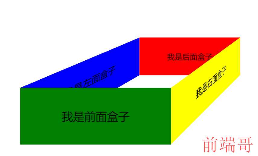
<style> * { margin: 0; padding: 0; } .box { position: relative; border: 3px solid black; left: 400px; /* 添加3D透视度 */ perspective: 2000px; /* 设置为3D转换 */ transform-style: preserve-3d; } .box>div { position: absolute; left: 10px; top: 400px; width: 400px; height: 150px; /* 文字居中 */ text-align: center; line-height: 150px; font-size: 30px; } /* 我是前面盒子 */ .greenBox { background-color: green; transform: translateZ(200px); } /* 我是后面盒子 */ .redBox { background-color: red; transform: translateZ(-200px); } /* 我是左面盒子 */ .blueBox { background-color: blue; /* 旋转+平移(面对盒子) */ transform: rotateY(90deg) translateZ(-200px); } /* 我是右面盒子 */ .yellownBox { background-color: yellow; transform: rotateY(90deg) translateZ(200px); } </style> <body> <div class="box"> <div class="greenBox">我是前面盒子</div> <div class="redBox">我是后面盒子</div> <div class="blueBox">我是左面盒子</div> <div class="yellownBox">我是右面盒子</div> </div> </body>
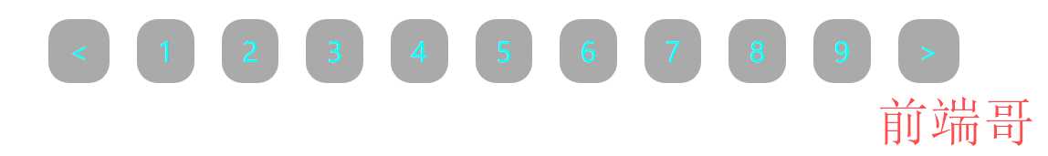
 # 过渡`transition ` ## 元素从一种形态**逐渐**变成另一种形态的过程 ## 过渡的两大条件 与`hover`一起用 - 过渡的`css`属性 - 过渡的时间周期 ## 过渡的css属性名 `transition` ```html
- <
- 1
- 2
- 3
- 4
- 5
- 6
- 7
- 8
- 9
- >
动画
设置动画属性
设置动画属性:
- 动画的名称
animation-name: firstAnimate; - 动画的时间周期
animation-duration: 8s; - 动画的时间速度曲线
animation-timing-function: linear; - 动画的延迟
animation-delay: 1s; - 动画的次数
animation-iteration-count: 2; - 动画的暂停
animation-play-state: paused;- 给谁加的动画 给谁暂停
创建动画
@keyframs 动画名称{ }
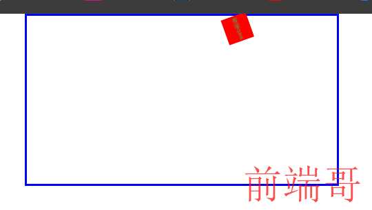
<style> <style> * { margin: 0; padding: 0; } .parent { position: relative; margin: auto; width: 1200px; height: 650px; border: 10px solid blue; } .child { position: absolute; width: 100px; height: 100px; background-color: red; text-align: center; line-height: 100px; color: #fff; font-size: 20px; /*动画的名称*/ animation-name: firstAnimate; /*动画的时间周期*/ animation-duration: 8s; /*动画的时间速度曲线*/ animation-timing-function: linear; /*动画的延迟*/ animation-delay: 1s; /*动画的次数*/ animation-iteration-count: 2; /* 无限次 */ animation-iteration-count: infinite; /* animation-play-state: running; */ } .child:hover { animation-play-state: paused; } /* 二、创建动画 @keyframs 动画名称 */ @keyframes firstAnimate { /* 开始到结束 两种方法 */ /* from { left: 0; top: 0; } to { left: 1100px; top: 0; } */ 0% { /* left: 0; top: 0; */ transform: translate(0, 0); font-size: 10px; } 25% { /* left: 1100px; top: 0; */ transform: translate(1100px, 0) rotate(360deg); font-size: 28px; color: green; } 50% { /* left: 1100px; top: 550px; */ transform: translate(1100px, 550px) rotate(720deg); font-size: 10px; color: orange; } 75% { /* left: 0; top: 550px; */ transform: translate(0, 550px) rotate(1080deg); font-size: 28px; color: gray; } 100% { /* left: 0; top: 0; */ transform: translate(0, 0) rotate(1440deg); font-size: 10px; color: darkblue; } } </style> <body> <div class="parent"> <div class="child">web前端</div> </div> </body>