前端开发之Echarts 图表渐变两种实现方式
- 前言
- 效果图
- 一、echarts中存在两种渐变方式
- 1、color: new echarts.graphic.LinearGradient(0, 0, 0, 1, [{},{},{}])
-
- 2、{type: 'linear',x: 0,y: 0,x2: 0,y2: 1, [{},{},{}]}
-
- 二、动态图表类型
- 1、触发事件中修改echarts类型
- 2、如果使用的是定时器修改类型从而达到不同的展示效果
前言
在使用echarts会使用到图表渐变的颜色来实现绚丽的图表会对用户又更多的吸引力
动态更改图表进行展示数据会增加科技感
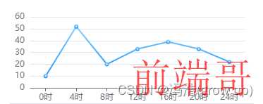
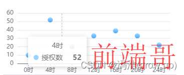
效果图
一、echarts中存在两种渐变方式
1、color: new echarts.graphic.LinearGradient(0, 0, 0, 1, [{},{},{}])
简单案例
| options: { |
| tooltip: { |
| trigger: 'axis', |
| extraCssText: 'z-index:1', |
| }, |
| grid: { |
| top: '5%', |
| left: '2%', |
| right: '4%', |
| bottom: '0%', |
| containLabel: true, |
| }, |
| xAxis: [ |
| { |
| type: 'category', |
| data: ['0时', '4时', '8时', '12时', '16时', '20时', '24时'], |
| axisTick: { |
| alignWithLabel: true, |
| }, |
| }, |
| ], |
| yAxis: [ |
| { |
| type: 'value', |
| }, |
| ], |
| series: [ |
| { |
| name: 'xxx', |
| type: 'bar', |
| barWidth: '60%', |
| data: [10, 52, 20, 33, 39, 33, 22], |
| itemStyle: { |
| borderRadius: [2, 2, 0, 0], |
| color: new echarts.graphic.LinearGradient( |
| 0, |
| 0, |
| 0, |
| 1, |
| ['#88D1FF', '#1890FF'].map((color, offset) => ({ |
| color, |
| offset, |
| })) |
| ), |
| }, |
| }, |
| ], |
| }, |
2、{type: ‘linear’,x: 0,y: 0,x2: 0,y2: 1, [{},{},{}]}
案例
| options: { |
| tooltip: { |
| trigger: 'axis', |
| extraCssText: 'z-index:1' |
| }, |
| grid: { |
| top: '5%', |
| left: '2%', |
| right: '4%', |
| bottom: '0%', |
| containLabel: true |
| }, |
| xAxis: [ |
| { |
| type: 'category', |
| data: ['0时', '4时', '8时', '12时', '16时', '20时', '24时'], |
| axisTick: { |
| alignWithLabel: true |
| } |
| } |
| ], |
| yAxis: [ |
| { |
| type: 'value' |
| } |
| ], |
| series: [ |
| { |
| name: 'xxxx', |
| type: 'bar', |
| barWidth: '60%', |
| data: [10, 52, 20, 33, 39, 33, 22], |
| itemStyle: { |
| borderRadius: [2, 2, 0, 0], |
| color: { |
| type: 'linear', |
| x: 0, |
| y: 0, |
| x2: 0, |
| y2: 1, |
| colorStops: ['#88D1FF', '#1890FF'].map((color, offset) => ({ |
| color, |
| offset |
| })) |
| } |
| } |
| } |
| ] |
| }, |
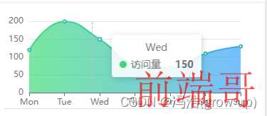
二、动态图表类型
1、触发事件中修改echarts类型
| |
| data.options.series[0].type = 'line' |
| |
| chart.setOption(props.options) |
2、如果使用的是定时器修改类型从而达到不同的展示效果
| 导入 import _ from 'lodash'组件 |
| _.sample:随机的 |
| _.pull(arry,type):arry类型列表,type当前类型 从列表中删除当前类型 |
| let timer |
| |
| onMounted(() => { |
| timer = setInterval(() => { |
| if (data.n > 0) { |
| data.n-- |
| } else { |
| data.options.series[0].type = _.sample( |
| _.pull(['line', 'bar', 'scatter'], data.options.series[0].type) |
| ) |
| chart.setOption(props.options) |
| data.n = 5 |
| } |
| }, 1000) |
| }) |
| |
| onBeforeUnmount(() => { |
| timer = null |
| clearInterval(timer) |
| }) |


