一、居中布局
内容主要在页面的正中央位置,突出显示,常见于登录、注册、提示用户、或点击头像查看大图等场景:
1.中文布局CSS库
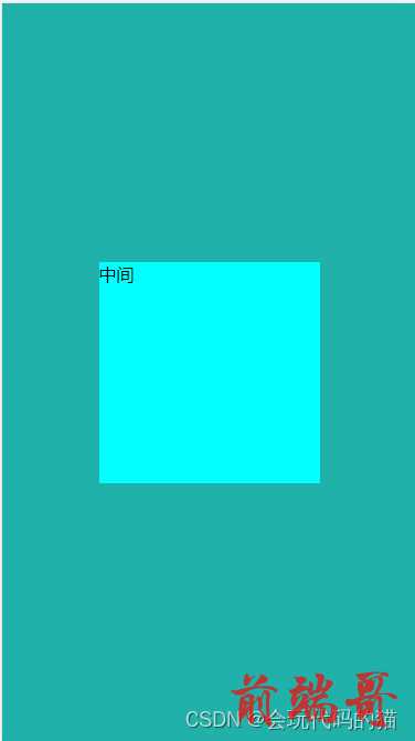
| |
| <style> |
| :root { |
| --居中: '. . .' 1fr '. 中 .' auto '. . .' 1fr / 1fr auto 1fr; |
| --双列: '左 右' 1fr / 1fr 1fr; |
| --三列: '左 中 右' 1fr / 1fr auto 1fr; |
| --吕形: '上' auto '下' 1fr / 1fr; |
| --上下栏: '上' auto '中' 1fr '下' auto / 1fr; |
| --四宫格: '左上 右上' 1fr '左下 右下' 1fr / 1fr 1fr; |
| --六宫格: '左上 中上 右上' 1fr '左下 中下 右下' 1fr / 1fr 1fr 1fr; |
| --九宫格: '左上 中上 右上' 1fr '左中 中中 右中' 1fr '左下 中下 右下' 1fr / 1fr 1fr 1fr; |
| --铺满: 1fr / 1fr; |
| --圣杯: '上 上 上' auto '左 中 右' 1fr '下 下 下' auto / auto 1fr auto; |
| --双飞翼: var(--圣杯); |
| --响应式: repeat(var(--行数, 2), var(--高, 100px)) / repeat(auto-fit, minmax(var(--宽, 100px), 1fr)); |
| } |
| *{ |
| margin: 0; |
| padding: 0; |
| } |
| html,body{ |
| |
| height: 100%; |
| } |
| body{ |
| background: lightseagreen; |
| display: grid; |
| grid: var(--居中); |
| } |
| |
| .main { |
| grid-area: 中; |
| height: 200px; |
| width: 200px; |
| background-color: aqua; |
| } |
| </style> |
| </head> |
| |
| <body> |
| <div class="main"> |
| 中间 |
| </div> |
| </body> |
2.绝对定位
利用绝对定位的距离,将需要显示的放在最中央
(建议用body作为主盒子,从这个开始以下的代码多套了一个盒子,因为多了一层dom,会影响性能,如果不注重性能,就用从这个代码之后的代码,如果考虑性能,自行改成上面这种就可以,自己去掉一层盒子就OK了)
| <style> |
| *{ |
| margin: 0; |
| padding: 0; |
| } |
| .main{ |
| height: 400px; |
| width: 400px; |
| background: lightseagreen; |
| position: relative; |
| } |
| .main div{ |
| width: 200px; |
| height: 200px; |
| background: rebeccapurple; |
| position: absolute; |
| left: 100px; |
| top:100px; |
| |
| } |
| </style> |
| </head> |
| <body> |
| <div class="main"> |
| <div class=""></div> |
| </div> |
| </body> |
3.绝对定位加负边距
- 利用left:50%,top:50%;
- margin-top:-100px,margin-left:-100px;
| <!DOCTYPE html> |
| <html lang="en"> |
| <head> |
| <meta charset="UTF-8"> |
| <meta http-equiv="X-UA-Compatible" content="IE=edge"> |
| <meta name="viewport" content="width=device-width, initial-scale=1.0"> |
| <title>Document</title> |
| <style> |
| *{ |
| margin: 0; |
| padding: 0; |
| } |
| .main{ |
| height: 400px; |
| width: 400px; |
| background: lightseagreen; |
| position: relative; |
| } |
| .main div{ |
| width: 200px; |
| height: 200px; |
| background: rebeccapurple; |
| position: absolute; |
| left: 50%; |
| top:50%; |
| margin-top: -100px; |
| margin-left: -100px; |
| |
| |
| } |
| </style> |
| </head> |
| <body> |
| <div class="main"> |
| <div class=""></div> |
| </div> |
| </body> |
| </html> |
4.绝对定位+平移
- 利用left:50%,top:50%;
- transform: translateX(-100px) translateY(-100px);
| <!DOCTYPE html> |
| <html lang="en"> |
| <head> |
| <meta charset="UTF-8"> |
| <meta http-equiv="X-UA-Compatible" content="IE=edge"> |
| <meta name="viewport" content="width=device-width, initial-scale=1.0"> |
| <title>Document</title> |
| <style> |
| *{ |
| margin: 0; |
| padding: 0; |
| } |
| .main{ |
| height: 400px; |
| width: 400px; |
| background: lightseagreen; |
| position: relative; |
| } |
| .main div{ |
| width: 200px; |
| height: 200px; |
| background: rebeccapurple; |
| position: absolute; |
| left: 50%; |
| top:50%; |
| transform: translateX(-100px) translateY(-100px); |
| } |
| </style> |
| </head> |
| <body> |
| <div class="main"> |
| <div class=""></div> |
| </div> |
| </body> |
| </html> |
5.网格布局
- display: grid;
- place-items: center; 子元素居中
| <!DOCTYPE html> |
| <html lang="en"> |
| <head> |
| <meta charset="UTF-8"> |
| <meta http-equiv="X-UA-Compatible" content="IE=edge"> |
| <meta name="viewport" content="width=device-width, initial-scale=1.0"> |
| <title>Document</title> |
| <style> |
| *{ |
| margin: 0; |
| padding: 0; |
| } |
| .main{ |
| height: 400px; |
| width: 400px; |
| background: lightseagreen; |
| display: grid; |
| place-items: center; |
| } |
| .main div{ |
| width: 200px; |
| height: 200px; |
| background: rebeccapurple; |
| |
| } |
| </style> |
| </head> |
| <body> |
| <div class="main"> |
| <div class=""></div> |
| </div> |
| </body> |
| </html> |
6.弹性布局
第一种:display:flex,外边距自动填充margin:auto;
| |
| <!DOCTYPE html> |
| <html lang="en"> |
| |
| <head> |
| <meta charset="UTF-8"> |
| <meta http-equiv="X-UA-Compatible" content="IE=edge"> |
| <meta name="viewport" content="width=device-width, initial-scale=1.0"> |
| <title>Document</title> |
| <style> |
| |
| * { |
| margin: 0; |
| padding: 0; |
| } |
| |
| |
| html, |
| body { |
| height: 100%; |
| background: gray; |
| } |
| body{ |
| |
| display:flex; |
| } |
| .center{ |
| |
| margin: auto; |
| padding: 20px; |
| background-color: white; |
| } |
| </style> |
| </head> |
| |
| <body> |
| <div class="center">内容撑开盒子</div> |
| </body> |
| |
| </html> |
第二种:display: flex;
justify-content: center;
align-items: center;
| <!DOCTYPE html> |
| <html lang="en"> |
| <head> |
| <meta charset="UTF-8"> |
| <meta http-equiv="X-UA-Compatible" content="IE=edge"> |
| <meta name="viewport" content="width=device-width, initial-scale=1.0"> |
| <title>Document</title> |
| <style> |
| *{ |
| margin: 0; |
| padding: 0; |
| } |
| .main{ |
| height: 400px; |
| width: 400px; |
| background: lightseagreen; |
| display: flex; |
| justify-content: center; |
| align-items: center; |
| } |
| .main div{ |
| width: 200px; |
| height: 200px; |
| background: rebeccapurple; |
| |
| } |
| </style> |
| </head> |
| <body> |
| <div class="main"> |
| <div class=""></div> |
| </div> |
| </body> |
| </html> |
7.表格布局
- display:table-cell;
- vertical-align: middle;
- text-align: center;
| <!DOCTYPE html> |
| <html lang="en"> |
| <head> |
| <meta charset="UTF-8"> |
| <meta http-equiv="X-UA-Compatible" content="IE=edge"> |
| <meta name="viewport" content="width=device-width, initial-scale=1.0"> |
| <title>Document</title> |
| <style> |
| *{ |
| margin: 0; |
| padding: 0; |
| } |
| .main{ |
| height: 400px; |
| width: 400px; |
| background: lightseagreen; |
| display: table-cell; |
| vertical-align: middle; |
| } |
| .main>div{ |
| width: 200px; |
| height: 200px; |
| background: rebeccapurple; |
| margin: 0 auto; |
| vertical-align: middle; |
| text-align: center; |
| } |
| </style> |
| </head> |
| <body> |
| <div class="main"> |
| <div class=""> |
| <div> |
| 程悦 |
| </div> |
| </div> |
| </div> |
| </body> |
| </html> |
二、单列布局
1.外边距法
margin:0 auto;
| <!DOCTYPE html> |
| <html lang="en"> |
| <head> |
| <meta charset="UTF-8"> |
| <meta http-equiv="X-UA-Compatible" content="IE=edge"> |
| <meta name="viewport" content="width=device-width, initial-scale=1.0"> |
| <title>Document</title> |
| <style> |
| *{ |
| margin: 0; |
| padding: 0; |
| } |
| .main{ |
| height: auto; |
| width: 600px; |
| background: lightseagreen; |
| } |
| .main div{ |
| width: 200px; |
| height: 200px; |
| margin: 0 auto; |
| border: 1px solid #fff; |
| background: blueviolet; |
| } |
| </style> |
| </head> |
| <body> |
| <div class="main"> |
| <div class=""></div> |
| <div class=""></div> |
| <div class=""></div> |
| <div class=""></div> |
| <div class=""></div> |
| </div> |
| </body> |
| </html> |
2.弹性布局
第一种:display: flex;
flex-direction: column;
justify-content: center;
align-items: center;
flex-wrap: wrap;
| <!DOCTYPE html> |
| <html lang="en"> |
| <head> |
| <meta charset="UTF-8"> |
| <meta http-equiv="X-UA-Compatible" content="IE=edge"> |
| <meta name="viewport" content="width=device-width, initial-scale=1.0"> |
| <title>Document</title> |
| <style> |
| *{ |
| margin: 0; |
| padding: 0; |
| } |
| .main{ |
| height: auto; |
| width: 600px; |
| display: flex; |
| flex-direction: column; |
| justify-content: center; |
| align-items: center; |
| flex-wrap: wrap; |
| background: lightseagreen; |
| } |
| .main div{ |
| width: 200px; |
| height: 200px; |
| |
| border: 1px solid #fff; |
| background: blueviolet; |
| } |
| </style> |
| </head> |
| <body> |
| <div class="main"> |
| <div class=""></div> |
| <div class=""></div> |
| <div class=""></div> |
| <div class=""></div> |
| <div class=""></div> |
| </div> |
| </body> |
| </html> |
第二种:display: flex;
justify-content: center;
flex-basis: 90%;
| <!DOCTYPE html> |
| <html lang="en"> |
| <head> |
| <meta charset="UTF-8"> |
| <meta http-equiv="X-UA-Compatible" content="IE=edge"> |
| <meta name="viewport" content="width=device-width, initial-scale=1.0"> |
| <title>Document</title> |
| <style> |
| |
| * { |
| margin: 0; |
| padding: 0; |
| } |
| |
| |
| html, |
| body { |
| height: 100%; |
| background: gray; |
| } |
| body{ |
| |
| display: flex; |
| |
| justify-content: center; |
| } |
| .center{ |
| |
| flex-basis: 90%; |
| background: white; |
| } |
| </style> |
| </head> |
| <body> |
| <div class="center"></div> |
| </body> |
| </html> |
3.绝对定位+平移
position: absolute;
left: 50%;
width: 90%;
height: 100%;
transform: translate(-50%);
| |
| <!DOCTYPE html> |
| <html lang="en"> |
| |
| <head> |
| <meta charset="UTF-8"> |
| <meta http-equiv="X-UA-Compatible" content="IE=edge"> |
| <meta name="viewport" content="width=device-width, initial-scale=1.0"> |
| <title>Document</title> |
| <style> |
| |
| * { |
| margin: 0; |
| padding: 0; |
| } |
| |
| |
| html, |
| body { |
| height: 100%; |
| background: gray; |
| } |
| |
| body { |
| position: relative; |
| } |
| |
| .center { |
| position: absolute; |
| |
| left: 50%; |
| |
| width: 90%; |
| height: 100%; |
| |
| transform: translate(-50%); |
| |
| background: white; |
| } |
| </style> |
| </head> |
| |
| <body> |
| <div class="center"></div> |
| </body> |
| |
| </html> |
4.网格布局
display: grid;
grid: 1fr / 1fr 10fr 1fr;
grid-area: 1 / 2 / 2 /3;
| |
| <!DOCTYPE html> |
| <html lang="en"> |
| |
| <head> |
| <meta charset="UTF-8"> |
| <meta http-equiv="X-UA-Compatible" content="IE=edge"> |
| <meta name="viewport" content="width=device-width, initial-scale=1.0"> |
| <title>Document</title> |
| <style> |
| |
| * { |
| margin: 0; |
| padding: 0; |
| } |
| |
| |
| html, |
| body { |
| height: 100%; |
| background: gray; |
| } |
| |
| body { |
| |
| display: grid; |
| |
| grid: 1fr / 1fr 10fr 1fr; |
| } |
| |
| .center { |
| |
| grid-area: 1 / 2 / 2 /3; |
| background: white; |
| } |
| </style> |
| </head> |
| |
| <body> |
| <div class="center"></div> |
| </body> |
| |
| </html> |
5.行内块元素
display: inline-block;
| |
| <!DOCTYPE html> |
| <html lang="en"> |
| |
| <head> |
| <meta charset="UTF-8"> |
| <meta http-equiv="X-UA-Compatible" content="IE=edge"> |
| <meta name="viewport" content="width=device-width, initial-scale=1.0"> |
| <title>Document</title> |
| <style> |
| |
| * { |
| margin: 0; |
| padding: 0; |
| } |
| |
| |
| html, |
| body { |
| height: 100%; |
| background: gray; |
| } |
| |
| body { |
| |
| text-align: center; |
| } |
| |
| .center { |
| display: inline-block; |
| |
| width: 90%; |
| height: 100%; |
| |
| background-color: white; |
| } |
| </style> |
| </head> |
| |
| <body> |
| <div class="center"></div> |
| </body> |
| |
| </html> |
三、双列布局
1.中文布局
| <!DOCTYPE html> |
| <html lang="en"> |
| |
| <head> |
| <meta charset="UTF-8"> |
| <meta http-equiv="X-UA-Compatible" content="IE=edge"> |
| <meta name="viewport" content="width=device-width, initial-scale=1.0"> |
| <title>Document</title> |
| |
| |
| |
| <style> |
| :root { |
| --居中: '. . .' 1fr '. 中 .' auto '. . .' 1fr / 1fr auto 1fr; |
| --双列: '左 右' 1fr / 1fr 1fr; |
| --三列: '左 中 右' 1fr / 1fr auto 1fr; |
| --吕形: '上' auto '下' 1fr / 1fr; |
| --上下栏: '上' auto '中' 1fr '下' auto / 1fr; |
| --四宫格: '左上 右上' 1fr '左下 右下' 1fr / 1fr 1fr; |
| --六宫格: '左上 中上 右上' 1fr '左下 中下 右下' 1fr / 1fr 1fr 1fr; |
| --九宫格: '左上 中上 右上' 1fr '左中 中中 右中' 1fr '左下 中下 右下' 1fr / 1fr 1fr 1fr; |
| --铺满: 1fr / 1fr; |
| --圣杯: '上 上 上' auto '左 中 右' 1fr '下 下 下' auto / auto 1fr auto; |
| --双飞翼: var(--圣杯); |
| --响应式: repeat(var(--行数, 2), var(--高, 100px)) / repeat(auto-fit, minmax(var(--宽, 100px), 1fr)); |
| } |
| |
| * { |
| margin: 0; |
| padding: 0; |
| } |
| |
| html, |
| body { |
| width: 100%; |
| height: 100%; |
| } |
| |
| body{ |
| background: lightseagreen; |
| display: grid; |
| grid: var(--双列); |
| width: 80%; |
| margin: 0 auto; |
| gap: 10px; |
| |
| } |
| |
| .left { |
| |
| width: 100%; |
| height: 100%; |
| background: aqua; |
| box-sizing: border-box; |
| } |
| |
| .right { |
| |
| width: 100%; |
| height: 100%; |
| background: aqua; |
| box-sizing: border-box; |
| } |
| </style> |
| </head> |
| |
| <body> |
| <div class="left"></div> |
| <div class="right"></div> |
| </body> |
| |
| </html> |
2.多列属性法
column:2
| |
| <!DOCTYPE html> |
| <html lang="en"> |
| |
| <head> |
| <meta charset="UTF-8"> |
| <meta http-equiv="X-UA-Compatible" content="IE=edge"> |
| <meta name="viewport" content="width=device-width, initial-scale=1.0"> |
| <title>Document</title> |
| <style> |
| |
| * { |
| margin: 0; |
| padding: 0; |
| } |
| |
| |
| html, |
| body { |
| height: 100%; |
| background: gray; |
| } |
| |
| body{ |
| |
| columns: 2; |
| |
| column-gap: 10px; |
| } |
| div{ |
| height: 100%; |
| background-color: white; |
| } |
| .left{ |
| margin-left: 10px; |
| } |
| .right{ |
| margin-right: 10px; |
| } |
| </style> |
| </head> |
| |
| <body> |
| <div class="left"></div> |
| <div class="right"></div> |
| |
| </body> |
| |
| </html> |
3.左浮动法
float: left;
float: right;
| |
| <!DOCTYPE html> |
| <html lang="en"> |
| |
| <head> |
| <meta charset="UTF-8"> |
| <meta http-equiv="X-UA-Compatible" content="IE=edge"> |
| <meta name="viewport" content="width=device-width, initial-scale=1.0"> |
| <title>Document</title> |
| <style> |
| |
| * { |
| margin: 0; |
| padding: 0; |
| } |
| |
| |
| html, |
| body { |
| height: 100%; |
| background: gray; |
| } |
| |
| div{ |
| width: 47%; |
| height: 100%; |
| background-color: white; |
| } |
| |
| .left{ |
| float: left; |
| margin-left: 2%; |
| } |
| |
| .right{ |
| float: right; |
| margin-right: 2%; |
| } |
| |
| </style> |
| </head> |
| |
| <body> |
| <div class="left"></div> |
| <div class="right"></div> |
| |
| </body> |
| |
| </html> |
4.绝对定位法
| |
| <!DOCTYPE html> |
| <html lang="en"> |
| |
| <head> |
| <meta charset="UTF-8"> |
| <meta http-equiv="X-UA-Compatible" content="IE=edge"> |
| <meta name="viewport" content="width=device-width, initial-scale=1.0"> |
| <title>Document</title> |
| <style> |
| |
| * { |
| margin: 0; |
| padding: 0; |
| } |
| |
| |
| html, |
| body { |
| height: 100%; |
| background: gray; |
| } |
| |
| body{ |
| position: relative; |
| } |
| div{ |
| position: absolute; |
| |
| top: 0; |
| bottom: 0; |
| background: white; |
| } |
| .left{ |
| left: 2%; |
| right: 51%; |
| } |
| .right{ |
| left: 51%; |
| right: 2%; |
| } |
| |
| |
| </style> |
| </head> |
| |
| <body> |
| <div class="left"></div> |
| <div class="right"></div> |
| |
| </body> |
| |
| </html> |
5.弹性布局
display: flex;
justify-content: space-evenly;
flex-basis: 48%;
| |
| <!DOCTYPE html> |
| <html lang="en"> |
| |
| <head> |
| <meta charset="UTF-8"> |
| <meta http-equiv="X-UA-Compatible" content="IE=edge"> |
| <meta name="viewport" content="width=device-width, initial-scale=1.0"> |
| <title>Document</title> |
| <style> |
| |
| * { |
| margin: 0; |
| padding: 0; |
| } |
| |
| |
| html, |
| body { |
| height: 100%; |
| background: gray; |
| } |
| |
| body{ |
| display: flex; |
| justify-content: space-evenly; |
| } |
| div{ |
| flex-basis: 48%; |
| height: 100%; |
| background-color: white; |
| } |
| </style> |
| </head> |
| |
| <body> |
| <div class="left"></div> |
| <div class="right"></div> |
| |
| </body> |
| |
| </html> |
6.网格布局法
display: grid;
grid-template-columns: repeat(2, 10px 1fr) 10px;
.left{
grid-area: 1 / 2 / 2 / 3;
}
.right{
grid-area: 1 / 4 / 2 / 5;
| |
| <!DOCTYPE html> |
| <html lang="en"> |
| |
| <head> |
| <meta charset="UTF-8"> |
| <meta http-equiv="X-UA-Compatible" content="IE=edge"> |
| <meta name="viewport" content="width=device-width, initial-scale=1.0"> |
| <title>Document</title> |
| <style> |
| |
| * { |
| margin: 0; |
| padding: 0; |
| } |
| |
| |
| |
| |
| |
| |
| |
| |
| |
| |
| |
| |
| |
| |
| |
| |
| |
| |
| |
| |
| html, |
| body { |
| height: 100%; |
| background: gray; |
| } |
| |
| body { |
| display: grid; |
| grid-template-columns: repeat(2, 10px 1fr) 10px; |
| } |
| |
| div { |
| height: 100%; |
| background-color: white; |
| } |
| .left{ |
| grid-area: 1 / 2 / 2 / 3; |
| } |
| .right{ |
| grid-area: 1 / 4 / 2 / 5; |
| } |
| </style> |
| </head> |
| |
| <body> |
| <div class="left"></div> |
| <div class="right"></div> |
| |
| </body> |
| |
| </html> |
四、吕形布局
1.中文字体库
| <!DOCTYPE html> |
| <html lang="en"> |
| |
| <head> |
| <meta charset="UTF-8"> |
| <meta http-equiv="X-UA-Compatible" content="IE=edge"> |
| <meta name="viewport" content="width=device-width, initial-scale=1.0"> |
| <title>Document</title> |
| <link rel="stylesheet" href="./css/chinese-layout.css"> |
| <link rel="stylesheet" href="./css/chinese-gradient.css"> |
| <style> |
| |
| * { |
| margin: 0; |
| padding: 0; |
| } |
| |
| |
| html, |
| body { |
| height: 100%; |
| } |
| |
| body{ |
| display: grid; |
| grid:var(--吕形); |
| |
| gap:5px |
| } |
| .top{ |
| height: 60px; |
| background: var(--紫红); |
| } |
| .bottom{ |
| background: var(--黄河); |
| overflow-y: auto; |
| } |
| |
| </style> |
| </head> |
| |
| <body> |
| <div class="top"></div> |
| <div class="bottom"></div> |
| </body> |
| |
| </html> |
2.固定定位法
position: fixed;
top: 0;
margin-top: 100px;
| <!DOCTYPE html> |
| <html lang="en"> |
| <head> |
| <meta charset="UTF-8"> |
| <meta http-equiv="X-UA-Compatible" content="IE=edge"> |
| <meta name="viewport" content="width=device-width, initial-scale=1.0"> |
| <title>Document</title> |
| <style> |
| *{ |
| margin: 0; |
| padding: 0; |
| } |
| .one{ |
| height: 100px; |
| width: 900px; |
| position: fixed; |
| top: 0; |
| background-color: aqua; |
| } |
| .two{ |
| width: 900px; |
| height: 800px; |
| margin-top: 100px; |
| background-color: aquamarine; |
| } |
| </style> |
| </head> |
| <body> |
| <div class="one"> |
| |
| </div> |
| <div class="two"> |
| |
| </div> |
| </body> |
| </html> |
3.非固定定位法
采用百分比布局
| |
| <!DOCTYPE html> |
| <html lang="en"> |
| <head> |
| <meta charset="UTF-8"> |
| <meta http-equiv="X-UA-Compatible" content="IE=edge"> |
| <meta name="viewport" content="width=device-width, initial-scale=1.0"> |
| <title>Document</title> |
| <style> |
| |
| * { |
| margin: 0; |
| padding: 0; |
| } |
| |
| |
| html, |
| body { |
| height: 100%; |
| } |
| .top{ |
| height: 10%; |
| background-color: red; |
| } |
| .bottom{ |
| height: 90%; |
| background-color: blue; |
| overflow-y: auto; |
| } |
| </style> |
| </head> |
| <body> |
| <div class="top"></div> |
| <div class="bottom"> |
| 测试文字测试文字测试文字测试文字测试文字测试文字测试文字 |
| 测试文字测试文字测试文字测试文字测试文字测试文字测试文字 |
| 测试文字测试文字测试文字测试文字测试文字测试文字测试文字 |
| 测试文字测试文字测试文字测试文字测试文字测试文字测试文字 |
| |
| |
| </div> |
| </body> |
| </html> |
五、上下栏布局
1.中文布局css库
| <!DOCTYPE html> |
| <html lang="en"> |
| |
| <head> |
| <meta charset="UTF-8"> |
| <meta http-equiv="X-UA-Compatible" content="IE=edge"> |
| <meta name="viewport" content="width=device-width, initial-scale=1.0"> |
| <title>Document</title> |
| |
| |
| |
| <style> |
| :root { |
| --居中: '. . .' 1fr '. 中 .' auto '. . .' 1fr / 1fr auto 1fr; |
| --双列: '左 右' 1fr / 1fr 1fr; |
| --三列: '左 中 右' 1fr / 1fr auto 1fr; |
| --吕形: '上' auto '下' 1fr / 1fr; |
| --上下栏: '上' auto '中' 1fr '下' auto / 1fr; |
| --四宫格: '左上 右上' 1fr '左下 右下' 1fr / 1fr 1fr; |
| --六宫格: '左上 中上 右上' 1fr '左下 中下 右下' 1fr / 1fr 1fr 1fr; |
| --九宫格: '左上 中上 右上' 1fr '左中 中中 右中' 1fr '左下 中下 右下' 1fr / 1fr 1fr 1fr; |
| --铺满: 1fr / 1fr; |
| --圣杯: '上 上 上' auto '左 中 右' 1fr '下 下 下' auto / auto 1fr auto; |
| --双飞翼: var(--圣杯); |
| --响应式: repeat(var(--行数, 2), var(--高, 100px)) / repeat(auto-fit, minmax(var(--宽, 100px), 1fr)); |
| } |
| |
| * { |
| margin: 0; |
| padding: 0; |
| } |
| |
| html, |
| body { |
| width: 100%; |
| height: 100%; |
| } |
| |
| body{ |
| background: lightseagreen; |
| display: grid; |
| grid: var(--上下栏); |
| width: 80%; |
| margin: 0 auto; |
| gap: 10px; |
| W |
| } |
| .top, .bottom { |
| height: 60px; |
| background: chartreuse; |
| } |
| .center{ |
| background: salmon; |
| overflow-y: auto |
| } |
| |
| </style> |
| </head> |
| |
| <body> |
| <div class="top"></div> |
| <div class="center"></div> |
| <div class="bottom"></div> |
| </body> |
| |
| </html> |
2.固定定位法
上下固定
中间自动
| |
| <!DOCTYPE html> |
| <html lang="en"> |
| |
| <head> |
| <meta charset="UTF-8"> |
| <meta http-equiv="X-UA-Compatible" content="IE=edge"> |
| <meta name="viewport" content="width=device-width, initial-scale=1.0"> |
| <title>Document</title> |
| <style> |
| |
| * { |
| margin: 0; |
| padding: 0; |
| } |
| |
| |
| html, |
| body { |
| position: relative; |
| } |
| |
| .top{ |
| position: fixed; |
| top: 0; |
| left: 0; |
| |
| width: 100%; |
| height: 80px; |
| |
| background-color: red; |
| } |
| .main{ |
| margin: 80px 0; |
| height: 1000px; |
| background-color: green; |
| } |
| |
| .bottom{ |
| position: fixed; |
| bottom: 0; |
| left: 0; |
| |
| width: 100%; |
| height: 80px; |
| |
| background-color: red; |
| } |
| |
| </style> |
| </head> |
| |
| <body> |
| <div class="top"> |
| 不管怎么滑动 都是不动的 |
| </div> |
| <div class="main"> |
| 主题盒子 |
| </div> |
| <div class="bottom"> |
| 不管怎么滑动 都是不动的 |
| </div> |
| </body> |
| |
| </html> |
3.非固定定位法
| <!DOCTYPE html> |
| <html lang="en"> |
| <head> |
| <meta charset="UTF-8"> |
| <meta http-equiv="X-UA-Compatible" content="IE=edge"> |
| <meta name="viewport" content="width=device-width, initial-scale=1.0"> |
| <title>Document</title> |
| <style> |
| *{ |
| margin: 0; |
| padding: 0; |
| } |
| html,body{ |
| height: 100%; |
| } |
| .one{ |
| height: 10%; |
| background-color: aqua; |
| } |
| .two{ |
| height: 80%; |
| background-color: rebeccapurple; |
| } |
| .three{ |
| height: 10%; |
| background-color: aqua; |
| } |
| </style> |
| </head> |
| <body> |
| <div class="one"> |
| |
| </div> |
| <div class="two"> |
| |
| </div> |
| <div class="three"> |
| |
| </div> |
| </body> |
| </html> |
六、九宫格
1.中文布局css库
| <!DOCTYPE html> |
| <html lang="en"> |
| <head> |
| <meta charset="UTF-8"> |
| <meta http-equiv="X-UA-Compatible" content="IE=edge"> |
| <meta name="viewport" content="width=device-width, initial-scale=1.0"> |
| <title>Document</title> |
| <style> |
| :root { |
| --居中: '. . .' 1fr '. 中 .' auto '. . .' 1fr / 1fr auto 1fr; |
| --双列: '左 右' 1fr / 1fr 1fr; |
| --三列: '左 中 右' 1fr / 1fr auto 1fr; |
| --吕形: '上' auto '下' 1fr / 1fr; |
| --上下栏: '上' auto '中' 1fr '下' auto / 1fr; |
| --四宫格: '左上 右上' 1fr '左下 右下' 1fr / 1fr 1fr; |
| --六宫格: '左上 中上 右上' 1fr '左下 中下 右下' 1fr / 1fr 1fr 1fr; |
| --九宫格: '左上 中上 右上' 1fr '左中 中中 右中' 1fr '左下 中下 右下' 1fr / 1fr 1fr 1fr; |
| --铺满: 1fr / 1fr; |
| --圣杯: '上 上 上' auto '左 中 右' 1fr '下 下 下' auto / auto 1fr auto; |
| --双飞翼: var(--圣杯); |
| --响应式: repeat(var(--行数, 2), var(--高, 100px)) / repeat(auto-fit, minmax(var(--宽, 100px), 1fr)); |
| } |
| html,body,ul{ |
| height: 100%; |
| } |
| ul{ |
| display: grid; |
| grid:var(--九宫格); |
| gap: 10px; |
| background: wheat; |
| } |
| li{ |
| list-style: none; |
| background: rebeccapurple; |
| } |
| </style> |
| </head> |
| <body> |
| <ul> |
| <li></li> |
| <li></li> |
| <li></li> |
| <li></li> |
| <li></li> |
| <li></li> |
| <li></li> |
| <li></li> |
| <li></li> |
| </ul> |
| </body> |
| </html> |
2.网格布局
设置成三行三列就ok,具体怎么写,看心情就好
| <!DOCTYPE html> |
| <html lang="en"> |
| <head> |
| <meta charset="UTF-8"> |
| <meta http-equiv="X-UA-Compatible" content="IE=edge"> |
| <meta name="viewport" content="width=device-width, initial-scale=1.0"> |
| <title>Document</title> |
| <style> |
| .main{ |
| width: 600px; |
| display: grid; |
| grid: repeat(3, 1fr) / repeat(3, 1fr); |
| } |
| .main div{ |
| width: 200px; |
| height: 200px; |
| background-color: aqua; |
| } |
| .main div:nth-child(2n){ |
| background-color: cadetblue; |
| } |
| </style> |
| </head> |
| <body> |
| <div class="main"> |
| <div></div> |
| <div></div> |
| <div></div> |
| <div></div> |
| <div></div> |
| <div></div> |
| <div></div> |
| <div></div> |
| <div></div> |
| </div> |
| </body> |
| </html> |
3.表格布局
设置display:table;display: table-row;display: table-column;
| <!DOCTYPE html> |
| <html lang="en"> |
| <head> |
| <meta charset="UTF-8"> |
| <meta name="viewport" content="width=device-width, initial-scale=1.0"> |
| <title>Document</title> |
| |
| <link rel="stylesheet" href="https://cdn.jsdelivr.net/npm/chinese-gradient"> |
| <style> |
| * { padding: 0; margin: 0; } |
| html, body, ul { height: 100% } |
| |
| ul { |
| width: 100%; |
| |
| |
| list-style: none; |
| |
| |
| display: table; |
| border-spacing: 3px |
| } |
| |
| |
| li { |
| |
| display: table-row |
| } |
| |
| |
| div { |
| |
| display: table-cell; |
| background: red; |
| } |
| </style> |
| </head> |
| <body> |
| <ul> |
| <li> |
| <div></div> |
| <div></div> |
| <div></div> |
| </li> |
| <li> |
| <div></div> |
| <div></div> |
| <div></div> |
| </li> |
| <li> |
| <div></div> |
| <div></div> |
| <div></div> |
| </li> |
| </ul> |
| </body> |
| </html> |
直接用表格标签
| <!DOCTYPE html> |
| <html lang="en"> |
| <head> |
| <meta charset="UTF-8"> |
| <meta http-equiv="X-UA-Compatible" content="IE=edge"> |
| <meta name="viewport" content="width=device-width, initial-scale=1.0"> |
| <title>Document</title> |
| <style> |
| .main{ |
| width: 600px; |
| display: table; |
| border-collapse:collapse; |
| border: 1px solid rebeccapurple; |
| } |
| .main td{ |
| width: 200px; |
| height: 200px; |
| background-color: aqua; |
| border: 1px solid rebeccapurple; |
| |
| } |
| </style> |
| </head> |
| <body> |
| <table class="main"> |
| <tr> |
| <td>sss</td> |
| <td>ssss</td> |
| <td>ssss</td> |
| </tr> |
| <tr> |
| <td>sss</td> |
| <td>ssss</td> |
| <td>ssss</td> |
| </tr> |
| <tr> |
| <td>sss</td> |
| <td>ssss</td> |
| <td>ssss</td> |
| </tr> |
| </table> |
| </body> |
| </html> |
4.绝对定位
| <!DOCTYPE html> |
| <html lang="en"> |
| <head> |
| <meta charset="UTF-8"> |
| <meta http-equiv="X-UA-Compatible" content="IE=edge"> |
| <meta name="viewport" content="width=device-width, initial-scale=1.0"> |
| <title>Document</title> |
| <style> |
| .main{ |
| width: 600px; |
| height: 600px; |
| position: relative; |
| } |
| .main div{ |
| width: 200px; |
| height: 200px; |
| background-color: aqua; |
| } |
| .main div:nth-child(2n){ |
| background-color: cadetblue; |
| } |
| .main div:nth-child(1){ |
| position: absolute; |
| top: 0; |
| left: 0; |
| } |
| .main div:nth-child(2){ |
| position: absolute; |
| top: 0; |
| left: 200px; |
| } |
| .main div:nth-child(3){ |
| position: absolute; |
| top: 0; |
| left: 400px; |
| } |
| .main div:nth-child(4){ |
| position: absolute; |
| top: 200px; |
| left: 0; |
| } |
| .main div:nth-child(5){ |
| position: absolute; |
| top: 200px; |
| left: 200px; |
| } |
| .main div:nth-child(6){ |
| position: absolute; |
| top: 200px; |
| left: 400px; |
| } |
| .main div:nth-child(7){ |
| position: absolute; |
| top: 400px; |
| left: 0; |
| } |
| .main div:nth-child(8){ |
| position: absolute; |
| top: 400px; |
| left: 200px; |
| } |
| .main div:nth-child(9){ |
| position: absolute; |
| top: 400px; |
| left: 400px; |
| } |
| </style> |
| </head> |
| <body> |
| <div class="main"> |
| <div></div> |
| <div></div> |
| <div></div> |
| <div></div> |
| <div></div> |
| <div></div> |
| <div></div> |
| <div></div> |
| <div></div> |
| </div> |
| </body> |
| </html> |
5.弹性布局
| <!DOCTYPE html> |
| <html lang="en"> |
| <head> |
| <meta charset="UTF-8"> |
| <meta http-equiv="X-UA-Compatible" content="IE=edge"> |
| <meta name="viewport" content="width=device-width, initial-scale=1.0"> |
| <title>Document</title> |
| <style> |
| html,body{ |
| height: 100%; |
| } |
| .main{ |
| width: 100%; |
| height: 100%; |
| display: flex; |
| flex-wrap: wrap; |
| |
| } |
| .main div{ |
| width: 33%; |
| height: 33%; |
| background-color: aqua; |
| } |
| .main div:nth-child(2n){ |
| background-color: cadetblue; |
| } |
| </style> |
| </head> |
| <body> |
| <div class="main"> |
| <div></div> |
| <div></div> |
| <div></div> |
| <div></div> |
| <div></div> |
| <div></div> |
| <div></div> |
| <div></div> |
| <div></div> |
| </div> |
| </body> |
| </html> |
七、响应式布局
1.中文布局css库
--响应式: repeat(var(--行数, 2), var(--高, 200px)) / repeat(auto-fit, minmax(var(--宽, 100px), 1fr));
要遵循库里设置的网格长宽大小
| <!DOCTYPE html> |
| <html lang="en"> |
| |
| <head> |
| <meta charset="UTF-8"> |
| <meta http-equiv="X-UA-Compatible" content="IE=edge"> |
| <meta name="viewport" content="width=device-width, initial-scale=1.0"> |
| <title>Document</title> |
| <style> |
| :root { |
| --居中: '. . .' 1fr '. 中 .' auto '. . .' 1fr / 1fr auto 1fr; |
| --双列: '左 右' 1fr / 1fr 1fr; |
| --三列: '左 中 右' 1fr / 1fr auto 1fr; |
| --吕形: '上' auto '下' 1fr / 1fr; |
| --上下栏: '上' auto '中' 1fr '下' auto / 1fr; |
| --四宫格: '左上 右上' 1fr '左下 右下' 1fr / 1fr 1fr; |
| --六宫格: '左上 中上 右上' 1fr '左下 中下 右下' 1fr / 1fr 1fr 1fr; |
| --九宫格: '左上 中上 右上' 1fr '左中 中中 右中' 1fr '左下 中下 右下' 1fr / 1fr 1fr 1fr; |
| --铺满: 1fr / 1fr; |
| --圣杯: '上 上 上' auto '左 中 右' 1fr '下 下 下' auto / auto 1fr auto; |
| --双飞翼: var(--圣杯); |
| --响应式: repeat(var(--行数, 2), var(--高, 200px)) / repeat(auto-fit, minmax(var(--宽, 100px), 1fr)); |
| } |
| html,body,ul,li{ |
| margin: 0; |
| padding: 0; |
| height: 100%; |
| } |
| ul{ |
| display: grid; |
| grid:var(--响应式); |
| list-style: none; |
| } |
| li{ |
| height: 200px; |
| background-color: aquamarine; |
| border: 1px solid red; |
| } |
| </style> |
| |
| </head> |
| |
| <body> |
| <ul> |
| <li></li> |
| <li></li> |
| <li></li> |
| <li></li> |
| <li></li> |
| <li></li> |
| <li></li> |
| <li></li> |
| </ul> |
| </body> |
| |
| </html> |
2.网格布局


