
CSS
Step1.我的第一个CSS程序
<!DOCTYPE html>
<html lang="en">
<head>
    <meta charset="UTF-8">
    <title>CSS第一个程序</title>
</head>
<body>
    <p style="color:red;font-size:30px">我的第一个CSS程序</p>
</body>
</html>
- 书写规范:在标签中写style=“”,引号中的内容是不同的样式,例如这里就是颜色和文字尺寸,不同样式之间用;隔开
Step2.CSS编写的位置
内联样式表
- 上面的程序,将style写在标签中,这就叫内联样式表
- 不足:只能对一个标签起作用
- 这时候我想更改100个p标签的样式,我就得复制粘贴100次
内部样式表
<!DOCTYPE html>
<html lang="en">
<head>
    <meta charset="UTF-8">
    <style>
        p{
            color:red;
            font-size:60px;
        }
    </style>
    <title>CSS的书写位置</title>
</head>
<body>
    <p>张宇航</p>
    <p>张长领</p>
    <p>王春珍</p>
</body>
</html>
- 将style标签写在head标签内部
- 一个p{}叫做CSS选择器(选什么,写什么),意思就是这个样式选择了所有的p标签
- 不足:只适用于当前页面,无法在多个页面对同一个CSS样式进行复用
外部样式表
HTML_0002.html
<!DOCTYPE html>
<html lang="en">
<link rel="stylesheet" href="../../css/CSS_HTML_0002.css">
<head>
    <meta charset="UTF-8">
    <title>CSS的书写位置</title>
</head>
<body>
    <p>张宇航</p>
    <p>张长领</p>
    <p>王春珍</p>
</body>
</html>
CSS_HTML_0002.css
p{
    color:green;
    font-size:60px;
}
- 将CSS样式写在一个单独的CSS文件中,在HTML文件中通过link标签调用
- …/是跳出当前目录
Step3.CSS的基本语法
-
p{ color:green; font-size:60px; } -
选择器 + 声明块
- 选择器:通过选择器可以选中页面中的指定元素,从而为其赋予指定的样式
- 比如p{…}就是选中页面中所有p标签
- 声明块:通过声明块来指定要为元素设置的样式
- 声明块是由一个一个声明构成
- 声明 —> 样式名:样式值;
- 选择器:通过选择器可以选中页面中的指定元素,从而为其赋予指定的样式
Step4.CSS常用选择器
元素选择器
-
选择页面中指定标签
<!DOCTYPE html> <html lang="en"> <head> <meta charset="UTF-8"> <link rel="stylesheet" href="../../css/CSS_HTML_0003.css"> <title>CSS选择器</title> </head> <body> <p>Iphone</p> <p>Ipad</p> <p>MacBook</p> <p>AppleWatch</p> <p>Siri</p> </body> </html>p{ color:red; }但是元素选择器并不能指定某一个p标签的样式
所以我们需要其他的选择器
-
语法:
- css中 —> 标签名{}
id选择器
-
获取页面中具有指定id的那个标签
<!DOCTYPE html> <html lang="en"> <head> <meta charset="UTF-8"> <link rel="stylesheet" href="../../css/CSS_HTML_0003.css"> <title>CSS选择器</title> </head> <body> <p>Iphone</p> <p>Ipad</p> <p id="APPLE">MacBook</p> <p>AppleWatch</p> <p>Siri</p> </body> </html>#APPLE{ color:cyan; } -
语法:
- 给想要单独更改样式的标签添加一个id属性(p id=“…”)
- 在css中使用#符号获取到这个id(前端代码中都是通过#来获取id的) —> #id名{}
类选择器
-
类选择器可以在不同标签中进行复用
<!DOCTYPE html> <html lang="en"> <head> <meta charset="UTF-8"> <link rel="stylesheet" href="../../css/CSS_HTML_0003.css"> <title>CSS选择器</title> </head> <body> <p>Iphone</p> <p>Ipad</p> <p class="PC">MacBook</p> <p>AppleWatch</p> <p>Siri</p> </body> </html>.PC{ color:darkcyan; } -
语法:
- html中是p class=“…”
- css中是.类名{}
通配选择器
-
通配选择器就是将页面中所有元素都选中赋予css样式
*{ color:green; } -
html中随便写
-
语法:
- *的意思就是全选(正则表达式中是一次或多次)
- 使用*{}就会全选
Step5.复合选择器
交集选择器
-
语法:前后不需要有任何分隔符,通常为了查看方便在不同选择器之间使用空格分隔
-
把整个页面的字体颜色设置成红色,然后指定要把div的字体大小设置的其他元素不一样
<!DOCTYPE html> <html lang="en"> <head> <meta charset="UTF-8"> <link rel="stylesheet" href="../../css/CSS_HTML_0004.css"> <title>复合选择器</title> </head> <body> <h1 class="red">标题</h1> <p class="red">p标签</p> <span class="red">span标签</span> <div class="red">盒子标签</div> </body> </html>.red{ color:green; } div.red{ font-size:100px; } -
这里的意思就是必须要既是div元素,又要具有red类,才符合样式条件
注意:同时具有元素选择器和其他选择器,元素选择器要放在最前面
-
还有一个例子
<!DOCTYPE html> <html lang="en"> <head> <meta charset="UTF-8"> <link rel="stylesheet" href="../../css/CSS_HTML_0004.css"> <title>复合选择器</title> </head> <body> <h1>标题</h1> <p>p标签</p> <span class="a b c">span标签</span> <div>盒子标签</div> </body> </html>.red{ color:green; } div.red{ font-size:100px; } .a.b.c{ color:cornflowerblue; } -
这里就必须是同时具有a b c三个类的标签才可以具有这个样式
并集选择器
h1,span{
    color:mediumpurple;
}
<!DOCTYPE html>
<html lang="en">
<head>
    <meta charset="UTF-8">
    <link rel="stylesheet" href="../../css/CSS_HTML_0004.css">
    <title>复合选择器</title>
</head>
<body>
    <h1>标题</h1>
    <p>p标签</p>
    <span>span标签</span>
    <div>盒子标签</div>
</body>
</html>
- 语法:
- 使用逗号分隔不同的选择器
- 作用:
- 所谓并集,就是只要满足一个就好
- 在这里是只要是h1标签或者是span标签就好
Step6.关系选择器
父子级元素
<!DOCTYPE html>
<html lang="en">
<head>
    <meta charset="UTF-8">
    <title>关系选择器</title>
</head>
<body>
    <div>
        我是一个div
        <p>我是一个p<span>我是一个span</span></p>
        <span>我是一个span</span>
    </div>
</body>
</html>
- 父元素:直接包含子元素的元素叫做父元素
- 子元素:直接被父元素包含的元素叫做子元素
- 祖先元素:直接或间接包含后代元素的元素叫做祖先元素
- 后代元素:直接或间接被祖先元素包含的元素叫做后代元素
- 兄弟元素:拥有相同父元素的元素叫做兄弟元素
子元素选择器
-
用法:选中指定父元素中的指定子元素
-
语法:父元素 > 子元素{}
<!DOCTYPE html> <html lang="en"> <head> <meta charset="UTF-8"> <link rel="stylesheet" href="../../css/CSS_HTML_0005.css"> <title>关系选择器</title> </head> <body> <div> 我是一个div <p>我是一个p<span>我是一个span</span></p> <span>我是一个span</span> </div> </body> </html>CSS_HTML_0005.cssdiv > span{ color:orange; } -
但需求变了,如果我有两个div同时包含span,但我只想让第一个div中的span变颜色
<!DOCTYPE html> <html lang="en"> <head> <meta charset="UTF-8"> <link rel="stylesheet" href="../../css/CSS_HTML_0005.css"> <title>关系选择器</title> </head> <body> <div> 我是一个div <p>我是一个p<span>我是一个span</span></p> <span>我是一个span</span> </div> <div> <span>我是一个span</span> </div> </body> </html> -
上面的类选择器和交集选择器
<!DOCTYPE html>
<html lang="en">
<head>
    <meta charset="UTF-8">
    <link rel="stylesheet" href="../../css/CSS_HTML_0005.css">
    <title>关系选择器</title>
</head>
<body>
    <div class="box">
        我是一个div
        <p>我是一个p<span>我是一个span</span></p>
        <span>我是一个span</span>
    </div>
    <div>
        <span>我是一个span</span>
    </div>
</body>
</html>
我给想改变的那个div增加一个class,然后在css中使用交集选择器指定具有这个类的div才会具有这个样式,而不同时满足的不会有这个样式
div.box > span{ color:orange; } -
注意:交集选择器中,如果同时存在元素选择器和其他选择器,元素选择器要放在最前面
后代元素选择器
-
选中指定元素中的所有后代元素
<!DOCTYPE html>
<html lang="en">
<head>
    <meta charset="UTF-8">
    <link rel="stylesheet" href="../../css/CSS_HTML_0005.css">
    <title>关系选择器</title>
</head>
<body>
    <div>
        我是一个div
        <p>我是一个p<span>我是一个span</span></p>
        <span>我是一个span</span>
    </div>
    <div>
        <span>我是一个span</span>
    </div>
</body>
</html>
div span{ color:lightskyblue; } -
这个的意思就是,选中div元素中所有是span的后代元素
-
还有一种
div > p > span{ color:lightskyblue; } -
选中div中为p的子元素,然后再找这个p中为span的子元素
兄弟元素选择器
div p + span{
    color:red;
}
-
选中div中p相邻的是span的兄弟元素
-
但现在我在p和兄弟span之间隔一个
<h1>(或者其他标签)<!DOCTYPE html> <html lang="en"> <head> <meta charset="UTF-8"> <link rel="stylesheet" href="../../css/CSS_HTML_0005.css"> <title>关系选择器</title> </head> <body> <div class="box"> 我是一个div <p>我是一个p<span>我是一个span</span></p> <h1></h1> <span>我是一个span</span> <span>我是一个span</span> <span>我是一个span</span> <span>我是一个span</span> </div> <div> <span>我是一个span</span> </div> </body> </html> -
上面的就显示不出来
-
这是因为
+是相邻的意思 -
我们需要使用
~进行长匹配div p ~ span{ color:red; }
Step7.属性选择器
-
在css中可以使用属性选择器选中属性,从而赋予对应的标签以样式
-
^表示以属性值为开头的所有属性值;$表示以属性值为结尾的属性值;*表示只要属性值中存在这个标签中的属性值就行
<!DOCTYPE html> <html lang="en"> <head> <meta charset="UTF-8"> <link rel="stylesheet" href="../../css/CSS_HTML_0006.css"> <title>属性选择器</title> </head> <body> <p title="box">我是一个p</p> <p title="abcde">我是一个p</p> <p title="46ytjabcde">我是一个p</p> <p title="kyujhabc">我是一个p</p> </body> </html>CSS_HTML_0006.css/*p[title=box]{*/ /* color:lightskyblue;*/ /*}*/ /*p[title*=abc]{*/ /* color:lightskyblue;*/ /*}*/ /*p[title^=abc]{*/ /* color:lightskyblue;*/ /*}*/ p[title$=abc]{ color:lightskyblue; }
Step8.伪类选择器
-
这是一个列表
<!DOCTYPE html> <html lang="en"> <head> <meta charset="UTF-8"> <link rel="stylesheet" href="../../css/CSS_HTML_0007.css"> <title>伪类选择器</title> </head> <body> <ul> <li>第1个</li> <li>第2个</li> <li>第3个</li> <li>第4个</li> <li>第5个</li> </ul> </body> </html> -
我想让某一个
<li>变色,但写类太麻烦,因为经常要变需求 -
所以就需要伪类选择器
- 伪类选择器:不存在的类
ul > li:first-child{ color:lightskyblue; } -
ul > li代表选中li的所有是li的子元素
-
:first-child指定第一个子元素
-
同理,:last-child是最后一个元素
ul > li:nth-child(2){ color:lightskyblue; } -
nth可以指定第几个子元素
-
所有奇数项
ul > li:nth-child(2n+1){
    color:lightskyblue;th
}
ul > li:nth-child(even){ color:lightskyblue; } -
所有偶数项
ul > li:nth-child(2n){
    color:lightskyblue;
}
ul > li:nth-child(odd){ color:lightskyblue; } -
除了第n个
ul > li:not(:nth-child(3)){ color:lightskyblue; } -
注意这里,在伪类选择器中,元素是第几个是从上往下数的,也就是说如果你的列表中有其他标签也得计数
-
例如:
<!DOCTYPE html> <html lang="en"> <head> <meta charset="UTF-8"> <link rel="stylesheet" href="../../css/CSS_HTML_0007.css"> <title>伪类选择器</title> </head> <body> <ul> <span>第0个</span> <li>第1个</li> <li>第2个</li> <li>第3个</li> <li>第4个</li> <li>第5个</li> </ul> </body> </html> -
这时候我们再想让第一个变色,老方法就不行了
-
因为nth-child()是大排行
-
需要使用nth-of-type()
ul > li:not(:nth-of-type(3)){ color:lightskyblue; } -
nth-of-type()是在符合条件的标签中进行标号
Step9.超链接的伪类
-
写这个后,我调出了我网站超链接的色调
a:link{ color:dodgerblue; } a:visited{ color:dodgerblue; } a:hover{ color:deepskyblue; } a:active{ color:deepskyblue; } -
a:link是链接的初始颜色
-
a:visited是访问过的链接显现的颜色
-
a:hover是鼠标放到链接上链接显示的颜色
-
a:active是点击超链接超链接显示的颜色(一瞬间,变色后立即切换回原来的颜色,适用于移动端,因为移动端是无法鼠标hover的)
Step10.伪元素
p标签
<!DOCTYPE html>
<html lang="en">
<head>
    <meta charset="UTF-8">
    <link rel="stylesheet" href="../../css/CSS_HTML_0009.css">
    <title>伪元素</title>
</head>
<body>
    <p>
        import tensorflow as tf
        import numpy as np
        from tensorflow import keras

        '''
        Sequential创建一个层序列
        里面的大参数是什么呢
        是我们要创建一个全连接层,全连接层里的参数:
        - units:大于0的整数,代表该层的输出维度
        - input_shape:这里我只能说到input_shape=[1]的意思是用于训练数据层的形状是只有一个值(就是只有一个神经元)
        神经元能做的就是学习将数据和标签进行匹配
        '''
        models = keras.Sequential([keras.layers.Dense(units=1,input_shape=[1])])

        '''
        optimizer(优化器)和loss(损失函数)
        机器学习中所有的数学运算都基于此
        这里的优化器和损失函数是做什么的呢
        神经网络并不知道数据和标签之间的关系
        所以只能猜测,然后对猜测结果进行评估
        损失函数是一种评估猜测结果优劣的方法
        优化器会基于该结果进行下一次的检测
        然后损失函数会再一次评估猜测结果
        以此类推...
        sgd被称为随机梯度下降;而loss被称为均方误差
        '''
        models.compile(optimizer='sgd',loss='mean_squared_error')

        '''
        numpy是一个Python库,可以极大简化数据处理流程(就是定义矩阵)
        这里我们定义数据为x,标签为y
        '''
        xs = np.array([-1.0,0.0,1.0,2.0,3.0,4.0],dtype=float)
        ys = np.array([-3,-1.0,1.0,3.0,5.0,7.0],dtype=float)

        '''
        模型创建好之后进行学习fit
        前两个值是参数,epochs是x和y匹配的次数
        '''
        models.fit(xs,ys,epochs=500)

        '''
        模型一旦完成,就可以用来预测值
        这里的意思是根据计算出来的结果预测当x = 10.0的时候y的值
        '''
        print(models.predict([10.0]))
    </p>
</body>
</html>
p::first-letter{
    font-size:50px;
}

p::first-line{
    color:mediumpurple;
}

p::selection{
    background-color:#00c4b6;
}
- first-letter代表第一个字母
- first-line代表当前可视化的第一行字符
- selection代表选中字符串,你可以设置这些字体被选中后的字体颜色、背景颜色等样式
div标签
<div>我是一个div</div>
div::before{
    color:red;
}

div::after{
    color:purple;
}
- 当然这样写是没有任何作用的
- 因为
::before它所在的是我是一个div的我字的前面 ::after也是一样- 所以我们需要在css中使用content来指定开头字符
div::before{
    content:'1';
    color:red;
}

div::after{
    content:'2';
    color:purple;
}
Step11.继承
<!DOCTYPE html>
<html lang="en">
<head>
    <meta charset="UTF-8">
    <link rel="stylesheet" href="../../css/CSS_HTML_0010.css">
    <title>继承</title>
</head>
<body>
    <p>
        我是p
        <span>我是p里的span</span>
    </p>

    <div>
        我是div
        <span>我是div里的span</span>
    </div>
</body>
</html>
p{
    color:red;
    background-color:mediumpurple;
}

div{
    background-color:purple;
    color:blue;
}
- 子元素会继承父元素的字体颜色
- 但是
背景、布局相关的不会被继承 - 你打开这个网页,子元素还会显示span为父元素背景色的原因是因为标签元素默认背景色是透明的,这只是父元素的背景色透过来而已
Step12.选择器的权重
| 选择器名称 | 权重 |
|---|---|
| 内联元素 | 1000 |
| id选择器 | 0100 |
| 类选择器和伪类选择器 | 0010 |
| 元素选择器 | 0001 |
| 通配选择器 | 0000 |
| 继承样式 | 没有优先级 |
<!DOCTYPE html>
<html lang="en">
<head>
    <meta charset="UTF-8">
    <link rel="stylesheet" href="../../css/CSS_HTML_0011.css">
    <title>选择器的权重</title>
</head>
<body>
    <div id="box" class="red">我是一个div</div>
</body>
</html>
div{
    background-color:orange;
}

.red{
    background-color:red;
}
-
多个选择器一起时会累加权重(优先级)
<!DOCTYPE html> <html lang="en"> <head> <meta charset="UTF-8"> <link rel="stylesheet" href="../../css/CSS_HTML_0011.css"> <title>选择器的权重</title> </head> <body> <div id="box" class="red">我是一个div</div> </body> </html>#box{ background-color:purple; } div#box{ background-color:orange; } .red{ background-color:red; }类选择器的优先级是10,id选择器的优先级是100,所以
div#box就是110,大于#box的100选择器累加的优先级最大也不会超过它的上一级的权重
- 例如很多class加在一起,那么他们也不会超过id的权重100
- 如果许多不同的id和class加在一起,也不会超过内联样式的优先级1000
-
分组选择器是单独计算的
div,span,p{
    background-color:blue;
}
div是div的权重,span是span的权重…
-
如果盒子有多个类,那默认样式为最底下的那个样式
<!DOCTYPE html> <html lang="en"> <head> <meta charset="UTF-8"> <link rel="stylesheet" href="../../css/CSS_HTML_0011.css"> <title>选择器的权重</title> </head> <body> <div id="box" class="red d1 d2 d3 d4">我是一个div</div> </body> </html>.red{ background-color:red; } .d1{ background-color:purple; } -
继承样式没有权重
<!DOCTYPE html> <html lang="en"> <head> <meta charset="UTF-8"> <link rel="stylesheet" href="../../css/CSS_HTML_0011.css"> <title>选择器的权重</title> </head> <body> <div id="box" class="red d1 d2 d3 d4"> 我是一个div <span>我是div中的span</span> </div> </body> </html>*{ font-size:20px; } div{ font-size:50px; }因为继承样式没有权重,通配选择器的权重虽然是0但是有,所以通配选择器的权重大于继承的样式
Step13.像素和百分比
-
一个像素在屏幕上就是一个小点
-
看着自己的屏幕中的代码很圆滑,实际上用放大镜放大了就是一个一个小正方形组成的
-
这一小正方形就叫做一像素
<!DOCTYPE html> <html lang="en"> <head> <meta charset="UTF-8"> <link rel="stylesheet" href="../../css/CSS_HTML_0012.css"> <title>像素和百分比</title> </head> <body> <div class="orange"> </div> </body> </html>.orange{ width:300px; height:300px; background-color:orange; } -
还有这种
<!DOCTYPE html> <html lang="en"> <head> <meta charset="UTF-8"> <link rel="stylesheet" href="../../css/CSS_HTML_0012.css"> <title>像素和百分比</title> </head> <body> <div class="orange"> <div class="cyan"></div> </div> </body> </html>.orange{ width:300px; height:300px; background-color:orange; } .cyan{ width:150px; height: 150px; background-color: cyan; } -
子元素的
width和height也可以通过相对父元素的百分比来显示.orange{ width:300px; height:300px; background-color:orange; } .cyan{ width:50%; height: 50%; background-color: cyan; }
Step14.em和rem
-
记住,HTML的根元素,也就是
<html>,font-size默认是16px;- em是相对于font-size的单位,1em = 16font-size;
-
也可以自定义
<!DOCTYPE html> <html lang="en"> <head> <meta charset="UTF-8"> <link rel="stylesheet" href="../../css/CSS_HTML_0013.css"> <title>em和rem</title> </head> <body> <div class="box1"></div> <div class="box2"></div> </body> </html>.box1{ width:300px; height:300px; background-color: #00c4b6; } .box2{ font-size:20px; width:15em; height:15em; background-color: mediumpurple; }这样width是15em,em是相对于当前元素的font-size来计算的,当前是20px,所以在box2中就是1em = 20px;
当前元素中font-size是多少px,一个em就等于多少px;
这里15 * 20,等于300px,和box1一样大
-
rem是相对于根元素
<html>的font-size<!DOCTYPE html> <html lang="en"> <head> <meta charset="UTF-8"> <link rel="stylesheet" href="../../css/CSS_HTML_0013.css"> <title>em和rem</title> </head> <body> <div class="box1"></div> <div class="box2"></div> <div class="box3"></div> </body> </html>html{ font-size:20px; } .box1{ width:300px; height:300px; background-color: #00c4b6; } .box2{ font-size:20px; width:15em; height:15em; background-color: mediumpurple; } .box3{ background-color: green; width:15rem; height:15rem; }
Step15.RGB
-
除了em、px等单位之外,还有一种就是颜色
RGB -
RGB —> R(red),G(green),B(blue)
-
RGB格式的颜色就是光的三原色(红绿蓝)三种颜色混合在一起,根据三种颜色各自所占的比例不同,呈现出不同的颜色
-
每种颜色的范围都是
0~255div{ background-color:rgb(255,255,255); background-color:rgb(0,0,0); background-color:rgb(255,0,0); background-color:rgb(0,255,0); background-color:rgb(0,0,255); background-color:rgb(255,255,0); background-color:rgb(255,0,255); background-color:rgb(0,255,255); }255,255,255就是白色,因为他是将光的三原色混合在一起了
-
rgba就是在RGB的基础上加上不透明度
background-color: rgba(0,0,0,.5);0是完全透明,0.5是半透明,1是完全不透明,等于没改
-
最后就是16进制的颜色
范围:00~ffbackground-color:#ff0000; background-color:#f00;两两重复的可以合并成一个(注意:必须是两两合并)
Step16.HSL
-
HSL(h->色相 s->深度 l->亮度)
div{ width: 100px; height: 100px; background-color:hsl(0,100%,0%); }<!doctype html> <html lang="en"> <head> <meta charset="UTF-8"> <meta name="viewport" content="width=device-width, user-scalable=no, initial-scale=1.0, maximum-scale=1.0, minimum-scale=1.0"> <meta http-equiv="X-UA-Compatible" content="ie=edge"> <link rel="stylesheet" href="../../css/CSS_HTML_0015.css"> <title>HSL</title> </head> <body> <div></div> </body> </html> -
h∈(0,360)
也叫色环 -
s∈(0,100%),颜色的深度
-
l∈(0,100%),颜色的亮度
Step17.文档流
-
网页是一层摞一层的多层结构
-
通过css为每一层设置不同的样式
-
作为用户只能看到最上面一层
-
这些层中,最底下的一层叫做文档流,文档流是网页的基础
- 我们所创建的元素都是默认在文档流中进行排列
-
对于开发者来说,元素主要有两个状态:
-
块元素
在页面中独占一行
默认宽度是父元素的全部(会把父元素撑满)
默认高度是被内容撑满(子元素)
-
行内元素
行内元素不会占用一行,默认只占自身的大小
行内元素在页面中从左向右水平排列,如果一行之中不能容纳所有的行内元素,则自动换到第二行继续从左向右排列
行内元素的默认宽度和高度都是被内容撑开
<!doctype html> <html lang="en"> <head> <meta charset="UTF-8"> <meta name="viewport" content="width=device-width, user-scalable=no, initial-scale=1.0, maximum-scale=1.0, minimum-scale=1.0"> <meta http-equiv="X-UA-Compatible" content="ie=edge"> <link rel="stylesheet" href="../../css/CSS_HTML_0016.css"> <title>文档流</title> </head> <body> <div class="box1">第一个div</div> <div class="box2">第二个div</div> <span>第一个span</span> <span>第二个span</span> <span>第三个span</span> <span>第四个span</span> <span>第五个span</span> <span>第六个span</span> </body> </html>.box1{ width:100px; background-color:orange; } .box2{ width:100px; background-color:yellow; } span{ background-color:#bfa; } -
Step18.盒模型、盒子模型、框模型(box model)
-
css将每个页面中的所有元素都设计成一个个的盒子
-
将元素设置成一个个的盒子之后,接下来就是将一个个的盒子如何摆放位置的操作了
-
每一个盒子都由以下几部分构成
- 内容区(content):子元素、文本内容等
- 内边距(padding):边框距离内容去的距离
- 边框(border):盒子的边框,可以指定
样式、尺寸、颜色等 - 外边距(margin):盒模型距离其他盒模型的距离
-
内容区(content)
-
元素中所有的子元素和文本内容都在
content中排列 -
内容区的大小由height和width两个属性决定
- width:设置元素的宽度
- height:设置元素的高度
<!doctype html> <html lang="en"> <head> <meta charset="UTF-8"> <meta name="viewport" content="width=device-width, user-scalable=no, initial-scale=1.0, maximum-scale=1.0, minimum-scale=1.0"> <meta http-equiv="X-UA-Compatible" content="ie=edge"> <link rel="stylesheet" href="../../css/CSS_HTML_0017.css"> <title>盒模型</title> </head> <body> <div>我是一个div</div> </body> </html>div{ width:100px; height: 100px; background-color:#bfa; }
-
-
边框(border)
-
边框其实就是盒子的边缘,出了边框就是盒子外部了.边框的大小会直接影响整个盒子的大小
-
设置边框至少需要设置三个样式:
- 边框颜色
- 边框样式
- 边框尺寸
div{
    width:100px;
    height: 100px;
    background-color:#bfa;

    border-color:lightskyblue;
    border-style:solid;
    border-width:10px;
}
-
Step19.盒模型的边框
- 上面说到,盒模型的边框至少需要设置三个属性,分别是
样式、颜色和边框尺寸 - 这里只解析一个尺寸,因为他们三个的css属性定义方法是一样的
border-width
-
你可以给四个边框设置不同的尺寸长度
<div> </div>div{ width:100px; height:100px; background-color:#fab; border-style:solid; border-color:aqua; border-width:10px 20px 30px 40px; }默认顺序是上右下左
-
除了
border-width,还有border-xxx-widthborder-style:solid; border-color:aqua; border-top-width:10px; border-right-width:20px; border-bottom-width:30px; border-left-width:40px; -
border-color也是这样设置的border-style:solid; border-color:yellow green blue purple; border-width:10px;就像border-width:10px 20px 30px 40px一样
顺序也是上右下左边
其他用法和border-width一模一样
-
border-style表示边框的样式- solid表示实线
- dotted表示点状虚线
- dashed表示虚线
- double表示双线
其他用法和border-width一样
Step20.内边距(padding)
-
内边距(padding):内容区(content)和边框(border)之间的区域就是内边距
<!DOCTYPE html> <html lang="en"> <head> <meta charset="UTF-8"> <meta http-equiv="X-UA-Compatible" content="IE=edge"> <meta name="viewport" content="width=device-width, initial-scale=1.0"> <link rel="stylesheet" href="../../css/CSS_HTML_0019.css"> <title>内边距</title> </head> <body> <div></div> </body> </html>div{ width:300px; height: 300px; background-color: #fab; border:10px green solid; padding-top:100px; }在这里可以知道
- 一,padding的尺寸会改变容器的尺寸
- 二,背景颜色会被padding拉伸
-
这样效果有点不明显
<!DOCTYPE html> <html lang="en"> <head> <meta charset="UTF-8"> <meta http-equiv="X-UA-Compatible" content="IE=edge"> <meta name="viewport" content="width=device-width, initial-scale=1.0"> <link rel="stylesheet" href="../../css/CSS_HTML_0019.css"> <title>内边距</title> </head> <body> <div class="box1"> <div class="box2"></div> </div> </body> </html>.box1{ width:300px; height: 300px; background-color: #fab; border:10px green solid; padding-top:100px; } .box2{ width:100%; height:100%; background-color:yellow; }- 这里因为盒模型的子元素最多会充满父元素的整个内容区,给父元素和子元素分别设置不同的背景颜色,就可以看出内边距了
-
padding和border一样,也有四个边的属性设置
- padding-top
- padding-right
- padding-bottom
- padding-left
-
当然,也可以同时多值设置
padding:10px 20px 30px 40px;顺序是上右下左
-
三个值:上
右左下 -
两个值:
上下/右左 -
一般盒子可见区域的大小,由内容区、内边距以及边框共同决定
-
所以计算盒的尺寸时要将这三个区域的尺寸加在一起计算
Step21.外边距(margin)
-
外边距不会影响盒模型的尺寸,但会影响盒模型的位置
-
外边距是盒模型和其他元素之间的距离
<!DOCTYPE html> <html lang="en"> <head> <meta charset="UTF-8"> <meta http-equiv="X-UA-Compatible" content="IE=edge"> <meta name="viewport" content="width=device-width, initial-scale=1.0"> <link rel="stylesheet" href="../../css/CSS_HTML_0020.css"> <title>外边距</title> </head> <body> <div class="box1"></div> </body> </html>.box1{ width:200px; height: 200px; background-color:#fba; border:20px lightskyblue solid; margin:50px; }
-
margin默认有四个属性,分别是
-
margin-top
-
margin-right
-
margin-bottom
-
margin-left
margin-top和margin-left移动自身
而margin-bottom和margin-right移动周边元素
<!DOCTYPE html> <html lang="en"> <head> <meta charset="UTF-8"> <meta http-equiv="X-UA-Compatible" content="IE=edge"> <meta name="viewport" content="width=device-width, initial-scale=1.0"> <link rel="stylesheet" href="../../css/CSS_HTML_0020.css"> <title>外边距</title> </head> <body> <div class="box1"></div> <div class="box2"></div> </body> </html>.box1{ width:200px; height: 200px; background-color:#fba; border:20px lightskyblue solid; /* margin:50px; */ margin-left:50px; margin-bottom:50px; } .box2{ width:220px; height:220px; background-color:aquamarine; }
-
-
margin也可以同时设置四个属性,用法和padding一样
Step22.盒模型的水平方向的布局
-
先写一个外部盒子和内部盒子
<!DOCTYPE html> <html lang="en"> <head> <meta charset="UTF-8"> <meta http-equiv="X-UA-Compatible" content="IE=edge"> <meta name="viewport" content="width=device-width, initial-scale=1.0"> <link rel="stylesheet" href="../../css/CSS_HTML_0021.css"> <title>盒模型的水平方向的布局</title> </head> <body> <div class="outer"> <div class="inner"></div> </div> </body> </html>.outer{ width:800px; height:200px; border:10px red solid; } .inner{ width:200px; height: 200px; background-color:#fba; }
-
在这里设置
margin-left:200px; -
正方形就会在矩形中向右移动200px;
-
但是设置
margin-right:200px; -
无论将
margin-right设置成多大都没用 -
元素在父元素中水平方向的布局
元素在父元素中水平方向的布局由以下几个属性共同决定:
- margin-left
- border-left
- padding-left
- width
- padding-right
- border-right
- margin-right
-
一个元素在父元素中,要满足以下等式:
(margin-left) + (border-left) + (padding-left) + (width) + (padding-right) + (border-right) + (margin-right) = 父元素的宽度 -
在盒模型中,这种情况必须满足
-
对于上面这个盒子
0 + 0 + 0 + 200 + 0 + 0 + 0 = 800; -
这显然不成立
-
如果结果不成立,这种情况被称为过度约束,等式会自动调整
-
如果这七个值中没有auto的情况,则浏览器会自动调整
margin-right以达到满足0 + 0 + 0 + 200 + 0 + 0 + 600 = 800;这时右外边距就是600

-
如果
width、margin-left、margin-right这三个值有一个被设置成auto,则浏览器自动调整这个值也就是说浏览器默认调整的是margin-right
.outer{
    width:800px;
    height:200px;
    border:10px red solid;
}

.inner{
    width:auto;
    height: 200px;
    background-color:#fba;
}
0 + 0 + 0 + auto + 0 + 0 + 0 = 800; auto = 800; -
如果将
width和左右外边距中的其中一个设置为auto,则width会被设置为最大.outer{ width:800px; height:200px; border:10px red solid; } .inner{ width:auto; height: 200px; background-color:#fba; margin-left:auto; margin-right:200px; }
-
如果将两个外边距设置成auto,width设置成指定宽度,则两个外边距会平分子元素剩下的区域
.outer{
    width:800px;
    height:200px;
    border:10px red solid;
}

.inner{
    width:200px;
    height: 200px;
    background-color:#fba;
    margin-left:auto;
    margin-right:auto;
}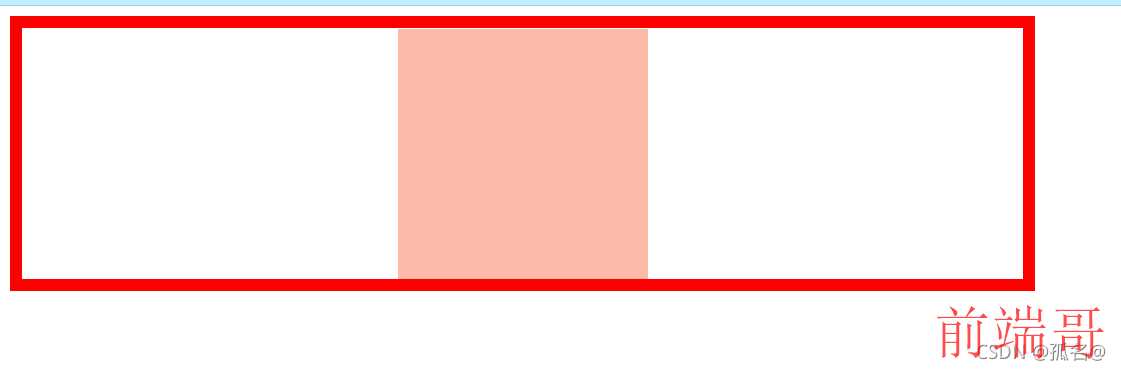
常用于设置子元素的居中
-
现在将两个margin删掉,将width设置成1000px;
.outer{
    width:800px;
    height:200px;
    border:10px red solid;
}

.inner{
    width:1000px;
    height: 200px;
    background-color:#fba;
    /* margin-left:auto;
    margin-right:auto; */
}
- 浏览器会自动设置margin-right为-200px
-
Step23.盒模型的垂直方向的布局
垂直方向的高度
-
父元素的默认高度是被子元素的
height撑开<!DOCTYPE html> <html lang="en"> <head> <meta charset="UTF-8"> <meta http-equiv="X-UA-Compatible" content="IE=edge"> <meta name="viewport" content="width=device-width, initial-scale=1.0"> <link rel="stylesheet" href="../../css/CSS_HTML_0022.css"> <title>盒模型垂直方向布局</title> </head> <body> <div class="outer"> <div class="inner"></div> </div> </body> </html>.outer{ background-color:#bfa; } .inner{ height:200px; }
这样看可能并没有什么效果
.outer{
    background-color:#bfa;
}

.inner{
    width:100px;
    background-color:orange;
    height:200px;
}
-
现在给
.inner设置外底边距<!DOCTYPE html> <html lang="en"> <head> <meta charset="UTF-8"> <meta http-equiv="X-UA-Compatible" content="IE=edge"> <meta name="viewport" content="width=device-width, initial-scale=1.0"> <link rel="stylesheet" href="../../css/CSS_HTML_0022.css"> <title>盒模型垂直方向布局</title> </head> <body> <div class="outer"> <div class="inner"></div> </div> </body> </html>.outer{ background-color:#bfa; } .inner{ width:100px; background-color:orange; height:200px; margin-bottom:100px; } -
结果是不变的
-
但
<!DOCTYPE html>
<html lang="en">
<head>
    <meta charset="UTF-8">
    <meta http-equiv="X-UA-Compatible" content="IE=edge">
    <meta name="viewport" content="width=device-width, initial-scale=1.0">
    <link rel="stylesheet" href="../../css/CSS_HTML_0022.css">
    <title>盒模型垂直方向布局</title>
</head>
<body>
    <div class="outer">
        <div class="inner"></div>
        <div class="inner"></div>
    </div>
</body>
</html>
-
以上都是父元素没有设置height的
-
现在给父元素设置一个大一点的height
.outer{ height: 800px; background-color:#bfa; } .inner{ width:100px; background-color:orange; height:200px; margin-bottom:100px; } -
这样就没子元素的
height什么事了
子元素溢出问题
-
当子元素的
height大于父元素的height的时候,会正常显示子元素和父元素的结果,但是这种情况叫溢出<!DOCTYPE html> <html lang="en"> <head> <meta charset="UTF-8"> <meta http-equiv="X-UA-Compatible" content="IE=edge"> <meta name="viewport" content="width=device-width, initial-scale=1.0"> <link rel="stylesheet" href="../../css/CSS_HTML_0022.css"> <title>盒模型垂直方向布局</title> </head> <body> <!-- <div class="outer"> <div class="inner"></div> <div class="inner"></div> </div> --> <div class="box1"> <div class="box2"></div> </div> </body> </html>/* .outer{ height: 800px; background-color:#bfa; } .inner{ width:100px; background-color:orange; height:200px; margin-bottom:100px; } */ .box1{ width:200px; height: 200px; background:#bfa; } .box2{ width:100px; height:400px; background-color: orange; } -
而且正常也不希望出现这种情况
-
所以我在
.box1,也就是父元素中加上overflow:hidden; -
hidden属性会将超过父元素的部分裁剪(隐藏)
-
overflow的另一个属性值就是
visible -
这是默认的意思,我目前觉得没什么卵用(不过被设计自然有它的道理)
-
最后一个就是
scroll -
这就是将超过父元素的部分和未超过的部分制作成一个滚轮,滚轮的高度等于父元素内容区的高度
<!DOCTYPE html> <html lang="en"> <head> <meta charset="UTF-8"> <meta http-equiv="X-UA-Compatible" content="IE=edge"> <meta name="viewport" content="width=device-width, initial-scale=1.0"> <link rel="stylesheet" href="../../css/CSS_HTML_0022.css"> <title>盒模型垂直方向布局</title> </head> <body> <!-- <div class="outer"> <div class="inner"></div> <div class="inner"></div> </div> --> <div class="box1"> 111111111111111111111111111111111111111111111111111111111111111111111111111111111111111 111111111111111111111111111111111111111111111111111111111111111111111111111111111111111 111111111111111111111111111111111111111111111111111111111111111111111111111111111111111 111111111111111111111111111111111111111111111111111111111111111111111111111111111111111 111111111111111111111111111111111111111111111111111111111111111111111111111111111111111 111111111111111111111111111111111111111111111111111111111111111111111111111111111111111 111111111111111111111111111111111111111111111111111111111111111111111111111111111111111 111111111111111111111111111111111111111111111111111111111111111111111111111111111111111 111111111111111111111111111111111111111111111111111111111111111111111111111111111111111 111111111111111111111111111111111111111111111111111111111111111111111111111111111111111 111111111111111111111111111111111111111111111111111111111111111111111111111111111111111 111111111111111111111111111111111111111111111111111111111111111111111111111111111111111 111111111111111111111111111111111111111111111111111111111111111111111111111111111111111 111111111111111111111111111111111111111111111111111111111111111111111111111111111111111 111111111111111111111111111111111111111111111111111111111111111111111111111111111111111 111111111111111111111111111111111111111111111111111111111111111111111111111111111111111 111111111111111111111111111111111111111111111111111111111111111111111111111111111111111 111111111111111111111111111111111111111111111111111111111111111111111111111111111111111 111111111111111111111111111111111111111111111111111111111111111111111111111111111111111 111111111111111111111111111111111111111111111111111111111111111111111111111111111111111 111111111111111111111111111111111111111111111111111111111111111111111111111111111111111 </div> </body> </html>.box1{ width:200px; height: 200px; background:#bfa; overflow:scroll; }
Step24.垂直外边距的重叠(折叠)问题
兄弟元素
-
相邻的垂直方向的外边距会发生重叠现象
<!DOCTYPE html> <html lang="en"> <head> <meta charset="UTF-8"> <meta http-equiv="X-UA-Compatible" content="IE=edge"> <meta name="viewport" content="width=device-width, initial-scale=1.0"> <link rel="stylesheet" href="../../css/CSS_HTML_0023.css"> <title>外边距的折叠</title> </head> <body> <div class="box1"></div> <div class="box2"></div> </body> </html>.box1{ width:100px; height: 100px; background-color:#bfa; margin-bottom:100px; } .box2{ width: 100px; height: 100px; background-color:orange; margin-top:100px; }[外链图片转存失败,源站可能有防盗链机制,建议将图片保存下来直接上传(img-B3eH4EbW-1673494068930)(C:\Users\张宇航\AppData\Roaming\Typora\typora-user-images\image-20211013140635051.png)]
-
兄弟元素的相邻外边距不同且同号,默认选择较大的
.box1{
    width:100px;
    height: 100px;
    background-color:#bfa;
    margin-bottom:200px;
}

.box2{
    width: 100px;
    height: 100px;
    background-color:orange;
    margin-top:100px;
}
-
如果是异号,那默认是两者的和
.box1{
    width:100px;
    height: 100px;
    background-color:#bfa;
    margin-bottom:-200px;
}

.box2{
    width: 100px;
    height: 100px;
    background-color:orange;
    margin-top:100px;
}
父子元素
-
父子元素相邻外边距,子元素会传递给父元素
<!DOCTYPE html> <html lang="en"> <head> <meta charset="UTF-8"> <meta http-equiv="X-UA-Compatible" content="IE=edge"> <meta name="viewport" content="width=device-width, initial-scale=1.0"> <link rel="stylesheet" href="../../css/CSS_HTML_0023.css"> <title>外边距的折叠</title> </head> <body> <!-- <div class="box1"></div> <div class="box2"></div> --> <div class="box3"> <div class="box4"></div> </div> </body> </html>.box3{ width:200px; height: 200px; background-color:#bfa; } .box4{ width: 100px; height: 100px; background-color:orange; margin-top:100px; } -
这种关系会影响到页面的布局,所以需要处理它
.box3{
    width:200px;
    height: 200px;
    background-color:#bfa;
    padding-top:100px;
}

.box4{
    width: 100px;
    height: 100px;
    background-color:orange;
}
但这样又会出现其他问题

-
可以改成这样
.box3{
    width:200px;
    height: 100px;
    background-color:#bfa;
    padding-top:100px;
}
虽然这样比较麻烦,但不失为一种方法
-
还有一种方法就是使用border将父元素和子元素的外边距隔开
.box3{
    width:200px;
    height: 200px;
    background-color:#bfa;
    border-top:1px red solid;
}

.box4{
    width: 100px;
    height: 100px;
    background-color:orange;
    margin-top:100px;
}
-
但是这种和上一种一样,都需要特意的去改变长度
Step25.行内元素的盒模型
-
行内元素不允许设置
width和height<!DOCTYPE html> <html lang="en"> <head> <meta charset="UTF-8"> <meta http-equiv="X-UA-Compatible" content="IE=edge"> <meta name="viewport" content="width=device-width, initial-scale=1.0"> <link rel="stylesheet" href="../../css/CSS_HTML_0024.css"> <title>行内元素的盒模型</title> </head> <body> <span class="s1">我是span</span> <div class="box1"></div> </body> </html>.s1{ background-color:yellow; width: 100%; height: 100px; } .box1{ background-color:#bfa; width:100px; height: 100px; }
-
行内元素可以设置padding,但垂直方向的padding不会影响页面的布局
.s1{
    background-color:yellow;
    padding:50px;
}

.box1{
    background-color:#dba;
    width:100px;
    height: 100px;
}
这里有一个问题就是padding-top没有显示
对于行内元素,
padding、border、margin是不会生效的这么说不准确,会生效,但不会影响垂直方向的布局,不会将其他元素弹开,只会覆盖
-
行内元素可以设置border,但垂直方向的border不会影响页面的布局
.s1{
    background-color:yellow;
    border:10px red solid;
}

.box1{
    background-color:#dba;
    width:100px;
    height: 100px;
}
-
行内元素可以设置margin,但垂直方向的margin不会影响页面的布局
.s1{
    background-color:yellow;
    margin:100px;
}

.box1{
    background-color:#dba;
    width:100px;
    height: 100px;
}
-
下面设置一个超链接标签
<!DOCTYPE html> <html lang="en"> <head> <meta charset="UTF-8"> <meta http-equiv="X-UA-Compatible" content="IE=edge"> <meta name="viewport" content="width=device-width, initial-scale=1.0"> <link rel="stylesheet" href="../../css/CSS_HTML_0024.css"> <title>行内元素的盒模型</title> </head> <body> <a href="https://zhang666zyh.github.io/">我的博客</a> </body> </html>a{ background-color:#bfa; width:100px; height: 100px; }
-
但我现在想让它变大
-
需要使用到另外一个CSS属性
display -
display可以指定元素的格式,有以下属性值-
block:将元素设置为块元素
-
inline:将元素设置为行内元素
-
inline-block:将元素设置为行内块元素
既可以设置宽高又不会独占一行
-
table:将元素设置成一个表格
-
none:元素不在页面中显示(隐藏)
-
-
最后一个属性是visibility
用于控制元素在页面中的显示样式
它有两个属性值
- visible:正常显示
- hidden:隐藏元素,但元素占用的位置还存在(隐形不是消失)
Step26.浏览器的默认样式
-
浏览器常常给元素设置某些默认样式
-
例如body永远有外边距
<!DOCTYPE html>
<html lang="en">
<head>
    <meta charset="UTF-8">
    <meta http-equiv="X-UA-Compatible" content="IE=edge">
    <meta name="viewport" content="width=device-width, initial-scale=1.0">
    <title>浏览器默认样式</title>
</head>
<body>
    <div class="box1" style="width:100px;height:100px;border:2px black solid;"></div>

    <p>第一个</p>
    <p>第二个</p>
    <p>第三个p</p>

    <ul>
        <li>第一个li</li>
        <li>第二个li</li>
        <li>第三个li</li>
    </ul>
</body>
</html>
-
通常个人是通过设置
margin:0px; padding:0px;*{ margin:0px; padding:0px; } -
也可以通过导入第三方资源包
reset.css<!DOCTYPE html> <html lang="en"> <head> <meta charset="UTF-8"> <meta http-equiv="X-UA-Compatible" content="IE=edge"> <meta name="viewport" content="width=device-width, initial-scale=1.0"> <link rel="stylesheet" href="../../resource/css/reset.css"> <title>浏览器默认样式</title> </head> <body> <div class="box1" style="width:100px;height:100px;border:2px black solid;"></div> <p>第一个</p> <p>第二个</p> <p>第三个p</p> <ul> <li>第一个li</li> <li>第二个li</li> <li>第三个li</li> </ul> </body> </html>reset.css@charset "utf-8"; /* Reset CSS 作用:清除和重置 基础css样式 */ /* 一、重置*/ html { overflow-y: scroll; } /* 让非ie浏览器默认也显示垂直滚动条,防止因滚动条引起的闪烁 */ body,div,p,span,a,img, dl,dt,dd,ul,ol,li, h1,h2,h3,h4,h5,h6, table,thead,tbody,tr,td,th{ padding: 0; margin: 0; } body, button, input, select, textarea { /* for ie */ /*font: 12px/1 Tahoma, Helvetica, Arial, "宋体", sans-serif;*/ font: 12px/1 "微软雅黑", Tahoma, Helvetica, Arial, sans-serif; /* 用 ascii 字符表示,使得在任何编码下都无问题 */ background: transparent; } button, input, select, textarea { font-size: 100%; /* 使得表单元素在 ie 下能继承字体大小 */ border: none; outline: none; } input::-ms-input-placeholder{ color:#c2c2c2; } input::-webkit-input-placeholder { /* webkit 浏览器*/ color:#c2c2c2; } input::-moz-placeholder { /* 火狐浏览器 */ color:#c2c2c2; } textarea::-ms-input-placeholder{ color:#c2c2c2; } textarea::-webkit-input-placeholder { /* webkit 浏览器*/ color:#c2c2c2; } textarea::-moz-placeholder { /* 火狐浏览器 */ color:#c2c2c2; } /* 设置input placeholder 样式 */ select{ appearance:none; -moz-appearance:none; -webkit-appearance:none; cursor: pointer; } select::-ms-expand { display: none; } /*将默认的select选择框样式清除*/ h1,h2,h3,h4,h5,h6{ font-weight: normal;} em,i{font-style:normal;} ul,ol{list-style:none;} a{ text-decoration: none; outline: none; color: #7f7f7f; } a:visited{ text-decoration: none; outline: none; } a:hover { text-decoration: none; outline: none; } a:active{ text-decoration: none; outline: none; } a:focus{ text-decoration: none; outline: none; } img { vertical-align: top;border: none; } /* 让链接里的 img 无边框 ie会出现*/ label{ cursor: pointer; } /* label标签鼠标移入后变为手型 */ table { border-collapse: collapse; /*合并边框*/ border-spacing: 0; } /* 重置表格元素 */ /**********************************************************/ /* 二、常用的 class*/ .fl{ float: left; } .fr{ float: right; } .clear_fix:after{ content:""; display: block; clear: both; } /*清除浮动*/ .beyond_eip{ white-space: nowrap; text-overflow: ellipsis; overflow: hidden; } /*超出省略*/ .beyond2_eip{ text-overflow: ellipsis; overflow: hidden; display: -webkit-box; -webkit-box-orient: vertical; -webkit-line-clamp:2; } .beyond3_eip{ text-overflow: ellipsis; overflow: hidden; display: -webkit-box; -webkit-box-orient: vertical; -webkit-line-clamp:3; } .beyond4_eip{ text-overflow: ellipsis; overflow: hidden; display: -webkit-box; -webkit-box-orient: vertical; -webkit-line-clamp:4; } /*超出多行省略*/ .ofh{ overflow: hidden; } /*超出隐藏*/ .el_hide { position: absolute; width: 1px; height: 1px; padding: 0; margin: -1px; overflow: hidden; clip: rect(0, 0, 0, 0); border: 0; } /* 隐藏元素 */ .bg_cover{ background-position: center; -webkit-background-size: cover; -moz-background-size: cover; background-size: cover; background-repeat: no-repeat; } /* 背景居中铺满 */ .img_center{ display: inline-block; margin: 0 auto; } /* 图片水平居中 */ .sele_none{ user-select: none; -moz-user-select: none; -ms-user-select: none; -webkit-user-select: none; } -
只要导入这个css包,浏览器所有的样式都会消除
Step27.盒模型的大小
- box-size:用于指定盒模型的计算方式
<!DOCTYPE html>
<html lang="en">
<head>
<meta charset="UTF-8">
<meta http-equiv="X-UA-Compatible" content="IE=edge">
<meta name="viewport" content="width=device-width, initial-scale=1.0">
<link rel="stylesheet" href="../../css/CSS_HTML_0026.css">
<title>盒模型的大小</title>
</head>
<body>
<div class="boxer"></div>
</body>
</html>
.boxer{
width:100px;
height:100px;
background-color:#bfa;
box-sizing:content-box;
/* box-sizing:border-box; */
}
-
box-sizing有两个属性值:
-
content-box:width和height为内容区的大小
-
border-box:width和height为盒模型整个可见区域的大小
也就是content + padding + border
-
Step28.盒子阴影和边角
-
盒模型可以设置轮廓阴影(box-shadow)
<!DOCTYPE html> <html lang="en"> <head> <meta charset="UTF-8"> <meta http-equiv="X-UA-Compatible" content="IE=edge"> <meta name="viewport" content="width=device-width, initial-scale=1.0"> <link rel="stylesheet" href="/css/CSS_HTML_0027.css"> <title>轮廓阴影和圆角</title> </head> <body> <div class="box"></div> </body> </html>.box{ width:200px; height:200px; background-color:#bfa; box-shadow:0px 0px 50px rgba(0,0,0,.3); }第一个值是阴影水平方向的偏移量
第二个值是阴影垂直方向的偏移量
第三个值是阴影的模糊半径
第四个值是阴影的颜色
-
盒模型也可以设置圆边角
.box{ width:200px; height:200px; background-color:#bfa; border-radius:20%; border-radius:10px 20px 30px 40px; }四个值:左上,右上,右下,左下(从左上开始顺时针)
三个值:左上,右上/左下,右下
两个值:左上/右下,右上/左下
一个值:四个都一样
50%:圆
-
box-shadow有一些属性
box-shadow: offset-x offset-y blur spread color inset;
参数解释offset-x:必需,取值正负都可。offset-x水平阴影的位置。
offset-y:必需,取值正负都可。offset-y垂直阴影的位置。
blur: 可选,只能取正值。blur-radius阴影模糊半径,0即无模糊效果,值越大阴影边缘越模糊。
spread:可选,取值正负都可。spread代表阴影的周长向四周扩展的尺寸,正值,阴影扩大,负值阴影缩小。
color:可选。阴影的颜色。如果不设置,浏览器会取默认颜色,通常是黑色,但各浏览器默认颜色有差异,建议不要省略。可以是rgb(250,0,0),也可以是有透明值的rgba(250,0,0,0.5)。
inset:可选。关键字,将外部投影(默认outset)改为内部投影。inset 阴影在背景之上,内容之下。
注意:inset 可以写在参数的第一个或最后一个,其它位置是无效的。
Step29.浮动初探
- 提前说明,无论怎么浮动,浮动元素都不会跑到父元素的外面
<!DOCTYPE html>
<html lang="en">
<head>
<meta charset="UTF-8">
<meta http-equiv="X-UA-Compatible" content="IE=edge">
<meta name="viewport" content="width=], initial-scale=1.0">
<link rel="stylesheet" href="/css/CSS_HTML_0028.css">
<title>浮动</title>
</head>
<body>
<div class="box1"></div>
</body>
</html>
.box1{
width:200px;
height:200px;
background-color:#bfa;
float:right;
}


-
当有两个盒子时
<!DOCTYPE html> <html lang="en"> <head> <meta charset="UTF-8"> <meta http-equiv="X-UA-Compatible" content="IE=edge"> <meta name="viewport" content="width=], initial-scale=1.0"> <link rel="stylesheet" href="/css/CSS_HTML_0028.css"> <title>浮动</title> </head> <body> <div class="box1"></div> <div class="box2"></div> </body> </html>.box1{ width:200px; height:200px; background-color:#bfa; /* float:right; */ } .box2{ width:200px; height:200px; background-color:#fba; } -
这时候两个盒子是正常排列的
-
但是当取消
float=right;的注解之后
这是因为浮动的元素是脱离文档流的,所以底下的会自动向上补全
-
当两个挨着的盒子一起浮动的时候,后面的元素不会超过前面的元素

-
浮动元素不会超过它上边浮动的兄弟元素,最多和它一样高
.box1{ width:400px; height:200px; background-color:#bbffaa; float:left; } .box2{ width:400px; height:200px; background-color:#fba; float:left; } .box3{ width:200px; height:200px; background-color:orange; float:right; }
Step30.浮动的特点
浮动可以创建文字围绕图片的效果
<!DOCTYPE html>
<html lang="en">
<head>
<meta charset="UTF-8">
<meta http-equiv="X-UA-Compatible" content="IE=edge">
<meta name="viewport" content="width=device-width, initial-scale=1.0">
<link rel="stylesheet" href="/css/CSS_HTML_0029.css">
<title>浮动的特点</title>
</head>
<body>
<div class="box"></div>
<p>2013 年 7 月,产品被拆分为:GitLab CE(社区版)和 GitLab EE(企业版),当时,GitLab CE 和GitLab EE 的许可仍然是根据 MIT 许可分发的免费和开源软件;
2014 年 2 月,GitLab公司宣布采用开放核心业务模式。GitLab EE 设置在专有许可证下,并且包含CE版本中不存在的功能;
2015 年 7 月,GitLab公司又筹集了 150 万美元的种子基金。截至 2015 年的客户包括阿里巴巴集团,IBM 和SpaceX。同年9 月,GitLab 从 Khosla Ventures 筹集了 400 万美元的 A 系列资金;
2016 年 7 月,GitLab CEO 确认了公司的开放核心功能。同年 9 月,GitLab 从 August Capital 和其他公司筹集了 2000 万美元的 B 系列资金;
2017年10月9日,C轮融资,GitLab Inc.获得 GV 领投,Telstra Ventures、Matt Mullenweg(个人)和INKEF Capital跟投的2000万美元资金;
2018年9月19日,D轮融资,GitLab Inc.获得 GS Growth 和 ICONIQ Capital 领投,Khosla Ventures、GV和INKEF Capital跟投的1亿美元投资;
2019年9月12日,E轮融资,GitLab Inc.获得 Goldman Sachs 和 ICONIQ Capital 领投,Y Combinator、Coatue、Adage Capital Management等跟投的2.68亿美元投资。
势头强劲</p>
</body>
</html>
.box{
width:200px;
height:200px;
background-color:#bfa;
float:left;
}

- 文字上面的元素浮动,文字会上浮,但是不会进入到上面浮动元素的下面
块元素的浮动
<!DOCTYPE html>
<html lang="en">
<head>
<meta charset="UTF-8">
<meta http-equiv="X-UA-Compatible" content="IE=edge">
<meta name="viewport" content="width=device-width, initial-scale=1.0">
<link rel="stylesheet" href="/css/CSS_HTML_0029.css">
<title>浮动的特点</title>
</head>
<body>
<div class="box">hello</div>
</body>
</html>
.box{
background-color:greenyellow;
}

.box{
background-color:greenyellow;
float:left;
}

-
块元素浮动
宽高默认被内容撑开
不再独占页面的一行
行内元素的浮动
-
行内元素浮动后,会变成块元素
浮动前<!DOCTYPE html> <html lang="en"> <head> <meta charset="UTF-8"> <meta http-equiv="X-UA-Compatible" content="IE=edge"> <meta name="viewport" content="width=device-width, initial-scale=1.0"> <link rel="stylesheet" href="/css/CSS_HTML_0029.css"> <title>浮动的特点</title> </head> <body> <span>hello</span> </body> </html>span{ width: 100px; height: 100px; background-color:#bfa; }
浮动后span{ float:left; width: 100px; height: 100px; background-color:#bfa; }
Step31.简单的网页布局
<!DOCTYPE html>
<html lang="en">
<head>
<meta charset="UTF-8">
<meta http-equiv="X-UA-Compatible" content="IE=edge">
<meta name="viewport" content="width=device-width, initial-scale=1.0">
<link rel="stylesheet" href="../../css/CSS_HTML_0030.css">
<title>简单的网页布局</title>
</head>
<body>
<header></header>
<main>
<nav></nav>
<article></article>
<aside></aside>
</main>
<footer></footer>
</body>
</html>
header main footer{
width:auto;
margin:0 auto;
}
header{
height:50px;
background-color:#bfa;
}
main{
height:580px;
margin:10px auto;
background-color:#dfdfdf;
}
nav{
display:inline-block;
width:230px;
height:100%;
background-color:wheat;
}
article{
display:inline-block;
width:1000px;
height:100%;
margin:0 10px;
background-color:mediumpurple;
}
aside{
display:inline-block;
width:243px;
height:100%;
background-color:wheat;
}
footer{
height:70px;
background-color:lightblue;
}

Step32.高度塌陷和BFC
-
先写一个outer和inner
<!DOCTYPE html> <html lang="en"> <head> <meta charset="UTF-8"> <meta http-equiv="X-UA-Compatible" content="IE=edge"> <meta name="viewport" content="width=device-width, initial-scale=1.0"> <link rel="stylesheet" href="/css//CSS_HTML_0031.css"> <title>高度塌陷和BFC</title> </head> <body> <div class="outer"> <div class="inner"></div> </div> </body> </html>.outer{ border:10px red solid; } .inner{ width:100px; height:100px; background-color:#bfa; }
-
没错,父元素默认被子元素的高度撑开
-
但是,现在子元素浮动
.outer{ border:10px red solid; } .inner{ width:100px; height:100px; background-color:#bfa; float:left; }
-
父元素高度丢失之后,其下的元素会自动上移,导致页面混乱
-
高度塌陷是页面布局中的重大问题,所以必须解决它
<!DOCTYPE html> <html lang="en"> <head> <meta charset="UTF-8"> <meta http-equiv="X-UA-Compatible" content="IE=edge"> <meta name="viewport" content="width=device-width, initial-scale=1.0"> <link rel="stylesheet" href="/css//CSS_HTML_0031.css"> <title>高度塌陷和BFC</title> </head> <body> <div class="outer"> <div class="inner"></div> </div> <div style="width:100px;height:100px;background-color:yellow;"></div> </body> </html>.outer{ height:100px; border:10px red solid; } .inner{ width:100px; height:100px; background-color:#bfa; float:left; }
-
当然我们可以通过给父元素设置高度来解决这个问题,但是
- 第一,这种实质上子元素还是浮动的,只是靠着父元素一个空的高度撑开
- 第二,往往需要使父元素的高度随着子元素的不同而不同
-
总之,最终目的是,既能实现子元素的浮动又能将父元素的高度撑开
-
这时候就需要使用BFC
BFC(块级格式化环境)
CSS中隐藏的属性,可以为一个元素开启BFC
开启BFC该元素会变成一个独立的布局区域
-
元素开启BFC的特点
- 开启BFC的元素不会被浮动元素所覆盖
- 开启BFC的元素的父元素和子元素外边距不会重叠
- 开启BFC的元素可以包含浮动的子元素
-
开启BFC有三种方式
-
第一种,给父元素添加浮动,使父元素和子元素处于同一层级中
.outer{ /* height:100px; */ border:10px red solid; float:left; } .inner{ width:100px; height:100px; background-color:#bfa; float:left; } -
第二种,将父元素设置为行内块元素
.outer{ /* height:100px; */ border:10px red solid; /* float:left; */ display:inline-block; } .inner{ width:100px; height:100px; background-color:#bfa; float:left; } -
但前两种都不被推荐使用,因为它们的结果都是这样的

-
目前最推荐的方式就是给父元素设置一个非visible值的overflow
.outer{ /* height:100px; */ border:10px red solid; /* display:inline-block; */ overflow:hidden; /* float:left; */ } .inner{ width:100px; height:100px; background-color:#bfa; float:left; }
-
Step33.BFC演示
开启BFC的元素不会被浮动元素所覆盖
<!DOCTYPE html>
<html lang="en">
<head>
<meta charset="UTF-8">
<meta http-equiv="X-UA-Compatible" content="IE=edge">
<meta name="viewport" content="width=device-width, initial-scale=1.0">
<link rel="stylesheet" href="F:\Code\WriteCodes\WebStudy\resource\css\reset.css">
<link rel="stylesheet" href="F:\Code\WriteCodes\WebStudy\css\CSS_HTML_0032.css">
<title>BFC的演示</title>
</head>
<body>
<div class="box1"></div>
<div class="box2"></div>
</body>
</html>
.box1{
width:100px;
height: 100px;
background-color:#bfa;
float:left;
}
.box2{
width:100px;
height:100px;
background-color:#fba;
overflow:hidden;
}

开启BFC的父元素和子元素的外边距不会重叠
<!DOCTYPE html>
<html lang="en">
<head>
<meta charset="UTF-8">
<meta http-equiv="X-UA-Compatible" content="IE=edge">
<meta name="viewport" content="width=device-width, initial-scale=1.0">
<link rel="stylesheet" href="F:\Code\WriteCodes\WebStudy\resource\css\reset.css">
<link rel="stylesheet" href="F:\Code\WriteCodes\WebStudy\css\CSS_HTML_0032.css">
<title>BFC的演示</title>
</head>
<body>
<div class="box1">
<div class="box3"></div>
</div>
</body>
</html>
.box1{
width:200px;
height:200px;
background-color:#bfa;
}
.box3{
width:100px;
height:1050px;
background-color:#fba;
margin-top:100px;
}

-
这种就是幺蛾子
-
给父元素开启BFC
.box1{ width:100px; height: 100px; background-color:#bfa; overflow:hidden; } .box3{ width:50px; height: 50px; background-color:#fba; margin-top:100px; }
Step34.Clear
-
Clear用于清除相邻的float对当前元素的影响
<!DOCTYPE html> <html lang="en"> <head> <meta charset="UTF-8"> <meta http-equiv="X-UA-Compatible" content="IE=edge"> <meta name="viewport" content="width=device-width, initial-scale=1.0"> <link rel="stylesheet" href="F:\Code\WriteCodes\WebStudy\resource\css\reset.css"> <link rel="stylesheet" href="F:\Code\WriteCodes\WebStudy\css\CSS_HTML_0033.css"> <title>Clear</title> </head> <body> <div class="box1">1</div> <div class="box2">2</div> <div class="box3">3</div> </body> </html>div{ font-size:20px; } .box1{ width:200px; height:200px; background-color:#bfa; } .box3{ width:200px; height:200px; background-color:orange; }
-
现在使float1浮动
div{ font-size:20px; } .box1{ width:200px; height:200px; background-color:#bfa; float:left; } .box3{ width:200px; height:200px; background-color:orange; }
-
但我想让盒子3不受盒子1的浮动影响
div{ font-size:20px; } .box1{ width:200px; height:200px; background-color:#bfa; float:left; } .box3{ width:200px; height:200px; background-color:orange; clear:left; }
-
原理:给当前元素加了一个相对于body和html的浮动元素模型尺寸的外边距
-
现在是这样的
div{ font-size:20px; } .box1{ width:200px; height:200px; background-color:#bfa; float:left; } .box2{ width:400px; height:400px; background-color:#fba; float:right; } .box3{ width:200px; height:200px; background-color:orange; clear:left; }
-
但我修改div3的clear方向
div{ font-size:20px; } .box1{ width:200px; height:200px; background-color:#bfa; float:left; } .box2{ width:400px; height:400px; background-color:#fba; float:right; } .box3{ width:200px; height:200px; background-color:orange; clear:right; }
-
就是说clear可以指定取消左边或者右边元素的浮动影响
-
clear还有一个值,是both,可以减少左右两边浮动元素对当前元素影响较大的影响
Step35.使用after解决高度塌陷问题

.outer{
border:5px red solid;
}
.inner{
width:100px;
height: 100px;
background-color:#bfa;
float:left;
}

-
解决方法
<!DOCTYPE html> <html lang="en"> <head> <meta charset="UTF-8"> <meta http-equiv="X-UA-Compatible" content="IE=edge"> <meta name="viewport" content="width=device-width, initial-scale=1.0"> <link rel="stylesheet" href="F:\Code\WriteCodes\WebStudy\css\CSS_HTML_0034.css"> <title>使用after解决高度塌陷问题</title> </head> <body> <div class="outer"> <div class="inner"></div> <div class="inner1"></div> </div> </body> </html>.outer{ border:5px red solid; } .inner{ width:100px; height: 100px; background-color:#bfa; float:left; } .inner1{ clear:both; }在outer中有两个子元素盒盒子,上面那个已经被设置成了浮动,只要将下面那个设置取消上面浮动对他的影响,这样两个子元素的距离就还是相同。看着还是父元素被第一个元素撑开,其实是被下面那个元素撑开
-
但这种方式弊端大大滴有
-
所以需要使用另外一种方式
.outer{
border:5px red solid;
}
.inner{
width:100px;
height: 100px;
background-color:#bfa;
float:left;
}
/* outer的after是div中的最底部的/最后一个子元素 */
.outer::after{
content:'';
display:block;
/* 即使你取消了父元素对子元素的浮动影响,但由于content默认是行内元素,不会独占一行,所以需要将其转换为块元素 */
clear:both;
}
Step36.同时解决高度塌陷和外边距重叠
<!DOCTYPE html>
<html lang="en">
<head>
<meta charset="UTF-8">
<meta http-equiv="X-UA-Compatible" content="IE=edge">
<meta name="viewport" content="width=device-width, initial-scale=1.0">
<link rel="stylesheet" href="F:\Code\WriteCodes\WebStudy\css\HTML_0035.css">
<link rel="stylesheet" href="F:\Code\WriteCodes\WebStudy\resource\css\reset.css">
<title>同时解决高度塌陷和外边距重叠</title>
</head>
<body>
<div class="outer">
<div class="inner"></div>
</div>
</body>
</html>
.outer{
width:200px;
height:200px;
background-color:#bfa;
}
.inner{
width:100px;
height:100px;
background-color:#fba;
}
.outer{
width:200px;
height:200px;
background-color:#bfa;
}
.inner{
width:100px;
height:100px;
background-color:#fba;
margin-top:100px;
}
这样就会出现外边距重叠的问题
-
解决方案
-
1
.outer{ width:200px; height:200px; background-color:#bfa; } .inner{ width:100px; height:100px; background-color:#fba; margin-top:100px; } .outer::before{ content:''; display:inline-block; clear:both; }
这样底部会有些越界,这是因为inline-block是行内块元素,有尺寸的
块元素就直接不起作用了
-
2
.outer{ width:200px; height:200px; background-color:#bfa; } .inner{ width:100px; height:100px; background-color:#fba; margin-top:100px; } .outer::before{ content:''; display:table; }table如果content为空是不占空间的
-
-
现在要实现给这个元素同时解决高度塌陷和外边距重叠
<!DOCTYPE html> <html lang="en"> <head> <meta charset="UTF-8"> <meta http-equiv="X-UA-Compatible" content="IE=edge"> <meta name="viewport" content="width=device-width, initial-scale=1.0"> <link rel="stylesheet" href="F:\Code\WriteCodes\WebStudy\css\HTML_0035.css"> <link rel="stylesheet" href="F:\Code\WriteCodes\WebStudy\resource\css\reset.css"> <title>同时解决高度塌陷和外边距重叠</title> </head> <body> <div class="outer clearfix"> <div class="inner"></div> </div> </body> </html>.outer{ width:200px; height:200px; background-color:#bfa; } .inner{ width:100px; height:100px; background-color:#fba; margin-top:100px; } .clearfix::before, .clearfix::after{ content:''; display:table; clear:both; }before和conntent和display是一组的
因为如果你想要解决外边距重叠只需要使用一个元素将子元素和父元素的外边距隔离开
after是和content、display以及clear是一组的
因为你需要利用底部空元素取消父元素浮动对其影响,这样子元素仍然可以将父元素撑开
因为这时候父元素的浮动和子元素无关了
Step37.定位
-
定位(position)
定位是一种更高级的布局方式
通过定位可以将元素放置到页面的任何位置
使用position设置定位
- 可选值| position的值 | 说明 |
| :----------: | :-------------------: |
| static | 默认值,元素不开启定位 |
| relative | 开启元素的相对定位 |
| absolute | 开启元素的绝对定位 |
| fixed | 开启元素的固定定位 |
| stricky | 开启元素的粘滞定位 |
- 可选值| position的值 | 说明 |
相对定位
-
将position的值设置为relative,即将元素设置为相对定位
-
相对定位是相对自身位置进行定位
开启相对定位之后,如果不给定位设置偏移量,则元素的位置不会有任何的变化
-
偏移量
value 说明 top 定位元素和定位位置上边的距离—>top值越大,元素上边和定位位置的距离就越大 bottom 定位元素和定位位置下边的距离—>bottom值越大,元素下边和定位位置的距离就越大 left 定位元素和定位位置左边的距离—>left值越大,元素左边和定位位置的距离就越大 right 定位元素和定位位置右边的距离—>right值越大,元素右边和定位位置的距离就越大 -
应用
<!DOCTYPE html> <html lang="en"> <head> <meta charset="UTF-8"> <meta http-equiv="X-UA-Compatible" content="IE=edge"> <meta name="viewport" content="width=device-width, initial-scale=1.0"> <link rel="stylesheet" href="F:\Code\WriteCodes\WebStudy\css\CSS_HTML_0036.css"> <title>定位之相对定位</title> </head> <body> <div class="box1"></div> <div class="box2"></div> <div class="box3"></div> </body> </html>
.box1{
width:100px;
height: 100px;
background-color:#bfa;
}
.box2{
width:100px;
height: 100px;
background-color:#fba;
margin-left:100px;
margin-top:-200px;
}
.box3{
width:100px;
height: 100px;
background-color:orange;
}

-
通常给元素定位会使用margin和float
-
但这两种方法的副作用也是很多的
-
所以这里使用position
.box1{ width:100px; height: 100px; background-color:#bfa; } .box2{ width:100px; height: 100px; background-color:#fba; position:relative; left:100px; top:-100px; } .box3{ width:100px; height: 100px; background-color:orange; }

绝对定位
- 当将position设置成absolute,即将元素设置成了绝对定位
- 设置成绝对定位的元素的特点
开启绝对定位的元素,如果不给元素设置偏移量,则元素的位置不会发生变化
开启绝对定位后,元素会从文档流中脱离
开启绝对定位后,行内变成块,块的宽高默认被内容撑开
绝对定位会使元素提升一个层级
绝对定位是相对于其他块包含快进行定位的
-
绝对定位的包含块
包含块就是离它最近的开启定位的祖先元素
所以为啥都将外层position设置为relative,里层设置为absolute,这样外层就可以不动,内层还可以相对于外层进行定位
如果所有的祖先元素都没开启绝对定位,则根元素就是包含块
<html>
<!DOCTYPE html>
<html lang="en">
<head>
<meta charset="UTF-8">
<meta http-equiv="X-UA-Compatible" content="IE=edge">
<meta name="viewport" content="width=device-width, initial-scale=1.0">
<link rel="stylesheet" href="F:\Code\WriteCodes\WebStudy\css\CSS_HTML_0037.css">
<title>绝对定位</title>
</head>
<body>
<div class="box1"></div>
<div class="box2"></div>
<div class="box3"></div>
</body>
</html>
.box1{
width:100px;
height:100px;
background-color:#fba;
}
.box2{
width:100px;
height:100px;
background-color:#bfa;
position:absolute;
left:0px;
top:0px;
}
.box3{
width:100px;
height:100px;
background-color:orange;
}

固定定位
- position:fixed;固定定位
- 固定定位是相对于浏览器可视窗口进行定位的,与其他无关
<!DOCTYPE html>
<html lang="en">
<head>
<meta charset="UTF-8">
<meta http-equiv="X-UA-Compatible" content="IE=edge">
<meta name="viewport" content="width=device-width, initial-scale=1.0">
<link rel="stylesheet" href="F:\Code\WriteCodes\WebStudy\css\CSS_HTML_0038.css">
<title>固定定位</title>
</head>
<body>
<div class="box1"></div>
</body>
</html>
.box1{
width:100px;
height:100px;
background-color:orange;
position:fixed;
top:100px;
left:200px;
}

粘滞定位
- position:sticky;开启粘滞定位
- 开启粘滞定位的元素,当前如果达到元素相对于浏览器可视窗口的top、left、right以及bottom四个元素的指定值,则元素被粘滞在当前位置(静止)
<!DOCTYPE html>
<html lang="en">
<head>
<meta charset="UTF-8">
<meta http-equiv="X-UA-Compatible" content="IE=edge">
<meta name="viewport" content="width=device-width, initial-scale=1.0">
<link rel="stylesheet" href="F:\Code\WriteCodes\WebStudy\css\CSS_HTML_0039.css">
<title>粘滞定位</title>
</head>
<body>
<div class="box"></div>
</body>
</html>
body{
height:10000px;
}
.box{
width:1000px;
height:50px;
background-color:#bfa;
}
这样如果拖动滑动条,那么div也会跟着移动
![Photo]
body{
height:10000px;
}
.box{
width:1000px;
height:50px;
background-color:#bfa;
position:sticky;
top:0px;
}
这样就解决了
Step38.绝对定位元素的位置
<!DOCTYPE html>
<html lang="en">
<head>
<meta charset="UTF-8">
<meta http-equiv="X-UA-Compatible" content="IE=edge">
<meta name="viewport" content="width=device-width, initial-scale=1.0">
<link rel="stylesheet" href="F:\Code\WriteCodes\WebStudy\css\CSS_HTML_0040.css">
<title>绝对定位元素的位置</title>
</head>
<body>
<div class="outer">
<div class="inner"></div>
</div>
</body>
</html>
水平方向的布局
.outer{
width:200px;
height:200px;
background-color:#bfa;
}
.inner{
width:100px;
height:100px;
background-color:orange;
position:absolute;
left:0px;
top:0px;
}
-
当元素开启了绝对定位后,它的left、top等元素就是相对于它的包含块进行定位
-
所以赋予绝对定位的块元素
-
它的水平布局就变成了、
left + margin-left + border + padding-left + width+ padding-right + border + margin-right + right = 包含块内容区的宽度
-
当给子元素同时设置
position:absolute; left:0px; right:0px; -
right则会失效
-
当一个元素开启了绝对定位
-
和水平方向一样,规则是一样的,只不过加上了一个left和right
-
过度约束
如果等式中没有auto,则自动调整right
如果有,则调整auto
*{ margin:0px; padding:0px; } .outer{ width:200px; height:200px; background-color:#bfa; position:relative; } .inner{ width:auto; height:100px; background-color:orange; position:absolute; left:0px; right:0px; }

-
*{
margin:0px;
padding:0px;
}
.outer{
width:200px;
height:200px;
background-color:#bfa;
position:relative;
}
.inner{
width:100px;
height:100px;
margin-left:auto;
margin-right:auto;
background-color:orange;
position:absolute;
left:0px;
right:0px;
}

-
它会自动调整margin-left和margin-right两个值,不会像left和right两个有优先级一说
-
将left和right都设置成auto
*{
    margin:0px;
    padding:0px;
}

.outer{
    width:200px;
    height:200px;
    background-color:#bfa;
    position:relative;
}

.inner{
    width:100px;
    height:100px;
    margin-left:auto;
    margin-right:auto;
    background-color:orange;
    position:absolute;
    left:auto;
    right:auto;
}
在绝对定位盒模型的水平布局中,left和right优先级大于margin-left和margin-right,会先调整left和right
所以此时margin会失效
如果还想像上面那样居中,可以通过固定left和right都为0,这样就可以了
垂直方向的布局
- 垂直方向和水平方向一样
- 这里如果想让inner在outer中居中
*{
    margin:0px;
    padding:0px;
}

.outer{
    width:200px;
    height:200px;
    background-color:#bfa;
    position:relative;
}

.inner{
    width:100px;
    height:100px;
    margin:auto;
    background-color:orange;
    position:absolute;
    left:0px;
    right:0px;
    top:0px;
    bottom:0px;
}

固定position的四个方向,然后让margin的四个方向全部为上下左右,这样就可以实现margin四个方向的属性自动调节了
Step39.元素的层级
- 写三个兄弟盒子
- 然后给第三个开启绝对定位
<!DOCTYPE html>
<html lang="en">
<head>
    <meta charset="UTF-8">
    <meta http-equiv="X-UA-Compatible" content="IE=edge">
    <meta name="viewport" content="width=device-width, initial-scale=1.0">
    <link rel="stylesheet" href="F:\Code\WriteCodes\WebStudy\css\CSS_HTML_0041.css">
    <title>Document</title>
</head>
<body>
    <div class="box1">1</div>
    <div class="box2">2</div>
    <div class="box3">3</div>
</body>
</html>
.box1{
    width:200px;
    height: 200px;
    background-color:#bfa;
}

.box2{
    width:200px;
    height:200px;
    background-color:orange;
    position:absolute;
}

.box3{
    width:200px;
    height:200px;
    background-color:skyblue;
}

会发现2将3覆盖住了
这是因为开启绝对定位的元素会脱离文档流,层级会升高
- 现在给三个盒子全部设置绝对定位
.box1{
    width:200px;
    height: 200px;
    background-color:#bfa;
    position:absolute;
}

.box2{
    width:200px;
    height:200px;
    background-color:orange;
    position:absolute;
    top:100px;
    left:100px;
}

.box3{
    width:200px;
    height:200px;
    background-color:skyblue;
    position:absolute;
    top:200px;
    left:200px;
}

可以看到,同时开启了绝对定位,网页中写在最下面的是最上面的
- 现在我想让2压着3
.box1{
    width:200px;
    height: 200px;
    background-color:#bfa;
    position:absolute;
}

.box2{
    width:200px;
    height:200px;
    background-color:orange;
    position:absolute;
    top:100px;
    left:100px;
    z-index:1;
}

.box3{
    width:200px;
    height:200px;
    background-color:skyblue;
    position:absolute;
    top:200px;
    left:200px;
}
给元素设置一个z-index,这样在开启绝对定位的所有元素中就依靠他们自身的z-index的数值大小决定层级的高低.z-index的数值越大,层级越高
注意
如果元素的层级一样,则优先显示靠下的(写在下面的元素)
祖先元素的层级再高也不会覆盖后代元素
Step40.字体
<!DOCTYPE html>
<html lang="en">
<head>
    <meta charset="UTF-8">
    <meta http-equiv="X-UA-Compatible" content="IE=edge">
    <meta name="viewport" content="width=device-width, initial-scale=1.0">
    <link rel="stylesheet" href="F:\Code\WriteCodes\WebStudy\css\CSS_HTML_0042.css">
    <title>Document</title>
</head>
<body>
    <p>今天天气真好啊</p>
</body>
</html>
p{
    color:orange;
    font-size:30px;
}
- color是字体的颜色,font-size是字体的大小
字体族
- 就是一些字体的分类
- 通过font-family来设置
<family-name>
一个字体族的名字。例如"Times" 和 "Helvetica" 都是字体族名。字体族名可以包含空格,但包含 空格时应该用引号。
<generic-name>
通用字体族名是一种备选机制,用于在指定的字体不可用时给出较好的字体。通用字体族名都是关键 字,所以不可以加引号。 在列表的末尾应该至少有一个通用字体族名。 以下是该属性可能的取值以及 他们的定义。
serif
带衬线字体,笔画结尾有特殊的装饰线或衬线。
例如: Lucida Bright, Lucida Fax, Palatino, "Palatino Linotype", Palladio, "URW Palladio", serif.
sans-serif
无衬线字体,即笔画结尾是平滑的字体。
例如, "Open Sans", "Fira Sans", "Lucida Sans", "Lucida Sans Unicode", "Trebuchet MS", "Liberation Sans", "Nimbus Sans L", sans-serif.
monospace
等宽字体,即字体中每个字宽度相同。
例如, "Fira Mono", "DejaVu Sans Mono", Menlo, Consolas, "Liberation Mono", Monaco, "Lucida Console", monospace.
cursive
草书字体。这种字体有的有连笔,有的还有特殊的斜体效果。因为一般这种字体都有一点连笔效 果,所以会给人一种手写的感觉。
例如,"Brush Script MT", "Brush Script Std", "Lucida Calligraphy", "Lucida Handwriting", "Apple Chancery", cursive.
fantasy
Fantasy 字体主要是那些具有特殊艺术效果的字体。
例如,Papyrus, Herculanum, Party LET, Curlz MT, Harrington, fantasy.
system-ui
从浏览器所处平台处获取的默认用户界面字体。由于世界各地的排版习惯之间有很大的差异,这个 通用选项 is provided for typefaces that don't map cleanly into the other generics.
math
针对显示数学相关字符的特殊样式问题而设计的字体:支持上标和下标、跨行括号、嵌套表达式和 具有不同含义的double struck glyphs。
emoji
专门用于呈现 Emoji 表情符号的字体。
fangsong
一种汉字字体,介于宋体和楷体之间。这种字体常用于某些政府文件。
- 上面这些都是最常用的字体,也是在写font-family多个值的时候最后面那个,为的就是确保如果前面的字体都没有,可以给页面适配最合适的字体
- 使用一下这些字体
p{
color:orange;
font-size:30px;
font-family:serif;
}

p{
color:orange;
font-size:30px;
font-family:'Courier New', Courier, monospace;
}
- 这种就是比较常用的写法,font-family支持同时设置多个字体,默认从左往后使用.
- 如果有第一个就使用第一个,如果没有就使用第二个,以此类推
- 这种就是为了防止客户端没有第一种字体这种类似情况而没有字体加载出现错误
- 中间有空格的字体写在最前面,而且要有引号,目的是防止空格将一个字体分割成两个单词
导入本地字体包
@font-face{
font-family:'my font';
src:url("F:/Code/WriteCodes/WebStudy/HTML/CSS_HTML/resource/font/JiZiJingDianKaiTiJianFan-Shan(GEETYPE-KaiTiGBT-Flash)-2.ttf");
}
p{
color:orange;
font-size:30px;
font-family:'my font', Courier, monospace
}
- 使用@font-face注解创建你的字体,font-family是字体名称,src是字体包路径
Step41.字体图片

-
通常使用图标,常识是以为使用图片,比如
阿里巴巴矢量图标网,然而,图片当放大十倍甚至更大的时候,像素失帧问题就体现出来了,像素会暴露得一览无余 -
但是字体不一样,你在页面中写字体,方法10倍可能只看到很小的锯齿,所以就出现了锯齿图标
-
阿里巴巴矢量图标网不好用
-
这里使用font awesome
-
进入官网
-
fontawesome


-
下载成功解压,将
css和webfonts两个目录放到你的项目路径下 -
然后在
index.html中引用all.css<!DOCTYPE html> <html lang="en"> <head> <meta charset="UTF-8"> <meta http-equiv="X-UA-Compatible" content="IE=edge"> <meta name="viewport" content="width=device-width, initial-scale=1.0"> <link rel="stylesheet" href="F:\Code\WriteCodes\WebStudy\css\CSS_HTML_0043.css"> <link rel="stylesheet" href="F:\Code\WriteCodes\WebStudy\HTML\CSS_HTML\resource\css\all.css"> <title>字体图标</title> </head> <body> <i class="fas fa-camera"></i> </body> </html>i{ color:tomato; font-size:50px; }
-
具体使用方法官网有文档,也可以CSDN、StackOverflow
Step42.字体图片的其他用法
读源码

-
可以看到,在前端中使用的fa、fab这种类都是在这里设置的
-
写个无序列表
<!DOCTYPE html> <html lang="en"> <head> <meta charset="UTF-8"> <meta http-equiv="X-UA-Compatible" content="IE=edge"> <meta name="viewport" content="width=device-width, initial-scale=1.0"> <link rel="stylesheet" href="F:\Code\WriteCodes\WebStudy\css\CSS_HTML_0044.css"> <link rel="stylesheet" href="F:\Code\WriteCodes\WebStudy\HTML\CSS_HTML\resource\css\all.css"> <title>字体图片的其他用法</title> </head> <body> <ul> <li>锄禾日当午</li> <li>汗滴禾下土</li> <li>谁知盘中餐</li> <li>粒粒皆辛苦</li> </ul> </body> </html>ul li{ list-style:none; } -
结果是每个li前面的点都消失了
-
如果想在它们前面加上自定义的样式,也就是fontawesome的字体图片
-
通常是直接写class="fab 。。。"这种,但是有多少个li,就要复制多少个class,累不累啊
-
可以使用li:before
ul li{ list-style:none; } ul li::before{ content:'\f188'; } -
这个’\f188’是什么意思呢

-
只要导入了
all.css,就可以在你自己的style中直接使用fontawesome定义的before样式
-
结果是这样的,我
all.css中都写了,这段字符是可用before,但为什么没生效自动转成ASCII码呢? -
别忘了这是字体图片,字体要有样式和深度、颜色等
-
继续读源码

-
不同类,比如fa、fab…等的字体、深度等样式参数都给定了
-
如果要使用指定类的content的字符码,那这个字符的样式一定要严格按照人家的来
ul li{ list-style:none; } ul li::before{ content:'\f1b0'; font-family:'Font Awesome 5 Free'; font-weight:900; }
Step43.iconfont(阿里巴巴矢量图标网)
-
使用iconfont和fontawesome一样,使用方法都是一样的
-
进入阿里巴巴矢量图标网
-
官网地址

-
然后选择一些图标添加到购物车

-
添加完之后点击购物车,将这些图标添加至项目.如果没有项目,需要新建一个


-
添加成功之后点击确定
-
点击下载至本地

-
然后将下载下来的这些都放到/css/iconfont目录下
-
怎么使用呢
-
打开下载包中的html文件
[外链图片转存失败,源站可能有防盗链机制,建议将图片保存下来直接上传(img-YJNTC66y-1673494068935)(F:\Code\MyBlog\Even\zhang666zyh\watermark,type_ZHJvaWRzYW5zZmFsbGJhY2s,shadow_50,text_Q1NETiBA5a2k5ZCNQA==,size_20,color_FFFFFF,t_70,g_se,x_16)]
-
读css源码

-
可以看到,它的类就是iconfont
-
先导入下载的css文件,在html中给元素赋予iconfont类,然后元素的内容为下载的压缩包中的html页面中的编码
-
这样下载的css就会渲染你的html页面中类为iconfont类的标签
index.html<!DOCTYPE html> <html lang="en"> <head> <meta charset="UTF-8"> <meta http-equiv="X-UA-Compatible" content="IE=edge"> <meta name="viewport" content="width=device-width, initial-scale=1.0"> <link rel="stylesheet" href="F:\Code\WriteCodes\WebStudy\css\CSS_HTML_0045.css"> <link rel="stylesheet" href="F:\Code\WriteCodes\WebStudy\HTML\CSS_HTML\resource\iconfont\iconfont.css"> <title>iconfont</title> </head> <body> <i class="iconfont"></i> <i class="iconfont"></i> <i class="iconfont"></i> </body> </html>
index.css
.iconfont{
margin-left:40px;
font-size:100px !important;
color:green;
}

-
这里使用!important是因为iconfont.css中的iconfont类将元素强制设定了尺寸
-
需要使用!important强制设置字体尺寸
-
还可以使用before
.iconfont{ margin-left:40px; font-size:100px !important; color:green; } .iconfont::before{ content:'\e653'; }
Step44.行高
-
行高指的是文字的实际高度
-
通过line-height改变行高的尺寸(默认值为1.33)
<!DOCTYPE html> <html lang="en"> <head> <meta charset="UTF-8"> <meta http-equiv="X-UA-Compatible" content="IE=edge"> <meta name="viewport" content="width=device-width, initial-scale=1.0"> <link rel="stylesheet" href="F:\Code\WriteCodes\WebStudy\css\CSS_HTML_0046.css"> <title>行高和字体框</title> </head> <body> <div>今天天气真不错</div> </body> </html>div{ border:3px red solid; font-size:50px; line-height:100px; }
-
行高可以直接指定一个大小
-
也可以直接指定一个整数
如果是一个整数的话,行高将会是字体指定的倍数
div{ border:3px red solid; font-size:50px; /* line-height:100px; */ line-height:4; }
-
-
行高还可以设置字体之间的行间距
行间距 = 行高 - 字体大小
(因为行间距就是两行字体之间的距离,然而在相同元素的相同CSS之中,所有的font-size和line-height都是一样的,所以行间距就等于行高(字体占用的实际高度) - 字体大小,其实也就是略等于字体与父容器之间的距离,而它是在字体上下均匀分布的,而两行字体都有行高,所以行间距就等于它们各自的字体实际高度 - 字体大小折半再乘2)

-
行高会在字体框的上下均匀分配
字体框
-
HTML中的文字,每一个字都是有框的

-
字体框就是字体存在的格子
-
设置font-size就是设置字体框的高度

Step45.字体样式的简写
-
通常设置字体样式都是使用font-size、font-weight等方式
-
和margin、padding这种一样,font也可以将所有属性写在一起
<!DOCTYPE html> <html lang="en"> <head> <meta charset="UTF-8"> <meta http-equiv="X-UA-Compatible" content="IE=edge"> <meta name="viewport" content="width=device-width, initial-scale=1.0"> <link rel="stylesheet" href="F:\Code\WriteCodes\WebStudy\css\CSS_HTML_0047.css"> <title>字体的简写属性</title> </head> <body> <div>今天天气真不错</div> </body> </html>div{ font:italic bold 50px '微软雅黑',Times,serif; }
italic是斜体的意思(意大利斜体),bold是加粗的意思 -
简写格式:字体大小 字体族
-
也可以指定行高
div{ font:italic bold 50px/2 '微软雅黑',Times,serif; }这种方式,如果你不在font中写,而在上面单独写line-height,下面写font,那font中默认的line-height1.33会将上面的值覆盖
-
字体的风格(font-style)
-
可选值:
normal(正常)
italic(意大利斜体)
-
-
字体的字重(font-weight)
-
可选值:
normal(正常)
bold(加粗)
-
加粗有(100-900)9个级别(没什么用)
其实加粗的原理是你电脑中有这种字体的不同粗细的版本,加粗其实就是将正常的字体换成粗的字体
-
-
Step46.元素的水平对齐和垂直对齐
水平对齐
- 使用text-align设置
- 可选值:
- left:左对齐
- right:右对齐
- center:中心对齐
- justify:两端对齐
<!DOCTYPE html>
<html lang="en">
<head>
<meta charset="UTF-8">
<meta http-equiv="X-UA-Compatible" content="IE=edge">
<meta name="viewport" content="width=device-width, initial-scale=1.0">
<link rel="stylesheet" href="F:\Code\WriteCodes\WebStudy\css\CSS_HTML_0048.css">
<title>元素的垂直对齐和水平对齐</title>
</head>
<body>
<div>
<p>
床前明月光,疑是地上霜,举头望明月,低头思故乡
离离原上草,一岁一枯荣,野火烧不尽,春风吹又生
</p>
</div>
</body>
</html>
div{
width:25vw;
height:10vh;
border:2px red solid;
text-align:left;
}

div{
width:25vw;
height:10vh;
border:2px red solid;
text-align:right;
}

div{
width:25vw;
height:10vh;
border:2px red solid;
text-align:center;
}

div{
width:25vw;
height:10vh;
border:2px red solid;
text-align:justify;
}

垂直对齐
- 垂直对齐使用vertical-align设置
- 垂直居中是应用在父元素上,作用是将父元素中的所有子元素全部设置成垂直居中
- 可选值:
- bottom:底部垂直对齐
- top:顶部垂直对齐
- middle:居中对齐
- baseline:默认值,基线对齐
<!DOCTYPE html>
<html lang="en">
<head>
<meta charset="UTF-8">
<meta http-equiv="X-UA-Compatible" content="IE=edge">
<meta name="viewport" content="width=device-width, initial-scale=1.0">
<link rel="stylesheet" href="F:\Code\WriteCodes\WebStudy\css\CSS_HTML_0048.css">
<title>元素的垂直对齐和水平对齐</title>
</head>
<body>
<div>
床前明月光<span>今天天气真不错!!!</span>
</div>
</body>
</html>
div{
border:2px red solid;
}
span{
border:2px red solid;
vertical-align:-200px;
}

-
基线
基线就是字体最底部最基础的那部分

-
图片的垂直对齐
<!DOCTYPE html> <html lang="en"> <head> <meta charset="UTF-8"> <meta http-equiv="X-UA-Compatible" content="IE=edge"> <meta name="viewport" content="width=device-width, initial-scale=1.0"> <link rel="stylesheet" href="F:\Code\WriteCodes\WebStudy\css\CSS_HTML_0048.css"> <title>元素的垂直对齐和水平对齐</title> </head> <body> <div><img src="F:\Code\WriteCodes\WebStudy\HTML\CSS_HTML\resource\image\Fox.jpg" alt="头像"></div> </body> </html>div{ border:2px red solid; } img{ width:20%; height:20%; }
-
可以看到,图片是沿着基线对齐的,下面有一小行空隙
-
因为vertical-align默认值是baseline
-
只要给它设置一个任意非baseline的vertical-align的值就好了
Step47.文本的其他样式
下划线
- text-decoration:给文本设置下划线
- 可选值:
- underline:下划线
- overline:上划线
- line-through:删除线
- none:什么都没有
<!DOCTYPE html>
<html lang="en">
<head>
<meta charset="UTF-8">
<meta http-equiv="X-UA-Compatible" content="IE=edge">
<meta name="viewport" content="width=device-width, initial-scale=1.0">
<link rel="stylesheet" href="F:\Code\WriteCodes\WebStudy\css\CSS_HTML_0049.css">
<title>文本的其他样式</title>
</head>
<body>
<div>今天天气真不错!!!</div>
</body>
</html>
div{
font-size:30px;
text-decoration:underline;
}

text-decoration:overline;

text-decoration:line-through;

-
还可以简写
text-decoration:2px red underline dotted;
空白样式
-
空白就是代码中的空格

-
通过white-space设置
-
可选值:
-
normal连续的空白符会被合并,换行符会被当作空白符来处理。换行在填充「行框盒子 (line boxes)」时是必要。
-
nowrap和 normal 一样,连续的空白符会被合并。但文本内的换行无效。在遇到
<br>元素时才会换行。 -
pre连续的空白符会被保留。在遇到换行符或者
<br>元素时才会换行。 -
pre-wrap连续的空白符会被保留。在遇到换行符或者
<br>元素,或者需要为了填充「行框盒子 (line boxes)」时才会换行。 -
pre-line连续的空白符会被合并。在遇到换行符或者
<br>元素,或者需要为了填充「行框盒子 (line boxes)」时会换行。 -
break-spaces与pre-wrap的行为相同,除了任何保留的空白序列总是占用空间,包括在行尾。
每个保留的空格字符后都存在换行机会,包括空格字符之间
这样保留的空间占用空间而不会挂起,从而影响盒子的固有尺寸(最小内容大小和最大内容大小)
<!DOCTYPE html> <html lang="en"> <head> <meta charset="UTF-8"> <meta http-equiv="X-UA-Compatible" content="IE=edge"> <meta name="viewport" content="width=device-width, initial-scale=1.0"> <link rel="stylesheet" href="F:\Code\WriteCodes\WebStudy\css\CSS_HTML_0049.css"> <title>文本的其他样式</title> </head> <body> <div>今天天气真不错!!!qqqqqqqqqqqqqqqqqq qqqqqqqqqqqqqqqqqqqqqqqqqqqqqqqqqqqqqqqqqqq qqqqqq qqqqqqqqqqqqqqqqqqqqqqqqqqqqqqqqqqqqqqqqqqq qqqqqq qqqqqqqqqqqqqqqqqqqqqqqqqqqqqqqqqqqqqqqqqqq qqqqqq qqqqqqqqqqqqqqqqqqqqqqqqqqqqqqqqqqqqqqqqqqq qqqqqq qqqqqqqqqqqqqqqqqqqqqqqqqqqqqqqqqqqqqqqqqqq qqqqqq qqqqqqqqqqqqqqqqqqqqqqqqqqqqqqqqqqqqqqqqqqq qqqqqqqqqqqqqqqqqqqqqqqqqqqqqqqqqqqq </div> </body> </html>div{ white-space:nowrap; }
-
<!DOCTYPE html>
<html lang="en">
<head>
<meta charset="UTF-8">
<meta http-equiv="X-UA-Compatible" content="IE=edge">
<meta name="viewport" content="width=device-width, initial-scale=1.0">
<link rel="stylesheet" href="F:\Code\WriteCodes\WebStudy\css\CSS_HTML_0049.css">
<title>文本的其他样式</title>
</head>
<body>
<div>a
a
a
a
a
</div>
</body>
</html>
div{
white-space:pre;
}

Step48.PS的安装
-
Ctrl + R
标尺
再次按退出标尺
-
调整PS当前页面的单位

右键


Step49.背景
背景1
<!DOCTYPE html>
<html lang="en">
<head>
<meta charset="UTF-8">
<meta http-equiv="X-UA-Compatible" content="IE=edge">
<meta name="viewport" content="width=device-width, initial-scale=1.0">
<link rel="stylesheet" href="F:\Code\WriteCodes\WebStudy\css\CSS_HTML_0051.css">
<title>背景图片(一)</title>
</head>
<body>
<div class="main"></div>
</body>
</html>
.main{
width:600px;
height:600px;
background-image:url("F://Code//WriteCodes//WebStudy//HTML//CSS_HTML//resource//image//Fox.jpg");
}

1.url中的静态资源地址的引号写不写都行
2.之所以重复是因为div的大小已经确定了,background-image是根据元素大小默认进行重复平铺图片的
如果元素尺寸小于图片大小,则超出元素范围的不显示出来;
如果元素尺寸大于图片大小,剩下的部分则会继续重复平铺图片
-
重复平铺是通过background-repeat设置的
-
默认值是repeat
.main{ width:600px; height:600px; background-image:url("F://Code//WriteCodes//WebStudy//HTML//CSS_HTML//resource//image//Fox.jpg"); background-repeat:no-repeat; }
-
repeat-x就是横向平铺,repeat-y就是纵向平铺
-
还有一个就是background-position
设置background-image在元素中的位置,移动的是图片而不是元素
.main{ width:600px; height:600px; border:2px red solid; background-image:url("F://Code//WriteCodes//WebStudy//HTML//CSS_HTML//resource//image//Fox.jpg"); background-repeat:no-repeat; background-position: center center; }
.main{
width:600px;
height:600px;
border:2px red solid;
background-image:url("F://Code//WriteCodes//WebStudy//HTML//CSS_HTML//resource//image//Fox.jpg");
background-repeat:no-repeat;
background-position: -100px 100px;
}

.main{
width:600px;
height:600px;
border:2px red solid;
background-image:url("F://Code//WriteCodes//WebStudy//HTML//CSS_HTML//resource//image//Fox.jpg");
background-repeat:no-repeat;
background-position: left center;
}

背景2
<!DOCTYPE html>
<html lang="en">
<head>
<meta charset="UTF-8">
<meta http-equiv="X-UA-Compatible" content="IE=edge">
<meta name="viewport" content="width=device-width, initial-scale=1.0">
<link rel="stylesheet" href="F:\Code\WriteCodes\WebStudy\css\CSS_HTML_0052.css">
<title>背景2</title>
</head>
<body>
<div class="box1"></div>
</body>
</html>
.box1{
width:500px;
height:500px;
border:10px red double;
background-color:#bfa;
background-image:url("F://Code//WriteCodes//WebStudy//HTML//CSS_HTML//resource//image//Fox.jpg");
background-repeat:no-repeat;
}

- 可以发现,边框之间还是有背景颜色的
background-clip(背景的范围)
-
可以使用background-clip设置背景的范围
.box1{ width:500px; height:500px; border:10px red double; background-color:#bfa; background-image:url("F://Code//WriteCodes//WebStudy//HTML//CSS_HTML//resource//image//Fox.jpg"); background-repeat:no-repeat; background-clip:padding-box; }
可选值还有content-box等等
-
content-box

就是说background-clip调整的是背景颜色的那个背景,并不是背景图片的那个背景
background-origin(背景图片的定位原点)
-
background-origin用于设置背景图片在元素中的定位
.box1{ width:500px; height:500px; border:10px red double; background-color:#bfa; background-image:url("F://Code//WriteCodes//WebStudy//HTML//CSS_HTML//resource//image//Fox.jpg"); background-repeat:no-repeat; background-clip:padding-box; padding:10px; background-origin:content-box; }
同样也有padding-box等可选值
background-size:背景图片在元素中的显示尺寸设置
.box1{
width:500px;
height:500px;
border:10px red double;
background-color:#bfa;
/* background-image:url("F://Code//WriteCodes//WebStudy//HTML//CSS_HTML//resource//image//Fox.jpg"); */
background-image:url("F://Code//WriteCodes//WebStudy//HTML//CSS_HTML//resource//image//background.jpg");
background-repeat:no-repeat;
background-clip:padding-box;
padding:10px;
background-origin:content-box;
background-size:100% 100%;
}

意思就是,将图片强行压缩成到元素尺寸长宽100%并作为元素的背景图片
-
可选值
-
cover —> (图片尺寸不变,覆盖元素,超出元素的部分hidden掉)
.box1{ width:500px; height:500px; border:10px red double; background-color:#bfa; /* background-image:url("F://Code//WriteCodes//WebStudy//HTML//CSS_HTML//resource//image//Fox.jpg"); */ background-image:url("F://Code//WriteCodes//WebStudy//HTML//CSS_HTML//resource//image//background.jpg"); background-repeat:no-repeat; background-clip:padding-box; padding:10px; background-origin:content-box; background-size:cover; }
-
contain(图片比例不变,按照元素长宽尺寸对图片进行相应的放大和缩小,直到最适应(长或宽和元素的长或宽相等))
.box1{ width:500px; height:500px; border:10px red double; background-color:#bfa; /* background-image:url("F://Code//WriteCodes//WebStudy//HTML//CSS_HTML//resource//image//Fox.jpg"); */ background-image:url("F://Code//WriteCodes//WebStudy//HTML//CSS_HTML//resource//image//background.jpg"); background-repeat:no-repeat; background-clip:padding-box; padding:10px; background-origin:content-box; background-size:contain; }
-
background-attachment:背景图片随着滚动拖动
<!DOCTYPE html>
<html lang="en">
<head>
<meta charset="UTF-8">
<meta http-equiv="X-UA-Compatible" content="IE=edge">
<meta name="viewport" content="width=device-width, initial-scale=1.0">
<link rel="stylesheet" href="F:\Code\WriteCodes\WebStudy\css\CSS_HTML_0052.css">
<title>背景2</title>
</head>
<body>
<div class="box1">
<div class="box2">
</div>
</div>
</body>
</html>
.box1{
width:500px;
height:500px;
border:10px red double;
background-color:#bfa;
/* background-image:url("F://Code//WriteCodes//WebStudy//HTML//CSS_HTML//resource//image//Fox.jpg"); */
background-image:url("F://Code//WriteCodes//WebStudy//HTML//CSS_HTML//resource//image//background.jpg");
background-repeat:no-repeat;
background-clip:padding-box;
padding:10px;
background-origin:content-box;
background-size:contain;
overflow:auto;
}
.box2{
width:400px;
height:1000px;
background-image:url("F://Code//WriteCodes//WebStudy//HTML//CSS_HTML//resource//image//Fox.jpg");
background-repeat:no-repeat;
background-attachment:scoll;
}

scoll是图片随着滚动条移动
因为这里父元素的高度是500px,子元素的高度是1000px,然后如果不给overflow设置样式默认是不显示的
给父元素设置一个overflow:auto;这样溢出的部分就会自动放进滚动条里
-
相反,fixed是背景图片不随着滚动条移动

背景的简写
<!DOCTYPE html>
<html lang="en">
<head>
<meta charset="UTF-8">
<meta http-equiv="X-UA-Compatible" content="IE=edge">
<meta name="viewport" content="width=device-width, initial-scale=1.0">
<link rel="stylesheet" href="F:\Code\WriteCodes\WebStudy\css\CSS_HTML_0052.css">
<title>背景2</title>
</head>
<body>
<div class="box3"></div>
</body>
</html>
.box3{
width:500px;
height:500px;
background:#bfa url("F://Code//WriteCodes//WebStudy//HTML//CSS_HTML//resource//image//Fox.jpg") center center no-repeat;
}

-
简写时,background-size、background-origin、background-clip的书写顺序
.box3{ width:500px; height:500px; border:10px red double; padding:10px; background:#bfa url("F://Code//WriteCodes//WebStudy//HTML//CSS_HTML//resource//image//background.jpg") content-box border-box center center/contain no-repeat; }
background-size写在background-position的后面,并用/斜杠隔开
background-origin写在background-clip的前面,用空格隔开
背景练习1

-
做一个电驴的导航条的背景颜色
-
它是从上往下渐变的
-
就可以使用ps将它横向一像素纵向为元素原高截下来然后在元素中横向重复
-
在网页中查看尺寸(990px * 40px)
-
然后将网站截图放到PS中
-
截取一像素

-
然后剪切

-
保存

-
导出格式设置

-
写代码
<!DOCTYPE html> <html lang="en"> <head> <meta charset="UTF-8"> <meta http-equiv="X-UA-Compatible" content="IE=edge"> <meta name="viewport" content="width=device-width, initial-scale=1.0"> <link rel="stylesheet" href="F:\Code\WriteCodes\WebStudy\css\CSS_HTML_0053.css"> <title>背景练习1</title> </head> <body> <div class="box1"></div> </body> </html>.box1{ width:990px; height:40px; background-image:url("F://Code//WriteCodes//WebStudy//HTML//CSS_HTML//resource//image//VeryCD.gif"); background-repeat:repeat-x; margin:0px auto; } -
结果

背景练习2
-
制作一个按钮,鼠标放上去边框变亮,点击边框变暗
-
这里网课给了三个按钮图片
hover.png
button.png
active.png
-
代码
<!DOCTYPE html> <html lang="en"> <head> <meta charset="UTF-8"> <meta http-equiv="X-UA-Compatible" content="IE=edge"> <meta name="viewport" content="width=device-width, initial-scale=1.0"> <link rel="stylesheet" href="F:\Code\WriteCodes\WebStudy\css\CSS_HTML_0054.css"> <title>背景练习2</title> </head> <body> <a href="javascript:;"></a> </body> </html>a:link{ display:block; width:93px; height:29px; background-image:url("F://Code//WriteCodes//WebStudy//HTML//CSS_HTML//resource//image//BlueButton//link.png"); } a:hover{ background-image:url("F://Code//WriteCodes//WebStudy//HTML//CSS_HTML//resource//image//BlueButton//hover.png"); } a:active{ background-image:url("F://Code//WriteCodes//WebStudy//HTML//CSS_HTML//resource//image//BlueButton//active.png"); }
-
按钮特效的原理是不同图片的切换
-
所以这就存在一个问题
-
link是刚打开浏览器就被加载到浏览器内存的
-
而hover和active不使用是不会被加载的
-
所以第一次打开网站的时候点击按钮或者将鼠标移到按钮上会发现有一瞬间的空白
-
这就是第一次加载hover或者active中的图片
-
解决方案:
雪碧图
-
雪碧图就是将多个用于hover、active等显示的图片拼成一张图,当发生不同的事件(hover、link、active)时,通过设置指定的元素尺寸和background-position来调整图片在元素中显示长图的哪一部分

<!DOCTYPE html> <html lang="en"> <head> <meta charset="UTF-8"> <meta http-equiv="X-UA-Compatible" content="IE=edge"> <meta name="viewport" content="width=device-width, initial-scale=1.0"> <link rel="stylesheet" href="F:\Code\WriteCodes\WebStudy\css\CSS_HTML_0055.css"> <title>雪碧图</title> </head> <body> <a href="javascript:;"></a> </body> </html>a{ display:block; width:93px; height:29px; background-image:url("F://Code//WriteCodes//WebStudy//HTML//CSS_HTML//resource//image//BlueButton//btn.png"); } a:hover{ background-position:-93px 0; } a:active{ background-position:-186px 0; } -
效果是一样的
Step50.渐变效果
线性渐变
非重复线性渐变(linear-gradient)
-
渐变是图片,要通过background-image设置
<!DOCTYPE html> <html lang="en"> <head> <meta charset="UTF-8"> <meta http-equiv="X-UA-Compatible" content="IE=edge"> <meta name="viewport" content="width=device-width, initial-scale=1.0"> <link rel="stylesheet" href="F:\Code\WriteCodes\WebStudy\css\CSS_HTML_0056.css"> <title>渐变</title> </head> <body> <div class="box"></div> </body> </html>.box{ width:200px; height:200px; background-image:linear-gradient(skyblue,#bfa); }
-
渐变可以指定方向
to left(从左向右渐变)
to right(从右向左渐变)
to bottom(从下往上渐变)
to top(从上往下渐变)
.box{ width:200px; height:200px; background-image:linear-gradient(to right,skyblue,#bfa); }
-
渐变可以指定角度
45deg(45度)

-
渐变可以指定圈数
.box{ width:200px; height:200px; background-image:linear-gradient(.8turn,skyblue,#bfa); }
-
渐变还可以指定渐变范围、宽度等
.box{ width:200px; height:200px; background-image:linear-gradient(skyblue 50px,#bfa); }
这个的意思就是说,天蓝色从50px的位置往上是纯色,元素去除从顶部开始到50px位置这一块剩下的部分,天蓝色和#bfa去平分空间的去渐变
.box{ width:200px; height:200px; background-image:linear-gradient(skyblue 50px,#bfa 70px); }
蓝色从0~50px,绿色从底部到100px尺寸的位置是本身的纯色,元素减去纯色剩余的部分由这几种颜色平均渐变
更正确的解释是,从50px的位置(天蓝色)~100px的位置(#bfa)之间进行渐变,其余部分为纯色
重复线性渐变(repeating-line-gradient)
.box{
width:200px;
height:200px;
background-image:repeating-linear-gradient(skyblue 50px,#bfa 100px);
}

-
它的意思就是,在50px~100px之间设置均匀渐变,其他没有设置的位置不是像非重复线性渐变那样设置纯色,而是将50px-100px之间的这段渐变在剩余部分进行平铺重复
-
其实写
skyblue 0px,#bfa 50px
skyblue 50px,#bfa 100px
skyblue 100px,#bfa 150px
skyblue 150px,#bfa 200px
-
是一样的
径向渐变
-
径向渐变就是从元素圆心向四周扩散渐变
<!DOCTYPE html> <html lang="en"> <head> <meta charset="UTF-8"> <meta http-equiv="X-UA-Compatible" content="IE=edge"> <meta name="viewport" content="width=device-width, initial-scale=1.0"> <link rel="stylesheet" href="F:\Code\WriteCodes\WebStudy\css\CSS_HTML_0075.css"> <title>径向渐变</title> </head> <body> <div class="box"></div> </body> </html>.box{ width:200px; height:200px; background-image:radial-gradient(skyblue,#bfa); }[外链图片转存失败,源站可能有防盗链机制,建议将图片保存下来直接上传(img-qsavxnqj-1673494068938)(F:\Code\MyBlog\Even\zhang666zyh\watermark,type_ZHJvaWRzYW5zZmFsbGJhY2s,shadow_50,text_Q1NETiBA5a2k5ZCNQA==,size_15,color_FFFFFF,t_70,g_se,x_16)]
-
这就是最普通的径向渐变
-
径向渐变默认是圆形
元素(正方形) —> 圆
元素(矩形) —> 椭圆
.box{ width:200px; height:400px; background-image:radial-gradient(skyblue,#bfa); }
-
还可以给渐变设置形状
ellipse —> 椭圆
circle —> 圆
.box{ width:200px; height:200px; background-image:radial-gradient(ellipse,skyblue,#bfa); }[外链图片转存失败,源站可能有防盗链机制,建议将图片保存下来直接上传(img-f4DZrUIA-1673494068939)(F:\Code\MyBlog\Even\zhang666zyh\watermark,type_ZHJvaWRzYW5zZmFsbGJhY2s,shadow_50,text_Q1NETiBA5a2k5ZCNQA==,size_15,color_FFFFFF,t_70,g_se,x_16)]
会发现,即使将渐变设置成椭圆结果依然是圆,因为如果元素是正方形,默认渐变就是圆
因为矩形中渐变的最短半径必须是正方形边长,不能变短,只能通过变长长轴或者短轴来进行渐变,但是元素尺寸是无法修改的,所以无法进行渐变
-
将元素设置成矩形,然后将渐变设置成圆
.box{ width:200px; height:400px; background-image:radial-gradient(circle,skyblue,#bfa); }
-
径向渐变也可以设置渐变半径
.box{ width:200px; height:200px; background-image:radial-gradient(50px 50px,skyblue,#bfa); }
-
径向渐变还可以设置渐变圆心的位置
.box{ width:200px; height:200px; background-image:radial-gradient(50px 50px at 30px 30px,skyblue,#bfa); }
.box{ width:200px; height:200px; background-image:radial-gradient(100px 100px at center center,skyblue,#bfa); }
.box{ width:200px; height:200px; background-image:radial-gradient(100px 100px at top left,skyblue,#bfa); }
-
径向渐变的边角设置
.box{ width:200px; height:200px; background-image:radial-gradient(farthest-corner at 50px 50px,skyblue,red); }
farthest-corner —> 距离渐变圈最近的角
farthest-side —> 距离渐变圈最近的边
clothest-corner —> 距离渐变圈最近的角
clothest-side —> 距离渐变圈最近的边
Step51.表格
普通表格
<!DOCTYPE html>
<html lang="en">
<head>
<meta charset="UTF-8">
<meta http-equiv="X-UA-Compatible" content="IE=edge">
<meta name="viewport" content="width=device-width, initial-scale=1.0">
<link rel="stylesheet" href="F:\Code\WriteCodes\WebStudy\css\CSS_HTML_0059.css">
<title>表格</title>
</head>
<body>
<table border='1' width:'50%' align:"center">
<tr>
<td>A1</td>
<td>B1</td>
<td>C1</td>
<td>D1</td>
</tr>
<tr>
<td>A2</td>
<td>B2</td>
<td>C2</td>
<td>D2</td>
</tr>
<tr>
<td>A3</td>
<td>B3</td>
<td>C3</td>
<td>D3</td>
</tr>
<tr>
<td>A4</td>
<td>B4</td>
<td>C4</td>
<td>D4</td>
</tr>
</table>
</body>
</html>

-
border是边框之间的小间隙,也就是表格边框的宽度
-
align:center就是让文本居中显示
-
width我不知道是什么意思
-
一个table就是一个表格,一个tr代表一行,一个td代表一行中一个小单元格
-
表格支持单元格合并
colspan横向合并
rowspan纵向合并
它们的值都是合并几个单元格
<!DOCTYPE html>
<html lang="en">
<head>
<meta charset="UTF-8">
<meta http-equiv="X-UA-Compatible" content="IE=edge">
<meta name="viewport" content="width=device-width, initial-scale=1.0">
<link rel="stylesheet" href="F:\Code\WriteCodes\WebStudy\css\CSS_HTML_0059.css">
<title>表格</title>
</head>
<body>
<table border='1' width:'50%' align:"center">
<tr>
<td>A1</td>
<td>B1</td>
<td>C1</td>
<td>D1</td>
</tr>
<tr>
<td>A2</td>
<td>B2</td>
<td>C2</td>
<td>D2</td>
</tr>
<tr>
<td>A3</td>
<td rowspan='2'>B3</td>
<td colspan='2'>C3</td>
<!-- <td>D3</td> -->
</tr>
<tr>
<td>A4</td>
<!-- <td>B4</td> -->
<td>C4</td>
<td>D4</td>
</tr>
</table>
</body>
</html>

长表格
-
长表格和普通表格没什么不同的
-
就是将整个表格的标签分为
<thead>、<tbody>以及<tfoot><!DOCTYPE html> <html lang="en"> <head> <meta charset="UTF-8"> <meta http-equiv="X-UA-Compatible" content="IE=edge"> <meta name="viewport" content="width=device-width, initial-scale=1.0"> <link rel="stylesheet" href="F:\Code\WriteCodes\WebStudy\css\CSS_HTML_0060.css"> <title>长表格</title> </head> <body> <table border="1" align:"center"> <thead> <tr> <th>_id</th> <th>username</th> <th>password</th> <th>salary</th> </tr> </thead> <tbody> <tr> <td>1</td> <td>张三</td> <td>123456</td> <td>1</td> </tr> <tr> <td>2</td> <td>李四</td> <td>123456</td> <td>0</td> </tr> <tr> <td>3</td> <td>王五</td> <td>123456</td> <td>0</td> </tr> <tr> <td>4</td> <td>赵六</td> <td>123456</td> <td>1</td> </tr> </tbody> <tfoot><tr> <td></td> <td></td> <td>总计</td> <td>4</td> </tr></tfoot> </table> </body> </html>
表格的样式
- 写一个表格
<!DOCTYPE html>
<html lang="en">
<head>
<meta charset="UTF-8">
<meta http-equiv="X-UA-Compatible" content="IE=edge">
<meta name="viewport" content="width=device-width, initial-scale=1.0">
<link rel="stylesheet" href="F:\Code\WriteCodes\WebStudy\css\CSS_HTML_0061.css">
<title>表格的样式</title>
</head>
<body>
<table border='1'>
<tr>
<th>id</th>
<th>username</th>
<th>password</th>
<th>salary</th>
</tr>
<tr>
<td>1</td>
<td>张三</td>
<td>123456</td>
<td>10000</td>
</tr>
<tr>
<td>2</td>
<td>罗翔</td>
<td>123456</td>
<td>10000</td>
</tr>
<tr>
<td>3</td>
<td>罗永浩</td>
<td>123456</td>
<td>10000</td>
</tr>
<tr>
<td>4</td>
<td>雷军</td>
<td>123456</td>
<td>10000</td>
</tr>
</table>
</body>
</html>
table{
border-collapse:collapse;
margin:100px auto;
border:2px solid #eee;
color:gray;
box-shadow:0px 0px 10px rgba(0, 0, 0, 0.3);
}

table-collapse:collapse;是将表格边框的中间缝隙取消掉,也可以说成合并
table{
border-collapse:collapse;
margin:100px auto;
border:2px solid #eee;
color:gray;
box-shadow:0px 0px 10px rgba(0, 0, 0, 0.3);
}
tbody > tr:nth-child(1){
background-color:#bfa;
}

box-shadow:0px 0px 10px rgba(0,0,0,3);是个很好用的阴影,适合做我游戏官网的人物卡片
table{
border-collapse:collapse;
margin:100px auto;
border:2px solid #eee;
color:gray;
box-shadow:0px 0px 10px rgba(0, 0, 0, 0.3);
}
tbody > tr:nth-child(odd){
background-color:#bfa;
}

table{
border-collapse:collapse;
margin:100px auto;
border:2px solid #eee;
color:gray;
box-shadow:0px 0px 10px rgba(0, 0, 0, 0.3);
}
tbody > tr:nth-child(odd){
background-color:#bfa;
}
tbody > tr{
height:100px;
}
tbody > tr > td{
vertical-align:middle;
text-align:center;
}

-
盒子也可以做成表格
<!DOCTYPE html> <html lang="en"> <head> <meta charset="UTF-8"> <meta http-equiv="X-UA-Compatible" content="IE=edge"> <meta name="viewport" content="width=device-width, initial-scale=1.0"> <link rel="stylesheet" href="F:\Code\WriteCodes\WebStudy\css\CSS_HTML_0061.css"> <title>表格的样式</title> </head> <body> <div class="boxFather"> <div class="boxSon"></div> </div> </body> </html>.boxFather{ width:200px; height:200px; background-color:orange; display:table-cell; vertical-align:middle; } .boxFather .boxSon{ width:50px; height:50px; background-color:#fba; margin:0px auto; }
margin:0 auto;是水平居中
display:table-cell;是将盒模型分割成单元格
vertical-align:middle;是垂直居中
垂直居中要用在父元素上,vertical-align是设置夫元素中的所有子元素垂直居中的
而margin:0 auto;是设置子元素本身的外边距(margin本来就是设置
自身外边距的)
Step52.表单
-
写个form表单、单选框、多选框以及下拉菜单
-
前提:所有表单组件都必须放到form中,因为如果一点击提交,HTML会将所有组件的name、value等以key-value的形式发送给服务器
<!DOCTYPE html> <html lang="en"> <head> <meta charset="UTF-8"> <meta http-equiv="X-UA-Compatible" content="IE=edge"> <meta name="viewport" content="width=device-width, initial-scale=1.0"> <link rel="stylesheet" href="F:\Code\WriteCodes\WebStudy\css\CSS_HTML_0062.css"> <title>表单</title> </head> <body> <table> <form action="https://zhang666zyh.github.io" method="post"> <tr> <td><input type="text" placeholder="请输入邮箱..."></td> </tr> <tr> <td><input type="password" placeholder="请输入密码..."></td> </tr> <tr> <td><input type="submit" value="登录"></td> </tr> <tr> 单选框 <td><input type="radio" name="i" value="1"><input type="radio" name="i" value="0"></td> </tr> <tr> 多选框 <td><input type="checkbox" class="j1"></td> <td><input type="checkbox" class="j2"></td> <td><input type="checkbox" class="j3"></td> </tr> <tr> <td> <select name="请选择" id="choice"> <option value="k1">北京</option> <option value="k2">上海</option> <option value="k3">深圳</option> </select> </td> </tr> </form> </table> </body> </html> -
代码解析
关于用户名、密码和提交没什么说的了 单选框 必须有个name,而且单选的多个按钮的name必须相同 必须有个value,这作为选择结果最后的值会连带着和username,password一起返回到服务器中 例如男的value是1,女的value是0 多选框,type="checkbox",剩下的比如class、id等就随便写了 下拉菜单,一个select就是一个下拉菜单 里面包裹着许多option项 一个option标签之间可以写一个字符
表单的补充
<!DOCTYPE html>
<html lang="en">
<head>
<meta charset="UTF-8">
<meta http-equiv="X-UA-Compatible" content="IE=edge">
<meta name="viewport" content="width=device-width, initial-scale=1.0">
<link rel="stylesheet" href="F:\Code\WriteCodes\WebStudy\css\CSS_HTML_0063.css">
<title>表单补充</title>
</head>
<body>
<form action="https://zhang666zyh.github.io" method="post">
<input type="color">
<input type="email">
<input type="reset" value="重置">
<input type="button" value="按钮">
<input type="submit" value="提交">
</form>
</body>
</html>

color就是可以自动取色
email其实和text一样,我猜它内部封装了正则表达式,使得只能输入邮件格式的数据,否则不会提交
button没什么大用
submit就是真正意义上的提交,它会将表单中所有组件的数据作为一个请求,向action的地址发起请求
-
这些组件还有一些属性,不是name,也不是value、id等,它们自己就是属性名,所以别将这些东西作为一个value写到name、value以及id的值中
autocomplete:自动补全,其实就是将以前提交成功过的数据记录下来,第二次输入的时候这些所有的值会以一个下拉菜单的形式提供给你
readonly:将标签(组件)设置为只读
disabled:将标签禁用
autofocus:自动获取鼠标焦点
Step53.过渡
-
过渡就是同一个元素的CSS样式,想让它变化的比较慢,从而呈现动态美的效果
<!DOCTYPE html> <html lang="en"> <head> <meta charset="UTF-8"> <meta http-equiv="X-UA-Compatible" content="IE=edge"> <meta name="viewport" content="width=device-width, initial-scale=1.0"> <link rel="stylesheet" href="F:\Code\WriteCodes\WebStudy\css\CSS_HTML_0064.css"> <title>过渡效果</title> </head> <body> <div class="box1"></div> </body> </html>*{ margin:0px; padding:0px; } .box1{ width:200px; height:200px; background-color:#bfa; transition: all 2s; } .box1:hover{ width:400px; height:400px; }

-
transition-property指定过渡的属性
-
transition-duratioin指定过渡的时间
-
元素的移动
translation-timing-function —> 过渡的时序函数
可选值
- ease:默认值,慢速开始,先加速后减速
- linear:匀速运动
- ease-in:加速运动
- ease-out:减速运动
- ease-in-out:先加速后减速
- cubic-bezier();指定时序函数
- steps();分步执行过渡过程
<!DOCTYPE html> <html lang="en"> <head> <meta charset="UTF-8"> <meta http-equiv="X-UA-Compatible" content="IE=edge"> <meta name="viewport" content="width=device-width, initial-scale=1.0"> <link rel="stylesheet" href="F:\Code\WriteCodes\WebStudy\css\CSS_HTML_0064.css"> <title>过渡效果</title> </head> <body> <div class="box1"> <div class="box2"></div> </div> </body> </html>.box1{ width:1000px; height:800px; background-color:skyblue; } .box2{ width:100px; height:100px; background-color:#bfa; margin-left:0px; transition-property:all; transition-duration:2s; transition-timing-function:linear; } .box1:hover .box2{ margin-left:800px; }

-
cubic-bezier();
.box1{ width:1000px; height:800px; background-color:skyblue; } .box2{ width:100px; height:100px; background-color:#bfa; margin-left:0px; transition-property:all; transition-duration:2s; transition-timing-function:cubic-bezier(.25,.1,.25,1); } .box1:hover .box2{ margin-left:800px; }参数值是可以到官网中设置

-
steps();
.box1{ width:1000px; height:800px; background-color:skyblue; } .box2{ width:100px; height:100px; background-color:#bfa; margin-left:0px; transition-property:all; transition-duration:2s; transition-timing-function:steps(2,end); } .box1:hover .box2{ margin-left:800px; }steps(2,start);代表时间开始时执行过渡
steps(2,end);代表时间结束时执行过渡
-
但是这种过渡将整个过渡进行2s2s的切割,使整个过渡变的不流畅
-
transition-delay的效果和其类似,只是它只对渐变从一开始延迟一次,后面就不存在了
transition-delay:2s;
-
Step54.动画
index.html
<!DOCTYPE html>
<html lang="en">
<head>
<meta charset="UTF-8">
<meta http-equiv="X-UA-Compatible" content="IE=edge">
<meta name="viewport" content="width=device-width, initial-scale=1.0">
<link rel="stylesheet" href="F:\Code\WriteCodes\WebStudy\css\CSS_HTML_0065.css">
<title>动画</title>
</head>
<body>
<div class="box1">
<div class="box2"></div>
</div>
</body>
</html>
index.css(解析都在这了)
.box1{
background-color:skyblue;
margin:0px;
padding:0px;
width:1000px;
height:600px;
}
.box2{
background-color:lightgreen;
width:100px;
height:100px;
/* 动画的关键帧的名称 */
animation-name:goRun;
/* 动画的执行时间 */
animation-duration:2s;
/* 动画的延时(指定时间后执行动画 而不是分步执行)*/
animation-delay:2s;
/* animation-timing-function */
/*
* 动画执行的次数
* 可选值:
* 指定次数
* 无限循环
*/
animation-iteration-count:3;
/*
* 动画执行的方向
* 可选值:
* normal:默认值,从from到to,每次运行时都是这样
* reverse:反转,从to到from,每次运行时都是这样
* alternate:从from到to运行,重复播放动画时反转执行(to到from)
* alternate-reverse:从to到from运行,重复播放动画时反转执行(from到to)
*/
animation-direction:none;
/*
* 设置动画执行的状态
* 可选值:
* running:运行
* paused:停止
*/
animation-play-state:running;
/*
* 动画的填充模式
* 默认动画执行后会返回原来的状态
* 可选值:
* none:默认值,动画执行后会返回原来的状态
* forwards:动画执行后停留在动画结束的位置
* backwards:动画延时等待时,就会执行from
* both:结合了forwards和backwards二者
*/
animation-fill-mode:backwards;
/* 动画名称 执行时间 执行次数 延迟时间 执行方向 */
/* animation:goRun 2s infinite 2s alternate; */
}
/* 动画的关键帧,设置了动画执行的每一个步骤 */
@keyframes goRun{
/* 动画初始,也可以写0% */
from{
margin-left:0px;
}
/* 从...到... */
/* 动画结束,也可以写100% */
to{
margin-left:800px;
}
}
Step55.变形
- 使用transform实现变形效果
- 变形不影响页面布局
index.html
<!DOCTYPE html>
<html lang="en">
<head>
<meta charset="UTF-8">
<meta http-equiv="X-UA-Compatible" content="IE=edge">
<meta name="viewport" content="width=device-width, initial-scale=1.0">
<link rel="stylesheet" href="F:\Code\WriteCodes\WebStudy\css\CSS_HTML_0066.css">
<title>变形</title>
</head>
<body>
<div class="box1"></div>
</body>
</html>
index.css
.box1{
width:200px;
height:200px;
background-color:skyblue;
margin:0 auto;
margin-top:200px;
}
.box1:hover{
transform:translateX(-100px);
}
当鼠标移动到div上时,盒子就会向左移动100px
translateX:水平方向移动指定距离
translateY:竖直方向方向移动指定距离
translateZ:文档流方向移动指定距离(脱离文档流)
-
写一个盒子浮动效果
index.html<!DOCTYPE html> <html lang="en"> <head> <meta charset="UTF-8"> <meta http-equiv="X-UA-Compatible" content="IE=edge"> <meta name="viewport" content="width=device-width, initial-scale=1.0"> <link rel="stylesheet" href="F:\Code\WriteCodes\WebStudy\css\CSS_HTML_0066.css"> <title>变形</title> </head> <body> <div class="box2"></div> <div class="box3"></div> </body> </html>index.cssbody{ background-color:rgb(253, 242, 242); } .box2,.box3{ width:200px; height:400px; background-color:#fff; margin:300px 100px; float:left; } .box2:hover , .box3:hover{ transform:translateY(-10px); box-shadow:0 0 10px rgba(0,0,0,.3); }
Z轴平移
-
Z轴就是一条和电脑屏幕垂直的指向你的坐标轴
-
调整它就可以对齐进行视觉上的放大或缩小
-
前提条件
1.需要设置父子级关系
2.给父元素设置网页视距,子元素调整translate
index.html
<!DOCTYPE html>
<html lang="en">
<head>
<meta charset="UTF-8">
<meta http-equiv="X-UA-Compatible" content="IE=edge">
<meta name="viewport" content="width=device-width, initial-scale=1.0">
<link rel="stylesheet" href="F:\Code\WriteCodes\WebStudy\css\CSS_HTML_0067.css">
<title>Document</title>
</head>
<body>
<div class="outer">
<div class="box"></div>
</div>
</body>
</html>
index.css
.outer{
perspective:800px;
}
.box{
width:200px;
height:200px;
background-color:skyblue;
margin:200px auto;
transition:all 1s;
}
.outer:hover .box{
transform:translateZ(200px);
}
旋转
效果图

index.html
<!DOCTYPE html>
<html lang="en">
<head>
<meta charset="UTF-8">
<meta http-equiv="X-UA-Compatible" content="IE=edge">
<meta name="viewport" content="width=device-width, initial-scale=1.0">
<link rel="stylesheet" href="F:\Code\WriteCodes\WebStudy\css\CSS_HTML_068.css">
<title>旋转</title>
</head>
<body>
<div class="outer">
<div class="box"></div>
</div>
</body>
</html>
index.css
.outer{
perspective:800px;
}
.box{
width:200px;
height:400px;
background-color:#bfa;
margin:200px auto;
transition:all 2s;
}
.outer:hover .box{
transform:rotateZ(45deg);
}
deg是角度的意思
缩放
- 缩放就是对元素进行适当的放大和缩小
index.html
<!DOCTYPE html>
<html lang="en">
<head>
<meta charset="UTF-8">
<meta http-equiv="X-UA-Compatible" content="IE=edge">
<meta name="viewport" content="width=device-width, initial-scale=1.0">
<link rel="stylesheet" href="F:\Code\WriteCodes\WebStudy\css\CSS_HTML_0069.css">
<title>缩放</title>
</head>
<body>
<div class="box"></div>
</body>
</html>
index.css
.box{
width:200px;
height:200px;
background-color:skyblue;
margin:200px auto;
transition:2s;
}
.box:hover{
/* 长宽都放大2倍 */
transform:scale(2);
}

transform:scale(n);就是将横纵坐标都放大指定倍数
当然还有transform:scaleX(n); 、 transform:scaleY(2); 、 transform:scaleZ(2); ,
- 还可以指定缩放原点
index.css
.box{
width:200px;
height:200px;
background-color:skyblue;
margin:200px auto;
transition:2s;
}
.box:hover{
transform-origin:20px 20px;
transform:scale(2);
}

Step56.less
less简介
- less就是CSS中的一种封装方法,将某个长度或者颜色等样式值赋给某个变量(定义为final),然后下面使用时就可以复用这个变量了
index.html
<!DOCTYPE html>
<html lang="en">
<head>
<meta charset="UTF-8">
<meta http-equiv="X-UA-Compatible" content="IE=edge">
<meta name="viewport" content="width=device-width, initial-scale=1.0">
<link rel="stylesheet" href="F:\Code\WriteCodes\WebStudy\css\CSS_HTML_0070.css">
<title>less简介</title>
</head>
<body>
<div class="box1"></div>
<div class="box2"></div>
<div class="box3"></div>
</body>
</html>
index.css
html{
--color:#bfa;
--length:200px;
}
div{
margin-bottom:5px;
}
.box1{
width:var(--length);
height:var(--length);
border:2px solid var(--color);
}
.box2{
width:var(--length);
height:var(--length);
background-color:var(--color);
}
.box3{
width:var(--length);
height:var(--length);
background-color:var(--color);
}

less的变量
- 可以声明一个less文件
- 编写它
index.less
.box1{
width:200px;
height:200px;
background-color:skyblue;
.box2{
width:100px;
height:100px;
background-color:#bfa;
}
.box3{
width:50px;
height:50px;
background-color:orange;
}
}
其实less是一种更高级的css,它将css语法逐渐高级语言化
下载easyless插件
编写less文件
less文件就会自动编译为css文件,在html中导入这个编译出来的css即可
- 这样做不为别的,只是为了编写方便,易于维护,但编译过程会降低效率

- less中使用
@声明变量,这个变量不会显示在生成的CSS中
index.less
@w:100px;
@h:100px;
@g:#bfa;
.box1{
width:200px;
height:200px;
background-color:skyblue;
.box2{
width:@w;
height:@h;
background-color:@g;
}
.box3{
width:50px;
height:50px;
background-color:orange;
}
}
- less基本语法
index.less
.box1{
width:200px;
height:200px;
background-color:skyblue;
.box2{
width:@w;
height:@h;
background-color:@g;
}
.box3{
width:50px;
height:50px;
background-color:@e;
}
}
// less中的变量可以在声明前就调用,但必须声明
@w:100px;
@h:100px;
@g:#bfa;
// 出现重复变量声明,默认使用最下面的那个
@e:orange;
@e:red;
// 指定类的less
@className:box4;
.@{className}{
width:200px;
height:200px;
background-color:skyblue;
margin-top:10px;
}
index.css
.box1 {
width: 200px;
height: 200px;
background-color: skyblue;
}
.box1 .box2 {
width: 100px;
height: 100px;
background-color: #bfa;
}
.box1 .box3 {
width: 50px;
height: 50px;
background-color: red;
}
.box4 {
width: 200px;
height: 200px;
background-color: skyblue;
margin-top: 10px;
}
index.html
<!DOCTYPE html>
<html lang="en">
<head>
<meta charset="UTF-8">
<meta http-equiv="X-UA-Compatible" content="IE=edge">
<meta name="viewport" content="width=device-width, initial-scale=1.0">
<link rel="stylesheet" href="F:\Code\WriteCodes\WebStudy\css\CSS_HTML_0071.css">
<title>less</title>
</head>
<body>
<div class="box1">
<div class="box2"></div>
<div class="box3"></div>
</div>
<div class="box4"></div>
</body>
</html>

父元素和扩展
index.html
<!DOCTYPE html>
<html lang="en">
<head>
<meta charset="UTF-8">
<meta http-equiv="X-UA-Compatible" content="IE=edge">
<meta name="viewport" content="width=device-width, initial-scale=1.0">
<link rel="stylesheet" href="F:\Code\WriteCodes\WebStudy\css\CSS_HTML_0072.css">
<title>混合函数</title>
</head>
<body>
<div class="box">
<div class="box1"></div>
<div class="box2">
<div class="box3"></div>
</div>
</div>
<div class="p1">
<div class="p2"></div>
<div class="p3"></div>
<div class="p4"></div>
<div class="p5"></div>
</div>
</body>
</html>
index.less
.box{
.box2{
background-color:skyblue;
// > 会被当成后代元素拼接成 ".box .box2 > .box3"
>.box3{
background-color:skyblue;
// &代表&位于的大括号{}的父元素
&:hover{
background-color:orange;
}
}
&:hover{
background-color:#bfa;
}
}
div &{
background-color:pink;
}
}
.p1{
width:200px;
height:200px;
background-color:mediumpurple;
}
// 继承其他类的样式,可在继承的父类基础上进行重写和扩展
.p2:extend(.p1){
color:red;
}
// 将样式当作函数调用的两种方式
// 第一种是直接通过".类名();"进行调用,这和继承这个类是一样的
.p3{
.p1();
}
// 第二种是直接定义一个样式函数,此时它就不是类了,而只是一个函数,并不会对和这个函数同名的类所属于的元素起作用
.p4(){
width:100px;
height:100px;
background-color:aquamarine;
}
.p5{
.p4();
}
混合函数
index.html
<!DOCTYPE html>
<html lang="en">
<head>
<meta charset="UTF-8">
<meta http-equiv="X-UA-Compatible" content="IE=edge">
<meta name="viewport" content="width=device-width, initial-scale=1.0">
<link rel="stylesheet" href="F:\Code\WriteCodes\WebStudy\css\CSS_HTML_0072.css">
<title>混合函数</title>
</head>
<body>
<div class="box">
<div class="box1"></div>
<div class="box2">
<div class="box3"></div>
</div>
</div>
<div class="p1">
<div class="p2"></div>
<div class="p3"></div>
<div class="p4"></div>
<div class="p5"></div>
</div>
<div class="func1"></div>
<div class="func2"></div>
<div class="func3"></div>
</body>
</html>
index.less
.box{
.box2{
background-color:skyblue;
// > 会被当成后代元素拼接成 ".box .box2 > .box3"
>.box3{
background-color:skyblue;
// &代表&位于的大括号{}的父元素
&:hover{
background-color:orange;
}
}
&:hover{
background-color:#bfa;
}
}
div &{
background-color:pink;
}
}
.p1{
width:200px;
height:200px;
background-color:mediumpurple;
}
// 继承其他类的样式,可在继承的父类基础上进行重写和扩展
.p2:extend(.p1){
color:red;
}
// 将样式当作函数调用的两种方式
// 第一种是直接通过".类名();"进行调用,这和继承这个类是一样的
.p3{
.p1();
}
// 第二种是直接定义一个样式函数,此时它就不是类了,而只是一个函数,并不会对和这个函数同名的类所属于的元素起作用
.p4(){
width:100px;
height:100px;
background-color:aquamarine;
}
.p5{
.p4();
}
// ---------------------------------------------------------------------------------------------------------------------------------
// 自定义函数,指定参数,然后在调用处传值
.funcOne(@w,@h,@bg-color){
width:@w;
height:@h;
background-color:@bg-color;
}
.func1{
.funcOne(100px,200px,#bfa);
}
// 还可以像Python那样给参数指定默认值,调用时可以不传值
.funcTwo(@w:100px,@h:100px,@bg-color:orange){
width:@w;
height:@h;
background-color:@bg-color;
}
.func2{
.funcTwo();
}
.func3{
.funcTwo();
// average函数是将两个函数取平均值
background-color:average(skyblue,#bfa);
}
body{
width:100%;
height:100%;
background-color:skyblue;
}
body:hover{
// darken将颜色变暗指定比例
background-color:darken(skyblue,20%);
}
less补充
less中可以直接进行加减乘除四则运算
index.less
body{
width:100px + 100px;
height:1000px / 10;
}
less和css之间的映射
- 复制这段代码

- 打开设置->扩展->Edit in settings.json

- 将刚才复制这段代码粘贴到这个位置

- 重新保存less文件,就会生成一个.css.map文件

Step57.弹性布局(display:flex)
基础知识
-
先创建一个模板
index.html<!DOCTYPE html> <html lang="en"> <head> <meta charset="UTF-8"> <meta http-equiv="X-UA-Compatible" content="IE=edge"> <meta name="viewport" content="width=device-width, initial-scale=1.0"> <link rel="stylesheet" href="F:\Code\WriteCodes\WebStudy\css\CSS_HTML_0073.css"> <title>Document</title> </head> <body> <div class="container"> <div class="box1">1</div> <div class="box2">2</div> <div class="box3">3</div> </div> </body> </html>index.less.container{ width:200px; border:2px black solid; .box1{ .whp(); background-color:aquamarine; } .box2{ .whp(); background-color:orange; } .box3{ .whp(); background-color:skyblue; } } .whp(){ width:100px; height:100px; text-align:center; line-height:100px; font-size:30px; }

-
给父元素设置一个flex
.container{
width:200px;
border:2px black solid;
display:flex;
.box1{
.whp();
background-color:aquamarine;
}
.box2{
.whp();
background-color:orange;
}
.box3{
.whp();
background-color:skyblue;
}
}
.whp(){
width:100px;
height:100px;
text-align:center;
line-height:100px;
font-size:30px;
}

display有两个取值:flex和inline-flex(见上图)
-
flex-direction:指定子元素在父元素中的排列方向
row:从左向右横向排列(默认值)
row-reverse:从右向左排列(row的倒序)
column:从上向下纵向排列
column-reverse:从下向上排列(column的倒序)
.container{ width:200px; border:2px black solid; display:flex; flex-direction:row; // flex-direction:row-reverse; // flex-direction:column; // flex-direction:column-reverse; .box1{ .whp(); background-color:aquamarine; } .box2{ .whp(); background-color:orange; } .box3{ .whp(); background-color:skyblue; } } .whp(){ width:100px; height:100px; text-align:center; line-height:100px; font-size:30px; }
-
display是给父元素设置的,指定父元素内部的子元素为弹性布局,flex-direction就是指定子元素在父元素中的排列方式
-
对于子元素,有主轴和侧轴
-
主轴:弹性元素的排列方向
-
侧轴:垂直于主轴的线
其实就是个坐标系
-
flex-grow:指定弹性元素在弹性容器中的伸展系数
当父元素有多余空间时,弹性元素按照多少比例去伸展
index.less.container{ width:200px; border:2px black solid; display:flex; flex-direction:row; .box1{ .whp(1); background-color:aquamarine; } .box2{ .whp(2); background-color:orange; } .box3{ .whp(3); background-color:skyblue; } } .whp(@grow){ width:100px; height:100px; text-align:center; line-height:100px; font-size:30px; flex-grow:@grow; }
-
flex-shrink:指定弹性元素在弹性容器中的收缩系数
当父元素不足以容纳弹性容器时,元素按照指定算法(不是比例)收缩
默认值为1,如果为1,就默认收缩;如果为0,就算溢出也不管
所以通常设置值都要大于1
index.less.container{ width:200px; border:2px black solid; // 弹性布局 display:flex; flex-direction:row; // flex-direction:row-reverse; // flex-direction:column; // flex-direction:column-reverse;.box1{ .whp(1,1); background-color:aquamarine; } .box2{ .whp(2,1); background-color:orange; } .box3{ .whp(3,1); background-color:skyblue; }}
.whp(@grow,@shrink){
width:100px; height:100px; text-align:center; line-height:100px; font-size:30px; flex-grow:@grow; flex-shrink:@shrink;}

+ 设置大于1的值后

### 弹性容器的样式
+ flex-wrap:指定越界的弹性元素是否换行
``index.html``
```html
<!DOCTYPE html>
<html lang="en">
<head>
<meta charset="UTF-8">
<meta http-equiv="X-UA-Compatible" content="IE=edge">
<meta name="viewport" content="width=device-width, initial-scale=1.0">
<link rel="stylesheet" href="F:\Code\WriteCodes\WebStudy\css\CSS_HTML_0074.css">
<title>flex的样式</title>
</head>
<body>
<div class="container">
<div class="box1"></div>
<div class="box2"></div>
<div class="box3"></div>
</div>
</body>
</html>
index.less
.container{
width:200px;
height:300px;
border:1px solid black;
display:flex;
flex-wrap:wrap;
flex-shrink:0;
.box1{
.box(#bfa);
}
.box2{
.box(orange);
}
.box3{
.box(skyblue);
}
}
.box(@bg-color){
width:100px;
height:100px;
background-color:@bg-color;
}
- flex-flow:flex-direction和flex-wrap的简写属性
index.less
.container{
width:200px;
height:300px;
border:1px solid black;
display:flex;
// flex-wrap:wrap;
flex-flow:row wrap;
flex-shrink:0;
.box1{
.box(#bfa);
}
.box2{
.box(orange);
}
.box3{
.box(skyblue);
}
}
.box(@bg-color){
width:100px;
height:100px;
background-color:@bg-color;
}

-
justify-content:指定弹性元素的空白区域在主轴上的分配方式
-
可选值
justify-content:flex-end; 所有弹性元素都朝着主轴最后边靠
justify-content:flex-start; 所有弹性元素都朝着主轴最前边靠
justify-content:space-around; 弹性容器的空白区域均匀分配给每个弹性元素的两边
justify-content:space-evenly; 弹性容器的空白区域均匀分配给每个弹性元素的一边
justify-content:space-between; 弹性容器的空白区域在弹性元素"之间"均匀排列(注意是之间,就是说两边没有)
.container{
width:500px;
height:300px;
border:1px solid black;
display:flex;
// flex-wrap:wrap;
flex-flow:row wrap;
// flex-shrink:0;
// justify-content:flex-end;
// justify-content:flex-start;
// justify-content:space-around;
justify-content:space-evenly;
.box1{
.box(#bfa);
}
.box2{
.box(orange);
}
.box3{
.box(skyblue);
}
}
.box(@bg-color){
width:100px;
height:100px;
background-color:@bg-color;
}
flex-start;

flex-end;

space-around;

space-evenly;

space-between;

- align-items:指定弹性元素在辅轴(横轴)的对齐方式
可选值:
flex-start; 最左边对齐
*flex-end;*最右边对齐
stretch;:默认将所有元素的长度全部拉长为父元素的高度(高度),但编写的时候所有元素不能写高度
center;:所有元素按照中垂线对齐(类似汉诺塔)
flex-start
.container{
width:500px;
height:300px;
border:1px solid black;
display:flex;
justify-content:space-between;
align-items:flex-start;
.box1{
width:100px;
height:100px;
background-color:aquamarine;
}
.box2{
width:100px;
height:200px;
background-color:skyblue;
}
.box3{
width:100px;
height:300px;
background-color:orange;
}
}

flex-end
.container{
width:500px;
height:300px;
border:1px solid black;
display:flex;
align-items:flex-end;
.box1{
width:100px;
height:100px;
background-color:aquamarine;
}
.box2{
width:100px;
height:200px;
background-color:skyblue;
}
.box3{
// .box(skyblue);
width:100px;
height:300px;
background-color:orange;
}
}

stretch
.container{
width:500px;
height:300px;
border:1px solid black;
display:flex;
justify-content:space-between;
align-items:stretch;
.box1{
width:100px;
background-color:aquamarine;
}
.box2{
width:100px;
background-color:skyblue;
}
.box3{
width:100px;
background-color:orange;
}
}

center
.container{
width:500px;
height:300px;
border:1px solid black;
display:flex;
justify-content:space-between;
align-items:center;
.box1{
width:100px;
height:100px;
background-color:aquamarine;
}
.box2{
width:100px;
height:200px;
background-color:skyblue;
}
.box3{
width:100px;
height:300px;
background-color:orange;
}
}

-
align-content;指定弹性元素的空白区域在辅轴上的分配方式
参数和justify-content一样
-
align-self;
用于覆盖当前弹性元素上的align-items样式
弹性元素的样式
-
flex-basis
指定弹性元素在主轴上的基础长度
既然是弹性元素的样式,肯定要写在元素的样式里
index.html<!DOCTYPE html> <html lang="en"> <head> <meta charset="UTF-8"> <meta http-equiv="X-UA-Compatible" content="IE=edge"> <meta name="viewport" content="width=device-width, initial-scale=1.0"> <link rel="stylesheet" href="F:\Code\WriteCodes\WebStudy\css\CSS_HTML_0075.css"> <title>Document</title> </head> <body> <div class="container"> <div class="box1"></div> <div class="box2"></div> <div class="box3"></div> </div> </body> </html>index.css.container{ width:700px; height:100px; border:2px solid black; display:flex; .box1{ .baseDiv(); background-color:aquamarine; } .box2{ .baseDiv(); background-color:orange; } .box3{ .baseDiv(); background-color:skyblue; } } .baseDiv{ width:100px; height:100px; flex-basis:200px; }如果主轴方向是横向,那它控制的就是元素的宽度
如果主轴方向是纵向,那它控制的就是元素的高度
默认值为auto,参考元素自身长度
如果传递了一个指定的数值,则以这个数值为准
使用flex:…同时设置弹性布局的三个属性
-
flex:a b c;
使用flex可以同时设置flex-grow、flex-shrink和flex-base三个属性
可选值
拉伸 缩减 基础initial: 0 1 auto 只在弹性元素溢出时候进行缩放,其他情况正常auto: 1 1 auto 只在弹性容器有多余空间的时候进行拉伸,其他情况正常(因为缩减的值默认是1)none 0 0 auto 既不拉伸也不缩减,元素没有弹性index.less.container{ width:700px; height:100px; border:2px solid black; display:flex; .box1{ .baseDiv(); background-color:aquamarine; } .box2{ .baseDiv(); background-color:orange; } .box3{ .baseDiv(); background-color:skyblue; } } .baseDiv{ width:100px; height:100px; // flex-basis:200px; flex:auto; }
Step58.聊聊像素
-
像素
屏幕是由一个个发光的小点点组成的,这一个个小点点就是像素
-
分辨率
1920 × 1080 , 说的就是小点点的数量
在前端开发中有两种情况,CSS像素和物理像素
-
物理像素
上述所说的小点点就属于物理像素
屏幕上的像素,一个个真实的液晶屏幕小点点
-
CSS像素
编写网页时,使用的都是CSS像素
width:100px; height:100px;
由于最终的页面展示是通过物理像素(液晶显示屏)现实的
所以浏览器在显示网页时,需要将CSS像素转换为物理像素才然后才呈现
一个CSS像素最终由几个物理像素表示,由浏览器决定
默认情况下PC端,一个css像素等于一个物理像素
总结就是编写的css文件中,最终呈现是需要将CSS像素转为物理像素的,因为显示的基础就是物理像素
-
视口
视口就是浏览器中用来显示网页的区域,就是浏览器整个大窗口
这么说并不准确,实际上视口是浏览器当前页面可视区域
可以通过查看视口大小来观察CSS像素和物理像素的比值
默认情况下PC端
CSS像素(视口宽度) = 物理像素 = 1920此时,CSS像素 / 物理像素 = 1:1在浏览器中放大页面,可视化区域(视口)就缩小了,当视口为960时,CSS像素 / 物理像素 = 1 : 2
也就是说,需要两个CSS像素才能转成一个物理像素(其实是4个,因为横纵都有)

- 总结:我们可以通过改变视口大小来改变CSS像素和物理像素的比值
- 但需要注意的是,物理像素除非在系统设置中更改否则是不会改变的
Step59.手机像素

资源网站
配色
工具网站
flatuicolors
博客网站配色
柔灰白色
background:#ffffff; color:#495158;
组件库
Uniapp
TM-VUETIFY
图标库
纯css实现的图标
网站设计
atom
大佬的博客网站
不同格式文件转换处理
-
css-protal
css、less、stylus、sass之间相互转换
